Hangzhou Tonglu Archives Building, Zhejiang, Chinese Architecture Images
Archives Building in Tonglu, Hangzhou
26 Jan 2021
Tonglu Archives Building
Design: BAU (Brearley Architects + Urbanists)
Location: Tonglu, Hangzhou, Zhejiang Province, China
‘it is the least we could do: minimalism in an environment of expressionism’
Steve Whitford (Partner)
hybrid typology
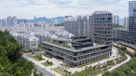
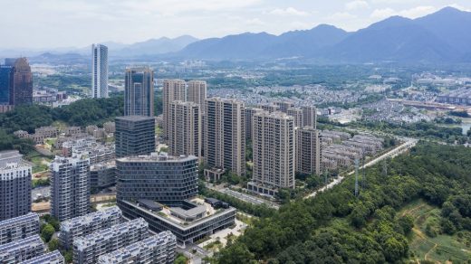
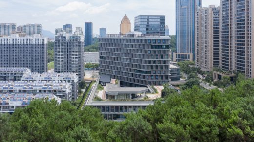
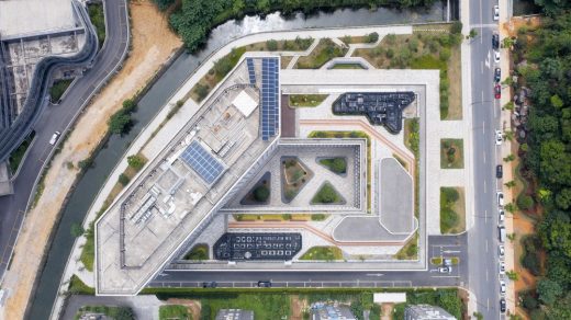
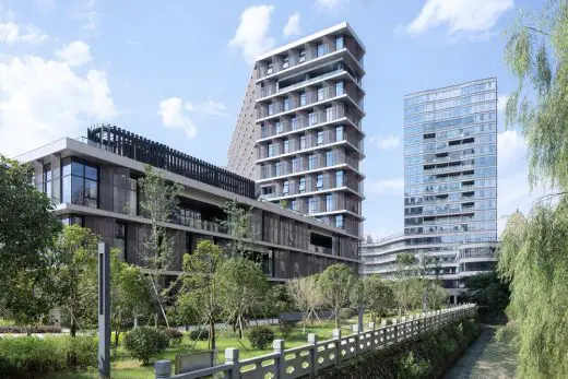
In China, the perimeter block typology doesn’t usually return the Floor Area Ratio (FAR) necessary to satisfy inner urban densities. This leads to an over reliance on detached towers to meet FAR requirements. The perimeter block with a tower extrusion however, presents a useful hybrid.
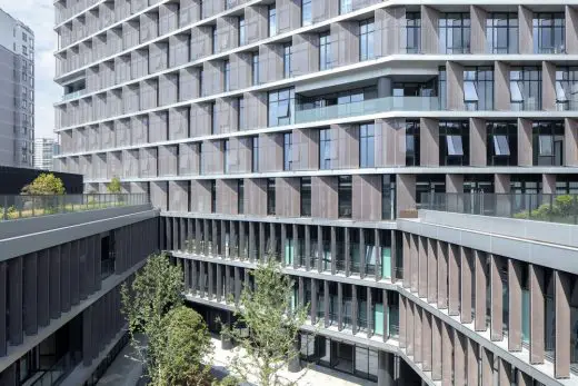
The advantages of the perimeter block (positive reinforcement of active urban street edges; well ventilated and naturally lit building interiors; and an internal courtyard that has the options of being private, semi-private-semi-public, or public space) are combined with the capacity of the tower to maximize floor area.
being a good neighbor
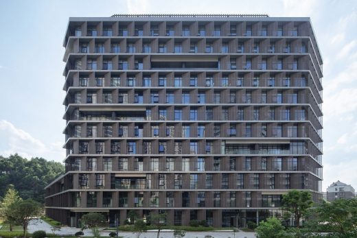
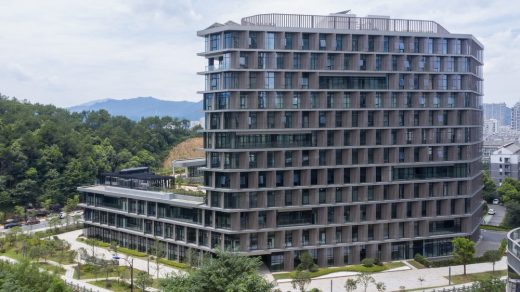
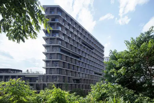
Urban form for this project was driven by the need to maintain strict solar access requirements to the neighbouring buildings. The low perimeter block did not impact solar access, however, the tower extrusion proved much more difficult to locate. Its final position exposes long east and west facades to low altitude summer sun.
metal petals
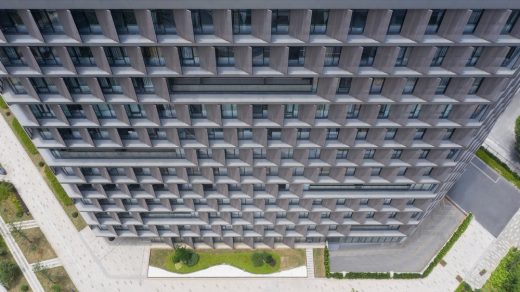
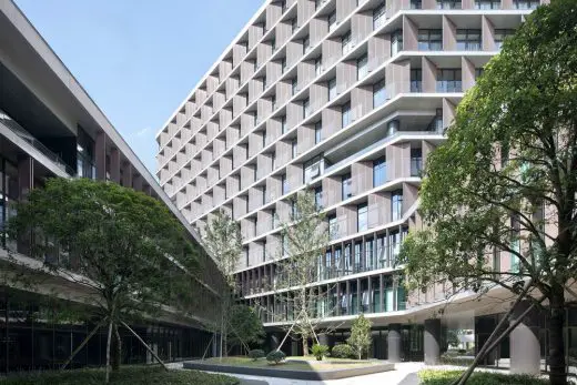
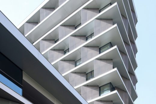
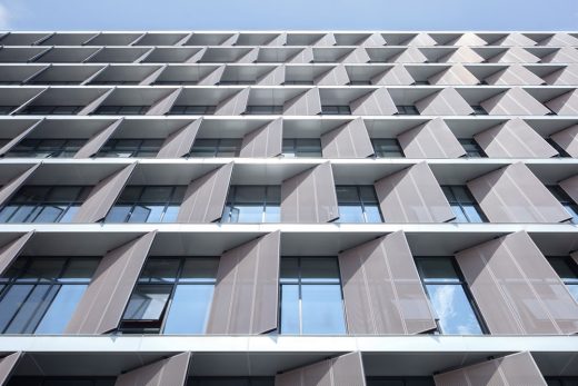
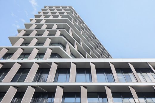
Surprisingly, all facades required vertical screens to prevent unwanted heat gain. Elegantly thin slab edges are projected past the window line and form horizontal ledges on which to sit vertical perforated metal sunscreens. These screens are closed enough to block the sun, yet open enough to not impede views out.
En masse, these sunscreens present as a series of metal petals covering unified facades.
Decks are then cut into the petals to provide outdoor space for each floor level, and subtle visual relief to the wall of petals.
minimalism 1. – expressionism 0.
The program for the Tonglu Archives Building is diverse: document archives, testing laboratories, staff canteen, a commercial street-front cafe, and variety of closed and open office spaces. This suggests an architectural articulation of these programs. In addition, the typological hybrid suggests articulation of the perimeter building and the tower.
However, rather than exploring these obvious solutions, the questions posed were: What are the differences in the program? What are the differences generated by combining perimeter block and tower typologies? And finally, what is the least we need to do to engage with these differences?
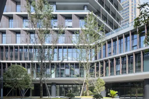
The answer to this question brought about two design responses: firstly, a unified façade which fulfilled the performance criteria for solar access and protection for each of the different programs; and secondly, the location of the entries for all programs into the central courtyard space.
semi-public courtyard
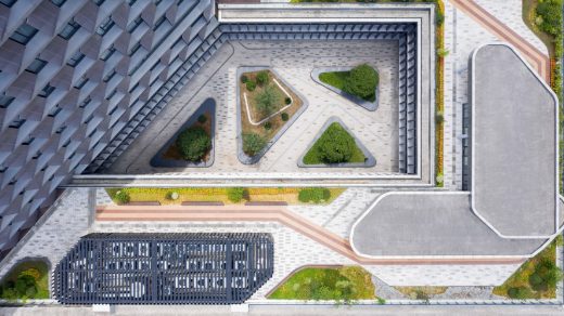
This centralized circulation strategy creates a semi-public outdoor space and provides opportunities for encounter and exchange amongst the different public departments. It also provides an active space for lunch in a protected courtyard landscape.
The courtyard directly links the public footpath of the main southern entrance to a proposed future pedestrian bridge to the north east of the site. This diagonal shortcut further reinforces the semi-public nature of the courtyard.
roofscape as displaced landscape
To encourage the staff to get out of the building and enjoy the river frontage or the courtyard, the paving from the ground floor interiors flows directly into the courtyard and out to the river’s edge – a robust strategy for the future, when the ground floor develops more pubic and/or commercial programs.
The tower overlooks the roof of the perimeter block and this space provides an opportunity for a major private outdoor space for the building tenants. A garden pavilion for staff lunches or informal meetings sits within a roofscape that presents as a displaced landscape. The staff canteen opens on to this roofscape. Plant rooms have been disguised as additional garden pavilions.
more visible than we think
In a commercial and retail environment where every building is trying hard to be seen as different from its neighbours, where advertising and signage are dominating streetscapes, where buildings are becoming extensions of corporate logos and marketing campaigns – a minimal, elegant and calm public building may be more visible than we think.
Design: BAU
Project Status: Completed 2019
Location: Tonglu, Hangzhou, Zhejiang Province
Client: Tonglu Urban Development and Management Co., Ltd.
Typology: Office
Program: Document archives; testing laboratories; office.
Year: 2016—2019
GFA: 26,700 sqm
Construction Cost: RMB 136 million
BAU Project Team: James Brearley, Jens Eberhardt, Chen Zhiyong, Luo Huaili, Steve Whitford, Gao Weiguo, Chen Jian
Builder: Hangzhou Harbour Construction Co.,Ltd.
Engineer+Documenting LDI: China United Engineering Company
Photographer:Xia Zhi
Hangzhou Tonglu Archives Building images / information received 260121
Location: Hangzhou, Zhejiang, China
Architecture in China
Chinese Architectural Designs – chronological list
Chinese Architect – Design Practice Listings
by e-architect
Design: UNStudio, Architects
photography : Tom Roe
Marina at Keppel Cove in Zhongshan
Design: The Architectural Design & Research Institute Of ZheJiang University Co,Ltd
photograph : Qiang Zhao
Shuyang Art Gallery Building
Shanghai Building – Selection
Shanghai Architect Offices – design firm listings for this city
Contemporary Chinese Buildings
Comments / photos for the Hangzhou Tonglu Archives Building page welcome


