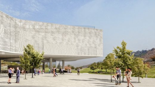
NuMu Chile new museum in Santiago building, Fundación Engel architecture design
NuMu: New Museum in Santiago
post updated January 27, 2025
Architects: Cristián Fernández Arquitectos + VadesHagemann Arquitectos + Matias Gonzalez R. + Guillermo Bustos N. + Claudio C. Araya
Location: Santiago, Chile
20 Dec 2020
NuMu: New Museum in Santiago Building
The word “MUSEUM” comes from the Greek word musa, the goddesses that provides inspiration to poets and artists.
We understand the MUSEUM as the place where we come to seek out inspiration.
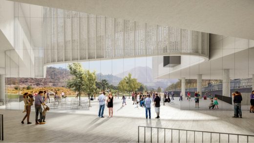
This building is inviting…it signals an openness towards the community that surrounds it.
Qualities like transparency and welcoming spaces create the type of place where people gather together.
The architects propose a building that invites one to linger, that promotes the interaction between people and art, in all its manifestations.
The park, its views, the external spaces and the exhibition areas, which take presence in the building, all create a place of congregation and stimulation that serves to inspire.
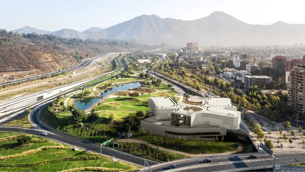
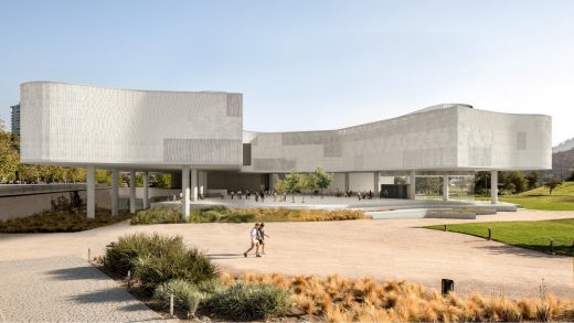
Diversity is represented by exhibition rooms floating at the upper level and oriented in different directions, a swirl of air or a star or a hand whose fingers reach out in a gesture of openness and diversity.
Unity is incarnated in a central open space, a large platform which ties the building together and can be filled by a variety of possibilities and events.
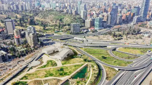
The building is an “interface” between the scale of the park and urban fabric.
Roots, identity and geographical landscape
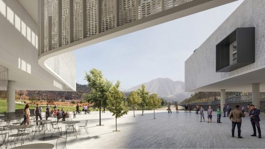
The building is rooted in the land surrounding it. Its volumes are situated so as to highlight the peaks and landmarks that historically and geographically make up the Santiago Valley.
The focus of the central courtyard is Manquehue Hill (from Mañkewe, a Mapudungun word meaning “where the condors fly”), the tallest hill in the valley, which has a significant connection to our culture’s origins and history.
To the West, the image of the Virgin Mary stands framed by San Cristobal Hill, representing Spanish colonization and our half-European, half-indigenous culture.
Finally, to the East, the building opens towards the heights of San Ramón. This is the great geographical scale, the Andes mountain range, which runs the entirety of the continent and hugs, within one of its folds, the greater city of Santiago.
The geometry of the building is organized so that it values the most significant geographical landmarks in the Santiago Valley. This way, the building’s conceptual matrix creates a gesture of inclusion, bringing to light the worldview of the original peoples of Chile.
Materiality
The building can be understood in three levels.
Each one of these levels has well-defined characteristics in terms of material definition.
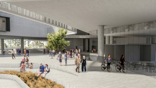
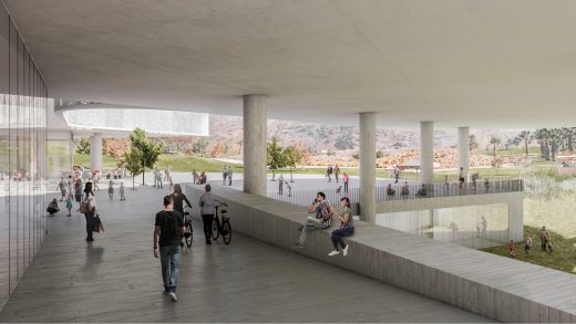
Below, the walkways, ramps and stairs are made of acetylated wood, which serves to create a surface that connects the city and the park with the building, and to convey a friendly, inclusive character.
Above, the exhibition rooms that float above the courtyard, coated in white limestone brickwork, incorporate translucent lighting elements, allowing these spaces to be retro-illuminated.
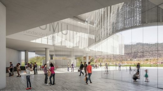
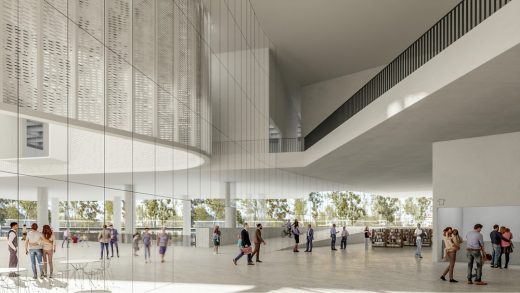
At the intermediate level sits the Lobby, connected to the street, the central patio and the park. Here transparency (glasswork) is the main standout feature.
Lobby
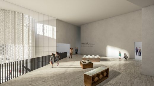
One enters the museum through a large ramp that leads to the “Events Courtyard” and, from there, to the Lobby. A large levitating reception desk allows for ticket sales and an information desk, as well as integrating the Gift Shop.
The Lobby, the Gift Shop, the “Events Courtyard”, the Cafeteria and the Restaurant all root the building to the “urban” lifestyle.
From street-level, this living interior linking the street, the patio and the park is transparent and open.
The artworks themselves can be seen from the city and from the park. It is a generous and inclusive space.
Events Courtyard
The “Events Courtyard” is an open space designed to bring diverse artistic activities together at the heart of the building.
This courtyard will be one of the main exhibition areas, alongside with the galleries. It will be an open space filled with life, diversity and art.
Exhibition Rooms
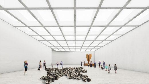
These three large spaces “float” within the building. They can be accessed from a central area, which looks out over the Events Courtyard. The placement of these galleries allows for different use patterns: connecting the rooms and creating a continuous exhibition space, or allowing each of them to be used separately.
The interior of each room is delimited by straight and lightly curving walls; these give the greatest possibilities for interior configurations. They have a regular ceiling structure which permits flexible exhibition displays. During the day they are bathed in indirect and controlled natural light; night illumination maintains these same characteristics. The rooms have two terraces which are extensions of the exposition spaces.
Auditorium
This is a simple space that allows at least two different, specialized configurations. It has a system of retractable theater-style seats which creates a flat space apt for performance, dance and other similar activities, or – when the seats are in place – the space becomes a sloped auditorium – perfect for movies, conferences, theater, etc.
In order to optimize these configurations, this space can be accessed from the first floor or from the lower plaza level.
Education
This section requires a sufficient amount of independent operation, so that students and the general public can meet here without passing through the museum’s interior, closed-off areas.
At the lower plaza level, the education rooms and the library are organized around a patio-garden, which can be accessed from the museum or directly from the park.
This patio serves as a space for workshops associated with the educational spaces.
Sound Arts
This is a 10 x 10 meter space with an interior height of 6 meters. This subterranean space is constructed with thick cement walls built so as to provide total acoustic isolation. It includes a large access gate which completely soundproofs the space.
This space can be accessed through the lower plaza, but it is mostly connected to the museum exhibition areas.
Service Areas
All levels of the museum are connected by a vertical circulations service space which includes a freight elevator, stairs, and internal service areas.
Access for pedestrians, cars and trucks is located in the south section of the lower plaza level. There is a space for trucks to load and unload material safely and comfortably. From here it’s easy to access the administrative areas and service departments.
NuMu: New Museum in Santiago, Chile – Building Information
Location: Santiago, Chile
Client: Fundación Engel
Competition year: 2020
Area: 7510 m2
EQUIPO
Architects: Cristián Fernández Arquitectos & VadesHagemann Arquitectos & Matias Gonzalez R. & Guillermo Bustos N. & Claudio C. Araya
Project leader: Cristián Fernández E.
Collaborators: Mara Mantoiu, Amalia Fernández S.,Gracia Fernández S., Cristián Fernández S.
Engineering: Luis Soler
Landscape: Macarena Calvo
NuMu: New Museum in Santiago, Chileimages / information received from Cristián Fernández Arquitectos
Location: Santiago, Chile, South America
Chile Architecture
Contemporary Chile Architectural Projects
Chile Architecture Design – chronological list
Chile Architecture – selection below:
The Winery at VIK
Design: Smiljan Radic architect
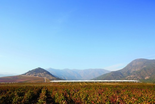
photo courtesy of Vik Retreats
The Winery at VIK
Caterpillar House, Lo Barnechea, Santiago de Chile
Design: Sebastián Irarrázaval Delpiano ; Associated Architect: Erick Caro
photo : Sergio Pirrone
Caterpillar House
Chile Architect Studios – Design Office Listings
Comments / photos for the NuMu: New Museum in Santiago, Chile page welcome

