Calgary Bridge Competition, Canada crossing design project images
Calgary Bridge Contest : Canadian Architecture Competition
Design Contest Entries by SPF:architects in Canada, North America
post updated March 8, 2025
Two projects submitted by Californian architects SPF:architects
Calgary Bridge Design Contest
2 Oct 2009
Calgary Bridge Competition
Submission 1
GLIDE
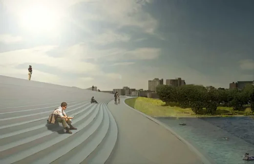
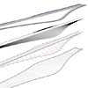
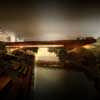
The main design impetus for Glide was to achieve a certain level of design purity and visual simplicity. In a world where we are constantly bombarded with a non-stop barrage of the overstated, overdone, over exalted and hyperbole, it was our mission to be as simple stated as possible while yet creating a dynamic environmental experience.
It was not our goal to create a geometric icon but rather too simply make a specific object for Calgary that also challenges the notion of what a bridge ought to be as a way of linking two parts of the city. In other words, the goal of Glide is to create links from the north and south banks the Bow River and St. Patrick’s Island using the notion of a public environment as the geometric generator for the bridge.
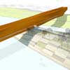
The basic shape and form of the bridge is derived from an interpretation of the flow of water and wind around a fixed object. The form generated from these studies create two sort of symmetrical undulations that slope down from the main spine of the bridge to gently land on St. Patrick’s Island. These undulations actually create a series of steps that resemble the ideas of simple ‘reverse’ amphitheatres. The goal is not to create performance spaces- although- this could be a terrific by-product- but rather intended to create comfortable public spaces where the bridge and the island could be experienced together.
The structure is a combination of steel and concrete- a hybrid composite system to achieve lightness, strength and slimness. From a plan standpoint, Glide has width but from an elevation standpoint it is incredibly slender and it is this dichotomy that interested us. The connections at the north and south banks of the Bow are designed to be seamless to the existing walk and bike paths. Similar notions of water and wind flow were utilized for the geometric connections to the existing banks.
Submission 2
The O-Bar
The main design impetus for O-bar was to achieve a certain level of design purity and visual simplicity. In a world where we are constantly bombarded with a non-stop barrage of the overstated, overdone, over exalted and hyperbole, it was our mission to be as simple stated as possible while yet creating a dynamic spatial experience.
It was not our goal to create a geometric icon but rather too simply make a specific object for Calgary that also challenges the notion of ‘space’ as a way of linking two parts of the city. In other words, the goal of O-bar is to create links from the north and south banks the Bow River and St. Patrick’s Island using space as the geometric generator for the form of the bridge.
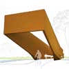
In order to create a space one needs material, and in order to bridge a gap one needs a structure. As Donald Judd once said, “My aphorism is not that form follows function but that it never violates it”, it is with this tenet that we moved forward. The basic shape and form of the bridge is a bar. The undulations of the bar are directly correlated to the compression and tension stresses of the semi-monocoque skin and truss structure.
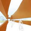
This structure was chosen for its lightness, simplicity and efficiency and it allowed us to create the subtle undulating geometry that we desired- we see it as almost a muscle- we could even call it the muscle of Calgary. Additionally, this allowed for another goal that our spatial object touch the earth at each of the three points as lightly as possible. The structural undulations, ultimately create the ‘space’ that was mentioned earlier. Because of the undulations, the user is confronted with a constantly changing perspective and perception of the Calgarian sky.
The continuous 100 meter slot on both sides of the bridge is located at rail height and above bicycle riders head height so that a hyper extended wide screen like panoramic view of Calgary is framed. The ends of the bridge are cantilevered to meet the adjacent properties and paths to create a gateway at the north and south entry points. A very light ramp pierces the O-Bar to attach it to St. Patrick’s Island and to connect bridge crossers to a geometric landscape of picnic areas, sunbathing pads, play areas and relaxing zones.
Location: Calgary, Alberta, Canada
+++
Calgary Architecture
Calgary Bridge Design Competition
image from architects
Calgary National Music Centre entry by SPF:architects
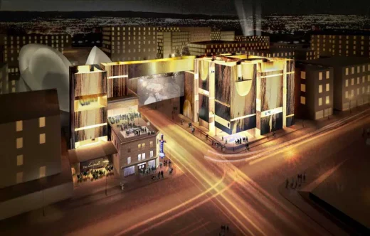
image from architects
Switch bloc, Calgary housing, Alberta
Architecture: Modern Office of Design + Architecture
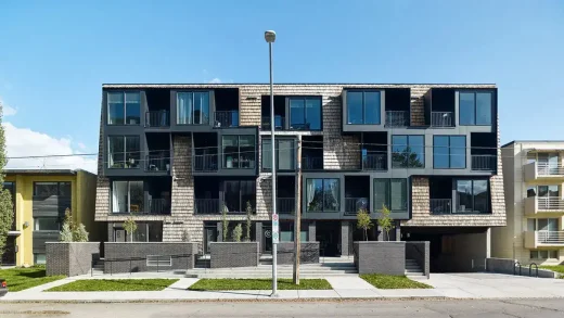
photo : Robert Lemermeyer Photography
Grow Community Housing, Calgary, Alberta, Calgary, Alberta
Architecture: Modern Office of Design + Architecture
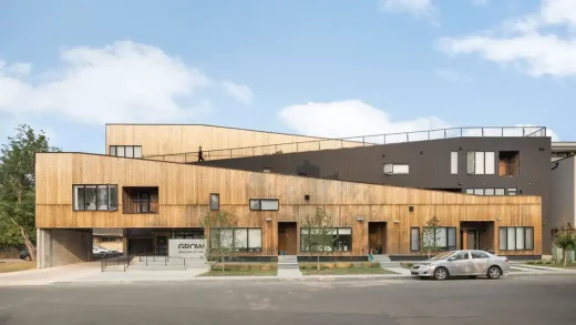
photo : Ema Peter
The Bow Calgary : design by Foster + Partners
+++
Canada Architecture
: city walks by e-architect
Comments / photos for the Calgary Bridge Competition Architecture in Alberta, Canada page welcome.


