All Hallows School Brisbane, Queensland Education Development, Australian Architecture Images, Architect
All Hallows School Brisbane
Higher Education Facility in Brisbane, Queensland design by Wilson Architects, Australia
page updated 29 Oct 2016 with new photos ; 5 Jun 2015
Location: Brisbane, Australia
Design: Wilson Architects
Wilson Architects’ vision for Brisbane’s All Hallows’ School successfully creates a relationship between layered heritage context and a contemporary façade.
All Hallows’ School in Brisbane Building
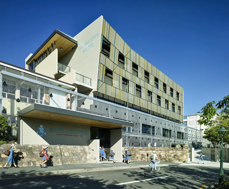
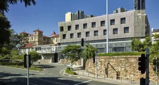
Looking to expand and facilitate the addition of year 7 students to high school, All Hallows’ challenged Wilson Architects with placing a new five-storey contemporary classroom building close to some of the oldest buildings in Brisbane.
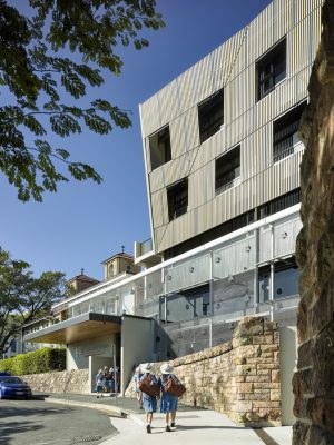
By using a vine screen, the contemporary façade reduces the apparent size of the building, ensuring it blends seamlessly into its surroundings. The result is a respectful and sympathetic design, providing active learning spaces and a vibrant, social courtyard for students, while capturing beautiful views and reducing energy consumption.
What was the design brief?
The design brief grew out of a review of the school’s masterplan, which looked at future building sites for the School to incorporate 15 new classrooms to facilitate the addition of Year 7 to high school in Queensland. The challenge was to place a new five-storey contemporary classroom building in very close proximity to some of the oldest school buildings in Brisbane.
What was your design intent on this project?
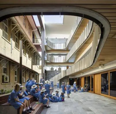
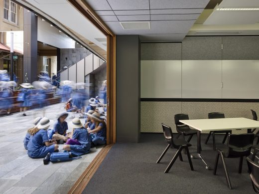
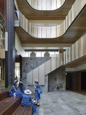
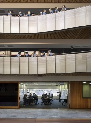
For the students, we wanted to encourage flexible and open learning behaviour with the classroom arrangement, with plenty of windows and whiteboards. We also wanted to create a vibrant, cool courtyard space, to encourage interaction and extend learning opportunities outside the classroom.
The design intent for the school as a whole was to create a new and contemporary front entry on Kemp Place, while reducing the apparent size of the building using a vine screen and coloured sunshade. We also wanted to maximise covered circulation into and through the school, and increase outside spaces for student interaction. Looking to the future, it was important to respect the heritage context by setting up a direct relationship between the new building elements and the layered history of the place. We also wanted to reduce energy consumption over the long-term by installing a precinct CHW tank, chilled using off peak power.
The façade design is essential to the character of the school. How does the design connect the old with the new, and play with the scale of the building?
As a heritage site, the school’s rear facades have, over time, become one of its most prominent public elevations. The design strategy acknowledges this, at the same time working with the framework of hierarchal facades on the heritage buildings where each face shifts its architectural language dependent on the spaces they address. The new building envelope responds to each of its elevations with a rotational tectonic, as if part of each facade is being pulled around and connected to the next.
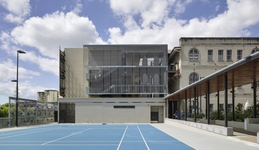
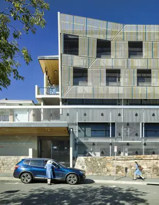
The street composition re-scales the five-storey building into a two-storey object floating over a two-storey-high garden screen. Garden and building screens are devices used in the past by the nuns to provide privacy, security and shade.
The western facade responds to the scale of the 1940 University Wing and composes an elevation of aluminium screening lightly suspended like the famous Queensland Thurlow Veranda Blind.
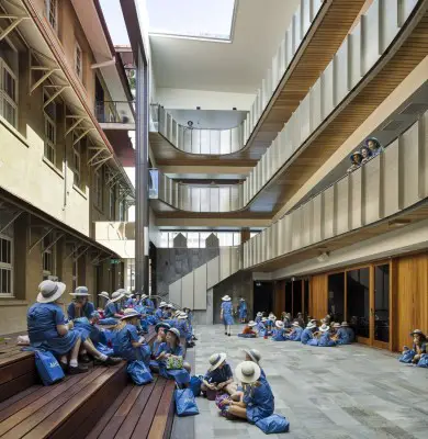
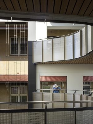
Where the new building engages directly with the facade of the old building (essentially the rear wall of the school) the facade is theatrically edited back. Rather than reveal the whole of this rather mundane but important facade the new works instead frame a fragment of it with a proscenium arch. This places the façade as a backdrop to the daily play of student interaction in the courtyard of Mary Place.
How did you overcome the challenges associated with the heritage-listed buildings?
One of our main challenges was to allay concerns about maintaining the special significance of the listed site and buildings. The project team, including heritage architect, Michael Kennedy, worked collaboratively with the Queensland Department of Environment and Heritage Protection (DEHP) and used extensive 3D modelling to explain the project. Each face of the building has particular relationships with its surroundings; these were developed to a high degree during the design phase, which gave DEHP confidence in the final result.
The new building is also very closely placed against a significant listed building and yet the ‘proscenium arch’ device is respectful and sympathetic. Does the design include any innovative approaches or materials?
A large CHW tank in the basement carpark uses existing chiller infrastructure on the other side of the campus to store cold water using off peak power. The tank capacity has been sized to enable the heritage listed buildings to be connected in the future so that existing small scale AC units can be removed from the exterior of the buildings.
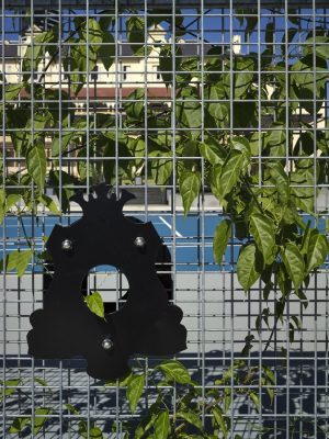
The two-storey trellis is fabricated from standard galvanised reinforcement mesh, suspended and double layered creating a moiré effect until the screen will be filled with the rapid growing Lady Bowen Creeper.
Large school emblem studs lock the two mesh screens together and form a pattern over the extensive surface. What have been the main benefits of the project?
The classrooms capture spectacular views to the Northeast, and students and teachers are enjoying the light and transparency in contrast to some of the original classrooms.
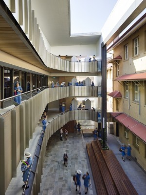
The central courtyard space has become a vibrant and social space, closely connected to the heart of the school.
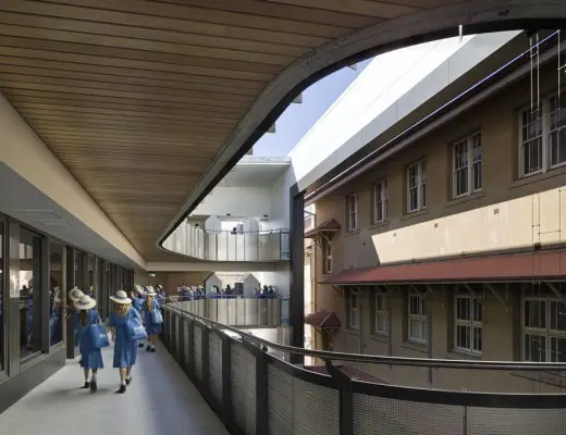
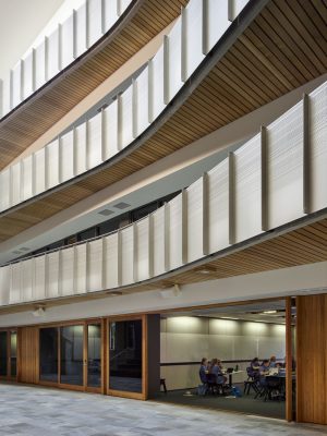
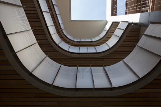
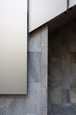
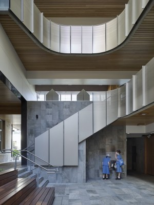
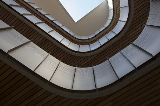
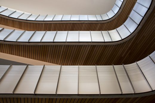
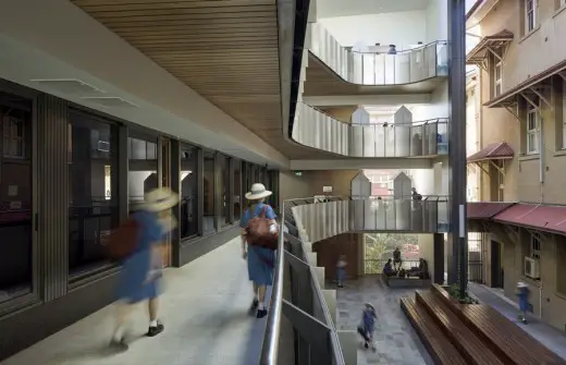
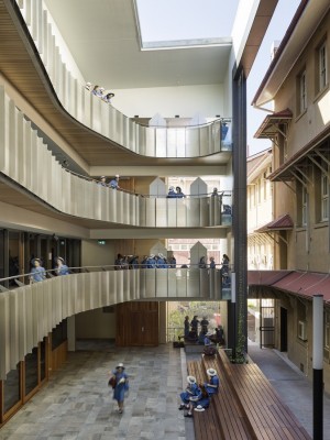
The cost of the building is surprisingly low per square metre, however, quality materials have been used to raise the apparent standard of the building. Timber soffits over public circulation areas reduce acoustic reverberation within the courtyard but also present a fifth elevation when viewed from the courtyard.
Classrooms are orientated to place the productive walls along the longer axis making the rooms shallow and wide. Students are encouraged to use the extensive whiteboards in active learning modes.
How does the design fit into its cultural and physical context?
1. Kemp St Elevation
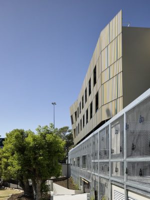
The colour of the Kemp Place screen is a mix of anodized aluminium colours, golds, browns and silvers. Mixed together they form a combination that reflects the colours of the original buildings. Bright blue battens match the colour of the school uniform and provide a colour counterpoint. The composition of the screen reflects the mass and loadbearing qualities of the original buildings, but as you move around it, it reveals its inherent transparency.
The building has been ‘re-scaled’ compositionally to defer to the scale of the heritage buildings. The large trellis structure on Kemp Place has been designed to amplify the existing landscape and stone walls on the periphery of the school. Planted with ‘Lady Bowen Creeper’, within a few years it will be a green wall blooming into bright orange flower.
2. Western Elevation
The western elevation responds to the western face of the adjacent University wing of the Main Building. The alignment of the building is deliberate and the screen elements reflect the storey levels and window placement of the original building. The two faces, while contrasting, form a harmonious edge to the eastern side of the courtyard space now known as Kirinari.
3. Kirinari
A new public place has been established in front of the old Convent extension (1892). This new space re-composes the relationship between the Convent to the south, the McAuley Building to the west, and The University Wing and the western face of the new building to the east. Fortitude Valley to the north becomes an important and expansive landscape reference to the plaza spaces. The new building and the
University Wing are read now as a single composition. Various heritage facade details are referenced and reinterpreted. The building respects the alignment of the adjacent Main Building, and with it forms the Eastern side of a new courtyard space to the original Convent Building.
4. Mary Place Courtyard
The interior courtyard formed between the new building and the rear wall of the Main Building has been set up as a new significant student gathering space in the school. The original rear face of the main building is theatrically framed with a proscenium arch and the new building forms a gallery of balconies that overlook the new courtyard. Vine screens provide an ersatz curtain for the stage of tiered seating for students.
How does the design respond to the local climate?
The Kemp Place screen and trellis structure shade the north east facing windows and protected the building from the recent hailstorms.
The classrooms use exposed concrete soffits as a heat sink for the air conditioning. Air is pushed at high level across the soffits for additional cooling.
All Hallows School – Building Information
Project Name: Mary Place, All Hallows’ School
Architecture Practice: Wilson Architects
Photos: Chris Frederick-Jones
Date of completion: November 2014
Total project cost: $10.6M
Gross Floor Area: $3,250sqm
Project cost : $3,260 per/sqm
Type of building contract: Traditional Lump Sum
Project Address: Kemp Place
Owner/Client Contact: AHS Business Manager, Chris Byrne
Project Manager: CPM (Australia), Robert Timms
Architecture Practice Team: Phillip Lukin, Hamilton Wilson, Daniel Tsang, Sarah Mahon, Maddie Zahos, Shaun Purcell, Nick Lorenz, Sarah Russell
Consultant Team:
Surveyor: Michael Jolly / Michael Jolly Surveys
Town Planning: Steve Craven / Craven Ovenden
Landscape Architect : Beth Wilson / Wilson Landscape Architects
Heritage Engineer: Michael Kennedy Architect
Structural Engineer: Grant Gowan, Ken Gallie / Cardno
Civil Engineer: Simon House / Cardno
Hydraulic Engineer: Greg Hamilton / H Design Pty Ltd
Mechanical Engineer: Liam Murray, Andy Bradley / Arup
Electrical Engineer: Caitlyn Young / Arup
Acoustic Engineer: Simon Ham / Arup
Lift Engineer: Paul Sullivan / Arup
Fire Engineer: Darren Horan / Omnii
Traffic Engineer: Stuart Holland / Holland Traffic Consulting
Quantity Surveyor: Ben Foster, Stewart Dowling, Brendan Lee / Steele Wrobel
Certification: Paul McCarthy, Chris Finch / McCarthy Consulting
Construction Team: Badge Pty Ltd
Construction Manager: Ashley Kruck
Site Foreman: Matt Murphy
Photography: Christopher Frederick Jones.
All Hallows School in Brisbane images / information received Wilson Architects
Address: 547 Ann Street, Brisbane QLD 4000, Australia
Phone: +61 7 3831 3100
Brisbane Buildings
, Quay Street Precinct, Brisbane CBD
Architects: Rothelowman
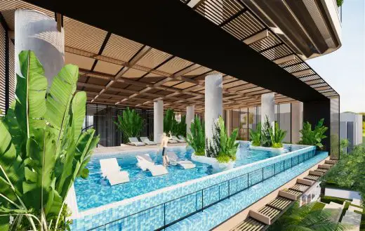
image courtesy of architects
57 Coronation Drive Brisbane
Design: Alexander &CO.
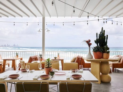
photograph : Anson Smart
Burleigh Pavilion Restaurant in QLD
Design: Jackson Teece Architecture
Brisbane Apartment Building
HASSELL
Brisbane Building
Australian Architecture Designs
New Arthur Phillip High School and Parramatta Public School Building, NSW, Australia
Design: Grimshaw Architects / BVN
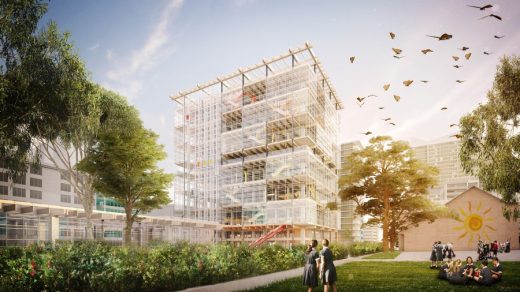
image courtesy Grimshaw
New High-rise Public School Building in Australia
Comments / photos for the All Hallows School in Brisbane page welcome
Website: Wilson Architects

