Vanhaerents Building, Architect, Image, Office, Architecture Project News, Design
Vanhaerents Office Building, Belgium
Contemporary Belgian Architecture design by BURO II Architects
New project of BURO II : extension of office building Vanhaerents
Vanhaerents Office Building At Torhout (Belgium) – 2008
16 Jan 2009
Vanhaerents Office
This project is an expansion of the existing offices of the project developer Vanhaerents.
Vanhaerents is a developer who consistently chooses for projects that can stand the test of time. These projects may vary from residential and office buildings, over schools, hospitals and even sports infrastructure. Managing director Joost Vanhaerents continuously seeks out new frames of thought and opted to work with BURO II for the new office building.
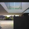
As the existing offices had to remain in use during construction and the site could not accommodate a new building adjacent to the existing volume, the new offices were built above the existing ones.
Architecture
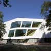
The existing offices were built in the eighties as a polygonal one-storey building in dark grey concrete blocks. The programme for the expansion proved too large for the limited site, leading the architects to opt for an upward expansion. The spaces are organized around a central atrium and courtyard, creating diagonal views and a spatial dynamic between old and new.
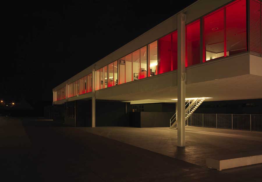
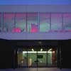
The two buildings are complementary with regards to materialization and spatial concept: steel and glass versus concrete masonry, transparency versus solidity, white versus black. The new volume is conceived as a light, white box in glass and steel, floating above the existing building, which was painted black to emphasize the contrast.
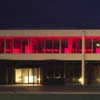
When dusk falls, the integrated LED-lighting brings a unique atmosphere to the building.
Conference space
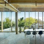
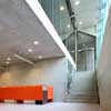
The organization of this flexible conference space is attuned to the internal workings of the company, offering generous meeting accommodation. The ten offices and four meeting rooms are set between a glazed façade and a glazed internal wall. They capture ample light and make their users very visible. The continuous glazed internal walls to the hall create a striking spatial fluidity. In this space, sober white walls and black floor coverings work perfectly, offering breathing space to the contemporary artworks that give identity to the individual offices.
Art
The building is more than just a functional and flexible office. The interaction between old and new mirrors the image of the company Vanhaerents, founded on strong tradition while at the same time maintaining a fresh vision to the future. A prime example of this is the public opening of the Vanhaerents Art Collection (www.vanhaerentsartcollection.com) in Brussels.
Two artists were invited to make in situ works of art especially for the new office building. Jan de Cock installed his Denkmal 81. There is no attempt at integration; rather the art seems to be purposefully placed in the way, winning in strength as a result. The crates and boxes are a reference to Russian constructivists and the abstract art of the twentieth century. In the reception area, Cerith Wyn Evans works with white neon lighting in his piece ‘Dymaxion’. The world map, audaciously folded opened with a wink to the American Buckminster Fuller, and the text in the atrium, referring to the Mexican architect Luis Barragan, reflect each other: a meeting between art and architecture.
On account of the new building, the company had a film made about the relationship between architecture and art. Art and architecture are often antagonistic, but just as often they can be natural partners. The primary question ‘Is architecture art?’ was posed to artists, architects and policy makers. The result is a collection of very diverse opinions and views.
Interior
The tables are made to measure, designed by BURO Interior: the meeting tables, the desks in individual glazed offices and the round black legless tables that seem to be part of the building. The chair by Arne Jacobson is a playful note within the austere interior design. The T5 lamps in the offices, hung in a cross pattern to break the rigidity of the straight mine, are another playful accent.
For acoustic reasons, the ceilings are finished with perforated plasterboard. The circular openings are a lively accent. The floors are all raised to allow for flexible cabling. The floor covering is an anthracite needle felt. Inside the steel building with aluminium joining, the human voice sounds muted.
The steel substructure of the stairs carries a black enamelled aluminium guardrail. A decorative light pillar between landing and wall lights the stairwell. In this fashion, a simple interruption of the horizontal structure of the complex is accomplished.
Vanhaerents office building Belgium image / information from BURO II
Location: Belgium – exact location unknown, western Europe
Belgian Architecture
Belgian Architecture
photograph from architects
Herge Museum
picture © Nicolas Borel
Architectural Tours – city walks
Comments / photos for the Vanhaerents Office Building Architecture design by BURO II Architects page welcome

