PTA Pods Perth Murray Street Mall WA, Western Australian Building Project Design Pictures
PTA Pods – Murray Street Mall, Perth
Underground Rail Station Project, Australia design by Iredale Pedersen Hook Architects
post updated 5 April 2026
Location : Western Australia
Design: Iredale Pedersen Hook Architects
Murray Street Mall Perth
7 Sep 2010
PTA Pods, Perth
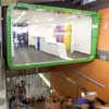
PTA Pods Perth: The PTA information centre explores the capacity of architecture to create a centralised identity for the metropolitan public transport network. Dwarfed by the rapidly emerging 140 William Street Hassell Architects tower building, the two pods hover precariously above the entrance to the Perth underground rail station providing a brief moment of visual clarity contrasting with the visual chaos of the existing retail context.
Initially the pods were both designed to be information centres, one staffed and one open to the public for self serve information. During the design process the pods were increased in size with the information centre being consolidated into one pod and the other designed as a shell to generate income from retail leasing. The pods retained their duality through form and colour.
Colour
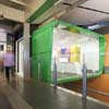
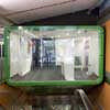
Transperth Green is applied to the exterior Alucabond shell of each pod providing an immediate identity to the transport network. The clear structural glazing front elevation exposes the activity of the information centre to the underground station entry.
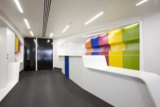
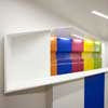
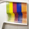
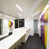
Internally the colours continue in the form of the individual network line colours, these cabinets contain the corresponding coloured brochures for each of the transport lines. All other surfaces are purposely white, sculptured and precise.
Form
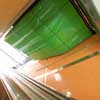
The design seeks a formal clarity that is unapparent in the surrounding context. It responds to the dynamic movement of passing people and commuters and to escalator and stair movement patterns. It may be approached from the front (Murray Street Mall) or underneath (Perth underground station). It creates a sense of intrigue when approaching from all directions; the underbelly gently pushes down to enforce a brief distraction from the surrounding context.
Thresholds
The information centre explores the role of thresholds indicative of entering the train section and then entering the train. This is identified by a continuous loop of white Staron that must be passed to enter the centre.
The information bench continues the play of thresholds by extruding out from the floor surface then lopping over the information brochures collecting all the information material in to one element.
Structure
The complexity of building over the existing entry to the station while maintaining continuous public access, combined with the construction site being trapped on three sides by the 140 William Street construction site demanded project specific solutions. From the early design stage investigation of construction systems exploring the potential for prefabrication and components formed a fundamental and effective aspect of the design. Materials were delivered as small pre-labelled components capable of being installed without the use of heavy machinery. At times night work was essential to minimise disturbance to the general public
Materials were selected based on their durability and vandal resistance; all materials were required to pass rigorous Public Transport Authority testing.
Internally Dulux Enviro2 Acrylic Paints are on the majority of surfaces and T5 and LED lighting incorporated to reduce energy consumption. Material wastage was minimised through maximising pre-fabrication of components in a factory environment.
Summary:
The PTA information centre explores the capacity of architecture to create a centralised identity for the metropolitan public transport network. Dwarfed by the rapidly emerging 140 William Street tower building, the two pods hover precariously above the entrance to the Perth underground rail station providing a brief moment of stoppage and clarity contrasting with the visual chaos of the existing retail context.
Identity and recognition is achieved through the use of colour and form. Transperth Green is applied to the exterior Alucabond shell of each pod providing an immediate identity to the transport network. The clear structural glazing front elevation exposes the activity of the information centre to the underground station entry.
Internally the colours continue with individual network line colours, these cabinets contain the corresponding coloured brochures for each of the transport lines. All other surfaces are purposely white, sculptured and precise.
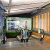
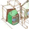
photo : Andrew Pritchard ; drawings : Iredale Pedersen Hook Architects
The design seeks a formal clarity that is unapparent in the surrounding context. It responds to the dynamic movement of passing people and commuters. It creates a sense of intrigue when approaching from all directions; the underbelly gently pushes down to enforce a brief distraction from the surrounding context.
Murray Street Mall Perth Pods design : Iredale Pedersen Hook Architects
PTA Pods Perth Project images / information from Iredale Pedersen Hook Architects
Location: Murray Street Mall, Perth, Western Australia.
Perth Buildings
Perth Architecture Designs – chronological list
Western Australian Architecture News – recent selection:
Paloma House, Eagle Bay, Western Australia
Design: Sandy Anghie Architect
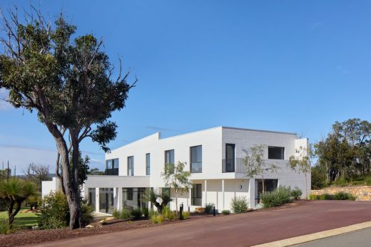
photograph : Jack Lovele
Paloma House, Eagle Bay
NEXTDC P2s
Redesign: Hames Sharley
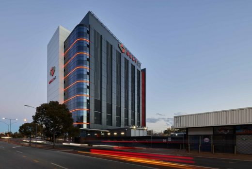
photograph : Douglas Mark Black
NEXTDC P2 Perth by Hames Sharley
Architecture in Australia
Australian Institute of Architects Gold Medal
Website: Perth Shopping
Another Perth design by Iredale Pedersen Hook Architects:
Perth Zoo Orang-utan Enclosure
Comments / photos for the PTA Pods Perth – Murray Street Mall Building design by Iredale Pedersen Hook Architects
page welcome
Website: Murray Street Mall Perth


