425 Park Avenue Building, New York Tower Building Design Competition, NY Skyscraper Contest
425 Park Avenue Manhattan : NYC Tower Contest
New York Architectural Competition – article for e-architect by Carlos M Teixeira architect, Brasil
Dec 12, 2018
425 Park Avenue Topping Out
425 Park Avenue Building Topping Out News
Oct 23, 2012
425 Park Avenue Manhattan
Back to 1916
425 Park Avenue Contest
Text by Carlos M Teixeira
A two-day exhibit held last week at New York’s Jazz at Lincoln Center was a good opportunity to see the competition’s entries for what is supposed to be “the first full-block office tower on Manhattan’s Park Avenue to be built in almost 50 years”. This is how developer L&L Holding announced the winner of the highly publicized 425 Park Avenue competition, where the eleven participant architects were asked to break the mold of New York’s static Park Avenue skyline, replacing its 425 Park Avenue building with a new landmark tower.
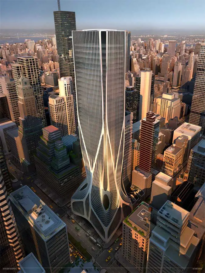
design by Zaha Hadid Architects:
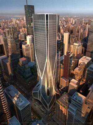
image from architects
Formally, the competition design could define a third element beyond the two prominent building typologies that have shaped Park Avenue throughout the last century: the zonings of 1916 and 1961 and their resulting formal clichés: the wedding cake and the shoebox, respectively.
design by OMA:
image from architects
The 1916 law took the Woolworth Building as a prototype: the total occupation of the plot area is permitted up to a certain height; from there, the stories should recede from the plot’s frontage according to a certain angle in order to allow light in the streets. The adoption of a new zoning in 1961 was the most significant architectural and urban event in postwar New York, replacing the 1916 cake with the shoebox and changing the relationship between street and building. Influenced by modern urbanism, these changes were intended to renew the traditional city oriented in favor of the street for an urbanism marked by continuous voids and punctuated by isolated towers.
design by RSH+P
image from architects
The competition posed a unique opportunity to redesign a typical 1916-zoning building and to reactivate the Avenue’s architecture with something beyond those zoning restrictions. As the New York Observer’ reporter Matt Chaban noted, the developer’s plan is to tear down a large part of the existent structure and replace it with the new tower, with flexible floorplates, column free-spans and LEED design. But as the 32-story wedding cake was built in 1957, its total built area is actually larger than what the (still valid) 1961 zoning allows. Were the developer to demolish the entire building, he would be forced to replace it with a smaller structure. Real estate attorneys have determined that they could retain the base of the 1957 tower, designing a replacement up from there, and, through some “zoning wizardry”, maintain the new building at the current one size, 65.000 square meters.
winning design by Foster + Partners:
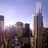
image from architects
Foster beat the other three finalists (Zaha Hadid of Zaha Hadid Architects, Rem Koolhaas of OMA, and Richard Rogers of Rogers Stirk Harbour & Partners) with a building with nothing that recalls the freshness of his diamond-gridded Hearst Tower built on Manhattan’s Eighth Avenue or the pyrotechnics presented by the other finalists. On the contrary; it looks surprising passé and not unlike a typical American office tower, except its slightly sculptural tapered steel frame that now seems shaped by the existing scale of the Avenue and not by the 1910s law.
As the winner architects explain, the volume has three gradated tiers of column-free floors, each of them separated by a landscaped terrace that provides amenity for tenants and offers views across Manhattan. The result is the same built area of the old 425 Park Avenue but taller, slender and within a new, revisited, softer envelope now able to offer semi-public gardens on the terrace floors and a urban architecture that, if it’s not new, it’s certainly far from the clumsy existent 1957 ziggurat (but restoring the old terraced step volume).
According to a New York Times review, it was chosen not for its landmark potential but mainly for its provision of common areas throughout the building where occupants can gather informally. “The whole idea of office space is to have places where you can have an intersection of ideas, areas of collaboration,” said the company’s CEO.
This reminded me the critic Kenneth Frampton, who once compared Herman Hertzberger’s Central Beheer and Foster’s (“grade one” listed) office building in Ipswitch (Willis Faber & Dumas Headquarters), in which he classifies the former as an attempt to overcome the bureaucratic division of labour through the ‘anthropological’ occupation of its labyrinthine office spaces, and the latter as a natural successor of Bentham’s Panopticon of 1791, an open plan form with an unremitting panorama of order and control.
It is true that open office spaces might appear flexible and nonhierarchical to their architects, but oppressive by their users. As it is true that Hertzberger’s humanistic discourse maybe got lost in the last decades, whereas Foster’s technocratic, efficient, a critical architecture has proved to be open enough to incorporate the generosity and human scale his first projects apparently lacked.
Carlos M Teixeira
This week’s guest editor, Carlos M Teixeira, is the founder of Vazio S/A, an architecture studio based in Brazil. He has shown his work at Venice Biennale, the V&A, São Paulo International Art Biennale and others. His latest book, “Entre: Architecture from the Performing Arts”, was published in English by Black Dog this year.
425 Park Avenue, New York, USA – news + more images
Exhibition of Four Designs
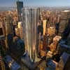
image from architects
Designs unveiled by the four shortlisted Architects:
Foster + Partners (Lord Norman Foster)
Rogers Stirk Harbour + Partners (Lord Richard Rogers)
OMA (Rem Koolhaas)
Zaha Hadid Architects
Location: 425 Park Avenue, New York City, NY, USA
American Architecture – Recent Buildings
Grand Central Terminal Building, New York
The Next 100 – Foster + Partners re-imagines Grand Central Terminal for 2013 Centenary
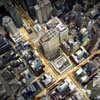
image : Foster + Partners
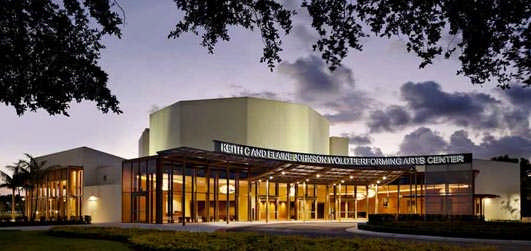
Keith C. & Elaine Johnson Wold Performing Arts Center, Lynn University, FL
Design: Newman Architects
photograph © Robert Benson Photography
Site of Obama / Romney Final Debate
Museum of Contemporary Art Cleveland – MOCA, Ohio
Design: Farshid Moussavi
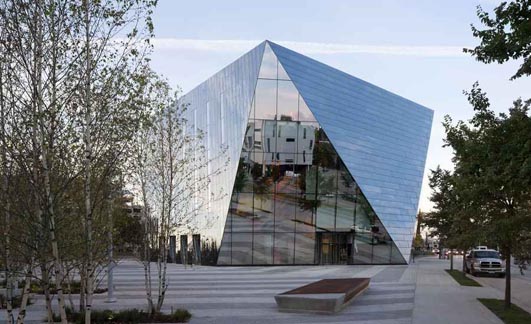
photo : Dean Kaufman
Residential Architecture in Japan by architect Carlos M Teixeira
Heavy and Light Lights by Carlos M Teixeira
Sea and Architecture by Carlos M Teixeira
Architecture Articles – Selection
Comments / photos for the 425 Park Avenue Contest – NYC Tower Competition page welcome

