Reflections of the Past Apartment, Amsterdam Interior Architecture, Netherlands, Dutch Design
Reflections of the Past Apartment in Amsterdam
19 July 2021
Design: Firm Architects
Location: Amsterdam, the Netherlands
Reflections of the Past Apartment
The wish of the client was a special private residence in Amsterdam. The aim was to create an honest, masculine, and architectural space with the largest possible usable floor space. No standard home, no compromises. Reflections of the Past is a sustainable apartment. Unique and made to measure. Firm architects designed and realized a conceptual living environment from scratch.
Environment
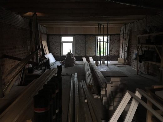
The floor of the building, located in the popular district De Pijp, was formerly used as an attic and was not suitable for living in. To turn this old attic into a livable space, the previous owner raised the roof about fifty centimeters a few years ago. After this, it was sold as a renovation object to the current owner.
Concept: “reflections”
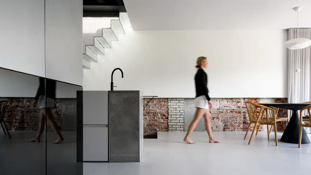
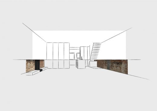
The new elevation of the space was realized by making a ring of dirty masonry around the old base. Laying the largely renewed roof beams on top. This principle of the space itself, a new elevation on an old basis, has become the starting point for the design. In the design, the entire space is visibly “cut through.” This cross-section is placed at a height of 95 centimeters above the floor.
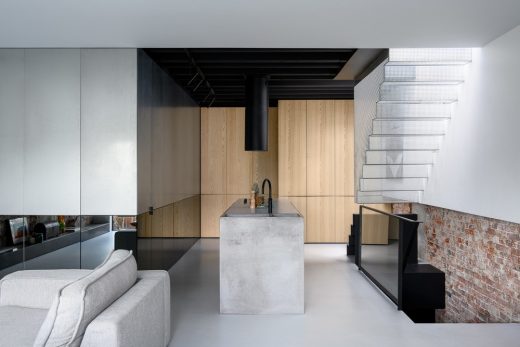
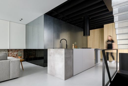
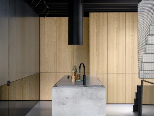
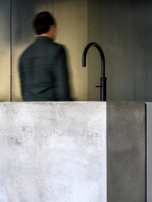
Above the horizontal cross-section, everything is new and covered in rendered and isolated walls. Sleek and finished. Everything below this line is old or a reflection of it. The walls here are bare and rough. The use of dark mirrors, unfinished zinc sheets, and rough bricks creates a special composition of materials. The zinc part above the line reflects a lot of light into the room, but the reflection itself is blurry. The dark mirrors reflect less light but do give a sharp image. This makes everything above the “section” a new interpretation and everything below a reflection of the old.
The line at 95 centimeters has both a practical and a more poetic origin. It is the height of kitchen doors and railings. And it is the central point of a man’s body. Standing with your lower body in the old and your upper body in the new reflects being rooted in the past and looking to the future. Firm architects thus centralizes the physical user in its design.
The concept, therefore, is named “reflections of the past.” This gives the premise of the space itself an architectural translation in the design and creates a clear difference between old values and new interventions. This conceptual approach to space and its rendering in all custom-made elements is characteristic of the work of Firm architects.
Space layout and material use
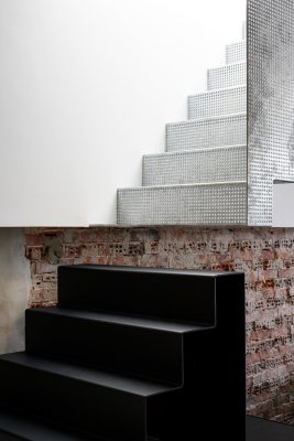
The journey through the apartment starts when you open the front door. The hall is painted all black and the old staircase is bare and rough. Above that is a custom perforated zinc staircase. It hangs 95 centimeters above the floor and connects the apartment with the roof terrace. The light of the roof hatch shines through the perforations down to the dark entrance. If you look up, you can see the sky.
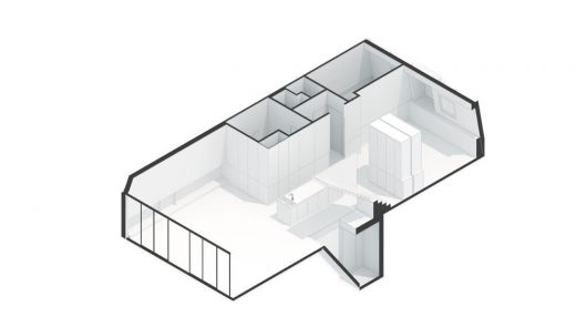
At the top of the stairs in the living room, your gaze is directed outwards through the sliding glass door, which occupies the entire width of the building. The profile of this frame is concealed in the walls, floor, and ceiling. This creates an almost frameless facade of glass in a place where originally there were only two small windows.
The living room is an open-light space that can be connected to the master bedroom by means of a large wooden sliding wall. A television and cupboard space is located behind 900 mm wide custom doors that open smoothly to the side.
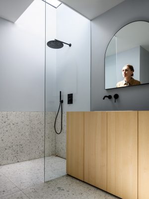
In order to make the space appear as large as possible, Firm architects has chosen to place a single volume in the space. Except for the living space and the master bedroom, all other functionalities such as bathrooms, toilets, laundry room, and guest room are concealed in this reflective box. Access to it is made invisible by a pivot door finished in the same materials. A particular part of the mirror cladding of the block is actually not a mirror, but reflective glass. This semi see-through from the living room to the bathroom. A skylight has been placed above the shower so that you can shower under an open sky. Flooding the bathroom with daylight.
Climate
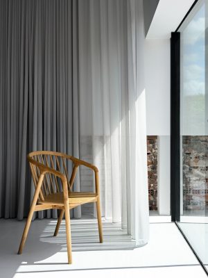
The fully openable glass facade on the south facade provides natural heating. The 17 cm floor insulation, the insulated walls, and the form of the outside insulated roof ensure the inside temperature remains stable. The single large net curtain can cover the entire rear facade, but when opened it does not block any part of the sunlight coming in.
This is due to the curved rails on which it hangs, ensuring maximum heating on cold days, whilst on sunny days in closed state ensuring not too much heat enters the house. In the meantime, the wind can blow through it. The ventilation it provides is important for good temperature management. The roof hatch above the entrance on the side of the house is electric and can be opened on hot days.
The perforated zinc staircase under the hatch reflects most of the sunlight and because the warmer air can escape at the highest point of the space, a natural draft is created. Firm architects borrowed this natural ventilation principle from tropical architecture. This keeps the house pleasantly cool in the summer. In winter, the insulation keeps the heat in. As a result, the gas consumption for heating is only a mere 1/5th of a regular apartment.
Poetry
Firm architects has tried to surprise the client with a conceptual distinguishing house elaborated on all aspects of a design. A unique place to unfold. The design freedom that was provided has led to a special house with a story.
About Firm Architects
At Firm, we believe that design affects the quality of our lives. In cities, in buildings, in offices, in our homes. In 2017, Niek Joanknecht joined Carolien Roos at Roos Interior Architecture which shortly after became Firm Architects. Firm is not only about the aesthetics of architecture. Having a background in project management as well enables us to deliver a smooth process for our clients. With strong accuracy, we manage budgets and planning. We engage clients in the process and are driven by extraordinary results.
Photography: Studio de Nooyer
Reflections of the Past Apartment, Amsterdam images / information received 190721 from v2com newswire
Location: Amsterdam, The Netherlands
Amsterdam Architecture
Netherlands Architecture Designs – chronological list
Another Amsterdam building design by Barcode Architects on e-architect:
Sluishuis IJburg Building in Amsterdam
Design: BIG – Bjarke Ingels Group and Barcode Architects
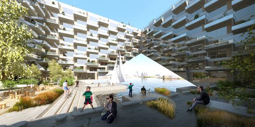
image courtesy of architects
Sluishuis IJburg Building
Amsterdam Architecture News – selection below:
Amsterdam Floating Home, Schoonschip
Design: i29 architects
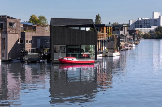
photo : i29 / Ewout Huibers
Floating Home
Jonas Kavel 42A IJburg Building
Design: Orange Architects
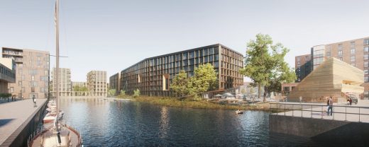
image courtesy of architects
Jonas Kavel 42A IJburg Building
European HQ for Calvin Klein & Tommy Hilfiger
Design: MVSA Architects
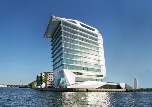
image © MVSA Architects/Ronald Tilleman
Amsterdam Architecture – contemporary building information
Comments / photos for the Reflections of the Past Apartment, Amsterdam design by Firm Architects page welcome

