Booking.com Amsterdam workplace building, Oosterdokseiland office development, Dutch commercial property photos, NL architecture
Booking.com Amsterdam workplace building design
29 June 2023
Architect: UNStudio ; Lead Interior Architect: HofmanDujardin
Location: Oosterdokseiland, Amsterdam, The Netherlands
Photos by Matthijs van Roon, unless stated otherwise
Booking.com Amsterdam work enivronment building
Booking.com’s diverse urban campus opens in Amsterdam
Let’s meet in Tuscany, grab a coffee in Panama City and talk strategy in the Serengeti! All this is possible in the innovative new urban campus of leading travel platform Booking.com, which opened its doors in Amsterdam. A unique collaboration of multiple interior architects and design firms has resulted in an inclusive workplace that is home to over 6,500 employees.
The brand new Booking.com working environment offers a diverse variety of spaces. As Lead Interior Architect, HofmanDujardin designed an interior masterplan for the 65,000m² campus building, while the building itself was designed by the Architect UNStudio. The headquarters combine the work of international design firms Linehouse Design, i29, Studio Modijefsky, CBRE Design, UNStudio, HofmanDujardin, Powerplant, Mijksenaar, MOSS, Scholten & Baijings, and Studio Rublek. Together, they created an inspiring environment where employees and visitors will meet, collaborate, live, work and play.
Interior Masterplan
Formerly spread over several locations in Amsterdam, the truly global company Booking.com is powered by employees representing more than 100 nationalities. The interior masterplan was designed around the concept ‘Booking Home’ and aims to create a home for all workers. Every place in the world, every travel destination, is someone’s home.
Because everyone has a different idea of home, HofmanDujardin developed a masterplan to embrace diversity. It defined a set of principles and mood boards for several uniquely themed areas. Different area designers were invited to follow those principles but also put their individual design stamp on those areas. Additionally, specialist layer designers were selected to create greenery, lighting, wayfinding and graphics, carpets, and food and beverage throughout the campus.
Diverse journey
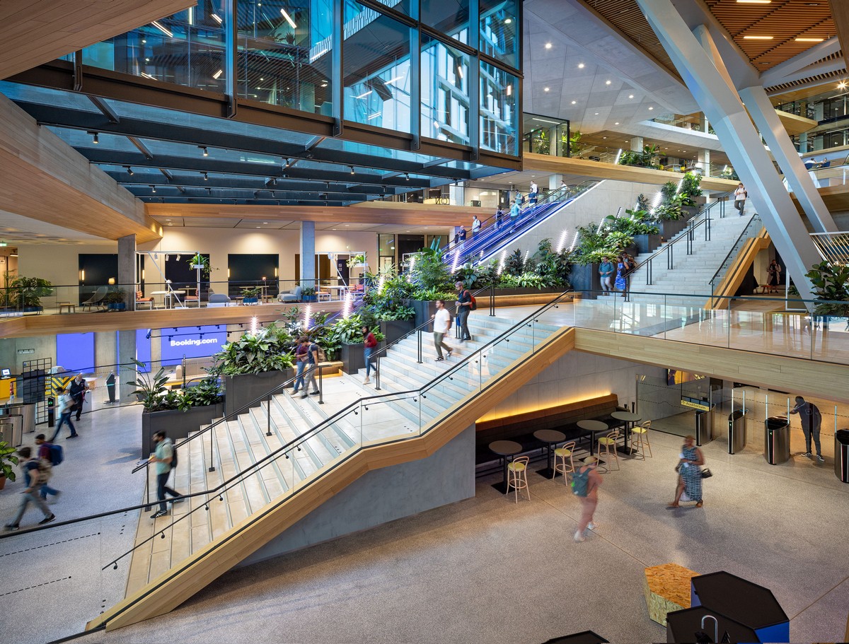
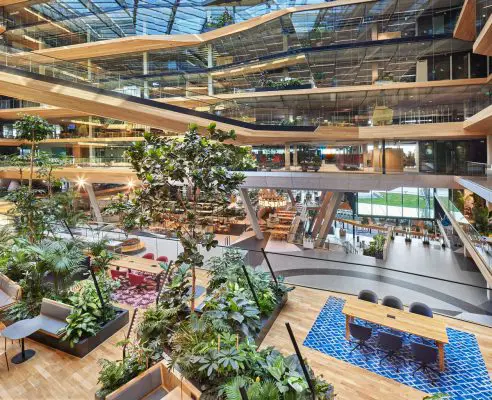
The campus journey starts at the main entrance, which is flanked by digital walls showing travel movies and slow-motion travel mood scenes, such as running water or leaves in the wind. It also offers views up a sweeping staircase and green corridor of plants to the light-filled upper floors.
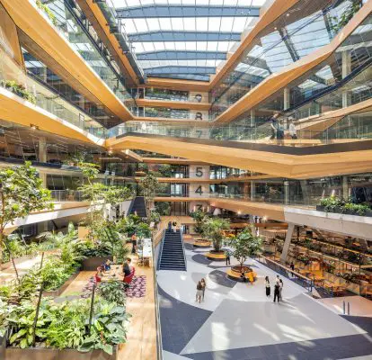
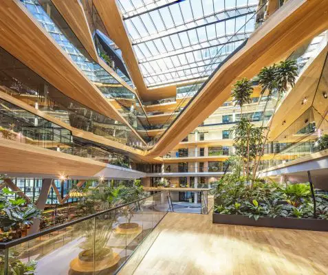
Everything about the entrance says “come in and explore the world with us”. The route leads up to the 1st floor meeting point and recruitment, research and learning centres, and fluently continues to the central atrium on the 2nd floor. This bright and vibrant connecting space offers physical and visual relations with all upper office floors.
Meals are taken in one of three restaurants: the 2nd floor Market (designed to give a sense of being in a spacious European market hall), the 5th floor Five Islands (designed as five joined but individually themed zones or ‘islands’) and the 9th floor High Garden with its lush roof garden and panoramic views over Amsterdam.
Even the car parking and bike parking areas are designed to reflect the wonder of travel. The former invokes the ice sheets of Antarctica while the latter has a large, colour-changing ‘sun’ light, giving bicycling employees a nice surprise each morning.
Designed to connect
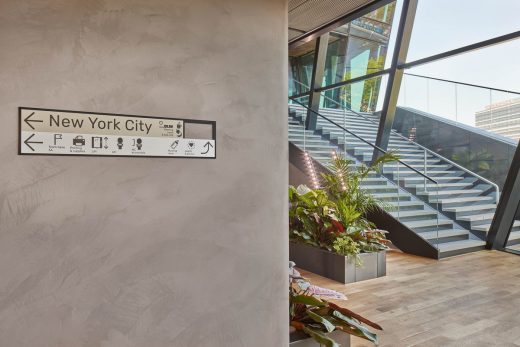
Throughout the building are 28 ‘micro-holiday destination’ breakout spaces, each themed on a place. People can stroll through New York City and Rio de Janeiro, chill out in the Greek Islands and visit the Amazon. Together with the larger connector spaces, they offer breaks from computer screens, allowing workers to collaborate, reset their minds and helping them to increase creativity and productivity. Employee photographs and souvenirs from around the world provide more reminders of travel and get people more involved with the building.
Designed to connect people and places, the novel campus is a real destination with a rich diversity of spaces that aims to create a vibrant inclusive community. Filled with lush green plants and awarded with a BREEAM excellent certificate, the office is also a front-runner in sustainability. It offers a great working environment for Booking.com and provides the company with a new home in the heart of Amsterdam.
Booking.com Amsterdam Office Design
Selected areas
Guided by the principles and mood boards in the interior masterplan, multiple designers created a wide variety of spaces. The paragraphs below provide a compact overview. More information can be found in the press kit and requested from the individual design firms.
Balcony by HofmanDujardin
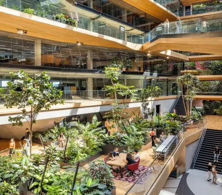
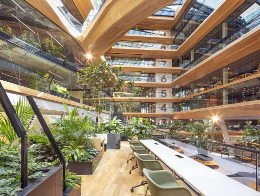
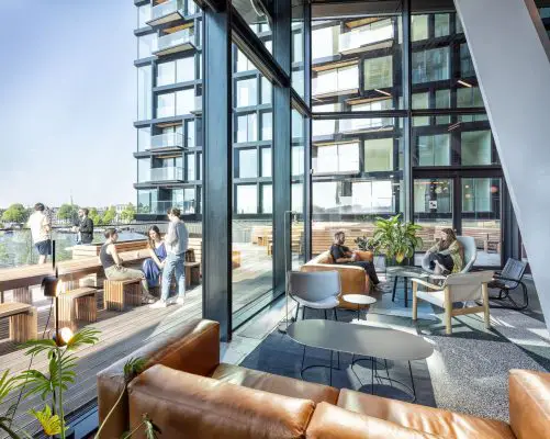
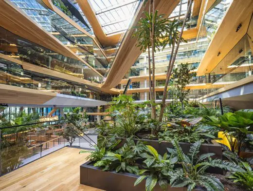
HofmanDujardin designed the interior masterplan, the base on which all areas were designed. They also designed the workplaces and various other areas in detail, including the 3rd floor balcony. This central space flanks the interior of the large atrium and enhances its brightness and spaciousness, creating a fresh, outdoor feel. Numerous planters with trees and lush greenery break up the space to create different places to work and have informal meetings. Tables of different sizes allow small group gatherings while more intimate spots and lounge seating provide privacy.
Auditorium by UNStudio
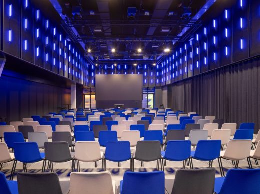
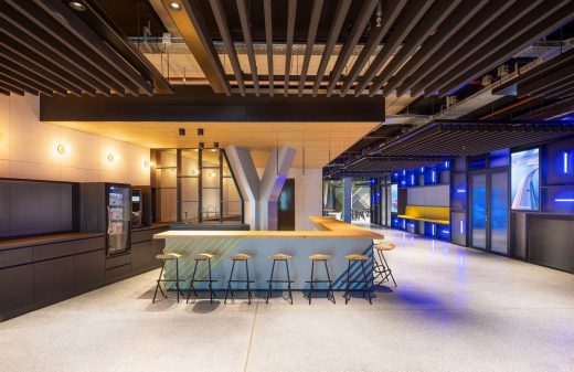
As well as designing the urban approach and architecture, including the continuous spatial experience of the building, UNStudio was responsible for the design of the Auditorium and Multifunctional Space. Half movie theatre, half presentation venue, the space is ideal for learning and sharing knowledge. Designed to convey an atmosphere of adventure, it is a place where employees and visitors can take sound-and-vision journeys. Physically connected to the 1st floor, the space can accommodate up to 400 seats in various layouts.
Boardroom connector by CBRE Design Collective Amsterdam
CBRE designed various areas including breakout spaces, the research, recruitment and learning centres, and the Panama City-themed Boardroom Connector. Inspired by the Latin American city’s diversity, the design reflects the different atmospheres of its Casco Viejo (or Old Quarter), its Innovation Center and the Panama Canal within the different zones of the Boardroom area. Combining these elements created the contrast and roughness that typifies Panama City, as described in the interior masterplan. The goal was to create privacy where needed and let employees and visitors enjoy the beautiful views of both atriums from the Boardroom Connector.
www.cbre.nl/en-gb/services/design-and-build/design
Restaurant The Market by Linehouse
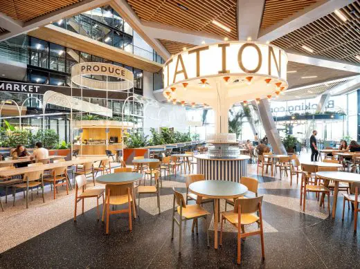
Linehouse was commissioned to design the rooftop bar Club 11 as well as restaurant The Market – a food hall – located on the 2nd floor of the atrium. The concept was developed around the journey one begins when arriving in a new city waiting to be discovered. The central element is the market square, a place where people gather and reflect a sense of community.
A white metal structure houses a coffee bar and frames a playful exploration of graphics, text, natural materials and patterns which complements the tall vertical space. Surrounding the main market square are diverse dining experiences, from intimate spaces, nooks and lounge seating to long tables for bigger groups.
Restaurant Five Islands by Studio Modijefsky
Studio Modijefsky was invited to design multiple areas, including connectors and restaurant Five Islands. They created a spatial design concept of five island groups: View, Fire, Canyon, Flight and Treasure Islands. The five island groups break up what was originally a large, open area into smaller, more intimate and welcoming zones.
Spatial interventions – a wall, a curtain, a lowered ceiling and an elevated floor – establish new areas without blocking sightlines, so a glimpse of the next adventure is always in view. All the island groups are subtly linked and play with flooring, lighting and partitions, as well as colour, texture and material to create a distinct environment and atmosphere.
Restaurant High Garden by i29
Restaurant High Garden by i29
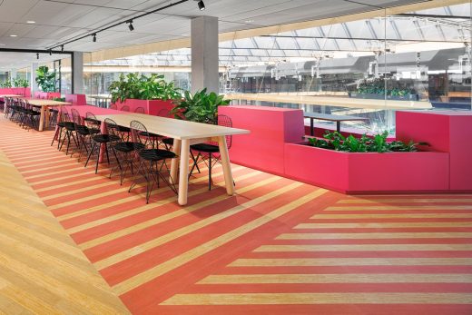
photo : Ewout Huibers
i29 designed various breakout spaces as well as restaurant High Garden, where fresh herbs are grown and used for healthy dishes. The designers at i29 questioned the relationship between nature and technology, referencing modern food production with vertical farming, and having fun with a food wall serving healthy ‘Fastbowls’ – a playful wink to the Dutch ‘automatiek’ (or fast food wall).
Pink lighting and stainless steel were used for the ‘kitchen laboratory’ contrasting with natural bamboo and lush greenery in a 900m2 restaurant and rooftop garden. This offers Booking.Com employees different zones and atmospheres in which to eat, relax and collaborate.
Workplace by HofmanDujardin & CBRE workplace consultancy
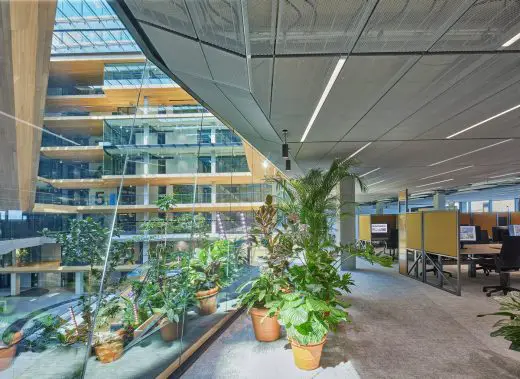
In close collaboration with Booking.com, HofmanDujardin and CBRE created a workplace concept that perfectly fits the company. Each work floor offers different types of workplaces for varying levels of concentration.
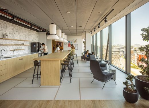
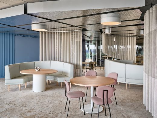
Colorful acoustic screens define smaller clusters of workstations, ranging from single desk concentration places to open team settings. Closed booths for single and double use offer space for calls or small meetings. In proximity to the work floors are 28 uniquely themed breakout areas that all feature a similar series of supportive functions like a pantry with a high table, lounge seating, meeting rooms and stand-up spaces. The breakouts stimulate collaboration and so allow the work floors to be relatively silent.
www.hofmandujardin.nl | www.cbre.nl
Layer designs
Throughout the entire campus, specialist designers created and supervised specific layers of the building. Harmonising diversity and continuity, their work ensures a fluent experience for employees and visitors to increase their wellbeing.
Greenery by MOSS
Makers of Sustainable Spaces (MOSS) developed a visionary green masterplan for the campus, aiming to use inspiring greenery to forge captivating environments. Nature seamlessly integrates with a botanical staircase, a seven-storey green wall and vibrant rooftop perennials. Workspaces flourish with plant groupings, enhancing employee mood and productivity.
Breakout spaces celebrate diversity, mirroring travel destinations with a rich array of plant species. Green accents and vertical farming help to provide fresh dining experiences. Nature truly embodies the essence of the Booking.com business, fostering a vibrant atmosphere that envelops visitors and employees and makes them feel right at home.
Wayfinding and graphics by Mijksenaar
As a layer designer, Mijksenaar was responsible for connecting the spaces of this astounding building to every visitor by creating consistent and clear wayfinding in line with Booking.com’s identity. From the bicycle parking to the atrium and on to the Serengeti breakout space, the wayfinding ties together each place.
This is done using compelling colours for identification, grid elements that work with the environment, and playful typography and pictograms familiar to users. By fluently navigating the world through the Booking.com campus, every visitor and employee can feel truly connected and empowered to explore.
Carpets by Scholten & Baijings
Scholten & Baijings created an office floor colour and material concept called Destination Amsterdam. In collaboration with floor covering company Desso | Tarkett, they developed 14 custom carpets. They visited the area on multiple occasions and used coloured pencils to create layered colour notations.
Static reference points such as elements of surrounding buildings were captured along with fluid and momentary sky tones and water reflections. These colour notations form the base of the concept. To every workspace in the building the designers assigned a specific colour, taking the viewpoint, light situation and window orientation into consideration. The colours travel from darker water nuances on the lower floor levels, to lighter sky tones higher up in the building. The colour flow works on each individual floor as well as throughout the entire campus building.
www.scholtenbaijings.com
Lighting by Studio Rublek
As light consultant Studio Rublek had the pleasure to join forces with UNstudio and HofmanDujardin to supervise the light plan for the Booking.com Campus from design to delivery. This involved creating the right atmosphere in all the layers, from architecture and interior design to joinery, light and design, all seamlessly blending.
For feature areas Studio Rublek were asked to design a custom light plan and fixtures. They focused on functional light with added aesthetic value for workplaces, reception areas, pantries and the auditorium, combining local production with high-end technology. Whether it is directly visible or not, light enhances the building users’ experiences and wellbeing in the Booking.com Campus.
Food and Beverage by Powerplant
Powerplant (under the former name Enbiun) was responsible for engineering all food and beverage spaces in the Booking.com campus. They created a concept that is seamless and reduces waiting time while increasing the customer experience by serving beautifully curated dishes that change every day. This all happens in three distinct and unique restaurants dispersed over three floors.
www.powerplant.nl
Booking.com Amsterdam Workplace, Holland – Building Information
Project data
Size: 65,000m²
Design period: 2017–2020
Construction period: 2020–2023
Sustainability: BREEAM Excellent
Location: Oosterdokseiland, Amsterdam, The Netherlands
Core project team
Client: Booking.com
Architect: UNStudio
Lead Interior Architect: HofmanDujardin
Project management: CBRE
Area designers
Linehouse Design: Restaurant The Market, Event space
i29: Restaurant High Garden, Breakouts
Studio Modijefsky: Restaurant Five Islands, Connectors
CBRE Design Collective: Meeting point, Learning and talent centre, Recruitment centre new talent, Research labs, Boardroom Connector, Breakouts
UNStudio: Bike and car parking, Bike entrance, Auditorium and multifunctional space, Rooftop garden, Core and shell
HofmanDujardin: Interior Masterplan, Main entrance, Service area, Balcony, Workspace, Breakouts
Layer designers
Mijksenaar: Wayfinding
MOSS: Indoor and outdoor greenery
Powerplant: Food and beverage
Scholten & Baijings: Carpets, graphic walls and floors
Studio Rublek: Lighting
UN Studio Architects
Booking.com Amsterdam workplace building, Holland images / information received 280623 from Architects UNStudio and Lead Interior Architect HofmanDujardin
Location: Oosterdokseiland, Amsterdam, The Netherlands, western Europe
Amsterdam Buildings
Major New Dutch Capital Building Designs
Architects: Mecanoo
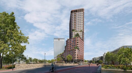
image : Mecanoo
Brink Tower Amsterdam
Sluishuis IJburg Building in Amsterdam
Design: BIG – Bjarke Ingels Group and Barcode Architects
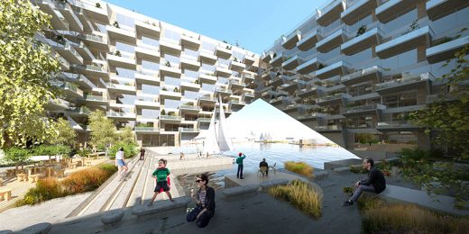
image courtesy of architects
Sluishuis IJburg Building
Valley Towers at Amsterdam CBD Zuidas
Architects: MVRDV
Design: Studioninedots Architects
photo : Peter Cuypers
Residential Complex on Zeeburger Island
Moos, West Amsterdam
Design: Studio Modijefsky
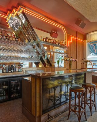
photo : Maarten Willemstein
Moos Bar, West Amsterdam
Jonas Kavel 42A IJburg Building
Dutch Architecture
Amsterdam Walking Tours by e-architect
Amsterdam Architecture – contemporary building information
Amsterdam Buildings – historic building information
Comments / photos for the Booking.com Amsterdam workplace building, Holland design by Architects UNStudio and Lead Interior Architect HofmanDujardin, NL, page welcome

