Oneswear Shop, Shanghai Real Estate, Chinese Modern Commercial Interior, Architecture Images
Oneswear Shanghai Shop in ChangNing District
27 Nov 2020
Oneswear Shanghai Shop
Designers: Parallect Design
Location: Shanghai, China
Oneswear Shanghai Shop is located in the second floor of a building named Columbia Circle in Changning District, Shanghai city, the area, covering 130 sqm and measured at 2.4 meters high, includes two rooms which can be connected by breaking the wall in between.
The client requires that the design can be adapted to a variety of reception areas, art installations, warehouse areas, exhibition areas and auxiliary space, etc., and it should be practical in usage and beautiful in design and have a sense of creativity.
Be faced with the challenges of contradictions among functions, spaces and environment, the designer needs to get rid of unwanted walls and make the two rooms a whole one. He needs break out the chains of original area by designing and satisfies the client to the extreme on the basis of strictly controlling the cost, creating a commercial space with the function of communication, exhibition, retail, tourism, and other functions. The limited space with unlimited functions provides the customers with the best shopping experience.
The concept of design– Treasure hunt in the KR-π platinum mine on Sumer planet
The significance of gems lies not only in their own value, but also in the process of discovery behind them. Even with cliffs, dense caves and abysses, miners are willing to explore the unknown and mysterious world, and finally get what they want.
Platinum is an important element of the ONESWEAR brand. The place with the most abundant platinum resources in the universe is the KR-π platinum mine on the Sumer planet. Therefore, the designer hopes to create a mysterious and experiential alien space, simulating the experience of an explorer landing in a platinum mine on an outer planet, so that every customer who enters the Vow will explore and discover with curiosity and find his own gem.
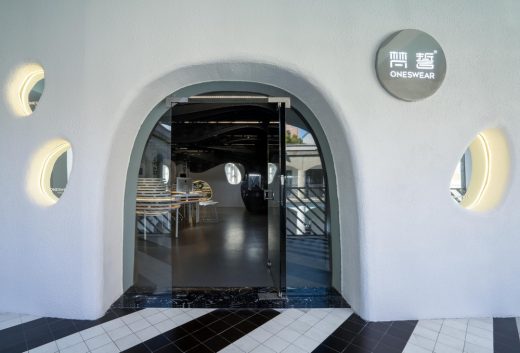
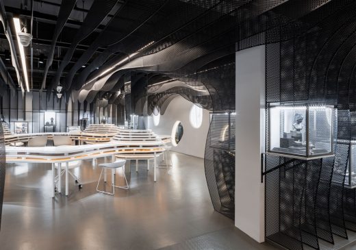
The cave shape of the space at the entrance creates the experience of an explorer landing in a platinum mine on an alien planet.
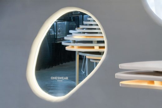
A mirror is placed at the bottom of the special-shaped hole on the facade, which not only reflects the beautiful and unique scenery of the surrounding Columbia Circle, but also provides materials for tourists to stop and take photos.
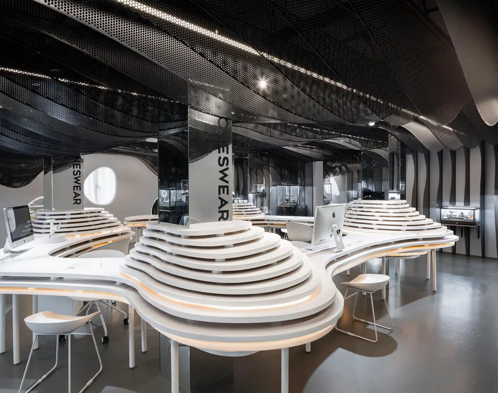
The design of the whole space starts at the exhibition space. The designer directly combines showcases and walls, leaving much room for streamlined artwork for exhibition at the center. The wall is made up of perforated boards which are cut into curved surfaces in pieces and has relatively strong ability of fire-proof.
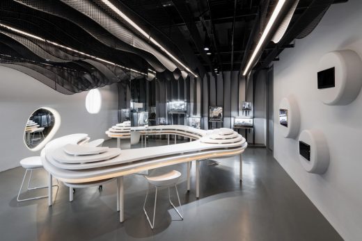
The curves are involved in the whole structure and appearance: the walls that used to be placed with full of square multimedia televisions are adapted to the continuous curved flakes which visually soften the edges of the televisions and showcases by embedding them in the shape of curves. The dark-gray curved and detached walls integrate with showcases makes a nature transition, a simulation of rocky coastlines in holes and caves. At the same time, the design meets the need of jewelry exhibition, improve space utilization and creates a visual sense of flow inside the space.
The white walls used to be decorated with square windows. To standardize the design language, the designer builds another barrier by using light steel joist inside the walls and creates anomaly holes on the top to fit in the outside design and smooth the vision of original square-like appearance of windows, making the overall arrangement more clear. The nature light let out through windows and professional lighting system achieves a perfect balance between sunlight and artificial light for this space.
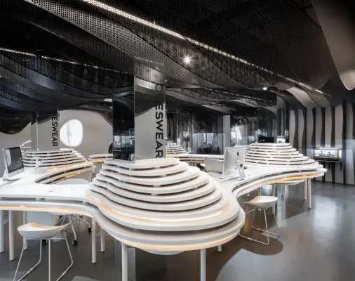
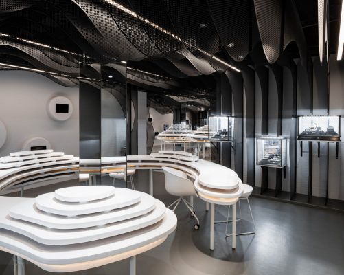
The indoor design has altered the tedious and simple spatial form to an artwork as the main exhibition area with a variety of functions such as exhibition, communication, tourism and sales, achieving unlimited forms within limited area. Moreover, various functions coordinate with the streamlines of the whole space and then also become dynamic and continuous moving lines, providing people with refreshing experience while they are shopping. As the streamlined artwork fit in with the sales, exhibition and activities, it offers the customers more continuity and variety in terms of viewing the moving lines, and it also become a poplar site for visiting among the young group. Such method of design restructures the function layout, and create a more complete and authentic space for jewelry sales, achieving a more clear and efficient streamlines and greater space visually.
As for the elements, the designer chooses the same element to construct the space and create multiple functions and spaces by the same method. The transformation of elements of curved flakes and the realization of the same curved flakes with different functions standardize the style of whole space and add details and variations to some parts, along with exquisite and compact lights, creating a rather authentic space.
The streamlined desktop and the walls fit in with each other but also stand alone on their own. Different spaces with different functions connect all the areas altogether such as jewelry exhibition area, negotiation area, sales area and washing basin to meet all the demand in the store and convey continuity and similarity of spatial vision. In addition, the design of complex of desks and chairs is in accordance with the Ergonomics and improve the level of comfort to the maximum. On the basis of balancing functions and forms, the design enables the customers to shop smoothly yet unpredictably.
The information counter is made up of the white lacquer board, and the parallel lines on the table facade makes it look more comfortable. The badminton glue is used to build the floor, and its gray tone is coordinated with the whole space.
The four thick cylinders used to stand in the way when customers look at the space. Then the designer uses mirror materials to cover the cylinders on which the mirrors reflect the structure of dark-gray walls and streamlined artwork with spots of lights, creating an atmosphere of mystery and making the inner space “wider”.
The structure with continuity of expanding and flowing becomes the most distinctive feature of indoor space. The popular artwork at the center greatly relieves the hollowness of loads of rooms, showing a beauty of balance. The repeated curved elements of the artwork make it fit in with the style of walls. This series of design makes customer feel like an adventure of treasure hunt and provides them with unique and authentic shopping experience. Far from the forms, the space solution also attaches the importance to the functions, customers’ participation and experience.
The showcases creatively integrate art exhibition and retail, revealing the brand’s characteristics and artistry. The accessories glow like gems against the dark gray box.
Oneswear Shop in Shanghai, China – Building Information
Designer: Parallect Design
Detail Designer: Shanghai hengtai architectural design consulting co., LTD
Time of Design & Accomplishment: 2020
Main Designer and Design Team: Wang Yitong,Yang Nan, Duan Yawen, Huang Di, Xiao Mingfeng
Address: No. 1262, Columbia Circle , Yanan Xi Road, ChangNing District, Shanghai city
Covered Area: 130 sqm
Client: ONESWEAR
Copyright of Photography: Zhu Runzi/Lin Guijiadong
Oneswear Shanghai Shop images / information received 271120
Location: Shanghai, People’s Republic of China
New Buildings in Shanghai
Contemporary Shanghai Architecture
Shanghai Architecture Designs – chronological list
by e-architect
Ports 1961
Architects: UUfie
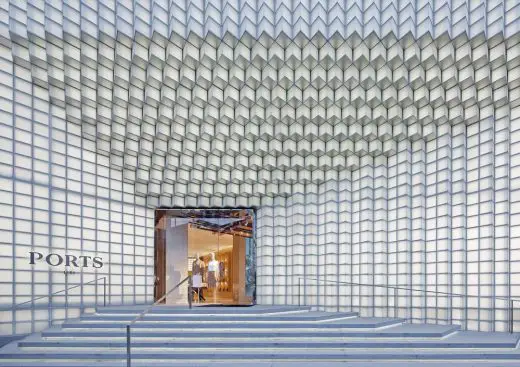
photo : Shengliang Su
Ports 1961 Flagship Store
Shanghai Grand Opera House
Architects: Snøhetta
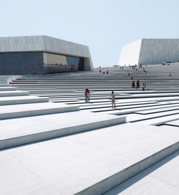
images © Mir and Snøhetta
Shanghai Grand Opera House Building
Spatial Renovation of M.Y.Lab Wood Workshop, Changning District
Design: Continuation Studio Architects
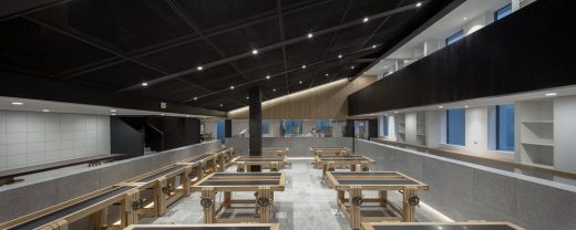
photo : SHIROMIO Studio
M.Y.Lab Wood Workshop
Shanghai Architect – architectural firm listings on e-architect
Comments / photos for the Oneswear Shanghai Shop, ChangNing District page welcome
Shanghai, China

