Deichman Library Design, Norwegian Building Contest, Picture, News, Image
Deichman Library Norway : Architecture
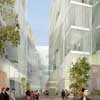
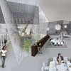
Deichman Library Competition Entry, Oslo – design by Wiel Arets Architects
20 Jul 2010
Deichman Library Contest
Competiiton Entry : ‘Sugar’, Deichmanske Library, Oslo, Norway
2009
Design: Wiel Arets Architects
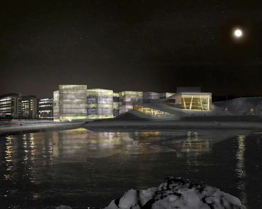
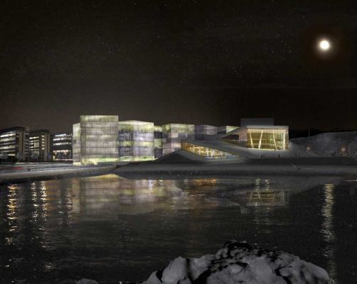
“Meeting place” is a cubic house emerging as a sculptural entity with a calm top and an expressive bottom. The new main library is destined to become a central meeting place as the privileged neighbour of the much acclaimed new Opera House on the waterfront of Oslo, capital of Norway.
Concept
The proposed urban configuration of the new Deichmanske Main Library capitalizes on the site’s morphologic potential. The site is centrally and prominently located between existing and up-and-coming cultural institutions. Positioned between the waterfront and the Oslo Fjord, the new library’s compact program has been divided into a number of volumes – ‘solitaries’ – that have been evenly dispersed throughout the site.
Rotating each volume towards one another, a public commons is defined, giving way to diverse exteriors, as well as unexpected perspectives. The built volume of the project realises the site’s commercial value; the public common become a scenic void that superimposes the spatial qualities of the alley, the way, the forecourt and the square – by merging them together into a meandering public realm.
To the west of the property, the five volumes that comprise the new Deichmanske Main Library become a part of the project’s overall spatial logic by merging together, and in turn, become an iconographic sculpture on the capital’s skyline.
Overtly public functions are predominantly concentrated on the ground floor to enable a vivid streetscape, whereas the public areas of the library have been evenly distributed in section to benefit from the expansive exterior views of the Oslo Fjord, which also serves to strengthen the public presence and recognition value.
Urban plan
Despite its concentration, the proposed urban footprint introduces a finer scale to the waterfront than the existing situation; cultivating aspects associated with old town, as well as domestic and human scales. Downscaling the current industrial character of the area not only encourages a lively streetscape – but also allows for future adjustments and alterations, such as the dimensioning of potential usage, flexible phasing and reprogramming.
Occupying a longitudinal location between city centre and waterfront, the issues of porosity – in relation to abidance and transition – as well as reciprocal sight lines, are essential. Therefore, a series of short cuts through Dronning Eufemias Gate North and Opera Gate South will be established to link the entire Bjørvika neighbourhood together, and allow for complete all-around access to each individual ‘solitaire’.
By rotating the geometries of the interior outdoors, a sequence of ever expanding and contracting spatial arrangements is created. In the same way, the length of the facade possessing a visual link to the urban fabric and sea – is multiplied. Additionally, both rows of blocks along the adjacent roads are visually connected to their respective opposite sides.
The development brings a sense of unity to Bjørvika by the height profile that defines, with two minor exceptions, a consistent roofscape that distinguishes itself from the polychromatic adjacent urban silhouette. Here the horizontal positions of each ‘solitaire’ respond to one another by generating an alternating contour – in turn projecting a dynamic image, rather than monotonous perspective.
In response to the immediate context, a mix of retail, gastronomic venues and lobbies are placed at ground level – with an additional integrated hotel. Through the different proportions, orientations and distinctive spatial references of each ‘solitaire’, the project’s collective identity becomes overlaid with a sequence of unique characteristics. To connect individual public functions to one another and their collective immediate surroundings – especially the adjacent Opera House – a high degree of transparency and openness is introduced.
A sky bar and other semi-public recreational programs are placed on the upper levels, in order to project a public realm from a distance. Each ‘solitaire’ has been dimensioned in such a way that a variety of established office configurations can exist, ranging from maximal cell to the ‘free plan’ layout. To enrich the sight relations as seen between floor levels of each ‘solitaire’, the volumes have been slightly shifted towards one another.
Urban space
The urban plan has to have a distinct identity and needs to provide enough atmospheres to ensure an exterior with strong spatial qualities without dictating formal determinations that would conflict with future customizations.
Given the complex process from urban planning to building development, the urban approach should be understood as an adaptable strategy, when it comes to the quantity of building units and a spectrum of sizes and their possible intersections, to also ensure larger continuous surfaces.
Next to the elaborated and illustrated schema, a range of analog configurations could be considered. Without losing the basic urban principles of the perceivable solitaires, intersections, rotations, transitions and public spacing that ensures identity and territoriality, the plan is made to correspond to the changing demands of the market in the long-term.
In order to keep the property free from standing vehicles, a parking garage under field A9 accommodates cars. Bike stands are located in a volume covered with a seating surface, which is almost completely sunken into the ground.
Library layout
Due to the digital revolution, library use has been and will continue to undergo radical changes. Information storage, consistent for centuries until quite recently, has been altered fundamentally. In the contemporary and future library, faced with ongoing digitization, computer screens will be as salient as traditional books.
The new Main Deichmanske Library is to become more than a place where people can consult information and enjoy tales. It will be a venue that allows for working in a concentrated manner, for audible and silent communication. It is also an open house able to contain data, as well as take it on, where people experience a sense of gathering without the need of any other stimulation except the atmosphere that the building and its surroundings radiate.
Taking advantage of the fact that half of the square meters of the new library are public, not only the ground related surfaces, but also the zones of all other floors, can be devoted to generating an open image for the library. Therefore an alternating system of public and internal areas in plan and section are distributed within the five blocks that comprise the project, four of which are intersected to create a succession of continuous spaces. Amidst the intersecting volumes a common twofold patio is created, which becomes one due to slightly angular inner facades that enhance the exposure to light.
The geometry and complexity blurs the border between inside and outs, and allows viewing of the site’s own frontage and inner yard – and for views both near and far. The height of the entrance volume offers a panoramic view.
Decisive factors for the ideal positioning of the single functions have been dimensions, insights, views and relations to one another. In essence, a public floor is arranged on top of one or more non-public floors, which are respectively read from the outside as one continuous entity. Giving the public areas a clearance ranging from one to three levels, the library becomes attached to a non-commercial scale. By shifting the public zones against each other, a series of multiple correlated spaces emerge. High, low, tight, complete, wide, dense and empty spaces intermingle in a simple and clear way, so that any user feels welcome to find his/her place of comfort and decide their degree of communication with other visitors.
All sub-programs are linked via a concise network of vertical connections consisting of escalators, elevators and stairs. Two parallel escalators going up and down, on top of a closed tube containing two independent fire stairs, establish a main public route. Their run is arranged to guide people in a cinematographic manner through the multilayered spatial structure. A number of free stairs add short cuts and detours, depending on specific situations. Two further helix stairs ensure fast direct connections and the necessary escape ways, which will be routed through the basement to the safety of the outdoors.
A nearly empty plate (in terms of construction) forms the basic element of the structure – not only for spatial reasons, but also because of permanent changes in working processes, intensity of usage, and the necessity for flexible and reversible divisions. Onto it, various layouts, as well the integration of further technical services and supplies such as conveyor belts and book lifts, can take place without interfering with the outspoken characteristic and identity of the overall figure.
In the course of current developments of libraries, a number of programs are breaking down their traditional mono-functionality. In case of the new Deichmanske main Library, the information centre, bookshop, café and auditorium not only enrich the building itself, but also have a positive effect on the urban setting. Located on the ground, basement, and first level, they add a further dimension to the mostly horizontal streetscape of fields A8 and A9.
Materialization
Given the geometric outline and the structural and physical requirements, the entire building shell is made of concrete, except for the façade. A minimized steel column structure linked to the pillars of the glazed façade together with a few other structural elements, such as diagonal and vertical shafts, carries the pre-stressed concrete footplates. A made to measure structural layout will ensure wide column free zones.
Due to environmental aspects, the skin is made of highly insulating glass combined with sunscreens, whereby the precise choice of materials, its fabric and different degrees of transparencies must still be explored; in general, a light textile quality is envisioned for the screen. Depending on the respective program behind, the screen could run between two glazed layers in the public areas and in front of the glass along the non-public facade. A further fine distinction in terms of flexible or fixed screen installment can be made with regard to the spread of internal working stations and areas requiring less light. Where public areas are concerned, the addition of an interior textile curtain could provide domestic characteristics as well as adaptable zoning.
Beside the contextual intermediation, for the most part, the transparent skin projects a dynamic image of the multilayered activities talking place inside. Perceived from the outside, every viewpoint engenders unforeseen readings of the merging of the single volumes and the resulting silhouette.
The materialization and clean detailing, its connection to the outside via filtered vast views and the intimate public spaces, as well as its stark figure beyond temporary aesthetics, have emerged as a response to the conditions of a new kind of library organization. In this tension, a non-conventional typology that responds to the demands of performing at opposite scales and times – now exists.
Deichman Library Competition Oslo image / information from Schmidt, Hammer and Lassen
Deichman Library Norway : main page with images of the winning design
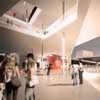
image : Atelier Oslo Architects and LundHagem Architects
Deichman Library Oslo : entry by a-lab architects
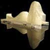
image from a-lab architects
Deichman Library Contest Entry images / information from Wiel Arets Architects
Location: Oslo, Norway
Norwegian Architecture
Contemporary Norwegian Architecture
Norwegian Architecture Designs – chronological list
Oslo Architecture Walking Tours
Norwegian Architecture – Selection
Knut Hamsun Center
Design: Steven Holl Architects
Knut Hamsun building
Design: Reiulf Ramstad Architects
Cabin Inside-Out
Comments / photos for the Deichman Library Norway Architecture page welcome

