MAX&Co. Flagship Store in Madrid, Building, Spanish Retail Interior, Architecture Images
MAX&Co. Flagship Store in Madrid
New Commercial Architecture in Spain design by Ciszak Dalmas, Andrea Tognon, Studio Pepe and the Max Mara design office
15 Oct 2018
MAX&Co. Flagship Store Design
Design: Ciszak Dalmas, Andrea Tognon, Studio Pepe and the Max Mara design office
Location: Calle de Serrano 18, Madrid, Spain
MAX&Co. Flagship Store
The first flagship store in Spain for MAX&Co. (Max Mara Group), the Italian fashion brand with an innovative approach to fashion, is now open in Madrid – Calle de Serrano 18 – featuring the firm’s new store concept.
A radically rethought space, based on a different approach to design in order to foster a whole new shopping experience.
The product of a collaboration among young talents from various areas of expertise. A think tank drawing upon individual creativity and productive fusion of experiences. A felicitous mix of different energies, skills and sensitivities.
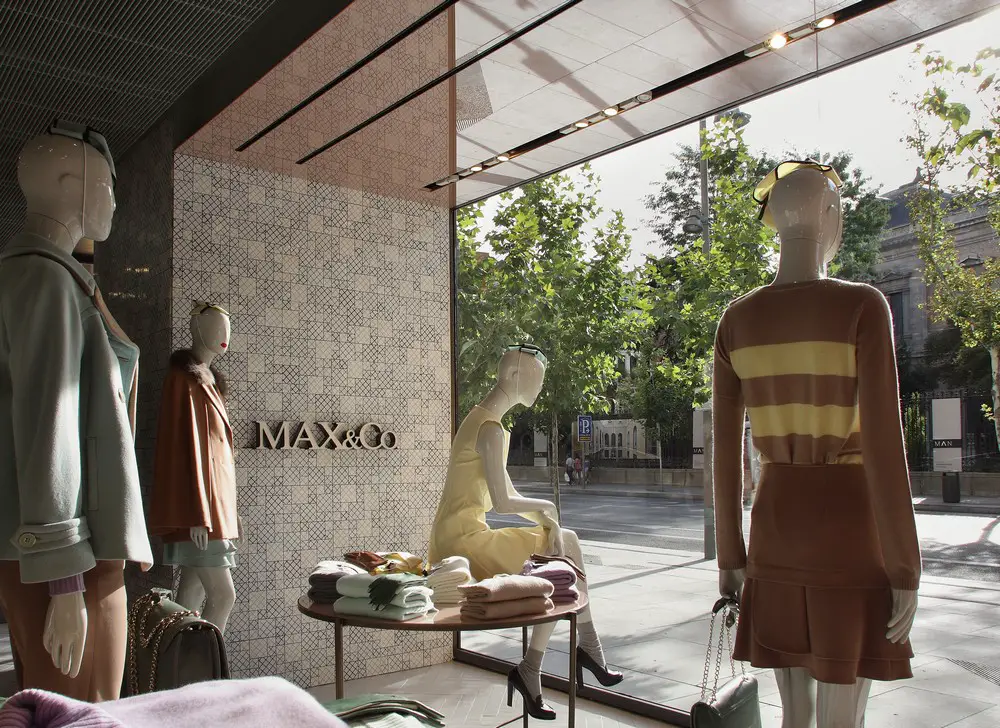
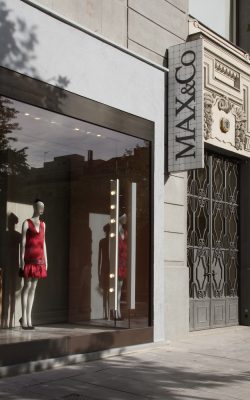
200 square meters and two huge windows opening onto Calle de Serrano, right in the heart of the capital’s most exclusive fashion shopping district. A prestigious location for the collections of clothing and accessories by MAX&Co.
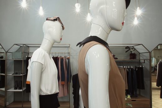
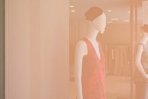
Windows like permeable membranes surrounded by frames in rose tinted mirroring glass, generating sophisticated reflections in a constant dialogue between the inside and outside. Solidly rooting the flagship store in the surrounding urban context.
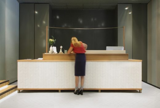
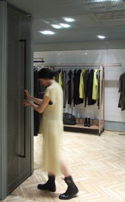
Blurring the distinction between in & out, a reception area featuring flooring in oblong glass tiles set in a herringbone pattern, a creative design for a craft-based material, specially made, boasting a dense, materic allure evoking habitational applications.
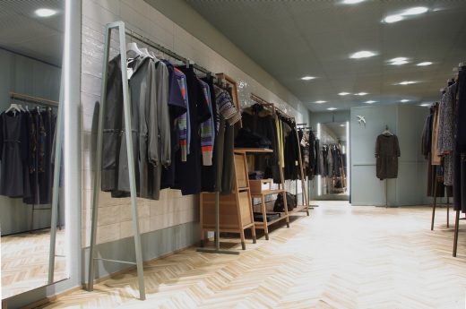
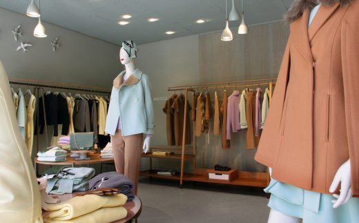
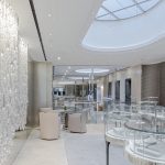
A large space, masterfully divided into more private areas in which to move about at ease, like the rooms in a cozy apartment.
Shopping pathways laid out with precision for surprising effect, varied in terms of constantly changing furnishings, forms and materials, lead to the back of the shop, a wider space where large windows open onto the greenery of a garden and where micro-living areas have been arranged, zones with armchairs, small tables, carpets, fresh flowers and magazines, perfect for welcoming and allowing shoppers to feel at home.
Radically rethinking spaces
Beginning with a whole different approach to design, featuring new aesthetic languages. For a fresh new shopping experience.
No star architects, but a think tank boasting just young talents.
Bringing together the experiences, sensitivities and creativity of experts in different fields – fashion, architecture and interior design as well as art, music, journalism and even banking. Informal meetings, brainstorming sessions with variable compositions encouraging freewheeling conversations. Heterogeneous intuitions and reflections, sparked in an extemporaneous way, then grouped into thematic clouds and arranged into constellations. This is how the new MAX&Co. store concept came into being.
The goal of the project
Create a “shopper-friendly” environment, a welcoming & cozy ambience, brimming with sensorial and emotional stimuli. Eliminating that sense of displacement generated by impersonal and cold spaces, infinitely reproducible by cloning in any context, concealing reality beneath an artificial veneer of perfection. Recovering and showcasing the authenticity, uniqueness and specialness of what was there before. Restoring the original spirit to spaces, allowing them to tell their stories and that of the brand, while bringing to life clothes and accessories.
Giving tangible form to ideas
A productive fusion of in-house and outside skills – Andrea Tognon for the architectural details and volumes, Studio Pepe for styling and coming up with materials, Ciszak Dalmas for furnishings and lighting – in a felicitous synthesis of individual creative experiences. Featuring a systematic reliance on the know-how of highly competent, passionate craftsmen.
The materials
Authentic, warm, handmade, simple, unfinished and natural. Terracotta and majolica tiles, wood, glass and metal. Materials evoking tradition, especially Italian tradition, with their own histories marked by the imprint of time, augmenting their allure, imbuing them with an affective component. Materials which continue to live, overcoming the curse of obsolescence with the blessing of aging gracefully.
The colors
A palette inspired by make-up tones. Subdued hues that convey well-being and serenity. Barely whispered shades, featured on a variety of different surfaces, finishes and textures, with contrasting acid touches.
The lighting
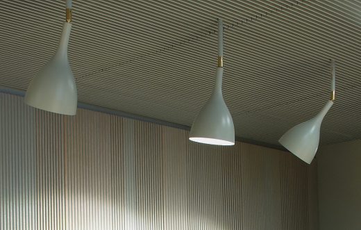
A mixed system – both spot and directional – showcasing the displayed products, while at the same time creating a relaxed mood.
The display units
Made by hand according to exclusive designs, they combine performance with delicate, ethereal and poetic forms. Oscillating between the purity of abstraction and the reassuring familiarity of domestic furnishings. Versatile elements which make it possible to create an infinite variety of displays. Little sets for showing off the products, setting all the elements that compose a look into a lively dialogue, conjuring up an entire world.
MAX&Co. Flagship Store – Building Information
Design: Ciszak Dalmas
Architects: Andrea Tognon Architecture
Styling: Studio Pepe
Project size: 200 sqm
Completion date: 2013
Building levels: 1
Photography: Ciszak Dalmas
MAX&Co. Flagship Store in Madrid images / information received 151018
Location: Calle de Serrano 18, Madrid, Spain
Architecture in Madrid
Madrid Architectural Tours by e-architect
Contemporary Madrid Architecture Projects – Selection
Espacio Miguel Delibes in Alcobendas – approx. 13 km north of Spanish capital
Design: Rafael de La-Hoz Arquitectos
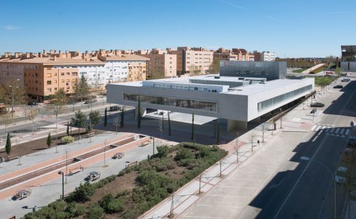
photograph : Alfonso Quiroga
Espacio Miguel Delibes Building in Madrid
Blue Building, Alcobendas, north of Spanish capital
Design: Rafael de La-Hoz Arquitectos
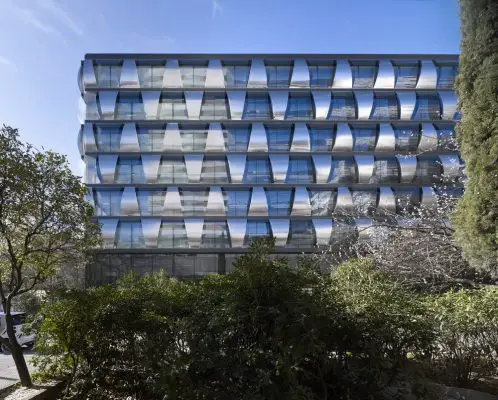
photographer: Alfonso Quiroga
Blue Building
Camarines House, Aravaca
Design: A-cero architects
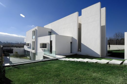
photography: Luis H. Segovia
Camarines House
Caixa Forum, Paseo del Prado
Architects: Herzog & de Meuron
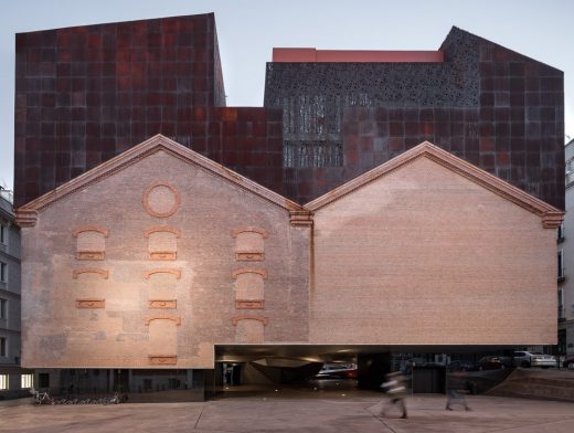
photo : Simon Garcia | arqfoto.com
Caixa Forum Building
Website: Vinoteka Ardoka Madrid
Comments / photos for the MAX&Co. Flagship Store in Madrid Architecture page welcome

