West 5 Apartment, Notting Hill London, London W2 Home, English Architecture, Images
West 5 Apartment in Notting Hill
23 May 2021
West 5 Apartment
Architects: Brosh Architects
Location: Queens Way, Notting Hill, London W2, UK
Brosh Architects’ client’s vision for the flat was very clear; “clean lines and bright space”.
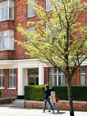
The property was situated in a 1930’s block of flats in Notting Hill. It was divided into small spaces with original herringbone pine flooring, which was rotten, damaged and missing in some places.
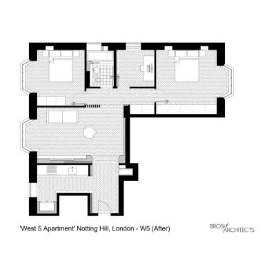
The West 5 Apartment project was on a budget and therefore major structural alterations were out of the question however, the space was divided into many small rooms separated by stud walls. We had to be creative and managed to manipulate the feel of the space with very little structural work involved.
Even though the main ceiling was high, it had many exposed structural beams and ventilation ducts which made the space feel lower than it was. We lowered the ceiling to hide the beams and used different ceiling levels for concealed lighting.
The main walls had odd corners, shapes, and niches, so we straightened them up and utilised the odd wall niches for storage space.
Floor:
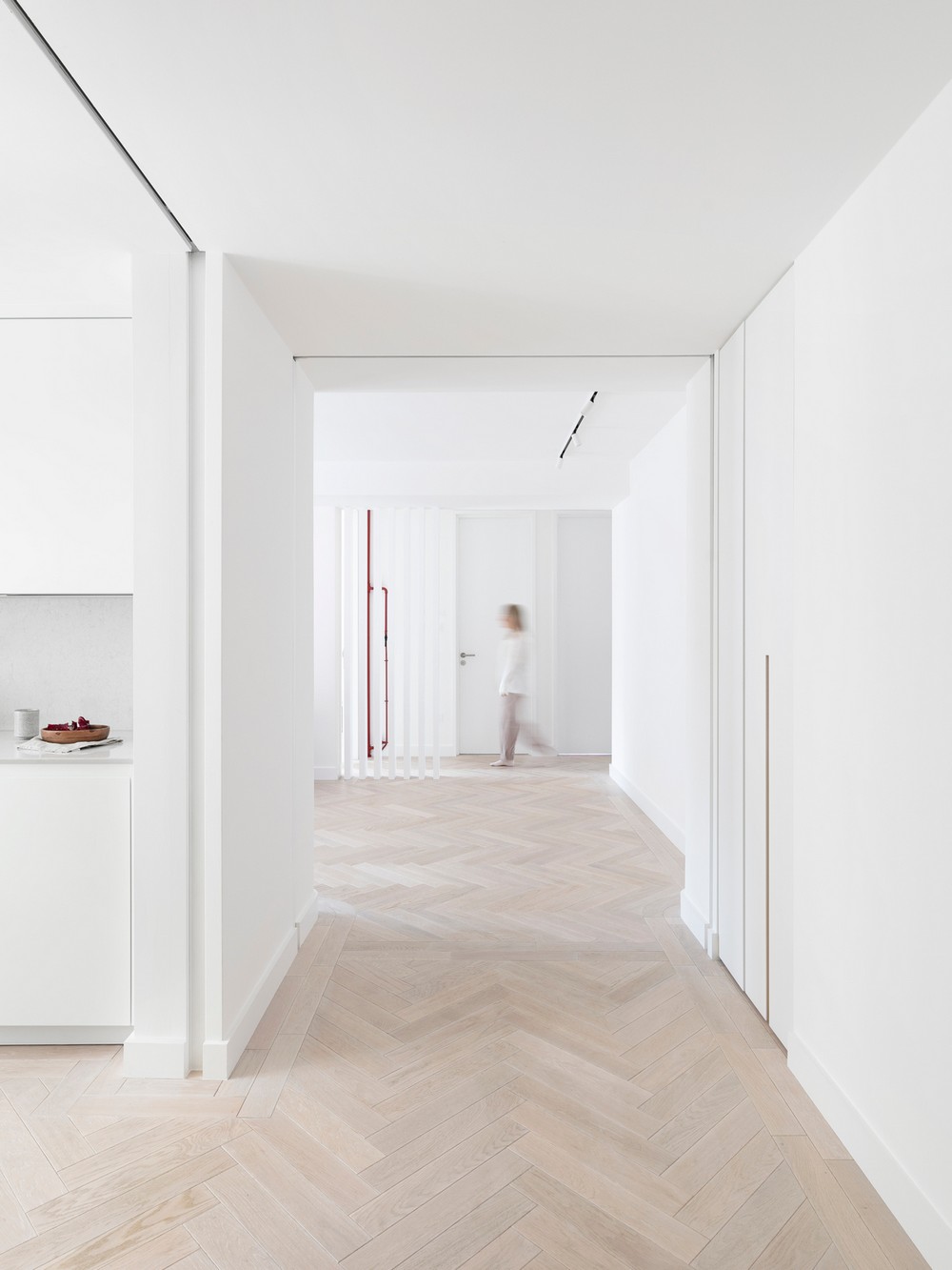
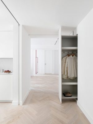
The existing pine herringbone flooring was damaged beyond repair, so we proposed an oak herringbone floor at similar panel size and pattern.
Entrance:
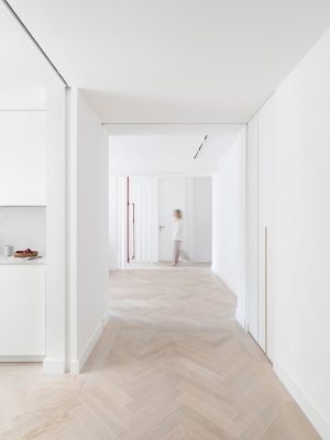
As you entered the apartment, you faced another door and to the left you had to step up into the tiled kitchen. We removed the door and completely opened the space up with concealed pocket doors and a curved wall to encourage natural light into the dark entrance hall.
It had an odd shaped and unused niche which we transformed into a sliding storage unit.
We lowered the ceiling to hide the existing beam structure and ducts to draw the eye into the living room rather than up to the ceiling.
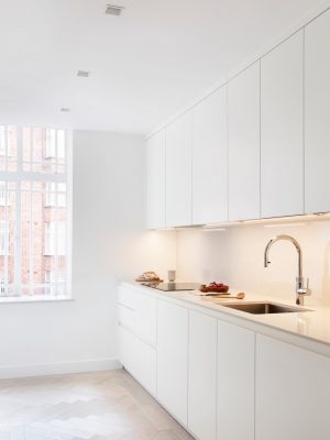
In the kitchen, we removed the tiles and step into the kitchen and proposed the same flooring throughout with a concealed pocket fire door to make the hallway feel bigger, lighter, and welcoming.
We changed the kitchen layout to expose the full height of the kitchen window and flood the kitchen and entrance hall with more natural light.
Living room:
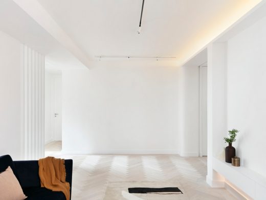
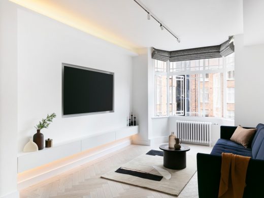
The ceiling difference between the entrance hall and living room created the opportunity for a concealed light which extended to the entire length of the living room which made it feel longer & more spacious. The concealed lighting shines upon the ceiling which bounces back down to the room effortlessly.
We created a fire rated fire door to open the space up and the curved wall created the niche for a media unit and within the thickness of the wall, we installed the entertainment unit.
We completely removed the stud wall between the living room and the hallway in order to bring more natural lighting into the living room however, it created an odd circulation space between bedroom 2 and the living room. This led to the idea of creating a slatted partition which was painted white so that it feels and acts like a wall, creating more modest circulation between the living room and bedroom 2 but not blocking the natural light coming in from the window of bedroom 2. At a certain time of day or when the lighting is on during night time, the slatted wall creates elegant silhouettes on the floor which adds drama to the lighting.
Hallway:
The hallway felt low, dark, and dull and in addition it had a boxed-in service pipe running vertically throughout the building that couldn’t be removed.
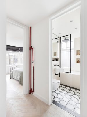
We solved this dark, dull space by installing full height doors and this creates a feeling of a higher ceiling. The natural light from the bedrooms bathed the hallway which immediately felt welcoming to walk through.
We decided that the boxing around the pipe had to go as it created an odd corner shape which left us with an ugly looking 90-year-old pipe. So rather than hide it, we painted it bright red to become a feature that now contrasts beautifully with the white walls.
Bathroom:
The existing bathroom was un-modernised and had to be demolished however since it was within a block of flats, the services outlets could not be moved.
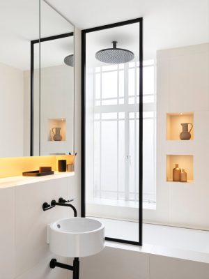
We created a modern bathroom with a black & white art deco feel to resemble the age of the apartment. We used 2 lighting circuits, 1 circuit is a “get ready to work circuit” and a second circuit is a feature lighting option or when you need want a low, warm light for the toilet in the middle of the night without being made fully awake with a bright light.
Bedrooms:
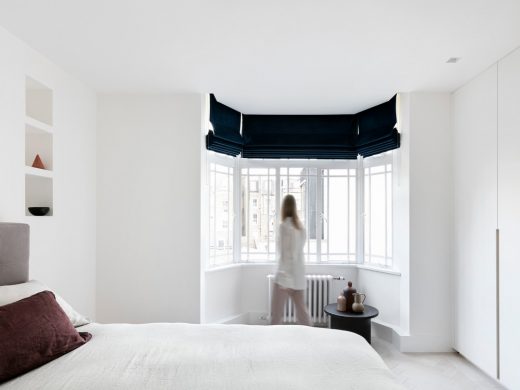
We opened-up hidden wall niches, we lowered the ceilings to hide curtain tracks and designed bespoke wardrobe according to the client needs.
What was the brief?
Clean lines and bright space
West 5 Apartment in Notting Hill, London – Building Information
Architect: Brosh Architects
Project size: 80 m2
Site size: 80 m2
Project Budget: $123000
Completion date: 2021
Building levels: 1
Kitchen: Suchdesigns
Photographer: Ollie Hammick
West 5 Apartment, Notting Hill London images / information received 230521
Location: Notting Hill, London, England, UK
London Building Designs
Contemporary London Architectural Designs
London Architecture Links – chronological list
London Architecture Walking Tours – bespoke UK capital city walks by e-architect
Notting Hill Architecture
Contemporary Notting Hill Buildings
Uli Restaurant
Design: Jonathan Clark Architects
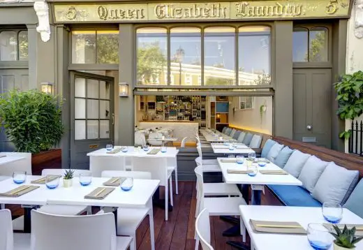
photograph : Richard Dean
Uli Restaurant in Notting Hill
Andina Notting Hill, 157 Westbourne Grove
Architects: El Equipo Creativo
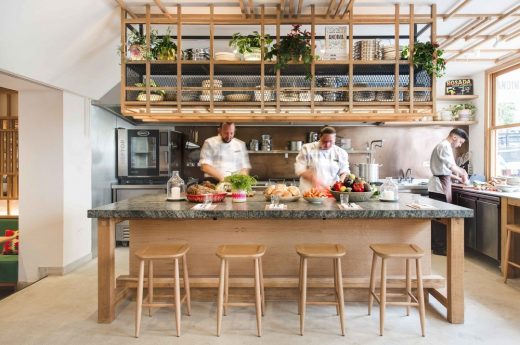
photo © Jade Nina Sarkhel
Andina Notting Hill Restaurant and Café-Bakery
Mixed-use hub in Notting Hill
Design: Studio RHE
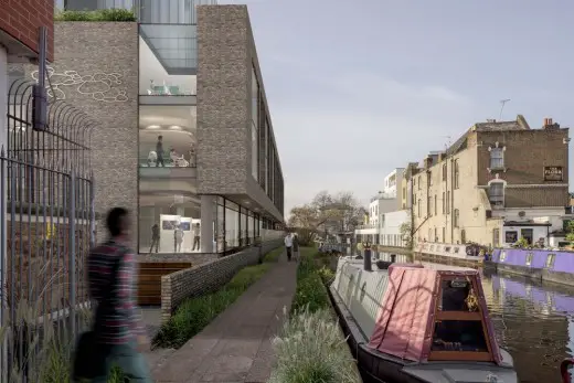
image courtesy of architects office
Mixed-Use Hub in Notting Hill
Westbourne Grove Church in Notting Hill
The Lichfield Studios Notting Hill
Website: Phoenix Garden Soho
Comments / photos for the West 5 Apartment, Notting Hill – page welcome
London, UK

