Mountain View House, London Building Extension, Residential Architecture Images
Mountain View House in London
15 July 2022
Mountain View is one of the UK’s best new homes
The Royal Institute of British Architects (RIBA) has announced the longlist for the 2022 RIBA House of the Year. The shortlist and winner are to be revealed on Channel 4’s Grand Designs: House of the Year.
RIBA House of the Year 2022 Winners
28 Feb 2022
Mountain View on 2022 RIBA London architecture awards shortlist
Mountain View is one of 68 projects shortlisted for the 2022 RIBA London architecture awards:
2022 RIBA London Awards shortlist
5 November 2021
Mountain View House on AR House awards 2021 shortlist
This London house extension design by CAN is one of 15 shortlisted projects from all over the world
AR House Awards 2021 Shortlist
5 Mar 2021
Design: CAN
Location: London, England, UK
Photos by Jim Stephenson
Mountain View House
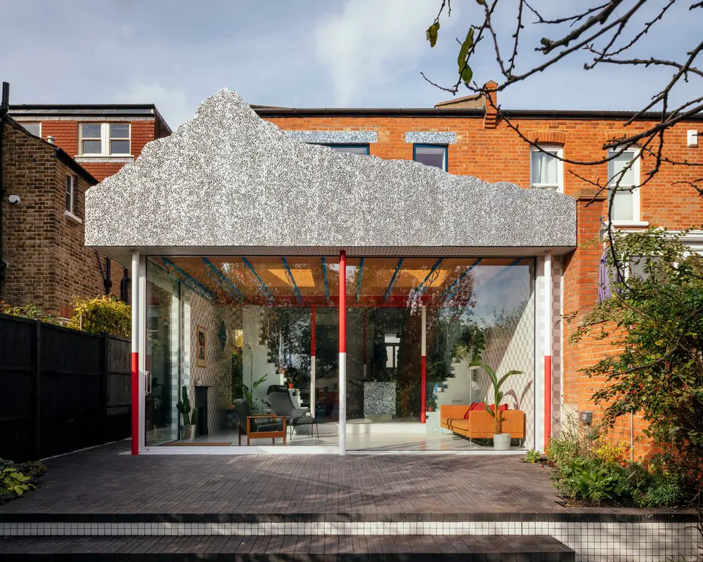
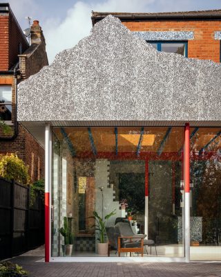
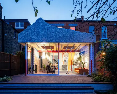
London-based architecture studio CAN has radically transformed an Edwardian semi-detached house into a colourful family home topped with staged mountain scenery.
Taking cues from theatre sets, geography, a fake Disneyland mountain and an Edwardian bread plate, Mountain View was designed by CAN Director Mat Barnes for his young family.
The unusual idea of the mountain roof came to Barnes after coming across images of the Matterhorn Bobsleds ride at Disneyland during its construction; a surreal mountain top aloft a skeletal frame.
“I loved the idea of elevating this heavy mountain on an unfeasibly thin structure”. Mat Barnes, Director, CAN.
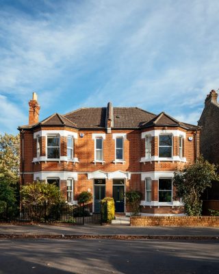
From the street, the two-storey building blends neatly amongst the neighbouring red brick houses, with the distinct design details reserved for the interiors and unique rear extension.
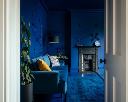
The house opens gradually, moving from dark to light like walking from the shadows of the wings onto the theatre stage. Visitors are greeted by a long hallway and monochromatic, striking blue lounge with Soanian-like architectural fragments arranged as sculptures on the walls. The fireplace is the only fixed item left untouched by the deep blue hue, which covers the walls, ceiling, and floors.
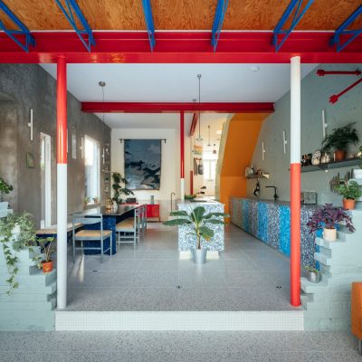
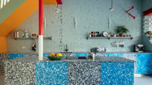
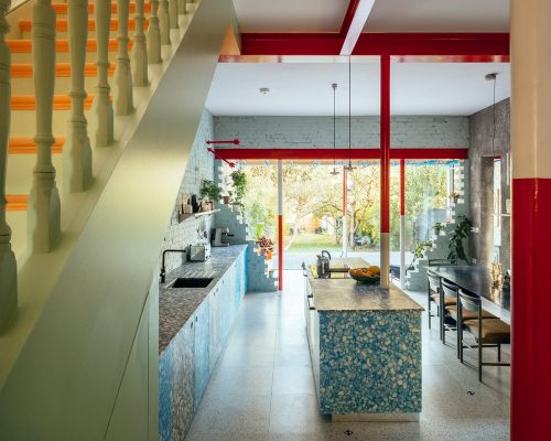
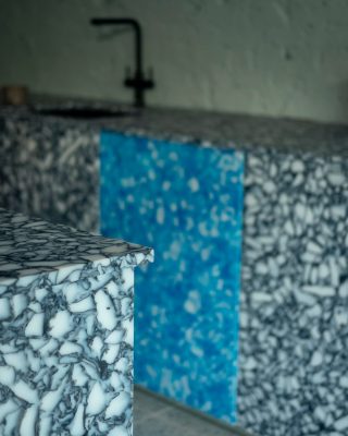
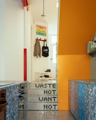
A bright hallway progressively widens and steps down into the East-facing, open kitchen and dining area. Two waist-height kitchen benches made of recycled chopping boards and milk bottle tops anchor the room, designed to accentuate the huge 3.4m ceiling height of the open plan space.
“We alternated the colours of the cabinet doors to keep the eye moving up; we didn’t want the kitchen benches to stretch the space horizontally. We kept the bench height uniform because we didn’t want any high level cabinets encroaching on the space. The height of the room brings us such joy. It feels somewhat grand or cavernous, with the variety of materials bringing texture and an unexpected warmth.” – Mat Barnes, Director, CAN.
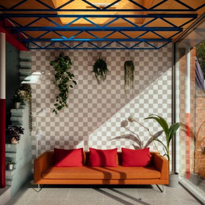
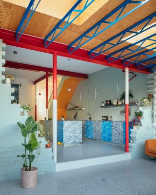
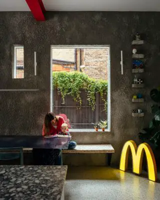
The space continues to unfold into the rear extension, with a small step leading through the partially demolished brick wall of the old house into a living area of exposed steel, timber and glass. Beside the dining area is a small window seat-cum-hallway that enjoys views to both the side passage courtyard and large rear garden.
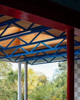
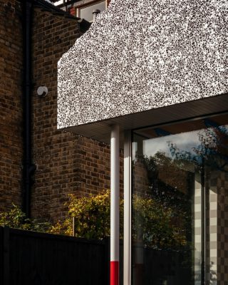
The purposely expressed steel beams above the living area nod to high-tech architecture and the lighting rigs of theatres. Mountain View also draws on geographic and topographical themes. Structural columns are painted to mirror red and white ranging poles and a foamed aluminium mountain cut-out sits atop the new extension. The steel beams, ranging poles, and partially ruined brick wall all add to a sense of the surreal, while the floor to ceiling glazing opens the home into the garden.
CAN have cleverly intersected materials, finishes, shapes and colours throughout to create highly textural and tactile spaces.
“We’re surrounded by so many colours and textures in the outside world that to me it feels natural to bring many different patterns and fabrics inside too”. Mat Barnes, Director, CAN.
Upstairs, CAN added an extra bedroom and bathroom to the floorplan, cleverly remodelling the home to be comfortable for a growing family. In contrast to the vibrant ground floor, the clean white walls lining the pastel staircase begin to relax the occupants as they climb up to bathe or sleep. The bedrooms and hall are intentionally neutral to provide a sense of calm and quiet. The ceiling of the hallway has been left open with structural timber beams painted in pastel blue and pink, allowing plenty of light to filter in.
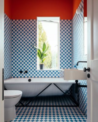
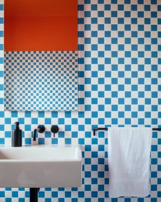
The bathroom is the only upstairs space where pattern reigns. When demolishing the existing house, the owners found a blue checkerboard tiled hearth at one of the old fireplaces. Not wanting to erase the history of the Edwardian semi entirely, CAN used similar tiles in the bathroom, broken only by a large window, black and white fixtures, and a tangerine ceiling.
“Our back garden faces east, and this lovely dappled light comes all the way up the hall in the mornings. It’s a lovely house to live in, for the kids to play in, and for us to enjoy. It is also great to hear our daughter tell everyone she has a mountain on top of her house!” Mat Barnes, Director, CAN.
What was the project’s biggest challenge?
Because we were expecting our second child in June 2020 (10 months after purchasing the house) I had to compress the design process and overlap stages (i.e construction detailing before receiving planning permission) where normally the design and ideas would have time to develop. This meant making a lot of design decisions on site without leaving time to mull them over. I think this resulted in more daring decisions (material and colour wise) because there wasn’t the opportunity to talk ourselves out of it. All of this compression turned out to be futile as the pandemic put pay to us moving in before the baby arrived. It delayed the installation of the glass doors by 4 months.
What was your original brief? Were you already living in the house and just decided to expand?
We were offered the chance to buy the house through a private sale. A very lucky occurrence where the house had been inherited by a distant relative of the elderly couple that had owned it, who lived abroad and wanted to offload it as quickly as possible. This meant we got the house at a knockdown price, affording us the opportunity to renovate so we moved in after purchasing it in August 2019 and started pre-construction work immediately. It was in an almost derelict state. All of the walls had rising damp, the windows leaked and there was no heating. The ceiling of the hallway actually collapsed whilst we were living there. Although pretty horrendous to live there with a young child, moving in for a time helped us to see what we wanted from the renovation.
The practical brief:
– Create an extra bedroom
– Bring light into the upstairs landing
– Replace the windows
– Insulate
– New services throughout
– Rationalise the myriad of small rooms downstairs
– Create an open plan kitchen and dining space
– Create a connection to the garden
The emotional brief:
– Making the most of the view of the garden and trees
– Visually connecting the front and back of the house (GF)
– Bringing light into the heart of the house
– Creating spaces with different feelings for different uses (dark/historic living room vs light maximalist kitchen/extension)
– Use the project to test out materials and ideas
– Instead of a ‘stage set for living’ more ‘living under the stage set’
What are the main materials used?
Worktop and kitchen fronts: Recycled chopping boards and milk bottle tops – supplier: Smile Plastics – Made by Harry Lawson and I
Survey Point Encaustic Tiles: CDJackfield
Terrazzo Floor: Inopera
Floor tiles in hallway: Grestec
Wall tiles to extension: Grestec
Bathroom Tiles: Grestec
Dining Table top: Vlaze
Dining Table legs : custom rubber rock by CAN
Mountain Parapet foamed aluminium: Alusion by Cymat
Glass sliding doors: Fineline Aluminium
Casement windows: Velfac
Paint: Dulux
Dining Room wall : Roughcast render
Where did the ‘mountain’ idea come from?
The Mountain. Whilst researching another project we came across images of the Matterhorn Bobsleds ride at Disneyland during its construction; a surreal mountain top aloft a skeletal frame. This idea fitted perfectly with what we were trying to achieve at Mountain View; a ‘heavy’ roof to emphasise the fragility/slenderness of the exposed structure below. Unlike Disneyland’s Matterhorn, it felt more fitting to emphasise the fakeness of it all and distort the scale resulting in a flat billboard mountain range. The mountain is made from a super lightweight foamed aluminium which was waterjet cut before being mounted on a steel subframe. Once we had the mountain form, themes of landscape (dining table as lake, dining area/concrete wall as cave) and surveying the landscape (ranging pole columns, survey marker tiles) developed from there.
Is it difficult being your own client, as opposed to designing for an external client?
Designing for yourself has the benefit of endless possibility and fewer constraints (except budget), and I had lots of big ideas. In a way my wife served the client role, tempering ideas that were too impractical or downright absurd but we still had to make the final decisions together and that was the hardest part. I find it much harder designing for yourself because you have to live in your decisions (and/or mistakes) and be reminded of them everyday! When designing for a client the final decision of whatever it might be (finish/concept/material/cost) lies with them.
What other Design References?
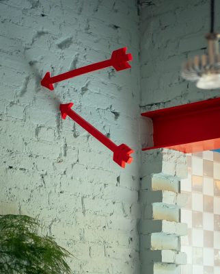
The crumbling walls leading to the extension reference the dealers flat in Trainspotting. There is a central wall in the flat; crumbling and held up by steel props to emphasise the dereliction and decay of the flat and the characters addictions. I thought it was a perfect way to retain a bit of the feeling or memory of the state we found the house in and also retain a memory of its construction. The crumbling walls and steel props give the impression that it may not be finished/is falling apart. The steel columns next to the crumbling walls are actually fake and purely used as a compositional device to better frame the view of the garden and give the impression of weight above.
The Waste Not Want Not inscription on the stairs to the kitchen reference a Breadplate designed by A.W Pugin, the gothic architect who designed the Houses of Parliament. It also happened to be my grandma’s favourite phrase and an obvious reminder of the way we should live today.
The name of the project ‘Mountain View’ somewhat obviously references the Mountain but I liked the idea that usually when a house is called ‘Mountain View’ the house has a view onto some mountains whereas in this case the house is in the Mountain.
What role do colour and pattern play in your architecture?
My early education and career was centred around the idea that white walls and almost invisible textures were “good taste” and that’s what architects did. Somehow the white walls and concrete floors of the art gallery had leached into people’s ideas of what a ‘good taste’ home should be. Architecture living in the background etc. But by choosing texture, colour or pattern, architectural elements can possess their own character and bring up feelings and memories in just the same way as art and food can. Why choose a white plastered wall when there are endless more interesting material options that can bring feeling and emotional responses/memories, textures and changes to a space.
Mountain View House Extension in London
Design: London
Project size: 150 sqm
Site size: 375 sqm
Project Budget: $220000
Completion date: 2020
Building levels: 2
Structural Engineer: Hardman Structural Engineers
Main Contractor: Catalin London Ltd.
Photography: Jim Stephenson
Mountain View House, London images / information received 050321
Location: London, England, UK
Barnes Property
Barnes Property Designs
Abstract Barnes, Borough of Richmond upon Thames
Design: Matteo Cainer Architecture
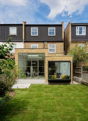
photograph : Guifré de Peray – Veeve
Barnes house extension in southwest London
Barnes Brick, London Borough of Richmond
Design: YARD Architects
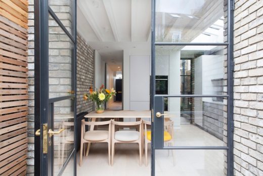
photo © Agnese Sanvito
Barnes Brick, London Borough of Richmond
London Buildings
Contemporary London Architecture Designs
London Architecture Designs – chronological list
Minories London
Design: ACME
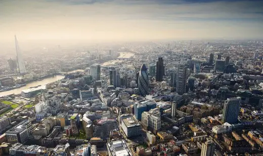
photo : Max Fordham
Minories London Masterplan page
New Motel One Building on the Minories, 24 – 26 Minories, City of London, EC3N
Design: Mackay + Partners, Architects
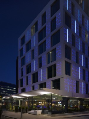
photography courtesy of Mackay + Partners, all rights reserved
Motel One Minories Londong
Hotel Motel One London Tower Hill
Aldgate Buildings – architecture photos
London Architectural Tours – tailored UK capital city walks by e-architect
Buildings / photos for the Mountain View House, London property design by CAN page welcome

