280 High Holborn, London Office Building, English Design, City Commercial Property Images
280 High Holborn London Offices
Office Development in London design by GMW Architects, England, UK
post updated 30 Jan 2021 ; 16 Jan 2013
Location: central London
Design: GMW Architects
280 High Holborn
GMW Completes 280 High Holborn Taking Inspiration From Views Over Leafy Lincoln’s Inn Fields
External Views Of ‘280’
280 High Holborn Development
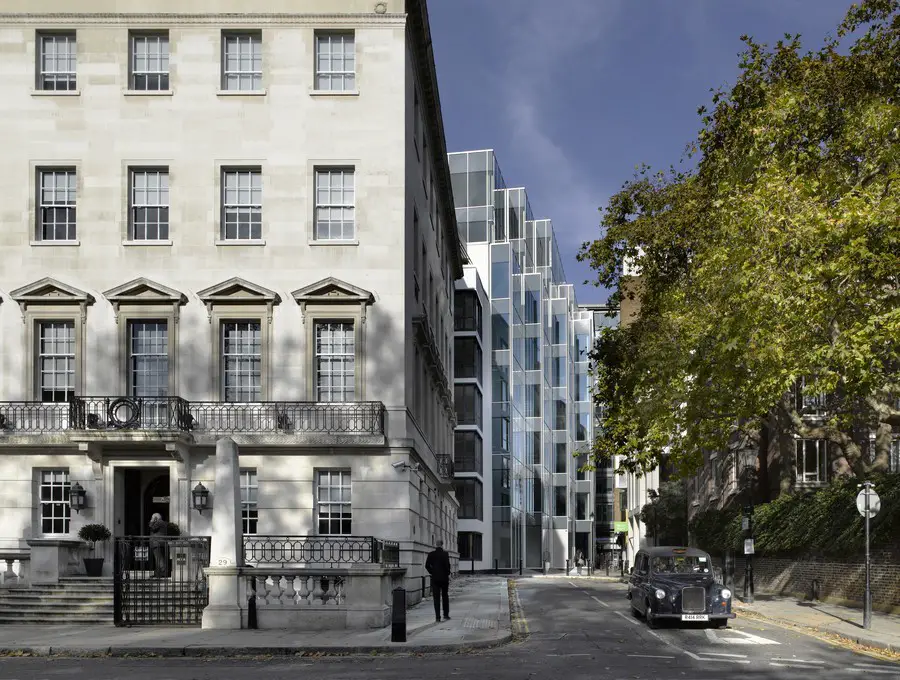
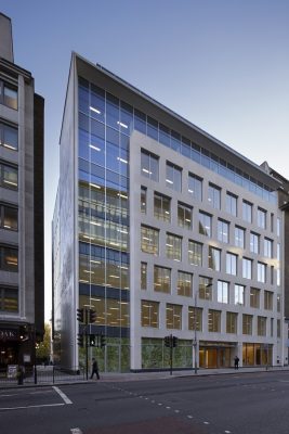
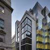
GMW has just completed a new mixed-use building on High Holborn in London for developer Hines. Externally ‘280’ presents an elegant addition to the busy street. Inside the building the main focus, and the architects’ inspiration, is the continuous view of gentle, dignified Lincoln’s Inn Fields to the south. The 7 storey 64,000 sq. ft. development includes offices, a self-contained residential complex, and a ground floor retail unit.

photograph © Richard Bryant/Arcaid
VIEWS OVER LONDON FROM INSIDE ‘280’
The development was carried out in two stages due to the initial 2006 design being halted in the economic downturn of 2008. When the project was restarted in 2010, GMW and the client saw an opportunity to revisit the early designs to tune aspects of the scheme to changing market demands and to take advantage of sustainability advances. The revisions ensured that the development supports the most up-to-date workplace and environmental standards and the new building has been awarded BREEAM ‘Excellent’.
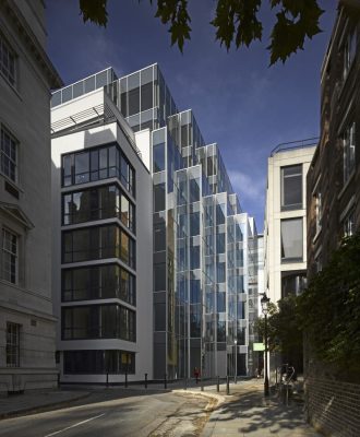
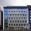
The building’s overall design is strongly influenced by its relationship with the surrounding buildings, as well as with the green space behind. Externally the new structure’s limestone-clad front façade sits in harmony with its midtown neighbours. GMW has also created a wide and light-filled pedestrian walkway that connects High Holborn directly to the Fields. The original 1960’s building formed a dark, narrow passage on the East side. GMW improved this route by reducing the building’s original footprint, and adding additional floor area on the upper levels, thus giving valuable space back to the street for pedestrians whilst maximising lettable floor space. Partner John Jackson stated, ‘our ambition for the re-development of this site was to create an attractive contemporary office environment, while also enhancing the urban grain, scale and texture of the building’s surroundings‘.
WAITING AREA
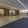
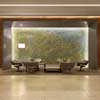
Internally GMW also designed the building to prioritise the leafy views behind the central London building. The entrance lobby and ground floor have been designed by GMW’s Interior Design team with subtle leaf and tree motifs. A 5m x 3m pixelated 3D art form of a tree canopy is the main focus in the lobby and is framed for passers-by by the sheer glass window to the street. A large specially commissioned artwork by WallerHewitt in the form of an abstract array of felt spheres also responds to woodland and tree scenes. This theme is reinforced by the use of satin finished red elm on the walls. GMW intended the design to lift the spirits of the office workers, and to create a feeling of natural light and space.
photograph © Richard Bryant/Arcaid
ENTRANCE LOBBY
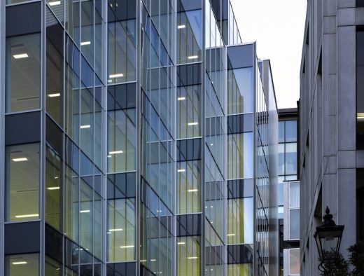
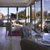
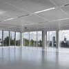
On each office level the design prioritises the southern orientation, the calming views of the park and the sense of being outdoors. Finishings have been paired back and the views maximised with floor to ceiling glazing and open plan floor space, significantly improving ambient lighting levels for employees. Support column widths and mullions have been minimalized. As the building users exit the lift on each floor, they are greeted by a virtually uninterrupted view of Park and Sky.

photos © Richard Bryant/Arcaid
VIEW FROM THE INNS ONTO THE REAR OF THE BUILDING
GMW Interior Design partner, Tim Hardingham, said “On the office floors the architecture falls away allowing Lincoln’s Inn right into the building – all we want people to remember is the view”.
At the rear of the building, GMW has designed a block of 6 apartments. The block is structurally independent of the office building and has different floor to ceiling heights to maximise the available area. The apartments all have uninterrupted views of the Fields.
Further Information
TECHNICAL FEATURES
Glass fritting
The building sits on a tight urban site. As a result some of the office floors are overlooked by residential apartments along the Great Turnstile passage. In order retain as much natural light as possible in 280 High Holborn, and to ensure privacy for the office workers, GMW specified glass fritting for the windows facing the residential block opposite. Different densities of fritting were specified for the exterior glass depending on the proximity of the adjacent premises. Where the buildings are very close, fritting has been used on two faces of the double glazed units (faces 2 and 3). Where the building is less exposed, fritting was applied to one face only, and where practicable the glass remains transparent.
Various fritting patterns, densities and templates were worked up by Spin before the final version was selected by the client and presented to the planners. Fritting patterns were also worked up by Spin for the glass entrance canopy and privacy screening at street level.
Heat extraction grills
The building directly abuts the new paved passage on Great Turnstile, with floor-to-ceiling glazing on the ground floor. The sheltered location and the new recesses made by the ‘stepped’ building footprint, with the added benefit of heating from basement plant areas, posed an issue with vagrants. To counteract this, a series of tapered inclined grills were designed which are inconspicuous and are impossible to rest on.
Structural challenges
Particularly careful consideration was given to the substructure design so as to ensure no detrimental impact on the nearby London Underground central line, or the Post Office tunnel and Thames Water sewer both of which run directly under the building. The architectural design of the High Holborn façade, with ‘hit and miss’ windows, ruled out a conventional approach of continuous columns behind the stonework. The most efficient structural solution was to consider the whole facade as one giant Vierendeel beam. The resulting smaller columns were then integrated into the facade system.
The steel frame was designed to be as economical as possible, this dictated a construction sequence of concreting the top 3 floors in a ‘top down’ sequence (floors 8,7,6).
Sustainability
The building has been awarded BREEAM excellent (2008) and an EPC rating of B. In order to achieve this GMW incorporated an area of green roof with bird and bat boxes, photo-voltaic panels (and solar panels to the residential element), materials were sourced with recycled content where practicable, low energy/ long life lighting was specified, as well as high performance glass, low water use appliances and air-conditioning by VRF (variable refrigerant flow) system with heat recovery.

photos © Richard Bryant/Arcaid
NOTES
GMW is an award-winning international architectural and design practice with offices in London, Istanbul and Doha. For over 60 years GMW has been designing buildings that shape the places and spaces in which people live and work. The practice applies its creativity to office buildings, airports, historic buildings, media centres, shopping centres, hotels and schools. GMW has recently completed Network Rail’s national centre in Milton Keynes and has a number of office projects on site in central London and the City. GMW has recently moved from their High Street Kensington office of 25 years, to a new design studio in Battersea.
280 High Holborn Office Development – Building Information
PROJECT TEAM: Client: Hines
Architect: GMW Architects
Interior Design: GMW Architects
Graphic Design: Spin
Quantity Surveyor: Davis Langdon (aecom)
M&E Engineers: Long and Partners
Structural Engineers: Ramboll
Project manager: GVA Second London Wall
280 High Holborn images / information from GMW Architects
Location: 280 High Holborn, London, England, UK
Holborn Buildings
61-65 Holborn Viaduct Building
Design: Stiff + Trevillion Architects and Jonathan Cook Landscape Architects
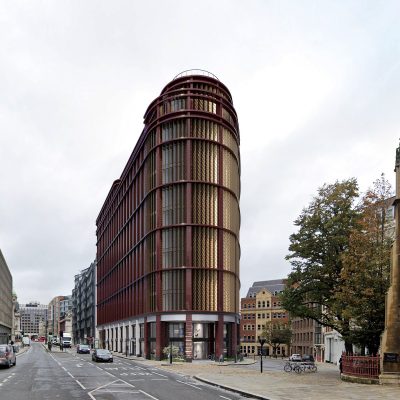
image courtesy of architects practice
61-65 Holborn Viaduct Building
Citicape House, Holborn Viaduct / Snow Hill, City of London
Design: Avery Associates Architects + Axis Architects
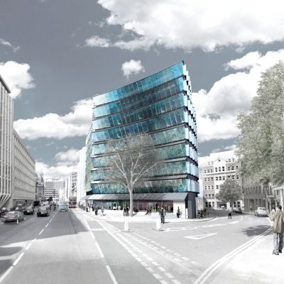
image from architect
Citicape House
120 Holborn Offices in London
Design: John Robertson Architects
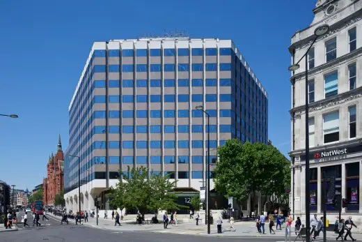
image courtesy of architects practice
120 Holborn in Central London
150 Holborn
Design: make architects
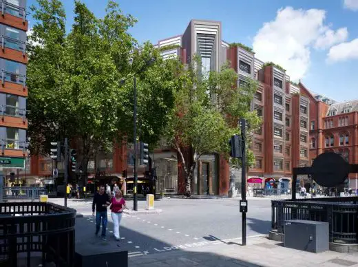
image © make architects
150 Holborn
Chichester House, 280 High Holborn
Design: GMW Architects
image © GMW Architects
Chichester House High Holborn Building
London Buildings
Contemporary London Building Designs
London Architecture Links – chronological list
London Architecture Tours by e-architect
London Architect Offices
Comments / photos for the 280 High Holborn London Offices design by GMW Partnership page welcome
Website: 280highholborn.com

