Westfield Mall of the Netherlands Leidschendam, South Holland Retail Building, Dutch Architecture Images
Mall of the Netherlands in Leidschendam
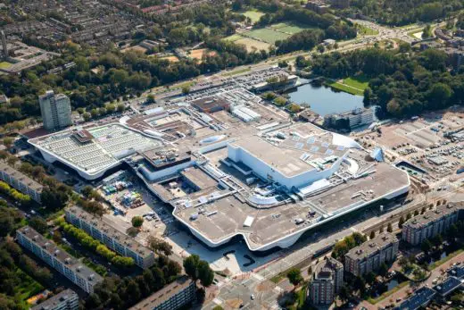
Westfield Leidsenhage Shopping Centre in South Holland, The Netherlands design by MVSA Architects
1 March 2022
MVSA Architects twice awarded with the highest honour in the category Retail and Leisure architecture
Design: MVSA Architects
Location: Westfield Mall of the Netherlands, Weigelia 48, 2262 AB Leidschendam, The Netherlands
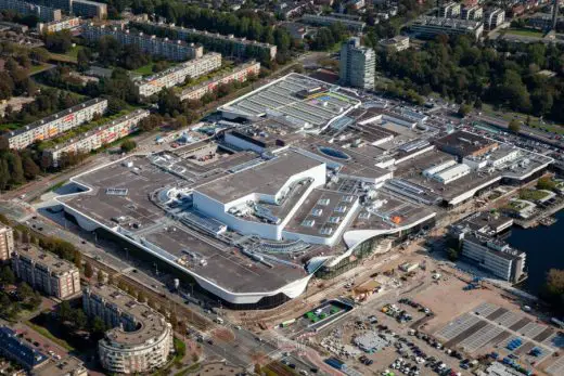
aerial photo courtesy of architects office
Westfield Mall of the Netherlands Award
Amsterdam, 1st of March 2022 – MVSA Architects twice awarded with the highest honour in the category Retail and Leisure architecture, for the design of the Westfield Mall of the Netherlands, at the International Property Awards 2021-2022.
Amsterdam – MVSA Architects has been honoured at the prestigious International Property Awards ceremony on the 25th of February for Westfield Mall of the Netherlands. In December 2021 MVSA Architects won a trio of prizes crowning the design the best of the Netherlands in Retail and Leisure. Last Friday MVSA was not only awarded best in Europe in two of these categories but was also awarded the overall prizes in the categories ‘Best international retail architecture’ and ‘Best international leisure architecture’. We are truly honoured to receive this amazing international recognition for our design for the Westfield Mall of the Netherlands.
Central Plaza:
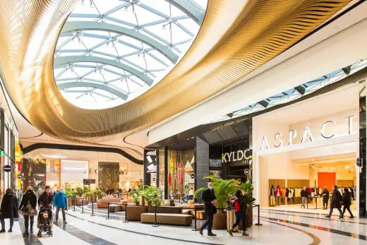
photo © Twycer / www.twycer.nl
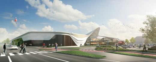
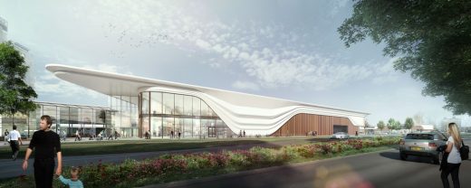
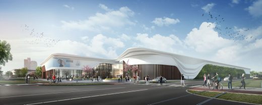
Westfield Mall of the Netherlands in Leidschendam is Netherlands largest all-round contemporary urban retail & leisure destination. The new design adds many exciting functions, services to the retail offer, and delivers the ‘wow’ factor – a strong and spectacular design identity that is architecturally ambitious and appropriate to the context. This is exemplified, for instance, by the flowing white curves of the façade; a graceful and unifying gesture based on the idea of a silk scarf wrapped around the building. The white scarf pulls the building together, here and there opening up to allow visitors to enter and exit the mall. The fluidity of the scarf was key to the concept of the interior too, where a flowing figure of eight loops through the building, carrying visitors along on an exciting journey of discovery.
Thijs van de Straat and Charlotte Griffioen collecting several awards at the Savoy Hotel in London.
About the European Property Awards
The European Property Awards, now in their 28th year, are judged by an independent panel of over 80 industry experts who focus on design, quality, service, innovation, originality, and commitment to sustainability.
www.propertyawards.net
Previously on e-architect:
3 December 2021
MVSA Architects Triple Winner at European Property Awards 2021-2022
Central Plaza ceiling:
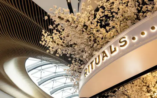
photo © Floris Heuer – www.florisheuer.com
Westfield Mall of the Netherlands, Leidschendam
The leading Amsterdam-based architecture company wins a trio of prizes for its Westfield Mall of the Netherlands in the prestigious European Property Awards, presented on December 2nd 2021.
Amsterdam – MVSA Architects has been honoured at the European Property Awards in an online virtual ceremony on December 2nd for Westfield Mall of the Netherlands. This project, involving the transformation of a run-of-the-mill shopping centre into a next-level, all-round urban leisure destination, gained the acclaimed architecture office awards in three categories. MVSA is awarded in the category Retail Interior and received the highest level of five stars in Retail Architecture and Leisure Architecture.
Westfield Mall of the Netherlands In Leidschendam is a visionary remodelling of an existing building featuring an expansion from 70,000m2 to 200,000m2, making it the Netherlands’ largest mall. The new design adds many exciting functions and services to the retail offer and delivers the ‘wow’ factor – a strong and spectacular design identity that is architecturally ambitious and appropriate to the context. This is exemplified, for instance, by the flowing white lines of the façade, a graceful and unifying gesture based on the idea of a silk scarf wrapped around the building.
Central Plaza ceiling ribs:
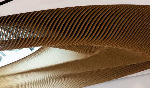
photo © Barwerd van der Plas
“Westfield Mall of the Netherlands offers a unique experience as a leisure attraction and next-level shopping venue with a high level of architectural ambition. We are honoured to receive no less than three European Property Awards for the project, which sets a whole new standard for shopping destinations in the age of the internet.” – Roberto Meyer, founder and Principal Architect of MVSA
Westfield Mall of the Netherlands will now be entered into the overall European awards in all two categories, competing on a international scale with the very best retail and leisure architecture.
Designer gallery:
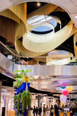
photo © Floris Heuer – www.florisheuer.com
Westfield Mall of the Netherlands
MVSA takes shopping to the next level by transforming a dated mall into a vibrant city destination
Our multi-award-winning design for the Westfield Mall of the Netherlands works a magical transformation on what was a dated, run-of-the-mill shopping centre. We were asked to remodel the existing building in Leidschendam to make it an all-round contemporary urban leisure destination, expanding it from 70,000m2 to 200,000m2 in the process to become the Netherlands’ largest mall.
Westfield is much more than a mall, however. The renovated shopping centre transcends its main function thanks to new uses and services – from a museum and cinema, to a car wash and ‘dog hotel’ – as well as exciting places to eat, drink and, of course, shop. The new mall offers a unique experience as a stylish leisure attraction and next-level shopping venue. Above all, it has the ‘wow’ factor – a strong and spectacular design identity that is architecturally ambitious and appropriate to the context.
White wrapping
From the outside, the flowing white lines of the façade define the mall. This gesture, based on the idea of a silk scarf draped around the building, plays a key role in unifying the design and giving the mall a single strong identity. Fluid and dynamic, the white scarf pulls the building together, here and there opening with a flourish to allow visitors to enter and exit the shopping centre.
The façade design features an unusually expressive and sculptural use of an everyday material: concrete. Glass fibre-reinforced micro concrete is used in super-thin moulded panels to create the softly waving forms – a fresh and unexpected use for the familiar material. The surface is polished, smooth and tactile. It catches the light beautifully and has a warm, friendly appearance. The white scarf contrasts beautifully with the expanses of glass window below, and with the rippling vertical aluminium louvres in bronze tones that cover the closed areas between windows, adding dynamism to the façade.
Journey of discovery
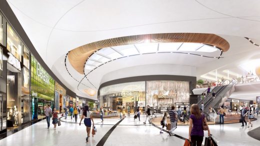
The fluidity of the scarf was key to the concept of the interior, too. Here a flowing figure of eight loops through the building, carrying visitors along on an exciting journey of discovery. This 1.8 km shopfront odyssey is epic by Dutch standards, with a huge range of attractions, stores, services, sensory input – colour, sights, scents, sounds, and things to discover. New for the Netherlands is the imposing height of the shopfronts: a lofty 7.5m. The interior height of the mall itself is similarly unprecedented: 10 to 12 metres.
Our design ensures that there is always something new around every corner. Curved lines accentuate the sense of movement. We use a simple palette of white marble with fluid black lines for the shopping galleries – accented by more spectacular materials for key areas – to enhances the unbroken spatial quality and provide a neutral backdrop for all the colourful retail experiences.
Heart of the city
The site is located in the heart of the city, bordering a park. The new mall needed to be beautifully embedded in its location, yet at the same time make an architectural statement as a stand-out attraction.
The concept of the scarf was a design solution that allowed the building to be unified by a single architectural gesture while giving it a unique and iconic identity. The ‘scarf’ opens up here and there, connecting the complex to its surroundings through a number of entrances that flow into the city. For example, there are strong new connections with the neighbouring park (the Zijdepark), and three subtle divisions on the side of the Burgermeester Banninglaan respond to the three neighbouring residential blocks opposite the mall. The strong connection with the park in particular boosts the attractiveness of the shopping centre as a leisure destination.
Exciting experiences
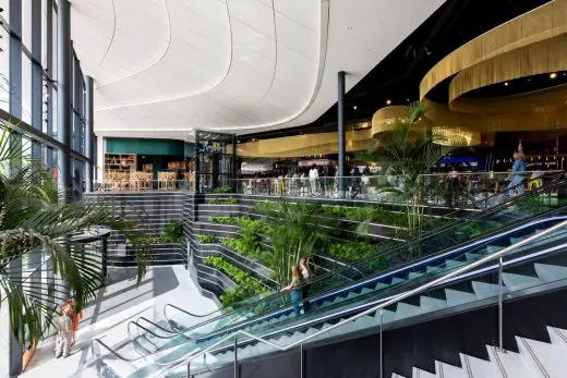
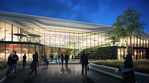
Our building choreographs a series of exciting moments thanks to a sequence of architectural highpoints. Key areas in the building’s exterior are the multiple entrances, which range from exuberant to more modest in approach depending on context. The entrance to the Dining Plaza is particularly spectacular: flanked by black marble ‘sawas’ (terraces) with lush greenery, it makes a strong visual statement and invites visitors inside.
In the interior, the curving figure-of-eight route leads visitors to the key spaces, with their more spectacular décor, including the Central Plaza, the Dining Plaza with cinema entrance, and the market (Fresh). Along the way, there are a number of smaller key spaces – every few metres, the customer journey is punctuated by a play area, a bench with phone charging points, or an ‘island’ store, for example – building up to the ‘crescendos’ of the headline spaces.
The Central Plaza
The Central Plaza is the key focal point for visitors as they move around the mall. Acting rather like a town square, it occupies the crossing-point of the figure-of-eight loop that runs through the shopping centre. This central space forms the heart of the redesign. Here all the lines that run through the galleries converge, forming a spectacular elliptical ceiling. The spiralling pattern is formed from 700 individual wooden ribs that weave around the central skylight – turning the space into a unique destination within the mall. The elegant design was precisely created and crafted with the help of 3D modelling software.
This central area is one of the Westfield Mall of the Netherlands’ prime destinations and it functions as a fully equipped event space, adding to its multifunctional possibilities.
The Dining Plaza
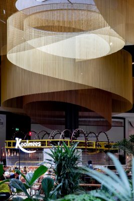
On the upper floor of the shopping centre, above the Designers Gallery, is the Dining Plaza. Directly connected to the main outdoor parking area and with its own dramatic entrance, the Dining Plaza is a stand-out attraction in itself. When entering from the street, the white façade folds in on itself and black natural stone terraced ‘sawas’ (terraces) with their lush greenery draw you in. Approached from inside, the fluid movement of the golden chains triggers the senses.
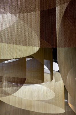
The curving chain curtains suspended from the ceiling mimic the movement of air flowing in different directions and create a sophisticated sense of space. The delicate yet dramatic design warmly embraces the visitor and reinforces the human scale in the huge space of the upper level. The colour of the lighting scheme can be changed, so the mood can be adapted to the time of day of year, creating a range of possible atmospheres.
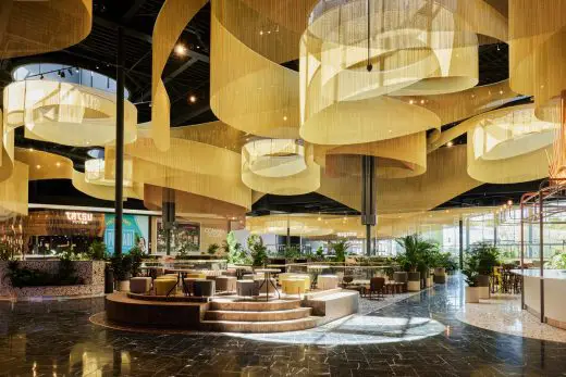
photo © Twycer / www.twycer.nl
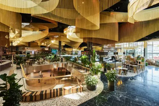
photo © Twycer / www.twycer.nl
The curtains descend to the different food kiosks, marking their spot and giving them definition. Except for the lavish gold-chain ceiling, the Dining Plaza uses subdued materials in keeping with the restrained design of Westfield Mall of the Netherlands and the philosophy of providing a neutral backdrop for retailers.
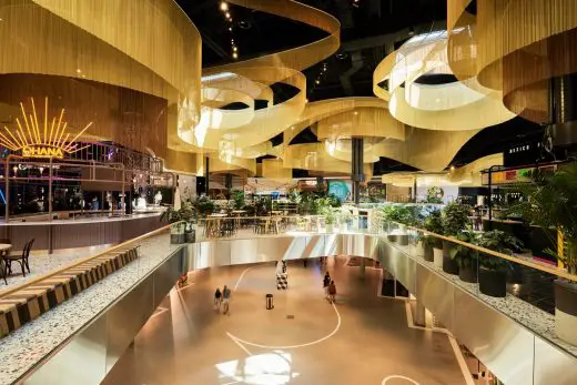
photo © Twycer / www.twycer.nl
The Fresh Food Market
Fresh, the (covered) food market, combines an industrial, local feeling with the subdued and open style of the rest of the interior. As well as a market, Fresh functions as a stage for cookery demonstrations and other food-related events.
The Designers Gallery
A new interpretation of the traditional Dutch shopping street, the Designers Gallery is a showcase for young designers in the Netherlands. Located beneath the dining plaza, the gallery’s neutral and elegant design provides the perfect setting for a wide range of talents.
Colour-coded parking
Westfield Mall of the Netherlands was designed as an experience destination, not as a standard shopping centre. The experience starts with the parking area which has space for 4000 cars.
When you enter this area, you are greeted by rhombus-shaped elements which guide you in. Each parking bay has a different colour for optimal orientation. The parking lobbies are designed as reflections of the mall and gradually invite you in via their open structure, leading you towards the shopping centre.
Beautiful bathrooms
Beautiful, restful, multifunctional (with make-up mirrors, changing stations and so on) and – unusually in the Netherlands – free of charge, the luxurious bathrooms indicate the shopping centre’s ambition to provide an optimal experience on every level.
A study in reuse
The decision to reuse the existing shopping centre structure, rather than demolishing it, was a crucial factor in making the new Westfield Mall of the Netherlands a sustainable project. In addition, the complex saves energy thanks to an aquifer thermal energy storage system (ATES) and LED lighting. Excess heat from the shops is reused, while the sawtooth roofs minimise direct sunlight and reduce heat. Indoor unloading of stock means less heat loss in winter. The use of glass-fibre reinforced concrete allowed the building’s façade to be unusually thin, and therefore saves materials.
aerial photograph courtesy of architects office
Westfield Mall of the Netherlands achieves the BREEAM-NL ratings Very Good certification for new construction and Excellent for renovation. BREEAM assesses buildings on nine different sustainability categories, including energy, water, materials and waste. BREEAM stands for Building Research Establishment Environmental Assessment Method and was originally developed and by the Building Research Establishment (BRE) in the UK.
Mall of the Netherlands, Leidschendam, NL – Building Information
Client: Unibail Rodamco Westfield
Lead Architect: MVSA Architects
Lead Interior Architect: MVSA Architects
Partner interior Architects:
Fresh!: Heyligers
The Gallery: …Staat
Furniture: Saguez and Partners
Contractor: Ballast Nedam
Constructor: Van Rossum Raadgevende Ingenieurs
Executive constructor: Goudstikker De Vries
Demolition work: Vlasman
Foundations and earthworks: Sterk
Façade: TGM
Tourniquets: Boon Edam
Vertical Conveyors: Otis
Electric installations: Energietechniek
Engineering installations: Roodenburg
Installation advisor: Techniplan Adviseurs BV
Building physics advisor: Peutz
Sprinkler installations: Trigion
Sanitary installations: Hoogendoorn
Construction logistics: Buko
Construction management: DVP
Design management: Brink groep BV
Advisory role realization: NEOO
Gross floor area old construction: 75.500m2
Gross floor area: ruim 200.000m2
Net floor area: 117.000m2
Program: Leisure
Date preliminary design: March 2014
Start demolition: Q3 2015
Start construction: Q1 2016
delivery: phased during 2021
Building price including installations: Over €600.000.000,-
Parking spaces: 4000
Parking areas: 5
Stores: ca. 280
Catering and Leisure: ca. 50
Cinema halls: 11
Façade
Concrete cladding voile: 9300 m2
HSB Facade: 9300 m2
Steel construction: 9300 m2
Aluminum curtain wall: 1800 m2
Steel curtain wall: 1250 m2
Aluminium: 4050 m2
green cladding: 950m2
Natural stone cladding: 225 m2
Dining Plaza (Eet Theater)
curtains: 30
Chain links: 12.251.200
Surface: 3.020m2
Total length 235km
Previously on e-architect:
5 Jul 2016
Westfield Mall of the Netherlands in Leidschendam
Design: MVSA Architects
Location: Westfield Mall of the Netherlands, Weigelia 48, 2262 AB Leidschendam
Building Permit for ‘Mall of the Netherlands’ official
The building permit for renewing shopping centre Leidsenhage has been officially approved by the municipality of Leidschendam. Leidsenhage is currently being transformed into ‘Mall of the Netherlands’ and will get a complete new identity. Commissioned by Unibail Rodamco, MVSA Architects has a talented team of architects, interior designers, and building engineers responsible for both the renovation and new extension, which includes also the entire interior design. The Westfield Mall of the Netherlands in Leidschendam will bring the shopping experience in the Netherlands and Europe to a whole new level.
With online shopping as an important new activity in our daily life, the role of the physical store has changed. The big verity of retailers, small shops and flagship stores, restaurants and cinema’s combined with a wide range of additional events and services Unibail Rodamco is addressing the changing needs of consumers.
These recent developments ask for a customized design that binds the strong diversity and ever changing retail landscape. We felt strongly inspired by a silk scarf that is smoothly draped around your body like a second skin. This scarf is the starting point for a spectacular façade design, which literally gathers together the new extension and the many individual buildings of the existing complex.
Roberto Meyer, leading architect and executive director of MVSA Architects: “Our concept for Mall of the Netherlands is based on the idea of one gesture, one design, one identity. We believe it gives the shopping center the allure and comfort it deserves.”
This ambition can totally be experienced within the shopping center, where everything emanates from a single source, the Central Plaza. Here visitors can wander through the mall in different directions, consisting of smooth lines and shapes applied to the floor and ceiling, which guides the customer along the commercial eight-loop of the building in the most natural way. One of the highlights is the ‘Dining Plaza’, a hospitality hotspot at the first floor of the complex, with an offer for a coffee break, lunch, a drink or dinner and a large cinema.
With the renewing of Leidsenhage a unique shopping center is created for the first time in The Netherlands. With our custom made architecture we aim to create the best conditions for customers and shopkeepers possible.
Mall of the Netherlands in Leidschendam – Building Information
Client: Unibail Rodamco
Architect: MVSA Architects, Amsterdam
Interior design: MVSA Architects, Amsterdam
Developer: Unibail Rodamco
Constructive Engineer: Van Rossum Raadgevende Ingenieurs
Technical Engineers: Techniplan adviseurs, Peutz
Landscape: OKRA landschapsarchitecten
Location: Weigelia 48, 2262 AB Leidschendam, NL
Building surface: 195.875 sqm
Completion: beginning of 2019
Westfield Mall of the Netherlands Leidschendam images / information from MVSA Architects
Address: Liguster 202, 2262 AC Leidschendam, Netherlands
Phone: +31 70 763 0530
Location: Weigelia 48, 2262 AB Leidschendam, Netherlands
Architecture in The Netherlands
Contemporary Dutch Architecture
Netherlands Architecture Designs – chronological list
Dutch retail building by MVSA Architects on e-architect
Design: Studio Komma / The Men of Foam
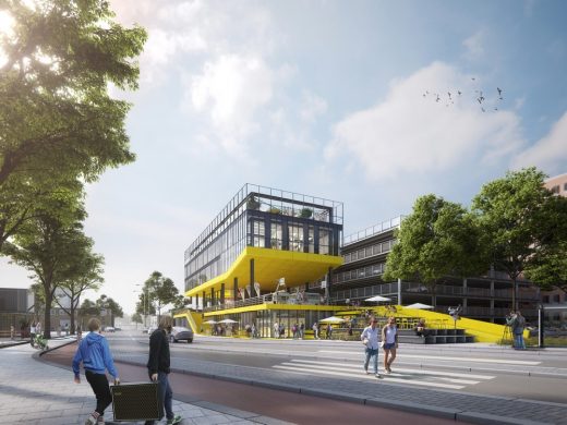
image © images Studio Komma / The Men of Foam
ZIP2516, Binckhorstlaan, Den Haag
Design: MVSA Architects
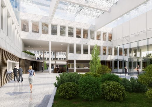
image © MVSA Architects
NATO Communications and Information Agency Den Haag
Amsterdam Architecture Walking Tours by e-architect
Dutch Architecture – Recent Selection
Eurojust Building
Design: Mecanoo / Haskoning
Eurojust Building The Hague
City Hall + Cultural Center in Nieuwegein
Design: 3XN Architects
City Hall + Cultural Center in Nieuwegein
Design: MVRDV Architects
MVRDV Glass Farm
Comments / photos for the Westfield Mall of the Netherlands in Leidschendam page welcome


