Les Mouleurs, Maastricht Real Estate, Dutch Building project, The Netherlands Housing, Architecture Images
Les Mouleurs in Maastricht
15 Jun 2022
Designed by Martens Willems & Humblé Architecten
Location: Maastricht, province of Limburg, The Netherlands
Photos: Arjen Schmitz
Les Mouleurs Housing, Holland
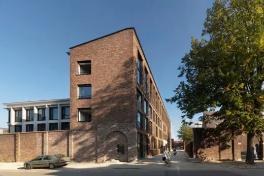
A building by a collective of private clients is integrated into the city and is a striking anchor point for the new residential area Sphinx South. The Les Mouleurs building plays a volumetric and compositional game with the old factory wall and the rhythm and height of the city.
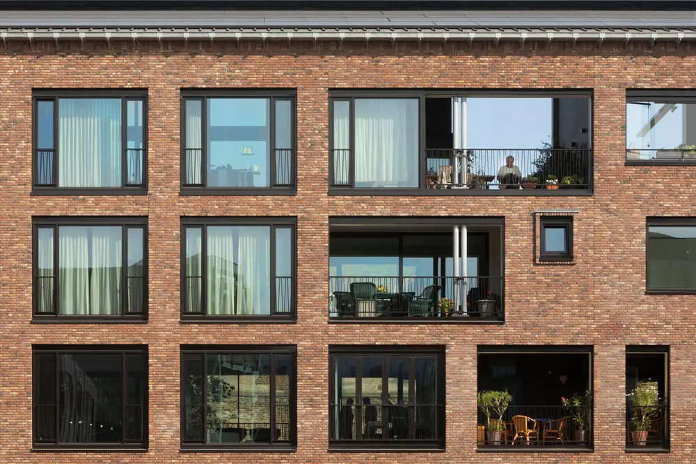
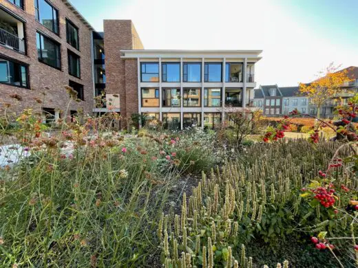
Throughout the structure, the different characters of the residents show themselves in the layouts of the large windows and in the large courtyard garden from which the large white concrete garden house looks back to the city.
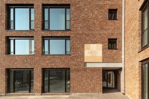
The name “Les Mouleurs” of the Collective of Private Clients is carved in stone above the main entrance. It is named after the mold makers from the former porcelain factory that stood on this location. It also symbolizes the way in which the building came about.
At the end of 2014, we were commissioned by the ‘Betrokken Wonen’ (‘Involved Liv-ing’) Foundation to make a preliminary design for their Collective Private Commissioning initiative. With the support of the Municipality of Maastricht, they had been given an option on a beautiful piece of land, on the former industrial area of Sphinx porcelain.
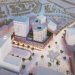
Hidden be-hind an old factory wall that encloses the Sphinx-Zuid site like a belt. Nothing could be seen on the vacant lot. Sphinx-South is part of the Belvedère plan, a large urban expansion on the north side of the city, in which the opening up of the landscape unknown to the city was in-tegrated. The master plan, very carefully designed by Palmbout Urban Landscapes, had be-come unsettled.
The banking crisis coupled with demographic shrinkage scenarios for the region had brought these ambitious developments to a halt in 2009. As a result of Les Mouleurs’ first plans, we were asked to review the urban design of Sphinx South. Together with the Municipality of Maastricht and Palmbout, we decided not to abandon the Master Plan entirely, but to update it within it’s own principles.
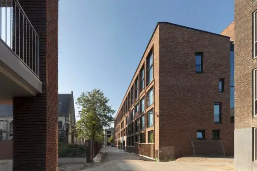
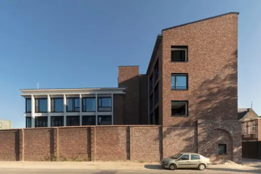
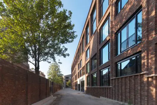
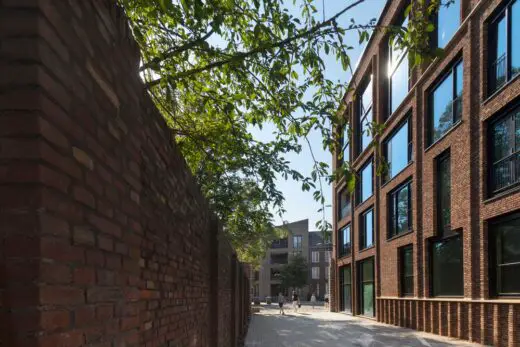
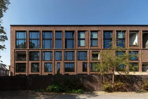
The main building of Les Mouleurs extends the old factory wall of Sphinx-Zuid and encloses an inner garden with an L-shaped movement. A bricked-up old gate is pressed into the new head facade, which places an exclamation mark on the old wall here. Behind the wall is a garden house that looks back to the city. The east facade accompanies the new street that provides access to the Sphinx quarter.
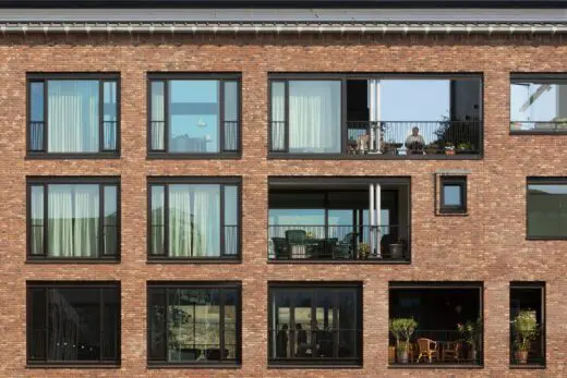
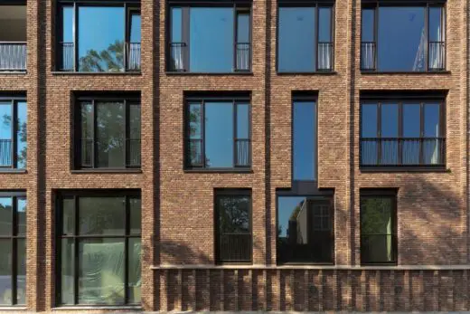
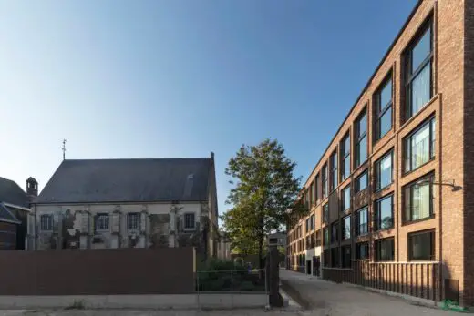
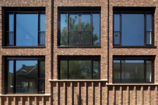
The new facade combines a sleek, regular vertical articulation with differences in the window layouts. It begins with a ribbed plinth that alliterates with the pegs of the old wall of the opposite laying chapel. Then comes a three-storey centerpiece covered with a cornice, which picks up the average height of the historic area. In addition, a series of double-height windows that, like a high Attica, provide a prelude to the higher new blocks of the development on Sphinx South. These formal means are used to anchor the new to the existing, partly monumental environment.
This need for formal representation does not apply to the north facade, which is lo-cated in a narrower street. We will never be able to perceive this facade as a whole. The strict order of the window positions we started with was allowed to fade away completely as a result of changes from within. At most, the basic scheme is still visible. This is also the case with the façades on the inner garden, where the many desired loggias took their own size where more freedom of composition could be taken on the garden side. The garden house, on the other hand, towers more formally above the wall and contrasts to the rest of the building.
The duality between the main volume and the garden house is also expressed in the choice of materials. The white concrete contrasts with the dark brick that appears to be from the old factory buildings. Together with the French limestone façade elements, which resemble the marl stones of the Andries chapel, the “local color” of history is included here. It is clearly a new addition to the cityscape, which seems as if it has always been there. Not a literal copy of shapes from the past, but a reference to them.
The first conversations with the board of Betrokken Wonen were about collective versus commonality and how this could be expressed in a building form, as well as about fulfilling their sustainability ambitions. From these conversations a basic concept was de-veloped with which, interested people could then be recruited. In this phase, important basic principles were established: Wide, shallow apartments where a lot of light can enter from both sides and with a view to both sides. Apartments of different sizes and with flexible layout options. Compact and central vertical circulation for maximum privacy. Indoor spa-cious loggias instead of hanging balconies to separate the placement of the outdoor space from the overall architectural composition.
There was also a conscious choice not to create a communal meeting space, the de-sign of the complex made it apparent that the inner garden would become the central meeting place.
The starting point was also a strong integration of the building with sustainable building technology: A smart roof in which heat exchange, ventilation and PV panels are in-tegrated; a well-insulated shell with brick from a local brick factory; a lot of high-quality glass with sun protection in the glass and in front of the window for maximum daylight en-try and view and limitation of the cooling load; as well as an energy supply linked to the nearby paper mill for heating and cooling the building.
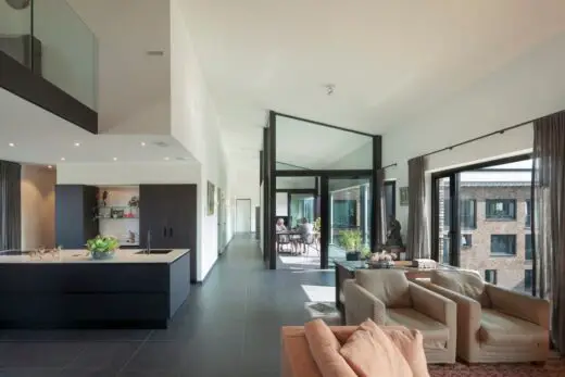
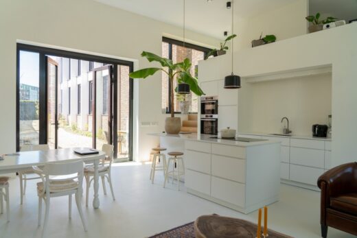
The first sketch plan combined a flexible interpretation of different house sizes with different house layouts of your choice. An open structure that is not hindered by structural elements because the floors span from facade to facade. A strip that could be subdivided into smaller sections, corresponding to a building grid of 3.6 m wide, in this case corre-sponding to the facade layout with large windows. The design refers to the idea of the “loft”. Only the location of bundled pipe ducts had to be fixed in strategic places, as a result of the logic of the technology.
Soon many candidates came forward from which, with some changes in the mean-time, a fixed group of 20 owners joined together. The first choice in principle was: What will our place in this complex be?
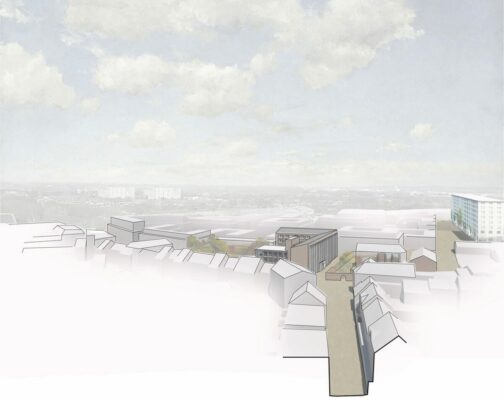
The perspective drawing, which we had actually made to evoke a first architectural image, shows three different forms of urban living: Contact with the historic street and the monumental environment on the lower floors; View of the downtown silhouette on the top floors; Living in the “garden house” behind the old factory wall in the green.
In a wonderful way all managed to find their favorite lot, their part in the whole, ef-fortlessly. From very personal motives. Even as the options narrowed, the last remaining puzzle pieces found a suitable owner.
At the beginning of the participation process, we had formulated a few simple rules of the game, which were expressed in a strict basic rhythm for the facade. Until then this had had a regular composition. But now the interior started to push itself more and more towards the outer facade. We could avoid allowing the theme of regularity and deviation, of order and coincidence in the facade. After all, every shift or deviation has a personal reason. The designer is no longer the only one who determines the appearance, but the cityscape does make demands on the overall appearance.
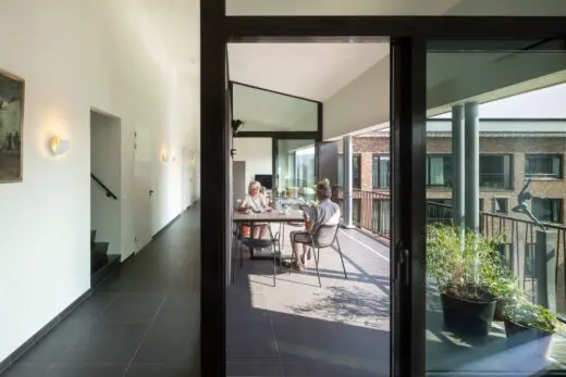
We learned that the position of the loggia very much determines the spatial identity of an apartment. The extra storey height and the floor structure made it possible to freely determine its dimensions and position. It was therefore happily pushed back and forth. Large windows to the floor on both facades were a basic starting point, but this principle was also questioned again and again. Where can I place my large bookcase or hang my be-loved painting? Can parapets be placed under the windows to display my collection? Can the sanitary room be used where that window is now? I just want less windows and more pri-vacy! Everyone had their own motives for making his, her or their home this or that. Unex-pected hobbies, collections, heirlooms, living experiences, or family histories demanded ex-traordinary answers to unpredictable questions.
In many serial housing projects, the prospective buyer remains anonymous. The hous-ing program is usually formulated neutrally as a shoe that fits everyone, but doesn’t really suit anyone. It is therefore a valuable experience for us that instead of using the building numbers from serial housing construction, we started calling these apartments by the name of the residents. Each apartment was given its own character, suitable for its occupant(s).
Les Mouleurs in Maastricht, Holland – Building Information
Design: Martens Willems & Humblé Architecten – https://www.martenswillemshumble.nl/
Completion date: 2021
Building levels: 4
Photography: Arjen Schmitz
Les Mouleurs, Maastricht images / information received 150620
Location: Maastricht, Netherlands, western Europe
Maastricht Buildings
Maastricht Building Designs – Selection:
Polyphemos, Klevarie
Design: Martens Willems & Humblé Architecten
photo : Philip Driessen
Polyphemos House, Klevarie Maastricht
Château St. Gerlach Estate Buildings, Valkenburg aan de Geul, near Maastricht, Limburg
Design: Mecanoo architecten
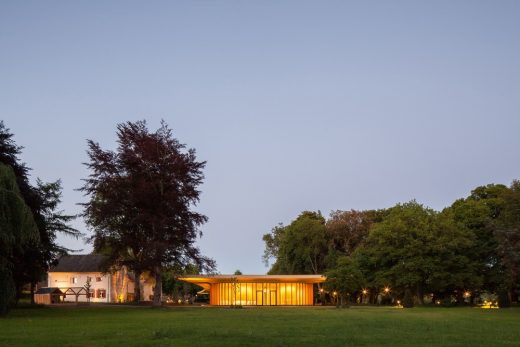
image courtesy of architects
Château St. Gerlach Estate Buildings
Pathé Maastricht, Sphinxkwartier Cinema, Sphinxkwartier
Design: Powerhouse Company, architects
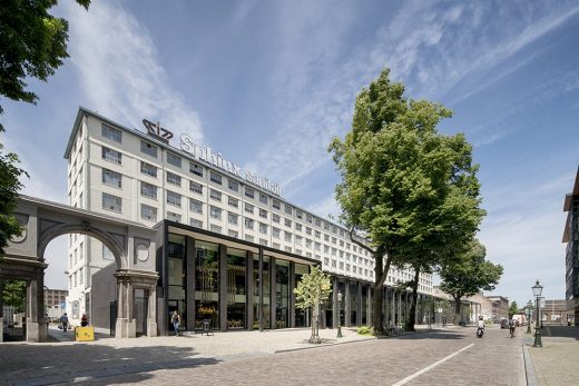
image courtesy of architects
Pathé Maastricht
V House
Design: Wiel Arets Architects
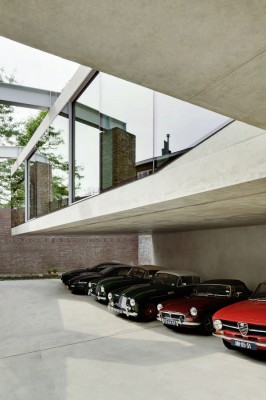
photograph © Jan Bitter
V House Maastricht
Architecture in The Netherlands
Contemporary Dutch Architecture
Netherlands Architecture Designs – chronological list
Amsterdam Architecture Walking Tours by e-architect
More Maastricht Buildings
Academy for Arts & Architecture
Design: Wiel Arets Architects
Maastricht Academy of Art & Architecture
Bookstore Selexyz Dominicanen
Design: Merkx+Girod architects
Maastricht Bookstore
Hotel Zenden
Design: Wiel Arets Architects
Hotel Zenden in Maastricht
Comments / photos for the Les Mouleurs, Maastricht designed by Martens Willems & Humblé Architecten page welcome

