Arnhem Cinema, Square, Museum, Park, Holland, Design, Architect, Project, News
ArtA Kunstencluster Arnhem
Art House, The Netherlands Building – design by NL Architects
21 Feb 2014
ArtA Kunstencluster Arnhem Building Design
Art House, The Netherlands
Design: NL Architects
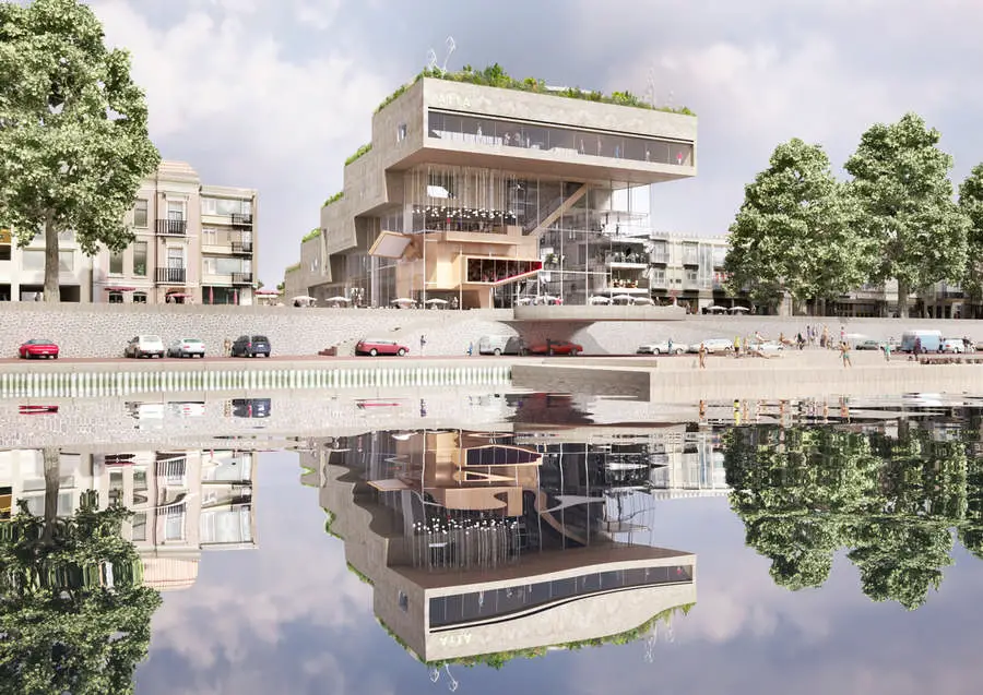
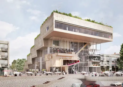
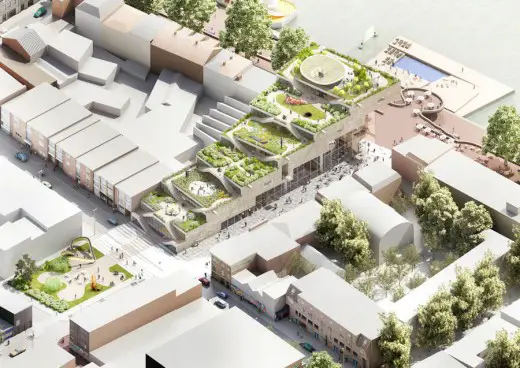
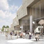
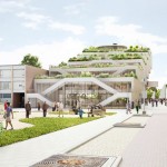
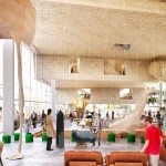
ArtA will be an exciting mixture of public functions: a ‘sandwich’ of cinema, square, museum and park: Art House, Art Square, Art Show, Art Park.
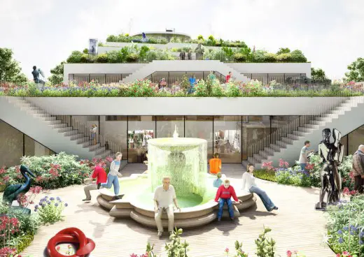
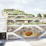
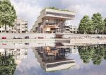
By pushing this programmatic sandwich down on one side the roof becomes accessible. At the same time the building opens up to the river. An easily accessible roof landscape emerges draped over vibrant city life: ‘urban moraine’.
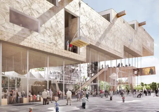
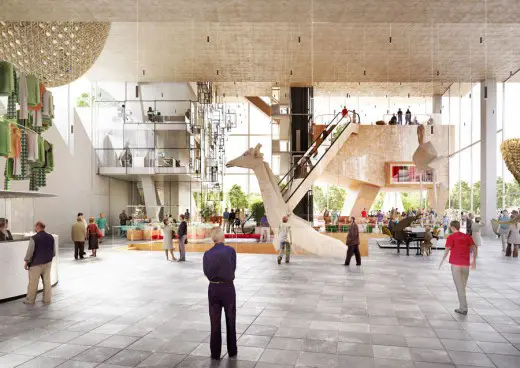
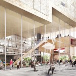
The Art Square will be placed between the museum and the film theatre forming a strategic vestibule for all functions in the building. The Art Square is intended as the catalyst of exchange between the different programs enveloping it. It will also serve as the public intermediary between the building and the city: a spatial interface.
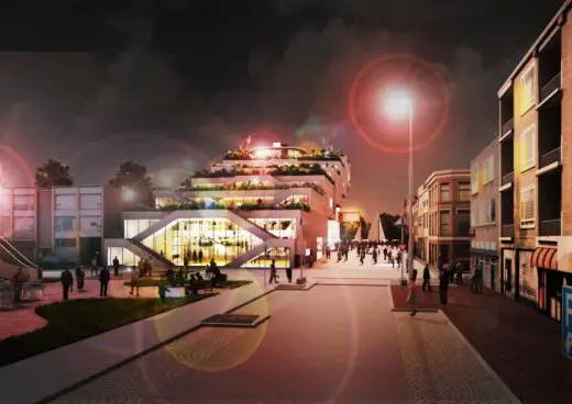
The threshold should be minimized. In order to perform in the best possible way the indoor square should be flush with ground level. To make this possible the movie halls are positioned underground -daylight and views to the outside are not crucial for this part of the program- with the Art Square on top. Welcome! Visitors can descend in a ‘cinematographic canyon’ excavated from the square.
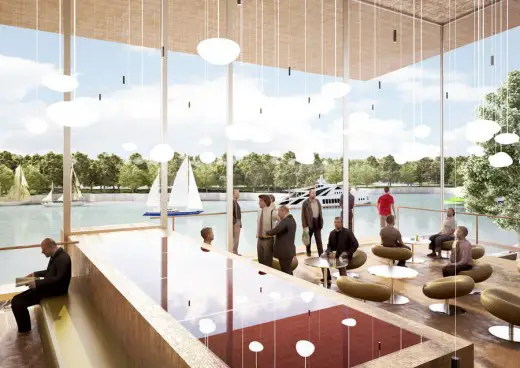
One of the halls seems to ‘escape’ from the base, a bit like a lava lamp: it will become a prominent and very visible emblem for the Cinema as a whole. Thanks to its elevated position it connects easily to the museum, it can become point of exchange. Big windows allow usage beyond the black box. An additional café or foyer can be placed on top featuring stunning views.
The sculpture garden is a fundamental part of the current museum. Let’s bring it back. By gently stepping down the volume a sequence of green squares emerges, a tilted New York High Line: giant stairs that invite for a stroll to the top. This abstract cascade of green forms a delightful background for the display of the sculpture collection. Hopefully the sculpture garden can be turned into a public park: for sports, leisure and art. Lunch break, sand pit, ‘bootcamp’. Rain as waterfall? BBQ with a view!
The routing on the roof is a ‘light’ version of the Baroque stairs in the garden of Villa Garzoni: a system of symmetrical flights that wind up, culminating in the stunning view over the River Rhine and the city. By turning mass into space daylight from the North will filter into the building.
A small pavilion on the summit contains a café and the quarters for the artist in residence as well as the elevator to the Art Square. The museum can be reached directly from the roof.
The museum halls get a logical position on top of the sandwich; if desired, daylight can easily be brought into the museum and carefully placed windows will grant wonderful panoramas.
One of the blessings of the wedge shape, of the ‘touchdown’, is that the museum meets the street level; it can be entered directly from the Arts Square. In principle the exhibition spaces have two entrances. Curators can decide on the routing. You can either start below and find you way up or take the escalator to the top and descend from there. By flipping the direction of the conveyor two fundamentally different spatial experiences can be staged.
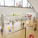
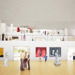
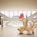
Inside the museum a grand stairway connects the subsequent levels. Mobile staircases can create shortcuts at will, allowing curators to unfold varying circuits from show to show. Plateau elevators bring the audience to the next level. The lifts are slightly oversized to allow sculptures (or sofa’s, or reading tables or …) to accompany the visitors on their way up or down, animating the art in an unexpected way.
We suggest that the permanent collection should not be placed in one specific part of the museum but could be ‘freed’ to travel through the museum. As such new relationships can be created with the space itself and the ever changing content of the museum.
How can a museum be shaped in such a way that is undefined and still full of character at the same time? How can you combine an ‘open’ plan –that allows endless configurations- with a specific spatial experience?
In ArtA this dilemma can be tackled by combining the rooms into one large hall that subsequently is segmented over different heights. The museum can either be experienced as ONE large interior landscape, or be turned into a sequence of distinct rooms with their required specific performances and atmospheres. The cascade allows freedom in the organization and at the same time offers a spectrum of unique spatial conditions.
The stepped character of the museum leads to a number of valuable opportunities: daylight can enter in a ‘natural’ way, it becomes possible to establish visual relationships and physical connections with both the sculpture garden on the roof and the Art Square below. The split-level organization renders shifting views and unexpected perspectives on the art; in a way it increases the visible spectrum. In addition the double height spaces that come into being at each ‘step’ might provoke specific interventions.
ArtA, as a consequence of the stepped volume, opens itself to the public and to the river. The wedge shape creates the space for larger objects to occupy the Art Square: the multifunctional hall, the ‘floating’ cinema, the office (with balconies towards the interior to catalyze interaction), the reception, wardrobe and art pieces all nestle in the wide open ‘beak’. The café could be intersected with the Art Square to become seriously Grand.
A swivel LCD screen -similar to the one on your camera- could work as a giant sign-board. The screen can, among many things, show the trailers of movies that are on. It can alternately serve pedestrians in the Nieuwstraat, people on the terrace of the grand café, visitors of the Art square or guest having a drink on the new balcony on the Rhine. Let’s go to the movies tonight!
ArtA Kunstencluster Arnhem – Building Information
Type: competition entry
Client: City of Arnhem
Size: 8,500 sqm
Location: Arnhem, the Netherlands
Architect: NL Architects
NL team:
Pieter Bannenberg, Walter van Dijk, Kamiel Klaasse
Gen Yamamoto, Eke Hoekstra, Jose Ramon Vives,
Laura Riano, Sander van de Weijer, Arne van Wees,
Mario Genovesi en Shane Dalke
Peter Bijvoet, DGMR
ArtA Kunstencluster Arnhem: text authorised by NL Architects
Location: Arnhem, Netherlands
Arnhem Buildings
Arnhem Building Designs
De Melkfabriek
Design: Team BPD | Studioninedots, Architects
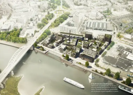
image : Studioninedots|Studiospacious|ZesXZes
De Melkfabriek Arnhem Buildings
Arnhem Museum
Design: Benthem Crouwel Architects
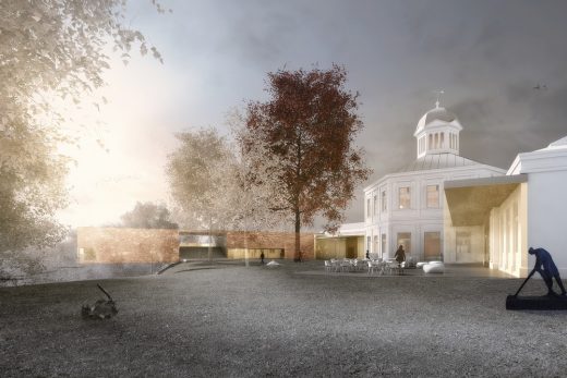
image from architect
Arnhem Museum Building
Arnhem Central Platforms
Design: UNStudio with Arup
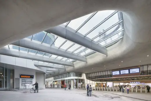
photo © Ronald Tilleman
Arnhem Station Building
Rehabilitation Centre Groot Klimmendaal
Design: Architectenbureau K van Velsen BV, Netherlands
Rehabilitation Centre Groot Klimmendaal Arnhem
Campus Presikhaaf Arnhem
Design: Broekbakema
Campus Presikhaaf Arnhem
Architecture in The Netherlands
Contemporary Dutch Architecture
Netherlands Architecture Designs – chronological list
Comments / photos for this ArtA Kunstencluster Arnhem page welcome

