Belaroia Hotel and Apartments Montpellier accommodation building, Modern southern French residential property photos
Belaroia Hotel and Apartments Montpellier
New accommodation building development in Southern France design by Manuelle Gautrand Architecture
post updated 8 November 2025
Design: Manuelle Gautrand Architecture
Location: Rue Jules Ferry, Montpellier, France
Belaroia Hotel and Apartments Montpellier Building
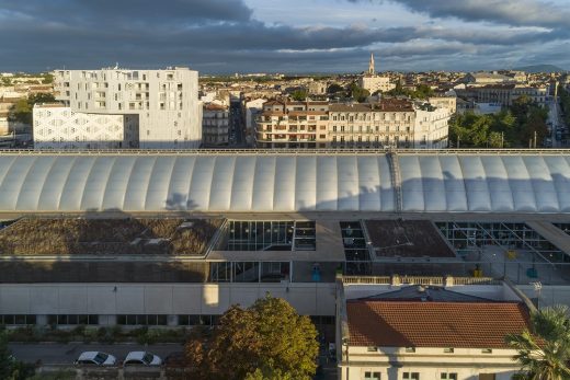
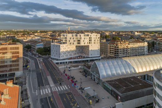
Belaroia Hotel and Apartments is an important project for the City of Montpellier and its development agency, the SERM, as it holds a strategic position between the city’s hyper-centre, characterised by its escutcheon form in plan, and new surrounding districts that have appeared in succession.
Its particular position is in fact on the prow of the Nouveau Saint-Roch development zone, and the first of the zone’s projects to be completed. To characterise this zone, the city highlighted the importance of a diversity of programmes, which our team interpreted as a hybrid project, interweaving two hotels, apartments, a seminar venue and an independent restaurant.
The site – the context
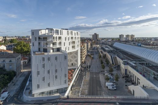
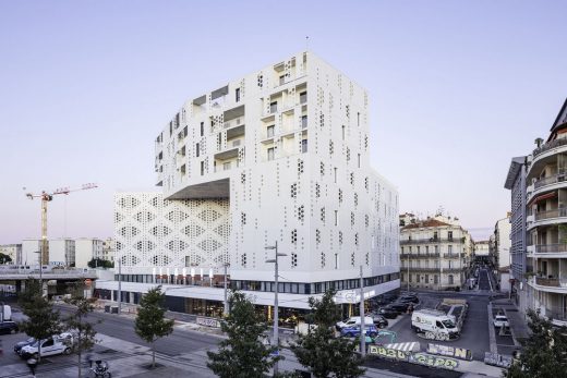
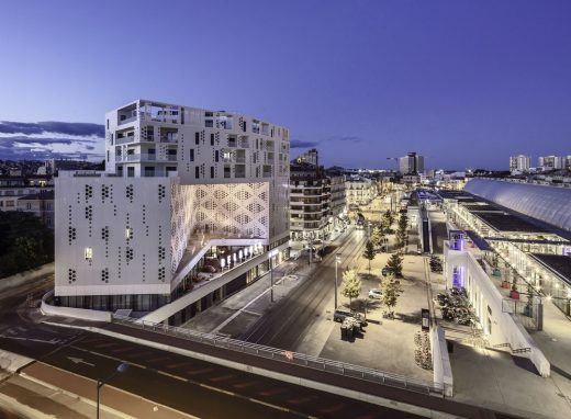
The site is right opposite Montpellier’s central Gare Saint Roch train station, and the BELAROIA is the first building you see as you come out of the station. The north terraces of the station overlook the project.
The massing
The small site led Manuelle Gautrand to stack up the functions, literally one on top of another, sharing some of the vertical circulation between different elements of the programme.
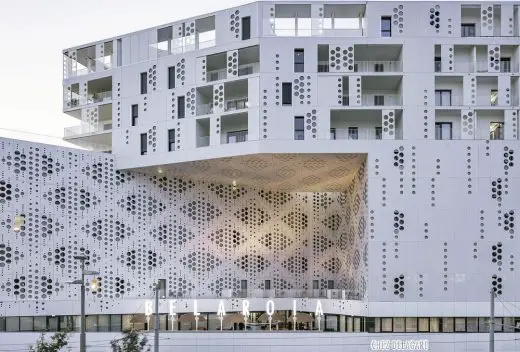
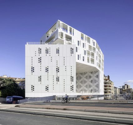
The complex triangular form of the site led us to design a continuous volume with a succession of folds that unfurl along the north and the east facades, topped by a wide bridge along the south facade.
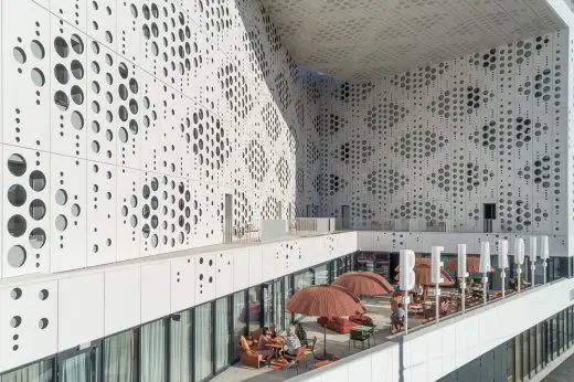
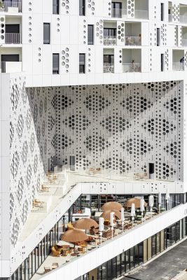
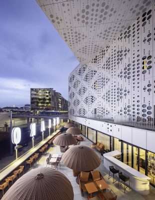
At the middle of these folds is set a large hollow volume, orientated to the south and sheltered by the bridge that overhangs it. This magnifi cent conch shelllike form is an extra element, a meeting place for all the users of the different programmes, a café with a terrace looking out over the train station, which faces us.
A project designed around public space, and hollows rather than solids
In this particular project, the almost immediate aim was to create, to orchestrate, and to provide an external space for all the building’s users, from each of the different programmes but also from the entire neighbourhood: a neighbourhood characterised by the station and its thoroughfare, by the nearby historic city centre, and by the future programmes that will gradually appear within the development zone.
Providing this majestic communal space was a way of giving a magnifi cent ‘shared’ urban room in the very first building constructed in the development zone, a way of positioning the level of engagement and ambition of this new neighbourhood.
Stretching and densifying a city does not happen without a trade-off, without providing, in compensation for space taken, new public places that constitute landmarks, places for meeting and amenities.
The ‘urban living room’ is the first room of the project, a great unifying void around which all our solids will wrap, sitting on a podium that houses all the entrances, it is then surrounded by the two hotels and overlooked by the apartments which crown it. It becomes a sort of urban stage, framed by animated wings (the hotel rooms): it is the starting point and the heart of the whole project.
Around this void the solids are successively distributed on the site, successively defining the various surfaces of the void, including that of its roof, to create a half-indoor, half-outdoor space protected from the wind and rain, an open stage fanning out on the southern side, addressing the midday sun and the station.
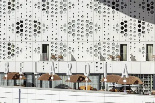
The programme is both simple and rich: the breakfast room of the 4-star hotel, a place for eating at any time of day and a fantastic bar in the evening, lit up by the giant luminous letters of BELAROIA.
Around our ‘urban stage’, layers of different programmes
The ground floor of the project tucks in along the retaining wall of the Pont de Sète road bridge and aligns with the two other edges of the site. It is consequently partially below ground and enclosed along the bridge side, more generously open on the east and south sides, where it incorporates the entrances for each programme.
Consequently, from north to south are the following: – On the north, the Campanile Hotel entrance and the entrance to the underground car park, – On the east, the Golden Tulip Hotel entrance and one of the two entrances to the restaurant, – On the south, the main entrance to the restaurant and the entrance to the apartments.
The two hotels:
The fi rst fl oor has a barely reduced perimeter, which, above the entrances to each programme, creates a base of communal spaces: a seminar venue with six meeting rooms, the bar with its magnifi cent terrace – where breakfasts are also served, and a spa and wellbeing centre.
Subsequently the two hotels are found on levels 2 to 7. They are integrated one after the other into a folded continuum, the first fold housing the 82 rooms of the Campanile to the north, the second the 105 rooms of the Golden Tulip. The latter are complemented by several suites over the next 4 floors, some of which are split-level.
In order to mutualise some of the vertical circulation, notably in case of fire, the circulation of the two hotels is inter-connecting in the middle in order to use the same fire escape. Everything in this project has been studied carefully in order to minimise the impact of each constraint, mutualising spaces and services, down to circulation and fire escapes. The project is a three-dimensional puzzle, where each square metre is precious, cleverly used and always assigned to prioritise quality spaces.
The apartments:
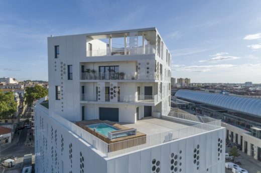
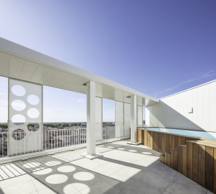
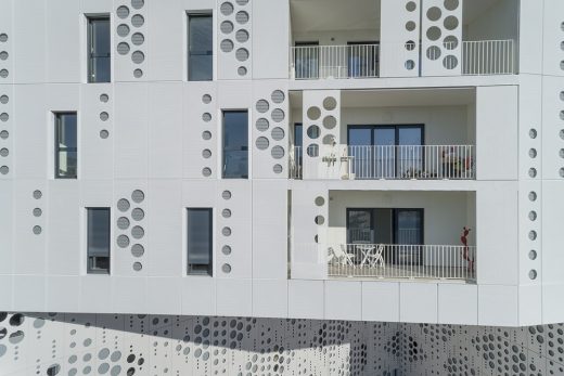
Finally, between levels 8 and 11, the last fold of the continuum houses the 12 one- to four-bedroom apartments. Four of the apartments, on the two top floors, are split-level: most of their rooms are on the lower level, with one room (kitchen or bedrooms, by request) on the roof, opening onto an open-air terrace with a swimming pool.
Because of their height (from 21 metres above ground level), the apartments have magnificent views over the city: to the north the historic centre of Montpellier, with the area inland from the Mediterranean in the distance. To the south is a more recent area of the city, with the sea in the distance.
These apartments were not actually part of the programme initially proposed by the City at the time of the competition. But the ambition for diversity mixed with that of creating a lively city block and a symbol of the regeneration of the neighbourhood incited us to incorporate some residential into the project.
Manuelle Gautrand Architecture didn’t want this project to be solely destined for ‘transient’ users. With the block so close to the station and the anticipation of exceptional views over the city and beyond, it seemed impossible not to give over part of the project to residential.
Certainly there wasn’t room for many apartments, but it makes it possible to incorporate long-term life and is a reminder that housing, in all situations, remains an essential component of the city: it needs to be everywhere, and should accompany almost any programme.
It is this permanent presence in the apartments, the programmatic Ariadne’s thread, that ensures the city’s success in meeting today’s demands: to be inclusive and accommodate new inhabitants with maximum generosity.
The facades:
With its great folds, the project does not have main front and back facades, but instead is a continuous loop of successive programmes, all enveloped in the same bright and homogenous material.
High environmental ambitions, among other factors, led us to prioritise very compact volumes, reinforced by an envelope largely insulated on the outside.
All the volumes are covered with a single cladding system to ensure simplicity and unity of form. On the upper section, this cladding is partly made up of sliding panels to shelter the apartments’ terraces, and then on the top floor the generous open-air terraces of the split-level apartments.
A profoundly environmental project:
The programmatic diversity and the particular density of the project helped us to design economically: everything contributed to minimising resources. Density and compactness helped us to minimise facade surfaces and their energy requirements. But even more important was the possibility of mutualising some of the services, the vertical fire escapes, some of the plant rooms, and the underground car park.
The project has been cleverly assembled to minimise space required for services in order to provide more communal areas and functions for public use. In a fair exchange, it could be said to take surface area from the host city but to give some back as shared space.
Even if these spaces remain ‘private’, as they are maintained by the management company, they are open and welcoming to the general public, reinforcing the attraction of the project and opening it to a broader public: not only the users of the building’s different programmes, but also all Montpelliérains.
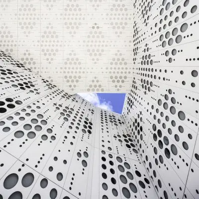
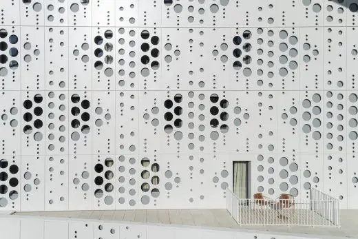
The facades were designed so as to envelope the whole project in a homogenous cladding system, generally covering external insulation. This cladding was designed to cater for the different functions that it covers: opaque or micro-perforated over the solid areas, perforated with large round openings in front of the windows of the hotel rooms, and finally sliding to shelter the north- and south-side terraces of the apartments, providing privacy and shade. Their white colour minimises heat absorption.
The large urban living room is orientated to give onto the station and its own terrace, but also due south to benefit from the sun: the shape of a conch shell, it faces the sun at midday, which is sufficiently low in the winter to benefit from its warmth, and sufficiently high in the summer to avoid over-exposure.
In the summer months, the terrace is more protected from the overhead sun, with parasols and vegetation to come. At the back of the urban living room, the last fold formed by the volume of apartments leaves a welcome opening to the sky, allowing for natural cross-ventilation to help cool the space.
The structure of the bridge building
The building is divided into three structurally distinct parts: two concrete-structure blocks (housing the hotels) topped with a mixed concrete–steel structure forming a three-dimensional truss (housing the apartments on four levels).
The construction of this element involved assembling 80 tonnes of steel structure 21 metres above the ground. A steel structure spanning 25m, 16.3m wide and 9m high. This bridge forms a module slightly folded at its centre, into which are grafted the apartments and terraces.
A design that forbade the use of a classic truss, which would not have resisted in torsion. The bridge building is therefore made up of 72 interlocking joists, of which 15 cross the apartments obliquely.
Within the apartments, the future inhabitants have been able to choose whether or not to leave the large diagonals of the Warren trusses visible. Those that have been left visible create a ‘loft’ feel in the apartments.
On the north-east wall, the elements were fixed by a spherical bearing to an insert embedded into the reinforced concrete floor slab. On the south-west wall, the lower joists slot into a 72cm deep recess, with a possible dilatation of up to 10cm. A solution that meets the seismic regulations of this zone classifi ed «low-risk».
Perpendicular displacement is blocked by bearings that can slide vertically, allowing for longitudinal dilatation.
The lower edge of the three-dimensional truss is dressed in steel tray, flocked on their underside and the covered in micro-perforated cladding with the same pattern as the facade. The upper floors are braced by a cross of St Andrew. Overall stability is reinforced by the concrete slab of the roof.
Belaroia, Montpellier, France – Building Information
Design: Manuelle Gautrand Architecture
Programme: A GOLDEN TULIP hotel (4*), a CAMPANILE hotel (3*), 12 apartments for sale on the open market, a restaurant, a spa, an underground car park.
Investor and Hotel Operator: VALOTEL FRANCE
Developer: LINKCITY
Design Team: ARTEBA: executive architect CEEF: facade engineer VERDIER: structural engineer BARBANEL: services LASA: acoustics
Other Consultants: ATELIER ARCHANGE: interior design of hotels
General Contractor: BOUYGUES BATIMENT SUD-EST
– Building: Gross floor area: 10,000m² Cost of works: 19 M€ ex. VAT
– Hotels: Hotel Golden Tulip: 102 rooms Hotel Campanile: 80 rooms
– Environmental standards: RT 2012
– Calendar: Design phase: 2011 – 2013 Site: 2017 – 2019 Completion: September 2019
Photography © Luc Boegly / Drone photos © Julien Thomazo
Drawings, texts, plans © Manuelle Gautrand Architecture
Manuelle Gautrand Architecture
Belaroia Hotel and Apartments in Montpellier, France images / information received 241019
Location: Rue Jules Ferry, Montpellier, France.
Montpellier Building Designs
Montpellier Building Designs – selection from e-architect:
Les Jardins de Verchant: Apartments, Montpellier
Architecture: NBJ Architectes
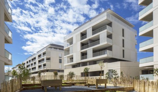
photo : Paul Kozlowski
Museum of the Human Body Montpellier – Cité du Corps Humain architecture competition
Design: BIG + A+Architecture + Egis + Base + L’Echo + Celsius Environnement + CCVH
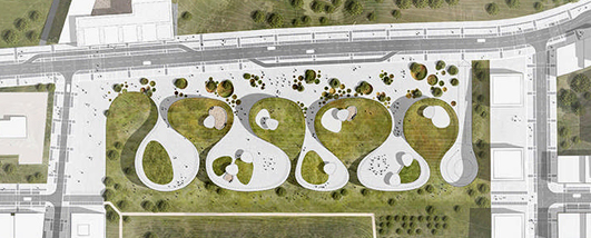
image © BIG
Leonard De Vinci High School in Montpellier
Design: Hellin-Sebbag architects
Jean-Claude Carrière Theatre
Design: A+Architecture
Sailing Cube in La Grande Motte, Montpellier
Design: Atelier Jérôme Lafond
Montpellier building design by Zaha Hadid – Pierre Vives
Design: Zaha Hadid Architects
++
New Buildings in France
French Architectural Projects
French Architect – design firm listings
Comments / photos for the Belaroia Hotel and Apartments in Montpellier Architecture design by Manuelle Gautrand Architects, France, a page welcome.


