Maggie’s Nottingham Building Architect, Image, Cancer Caring Centre England
Maggie’s Nottingham Building
Cancer Caring Centre in England design by Piers Gough, CZWG, United Kingdom
9 Nov 2011
Location: Nottingham, England, UK
Date built: 2011
Design: CZWG
Maggie’s Centre Nottingham
Project Description
Maggie’s Nottingham serves the Mid Trent Cancer Network and is situated next to the Breast Institute at Nottingham City Hospital. The Mid Trent Cancer Network covers the populations of Nottingham, North Nottinghamshire and Lincolnshire – approximately 1.3 million people. Within this area, there are over 4,000 new cases of cancer a year.
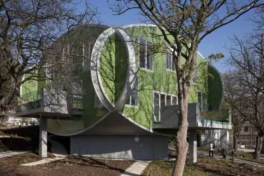
photo : Martine Hamilton Knight
Maggie’s Nottingham Building Design
The near symmetrical design and generous height of Maggie’s Nottingham allows the building to have a sense of space and balance. The oval building of green glazed ceramic tiles floats over a smaller basement, with plants and trees surrounding. Balconies extend from the kitchen and sitting rooms and provide places from which to look out onto the surrounding landscape, which is designed to use scent and texture to create a secluded and uplifting area for people to enjoy.
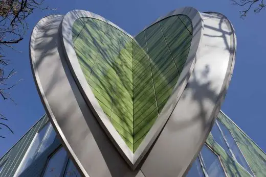
photo : Martine Hamilton Knight
“The light, peaceful and non-institutional design of Maggie’s Nottingham is a sanctuary for all those who walk through the door. From the outside the playful appearance entices people to take a look through inside; once they do the harmony of light and space creates a uniquely welcoming environment.
It’s a daytime event. It’s a place for living, rather than sleeping.”
Piers Gough, Partner CZWG Architects
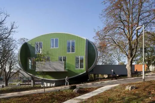
photo : Martine Hamilton Knight
Nottingham-born fashion designer Sir Paul Smith has designed the interior of Maggie’s Nottingham. Each room has carefully selected pieces of furniture and objects from around the world – all with their own story to tell. The upholstery of these pieces include a Paul Smith tartan and floral printed fabric. The upholstery of several chairs within the building make a direct reference to the classic Paul Smith stripe.
“I am delighted to have been involved in creating this Centre for people living with cancer and their family and friends. It will be a great resource for everyone and a fantastic new addition to the city.
Piers Gough is an incredible architect and it has been a joy to work together on the design.”
Sir Paul Smith
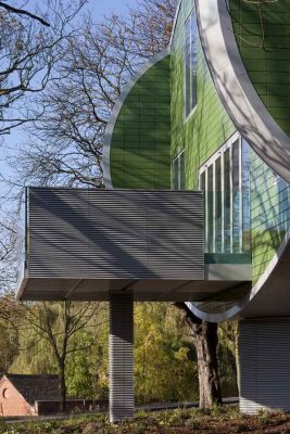
photo : Martine Hamilton Knight
Maggie’s Nottingham : A short film by Living Projects
Maggie’s Nottingham film:
Maggie’s Nottingham building film on YouTube
Living projects has produced a short film on the new Maggie’s Centre in Nottingham. The film is the latest collaboration from director Richard Mullane and architectural photographer / videographer Tim Crocker. It tells the story of the design of Maggie’s Nottingham, revealing how Piers Gough, Partner at CZWG architects, Paul Smith and Maggie’s hope the centre will be used and enjoyed.
Living Projects focus on producing short films about people, places and architecture. We take a highly aesthetic approach to filming people in spaces, buildings and places, using perspective correction photography for moving image. We combine this with a deep understanding of the design and planning process to create compelling narratives that bring buildings, those who created them and the people who use them, to life.
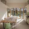
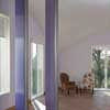
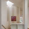
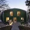
photos : Martine Hamilton Knight
Maggie’s Nottingham Building Information
Project name: Maggie’s Nottingham
Address: Nottingham City Hospital Campus, Hucknall Road Nottingham, NG5 1PB
Status: Completed
Construction Start: Autumn 2010 (8 Nov 2010)
Contract duration: 11 months
Completion: Oct 2011
Construction Cost: £1.45m
Cost per m²: £4000
Area: 360 m² (144 m² on each of two floors above a 72m² basement)
Contract Type: Traditional
The Brief
Maggie’s is a well-established charity. Named after the late Maggie Keswick Jencks, the centres are based on her idea of an alternative environment to a hospital where cancer patients and their families can take time to discuss and learn more about the illness and the situation that the patient and surrounding family and friends may face. This year (2011) Maggie’s is celebrating ‘15 at 15’ – its 15th year since the first centre was built in which time 15 centres have been built across the UK.
The design team were given a very clear and succinct design brief as the charity is born of the belief in Maggie’s original idea and has had 15 years of subsequent experience of constructing such buildings.
Nottingham City Hospital agreed to host a Maggie’s Centre on its campus. A number of sites for the building were considered within the campus including a disused Chapel but this was later rejected as it was thought restricting to change the focus of the use within such an existing building.
The chosen site, a sloped grass verge nearby to the Breast Institute, had the following attractions for the new Centre:
– Small and secluded from the surrounding noise of the hospital campus by mature trees.
– The sloping site was unlikely to be required by the hospital for clinical buildings in the future
– Close to the oncology and breast units of the hospital.
– Pleasant views and aspects from the building that are also not for immediate future development.
– Close to an entrance to the hospital grounds for ease of navigation.
Maggie’s Centre Nottingham – image from 2010:
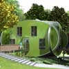
image © Maggie’s Centres
The Design
‘The idea was to make a refuge, something slightly hidden away, nestling into the trees and away from the hospital.
The building is almost perverse in its symmetry. The requirement of the brief seemed to me exactly symmetrical and it seemed intriguing to do a building that wasn’t free-form; the landscape around it is quite loose and free so the building could become symmetrical. The conceit is that the elevations are all ovals and they interlock like a Canadian log house.
I hope that people will find it charming, something like a surprising home’
Piers Gough, Partner CZWG Architects
The oval elevations of the building appear as ‘friendly oval faces’ – something almost like a fairy-tale building which the visitor comes across in the charming little patch of woods amid the les charming site of the hospital.
The near symmetrical design and generous height allows Maggie’s Nottingham to have a sense of space and balance. The oval elevated building of green glazed ceramic tiles floats over a smaller basement, with plants growing up the sides. Balconies extend from the kitchen and sitting rooms and provide places from which to look out onto the garden, which is designed to use scent and texture to create a secluded and uplifting area for people to enjoy.
The interior contained by those four flat, friendly oval faces is extremely straightforward and domestic. The focus of the internal spaces is on conventional comfort and real rooms with the spaces having a homely feel to them. The building which is spread over two floors and a basement, is square on plan and is set diagonally on the sloping site.
Unlike many of the other Maggie’s Centre’s where you enter straight into the kitchen or social space, the entrance to this Centre is unique. Visitors arrive into a central lobby space via a bridge which passes through the trees and plants on the sloping site. From the central lobby one can follow the stairs in front straight down into the double height kitchen space with its own balcony framed by the surrounding trees.
Directly off from the central lobby there is a staff office and a library – each with their own balconies framed by the trees. The ground floor also has two medium sized sitting rooms.
Also off the central lobby is the central staircase, lit by a clerestory window, and lift which takes you up to two consultation rooms, a day bedroom, two lavatories (one disabled) and a large meeting space, which can be used for exercise classes, and various functions or events. This main meeting room space has flexible partitions so that it can be divided for smaller group work. The ceilings on this level follow the curves of the sloping roof and give the space a unique sculptural feel.
Client quote:
“Design and architecture are very important to Maggie’s centres and to visitors because from the outside the buildings are striking and stunning, when people enter they come with a certain curiosity and what they’re met with is this beautiful light and this openness and beautiful lines. They feel a sense of being somewhere special which is uplifting to them and makes them feel special as well”
Mandy McMahan, Centre Head Maggie’s Nottingham
Maggie’s Nottingham Design Team
Architect: CZWG
Interior Design: Paul Smith (Interiors)
Structural engineer: Adams Kara Taylor
M&E consultant: KJ Tait Engineers
Quantity surveyor: Turner & Townsend
Lighting Consultant: FOTO-MA
Landscape Architect: envert studio
Project manager: Turner & Townsend
Main contractor: Bowmer and Kirkland Building Services
CDM coordinator: PFB Construction Management Services
Approved building inspector: MLM Building Control
Maggie’s Nottingham – image from 2009:
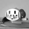
image © Maggie’s Centres
Maggie’s Nottingham – Cancer Caring Centre – images / information from CZWG
Location: Nottingham City Hospital Campus, Hucknall Road Nottingham, NG5 1PB, UK
Nottinghamshire Buildings
Nottinghamshire Architectural Designs
Maggies Cotswolds, Cheltenham, England
MacCormac Jamieson Prichard
Nottinghamshire Architecture – Selection
MediPark for Nottingham
Studio Egret West
MediPark Nottingham
, Nottingham
HawkinsBrown
New Art Exchange
Old Market Square, Nottingham
Gustafson Porter
Nottingham square
Comments / photos for the Maggies Nottingham page welcome

