Techsize Living Aesthetic Exhibition Hall Hangzhou Design, Modern Chinese Interior Architecture Photos
Techsize Living Aesthetic Exhibition Hall in Hangzhou
2 July 2022
Design: Chen Lin and Cui Shu
Location: The Sixth Space Building Materials Museum, Binjiang, Hangzhou, Zhejiang Province, East China
Photos by Pan Jie, WM STUDIO, Si You
Techsize Living Aesthetic Exhibition Hall, Hangzhou, China
A Collaborative Design by Chen Lin and Cui Shu丨Techsize Global Flagship Store
The mind is as deep as a valley, the friendship is as deep as water.
Being righteous and well-mannered,
If so already, take it easy!
— Feng Zikai
Beauty is always hidden in a large environment, exists in life, and appears in all things.
In such a space, the elements of wind, fire, water, and soil change and move, where the stripes are deep and brilliant, the lights are clear and independent, the water rhythm is light, and the ink brush is vigorous and bold.
Realization of beauty
“Observing without evaluating is the only realization of beauty.”
–Jiddu Krishnamurti
Originated in Spain and located in Hangzhou, the Techsize global flagship store adheres to the spirit of “feeling new beauty and exploring new trends in art and design” to convey the brand concept of “creating a beautiful living space”. Breaking through the traditional display logic, the design does not focus on displaying product features, but to present the spiritual core, thus creating a space full of art and a living atmosphere.
1 Transcendence and experiment
The story started with a phone call in the summer of 2020. Chen Lin, who likes to tell stories via immersive scenes, emphasizes the concept of “being practical and beautiful”, which coincides with Techsize’s vision of conveying a better way of life. In addition, he invited Cui Shu, a designer who is rebellious, individual, delicate, and rigorous to collaborate on this project.
As a design across age and city,
it is just because of the willingness to surpass,
that the practice comes into being.
Combination
As a result, the two designers from different cultural contexts complement and contrast in respective perspectives and understandings, interpreting the flexibility of spatial scale, the spirit of details, and the tension of creativity.
As a designer born in North China, Cui Shu thought that the space of 400 square meters was not large at first, so he planned to present it in a pure and complete way. On the contrary, Chen Lin, who had the subtle temperament of the people in South China, thought that the space was not small, and he proposed to bring the artistic conception of landscapes in the south of the Yangtze River into the design.
Explored, collided, reorganized, and combined, they often worked and communicated until the early morning. Gradually, their respective inspirations are overlapped in a three-dimensional way.
Creativity
Between architecture and nature, design and aesthetics, unity and change, balance and emptiness, their creation is not to design shapes but to create life.
So, eastern art and western culture collided in the interlaced time and space, in which the common beauty of good design, products, and craftsmanship is generated through the control of density and rhythm. When the visitors stepped into that hazy and implicit tension of space, the infinite possibilities of space can be felt.
2 Departure and Arrival
First and foremost, it is an aesthetic life museum.
The ink-colored building stands still in the surrounding irregular mapping waterscape, and what makes people stop and watch is the freehand brushwork revealed from the wide windows: the layers of parallel lines are the background, the flexible water ripple texture is an ornament to space, and a long case is used to bring out the theme.
Life is always between departure and arrival, the most important thing is to maintain this attitude of not knowing and have a firm grasp of yourself in the midst of wandering.
– Bei Dao
Beginning point
The window at the entrance presents a scene of a family dinner, where people can sit and share their thoughts on life. Waiting for the time to go by, have a drink, and enjoy the lush greenery outside the window.
However, people who enter cannot directly reach this space. The first thing they step into is a roundabout way made by the Techsize rampart, which is like hills, water, clouds, and fog. The vast and strong sense of mystery attracts visitors to go deeper into the stillness to explore further. When ascending step by step, the open and flat way suddenly turned into a bridge on the water, which is a long and narrow path in a pure black background with scattered white dots, as if walking in the Milky Way.
All the encounters along the circular display route come to a common destination. Such an indirect process of entering includes the visual attraction, the material display, and the atmosphere felt by the body and mind. Just like life itself, it starts from the initial appearance of everything, then to reality, and finally to the truth behind it.
Destination
Themed with departure and arrival, the space is like a journey, from the collision of inspirations to the completion of the ideal work in the heart. It is also the starting point of an ideal life conception for visitors.
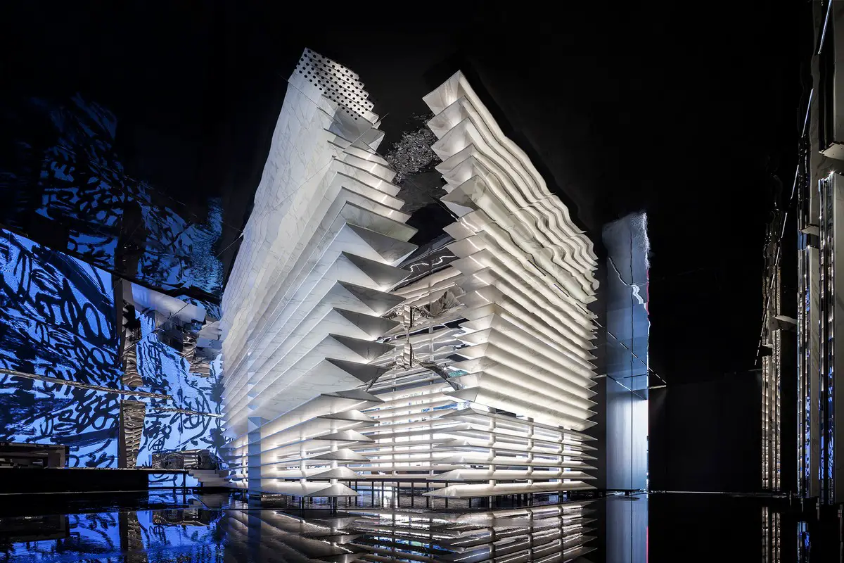
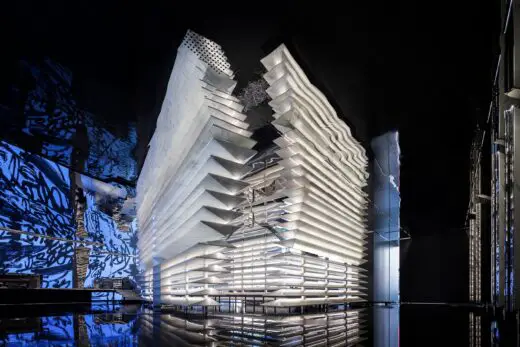
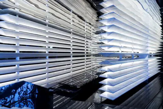
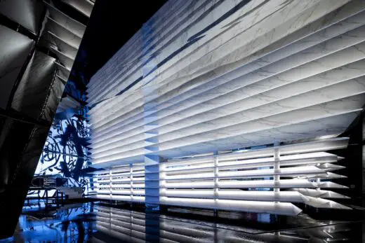
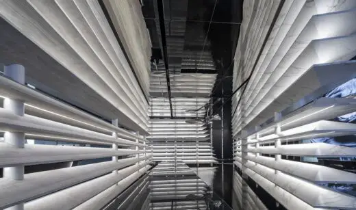
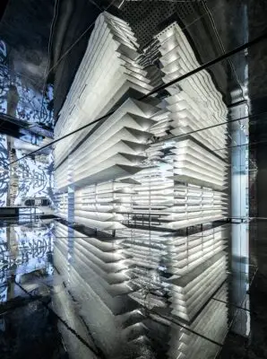
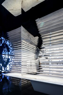
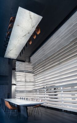
The layers of 3D carved slabs are superimposed to outline the mountain, and the irregular edges are like the aeolian monadnocks that have been eroded for thousands of years.
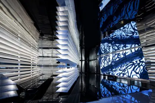
Taking advantage of the nonabsorbent and impermeable feature of the product material, the surrounding waterscape makes the floor a form of an island, achieving the poetic sense of mountains surrounded by lakes and the lake reflecting the green mountain.
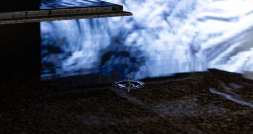
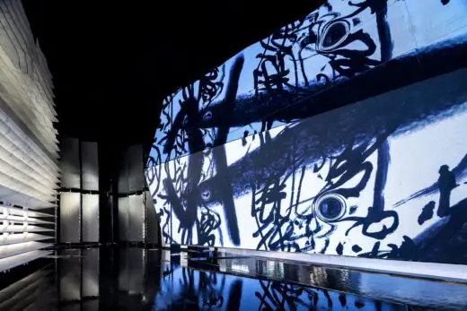
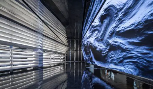
In addition to conveying awe and praise to the landscape, the designer tries to express the restoration of the connection between man and nature. The multimedia art displayed throughout the exhibition hall showcases the changing scenery of mountains, rocks, and ravines, which turn into the silky texture, the West Lake ripples, and finally the black and white ink.
In any case, humanities are always the most outstanding embellishments in nature. The cycle in the video is exactly a dialogue, an exploration, and an experiment!
3 Construction and subtlety
Like Yayoi Kusama, who used mirrors, metals, light bulbs, wood, and water to create the installation art of Fireflies on the Water, a poetic existence often makes everyone who walks into the space forget the worldly reality but see the vastness, depth, and dream. The profound meaning is about the mind and the atmosphere.
We can’t change the outline of a mountain, the flight path of a bird, and the speed of the river’s flow, and we can observe it and discover its beauty.
Gorgeous canyon
Just like this dark-colored space, every time going deep inside, one will feel like being in a canyon, which is also a metaphor for the brand concept that the product comes from stone and is better than stone.
The abstract shapes of mountains are constructed vertically, which are towering and heavy, marking out the straight and staggered paths smoothly. When observed carefully, the delicate patterns on the material are like the Danxia cliffs carved by wind and rain for thousands of years, with diversified colors and changes.
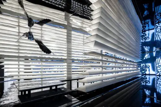
When stop and look up, visitors will find out the geometric objects irregularly distributed in space. They are either suspended, inverted, or attached, sometimes reflecting the sparkling water, sometimes shining upon the changing lines, just like the cliffstone in the canyon. They are the little subtleties that exist distinctly in the great majesty.
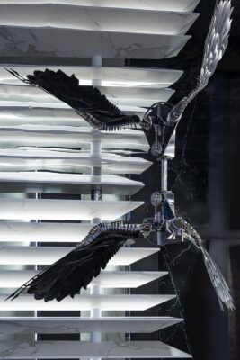
The most awesome thing is a “flying bird” suspended in the crevice of the canyon where light penetrates. Made from superimposed metal plates and bearings, it slowly opens wings in the canyon.
“When the birds in the mountains flew over the head, a strange eye contact happened in the air. After a long period of silence and dormancy, the treasuring and love for all things in the world emerged.” This flying clue is set as a foreshadowing in the space.
Ink painting
“Indoors, clean hands, burn incense, and practice calligraphy among the fragrance of ink with a calm and peaceful mind.” This is the aspirational poetic life in oriental aesthetics.
「Subtle and mysterious, deep and unfathomable」
If this space is calm and stable, then the famous calligrapher Wang Dongling’s writing can always stir the human mind. Wang’s cursive calligraphy has a charm of rotating like a star cloud, which is sharp and gentle with restrained firmness, echoing the characteristics of slabs, that is hard with flowing texture and warm touch.
The calligraphy of Su Shi’s verse, “The rocks on the cliffs are like clouds, and the stormy waves slammed them violently, rolling up like snow.” is a variation of the cursive script in the modern context, it is a clarification in the chaos, and chaos with the beauty of dance and abstraction. As it is said: that’s when everything settles down during a happy journey!
Wandering in this space, visitors can not only feel the exquisite products and craftsmanship but also imagine the infinite possibilities of customized application of Techsize slabs, as well as the possibilities to explore humanities, art, and aesthetics. In such a complete space integrated with nature, humanities, and technology, a journey full of energy that travels thousands of miles in openness starts from here.
Techsize Living Aesthetic Exhibition Hall, Hangzhou, China – Building Information
Project Name: Techsize Living Aesthetic Exhibition Hall
Project Location: The Sixth Space Building Materials Museum, Binjiang, Hangzhou, China
Project Area: 408m²
Completion Time: 2022.05
Chief Designer: Chen Lin, Cui Shu, Chen Linping
Design team: Kong Weiqing, Li Hui, Na Mula
Calligrapher: Wang Dongling
Written by: Cui Shu
Photographers: Pan Jie, WM STUDIO, Si You
Multimedia Installation: Ruan Yuelai, Zhang Haoguang
Video Production: Yun Dawei
Construction Firm: Hangzhou Taoyi Building Decoration Engineering Co., Ltd.
Lighting Design: Beijing Benzhi Lighting Design Co., Ltd., An Sheng
LED Screen: Shenzhen Juhe Guangcai Display Technology Co., Ltd.
Intelligent System: Morgan Smart System
Fragrance: EnjoyScent
Landscape: Xinzizhu Gardening Design Co., Ltd., Hangzhou Wushe Gardening Co., Ltd.
Logo light box: Hangzhou Wanlin Advertising Co., Ltd.
Stainless Steel Metal: Castle Metal Aesthetics
Ancient Furniture: Xingyue Culture and Art
Animation: Xiangxian Art Design
Kitchen Appliances: SMEG
Revolving Frame: Zuofan Smart
Kitchen Equipment: Crown
Lamps: SLAMP
Waterproofing: MAPEI
德赛斯生活美学馆展厅
项目名称 | 德赛斯生活美学馆展厅
项目地址 | 杭州滨江第六空间建材馆
项目面积 | 408m²
完工时间 | 2022年5月
主创设计师 | 陈林、崔树、陈林平
参与设计师 | 孔伟青、李辉、那木拉
书法家 | 王冬龄
文案 | 崔树
摄影师 | 潘杰、WM STUDIO、四又
多媒体装置艺术 | 阮悦来、张浩光
视频制作 | 惲大威
施工单位 | 杭州淘艺建筑装饰工程有限公司
灯光设计 | 北京本至光影照明设计有限公司 安生
LED屏 | 深圳市聚合光彩显示技术有限公司
智能系统 | moorgen德国摩根智能家居
空气香氛 | 隐迹空间香氛EnjoyScent
绿植景观 | 新紫竹园艺设计有限公司、杭州无舍园艺有限公司
1ogo灯箱 | 杭州万林广告有限公司
不锈钢金属 | 卡素金属美学
中古家具 | 杏悦文化艺术
动画影像 | 象限艺术设计
厨房电器 | SMEG
旋转架 | 左凡智能
厨房设备 | 皇冠
灯具 | SLAMP
防水 | 马贝
陈林 × 崔树联袂设计丨德赛斯全球旗舰店
深谋若谷,深交若水。
深明大义,深悉小节。
已然,静舒!
——丰子恺
美的聚场,藏于大境之中,居于生活之内,慕之万象,皆在其物。
在这般空间里,风火水土,变幻移动,一条条纹络深邃又烂漫、一道道光照清晰且独立,水韵轻盈却点睛,墨笔苍劲也疏离。
美的了悟
「去感受美而不是加入意见,是唯一对美的了悟。」
–吉杜·克里希那穆提
位于杭州的西班牙德赛斯全球旗舰店,秉持着“感受美学新场域,探索艺术设计新趋势”的精神,去传递“美好生活空间”的品牌理念,设计师将传统的展陈逻辑打破——不再执着于展示产品特性,而是去呈现它们的灵魂内核,营造一个极富艺术气息亦有生活氛围的空间。
01超越与试炼
这一切,要从2020年夏天那通电话说起。喜欢在空间中用沉浸式场景讲故事的陈林,内心讲求“实用到美,而不是美到实用”的理念,与德赛斯想要传达一种美好生活方式的想法不谋而合。此外,他还邀请到崔树,这个集叛逆、个性、细腻与严谨于一身的设计师联合打造。
一次跨越年龄与城市的设计
正因为想跨越,
这个试炼才会降临
联·合
于是,来自于不同文化语境下的两位设计师,在别样视角和各自理解中形成的互补与反差,诠释着空间尺度的收与放、细节的灵与骨,以及创意力量的松与紧… …
崔树,作为北方设计师一开始觉得400平米的空间并不大,所以打算用一个纯粹而完整的方式呈现出来;而映射着南方含蓄气质的陈林则相反,他觉得空间不小,可以将江南的山水意境带入设计。
他们试探、碰撞、重组、融合……常常工作沟通到凌晨,慢慢地,他们把各自的灵感用立体的形式重叠起来。
盈·造
二人的创作,就在建筑与自然、设计与美学、统一与变化、平衡与放空,“不必去设计造型,而是去打造生活。”
于是他们将东方艺术与西方文化在交错的时空中碰撞,好设计、好产品、好工艺,通过对密度和节奏的把握,让其生出共性之美,步入的观者在那种朦胧含蓄的张力中,去感受空间的无限可能。
02开始与抵达
这里,首先是一座美学生活馆。
墨色的建筑,在外围不规则形态的水景映射中静立,而令人驻足凝望的,是宽阔大窗中透露的一派写意:层层铺陈的平行线条是背景,灵动的水波纹路是点睛,再用一方长案代入主题。
处于出发与抵达之间,重要的是持未知态度,在漂流中把握自己。
——北岛
起·落
入口处的窗,实则呈现了一个家庭晚宴的场景,人们可以落座于此,分享心中的生活美学。待光影流转,推杯换盏,望窗外葱茏。
但进入的人们又不可直接抵达这个空间,首先踏入的是由亦山、亦水、亦云、亦雾的德赛斯大堡礁铺陈的一圈回转路径,辽阔而又深邃的神秘感,吸引着人往幽静的更深处一探究竟。
拾级而上时,辽阔而又平坦的步道突然变成了水上的廊桥,纯黑的底色配以零星的白点在水面上展开狭长的步道,行于上,如在银河漫步。
循环的展示动线,诸多遇见,又似乎都指向共同的目的地。这样一个婉转而入天地的过程,从视觉吸引,到材料展示,再到身心灵所感触到的氛围,都好像人生——从初始表象的声色犬马,到慢慢地看得真切,才有了后来了然于心的悟道。
安·妥
开始与到达,这个被设计师们诠释的空间主题,仿佛一段旅程,从火花碰撞到心中理想作品的完成。同时,这也是进入空间的人们对美好生活幻想的开始。
空间中被立体雕琢过的层层岩板,叠加勾勒出山的轮廓,不规则的边缘,如自然地貌中被风蚀千年的残丘。
因了产品材质零吸水、零渗透的性能,而环绕遍布空间的水景将地面烘托成岛屿的形态,仿佛灵动的魂,轻轻地,便营造出“山绕平湖波撼城,湖光倒影浸山青”的意蕴。
而在敬畏且赞美山水的途中,设计师也试图表达人与自然的连接修复。分布整个展厅四维的多媒体艺术影像,以山石沟壑的景致切入,随画面衍变,成为缥缈丝韵的纹络、西湖的水波涟漪,最终幻化为黑白墨书。
无论怎样,人文总是自然中最闪光的点缀。影像中这一场场轮回,又何尝不是一次对话、一次探索、一次实验!
03构建与精微
草间弥生用镜子、金属、电灯泡、木材、水等创造出萤火虫在水面的影像……诗性的存在,往往让每一个走进空间的人忘却现实的繁俗,而望见广袤、深邃与梦幻。那层层的寓意,关乎内心与氛围……
我们改变不了一座山的轮廓、一只鸟的飞翔轨迹、河水流淌的速度,只是观察它,发现它的美。
峡·谷
就像这个暗色调的空间,每每走入深处,总会恍惚身在峡谷,那也是在隐喻源于石而优于石”的概念。
竖向构建的山川抽象造型,高耸厚重,覆盖感之下却流畅划出曲直交错的路径。细细观望,触得到材质上的细腻纹样,仿佛被风雨雕琢千年的丹霞峭壁,色彩多变且回转。
若停下脚步仰望,会看到空间中不规则出现的几何体,它们或悬空、或倒置、或依附,时而反射水光粼粼,时而映照线条变幻,像极了峡谷中的崖石,那是在大的雄浑中而清晰存在的小的精微。
最玄妙的,是设计师在这有光透过的峡谷裂隙中悬置的一只“飞鸟”,叠加元素的金属板与轴承,构造出它的翅膀与身躯,在峡谷中慢慢展翅。
“山间的飞鸟越过头顶,才有了陌生的目光在空中相遇。长久的沉寂与蛰伏后,是对世间万物的珍惜与热爱。”这个飞翔的种子,也许正是设计师悄悄于空间中埋下的伏笔。
墨·韵
“屋内,净手焚香,研墨展卷,行云流水中,墨香悠然而散,心静神宁。”这是东方美学中令人向往的诗意生活。
「微妙玄通,深不可识」
如果说这个空间是稳而定的,那么著名书法家王冬龄的墨迹却始终有令心沉浮的气息,他的草书素有神韵,如星云般旋转的王氏草法,疾涩有度,刚柔节制,与岩板坚硬的材质,行云流水般的纹理,温润触肌感的特色相呼应。
“乱石穿空,惊涛拍岸,卷起千堆雪”的乱书,是草书在现代语境下的生变,是在乱象中理清,是加入了舞蹈之美、抽象之美的乱中取胜。正如大家所说的:那是逍遥游中的尘埃落定!
漫游在该场域,感受到的不仅是精致的产品,精湛的工艺,还能想象到德赛斯岩板在空间定制运用的无限可能,以及在生活中实践探索人文、艺术、美学等形态上的无限可能。一个完整的场域,与自然、人文、科技相融合,在开放与开怀中,开启心游万仞的能量之旅。
Techsize Living Aesthetic Exhibition Hall, Hangzhou, design images / information received 010722
Location: The Sixth Space Building Materials Museum, Binjiang, Hangzhou, People’s Republic of China
New Hangzhou Buildings
Hangzhou Buildings Designs – recent selection:
GUD Restaurant and Cocktail Bar
Interior Designers: STUDIO8
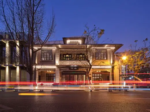
photo : Sven Zhang
GUD Restaurant and Cocktail Bar
Enshadower Hangzhou clothes store, Southern Song Imperial Street
Design: say architects
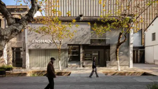
photo : Minjie Wang
Enshadower Hangzhou clothes store design
Panasonic Flagship Store
Design: Say architects
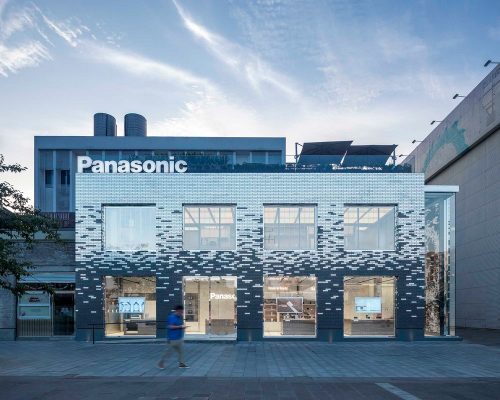
photograph : RAW VISION, dk
Panasonic Flagship Store
Hangzhou Quiet World Sales Center
Design: UMA Interior Design
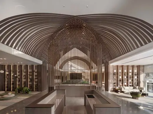
photos by Chen, Yanming
Hangzhou Quiet World Sales Center Design
Architecture in China
Contemporary Architecture in China
China Architecture Designs – chronological list
Chinese Architect Studios – Design Office Listings on e-architect
Comments / photos for the Techsize Living Aesthetic Exhibition Hall, Hangzhou designed by STUDIO8 page welcome

