Red Classic Chao Cuisine Shenzhen, Chinese restaurant building design, Modern Chinese architecture
Red Classic Chao Cuisine in Shenzhen, China
7 Sep 2023
Architects: AD Architecture
Location: Shenzhen, China
Photos by Ouyang Yun
Red Classic Chao Cuisine, China
A taste of red hidden in the heart of Shenzhen Museum
Brilliant carmine hue|Embraced by the tranquility in the downtown city
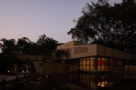
Near the KK100 skyscraper, Red Classic Chao Cuisine selects its venue in an ancillary building of the Shenzhen Museum of Ancient Art, which blends the old and new, brimming with versatile charm. The museum is one of the eight significant cultural facilities built since the establishment of the Shenzhen Special Economic Zone, hailed as one of the best modern museums in China in the 1980s and one of “the top ten buildings of reform and opening up in Shenzhen”.
Keeping abreast of the rapid development of the planning and construction of cultural and sports facilities in Shenzhen and responding to the urban planning of Shenzhen, the restaurant’s design fully takes into consideration its locality and brand features, and combines a touch of brilliant rouge with the cultural context of Chaoshan to interpret a space for fine Chaoshan cuisine experiences through exquisite, concise, and mature expressions.
Dining in such a profound ambiance infused with new Chaoshan cuisine aesthetics and poetic architectural sense, the mind and body are embraced by the tranquility at a corner of the bustling city. From an integrated perspective, a brand-new operation mode of a modern restaurant in a museum area emerges and stands out in the prosperity of the downtown city.
Lotus pond scene|Blooming flowers reflecting in the pond reveal red with different saturation
Surrounded by a vibrant natural environment, the mellow space is created based on the combination of the old and new, art and humane. The yard built with bamboo fences is like a masterpiece of nature. Stepping into the multilayered picturesque landscape, visitors will enjoy the lotus pond scene, encounter an octagonal pavilion and a path leading to the restaurant, a secluded place with Chinese guardian lions sitting at the entrance.
In the context of the shrinking demographic dividend, prudent consumption, and fiercely competitive market, AD ARCHITECTURE conceived the space based on the target customers and took account of the integration of the old to the new in urban planning to create tension in the peaceful space. With delicate design in detail and a big-picture vision, visitors will enjoy an alternation between indoor and outdoor experiences anywhere in the restaurant filled with swaying shadow of greenery.
Gray tiles and vermilion eaves|A winding path leading to the luxuriant red hall
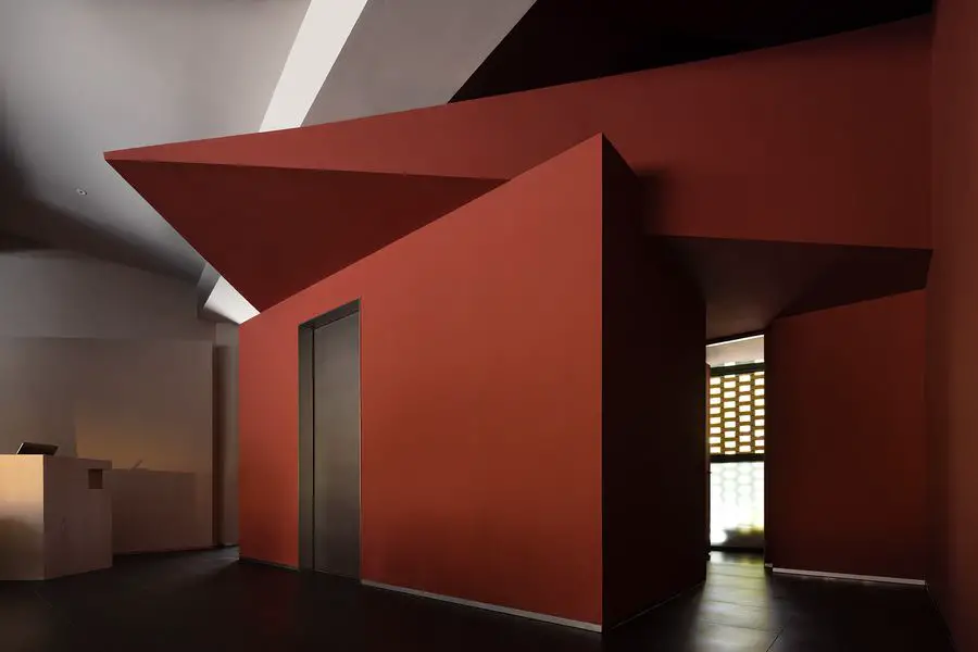
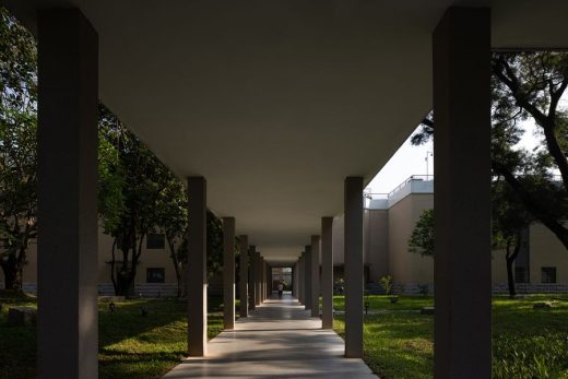
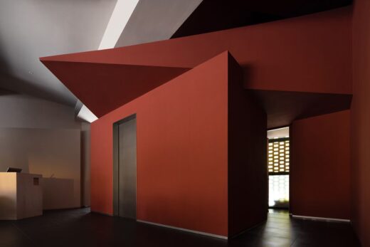
Passing through the winding path, the guests will encounter the restaurant entrance. The space design emphasizes the connection with the outdoor garden landscape and corridor, and creates a strong color contrast with structures as the media. The entrance elongated by the corridor and columns becomes narrow and long, which creates a slow-motion illusion. The hall is defined by red wall coatings and a restrained scale of structures, where the block, plane, line, and lighting are interpreted as geometric expressions from a structuralist perspective to the greatest extent.
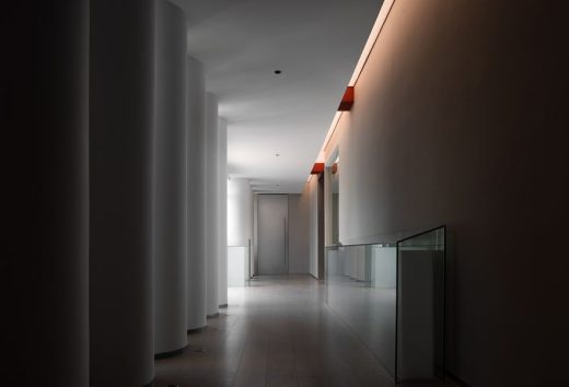
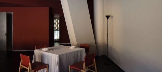
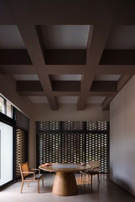
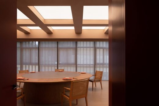
The interior colonnade forms the corridor to create spatial permeability. Except for meeting the dining needs, the space achieves a strong sense of geometric order in the peaceful red palette, and the ceiling light boxes emphasize the deconstruction of space through geometric transformations, creating a tension that integrates geometric structures. The combination of red paint, wood color, and gray bricks symbolizes the collision between modern and traditional elements, and the charming coexistence of the old and new.
Ever-changing|The unchanged fun of life is enjoying the tasty food and wine
A strong dining vibe conveyed by smell permeates the space, offering immersive visual, taste and auditory experiences. The large area of geometric divisions and blank surfaces in interior design create a pretty space form that dialogues with the red tone symbolizing Chaoshan cuisine. AD ARCHITECTURE believes that smell, as an explicit experience of the five senses compatible with space, shall be highlighted as a visible presence in space.
The delicacy of Chaoshan cuisine lies in the fresh ingredients, skillful cutting, and curated plating. The cutting skills, duration and degree of heating, and coordination of different tastes are not only about the cooking approach of Chaoshan people but contain their culinary aesthetics and life philosophy, laying a fundamental foundation for patron loyalty and pricing of the brand.
An open layout|A magnificent and innovative dining destination
Different from the traditional “museum tourist-oriented” strategy, AD ARCHITECTURE proposed a new catering marketing strategy of constructing “a customer group system” and developing “customer stickiness by interests of the community”. By excavating the regional cultural context characteristics and carrying forward the existing ecological environment advantages, the design team intended to create a dining space, a community, and a spatial carrier to attract patrons and exert certain influences to facilitate the cross-over connection with the historical and cultural architecture. Taking the activity in space as the clue, the space layout is derived from user behaviors.
The design team grasped the most sensitive space requirements of the customer group and broke away from the homogeneous structure and form of surrounding restaurants. The dialogue of space language, materials, light and shadow maximize the dining vibes of the hall, and the open layout creates a game constituted by geometric symbols. The pleasure gained from the space is the significance and benefits for guests produced by this intangible game. Beyond the concept of “constructing a customer group system”, the design team hopes to turn the space into a medium that drives changes in the contemporary lifestyle that blends into the soul of the Chaoshan spirit and the humanistic sentiments of the city.
Up to the second floor, what comes into view first is the multifunctional area composed of the reception counter and water bar. The open terrace enjoys a pleasant ambiance. The contemporary geometric form above the bar counter contrast with the handmade rattan furniture and outdoor woven structures, creating a space atmosphere that encourages people to explore through the use of geometric symbols. The bold yet restrained design generates the collision between Eastern and Western aesthetics and philosophy.
Red Classic Chao Cuisine elegant restaurant
All-embracing|An elegant restaurant to receive friends with its echoing and collision charm
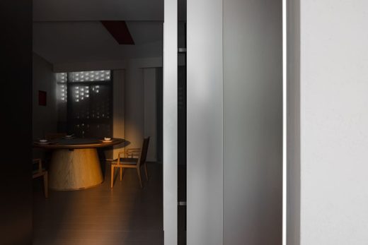
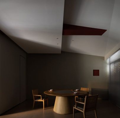
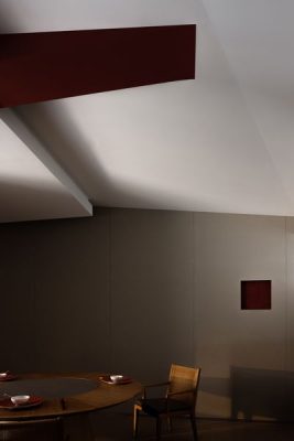
With vibrant and coherent rhythm, each part of the space plays its role. Set against the all-inclusive urban backdrop, the private dining rooms dialogue with the surroundings, and interact with the gray brickwork wall through structural divisions and proportions. The design highlights an overall comfortable and interactive environment, as well as communication among diners.
The outdoor greenery echoes with the indoor red tone, which reveals the eastern color charm of the Han Dynasty. The irregular spatial form appears as natural enclosures or an extension of the building. Coincidentally or intentionally, it creates an unexpected sense of certainty. The interior design concept takes inspiration from a broken and hollowed sculpture, making the reality illusory. This bold and exaggerated expression is inseparable from the tension of art.
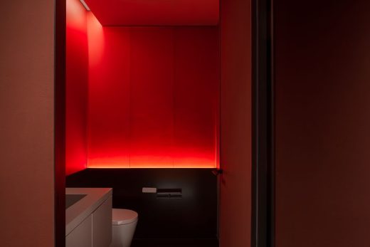
The design team experimented with lacquer art in an innovative way. The large area of lacquer art throughout the entire restaurant unexpectedly retains the simplicity of concrete and meanwhile generates a gorgeous visual effect. The contrast between the wood flooring and metal edging, the harmonious coexistence of hard and soft textures, the alternation of warm and cold colors, as well as the edging details, present a peaceful and lively harmony and integrate various contrasting, resonating elements in the space.
Red memory|Retrospect the past beautiful memories and depict the future
The guests’ consumption motive was a key consideration in the circulation design, so the design team worked out a rational layout based on the main and auxiliary functions of the overall space. AD ARCHITECTURE used Western design order to build Eastern spatial sentiments and philosophy in the restaurant space.
The overall design language of the restaurant introduces a new consumption mode into the library area to drive its operational transformation. The restaurant offers a multi-media and multi-sensory experience and improves the offline experience through online media promotion. The space design aims to increase consumer stickiness and promote the Chao cuisine brand, which is exactly the objective of AD ARCHITECTURE in this project.
Red Classic Chao Cuisine, China – Building Information
Project name: Red Classic Chao Cuisine, Shenzhen
Client: Shenzhen Chaoshanhui Catering Co. Ltd.
Design firm: AD ARCHITECTURE – http://www.arch-ad.com/
Email: office(at)arch-ad.com
Chief designer: Xie Peihe
Location: Shenzhen
Area: 600 sqm
Main materials: Stainless steel, acrylic, sintered stone, Italian handmade paint, bespoke wood flooring
Design time: January 2023
Completion date: May 2023
Photography: Ouyang Yun
Red Classic Chao Cuisine, Shenzhen China images / information received 070923 from AD Architecture
Location: Shenzhen, People’s Republic of China, eastern Asia
New Hangzhou Buildings
Hangzhou Buildings Designs – recent selection:
Design: Aedas
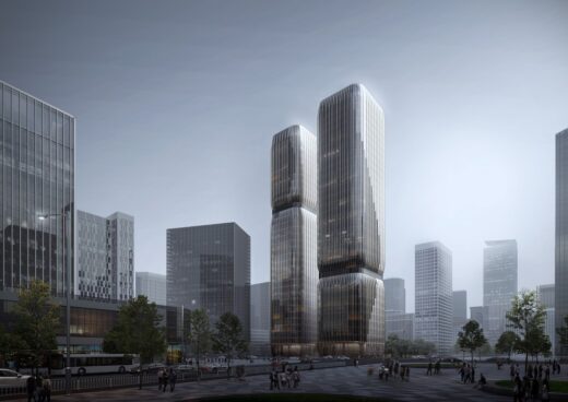
photo : Zhang Xi
Qianjiang Century City A-07 Plot, Hangzhou
Design: WJ STUDIO
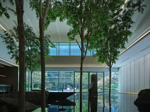
photograph : Zhang Xi
Cloud Land Business Center, Hangzhou
Architecture: PH Alpha Design
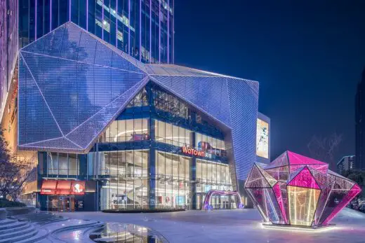
photo : LUOHAN Architechtural Photography
Hangzhou Huaxia Center
Design: MMC DESIGN
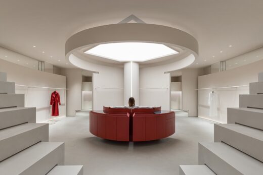
space photographs : HAMO VISION / Ye Song
Yinno Unico Boutique Store
Architecture by Zaha Hadid Architects in China
Contemporary Zaha Hadid Architects Designs in China – recent selection on e-architect:
ZHA Future Cites exhibition Chengdu
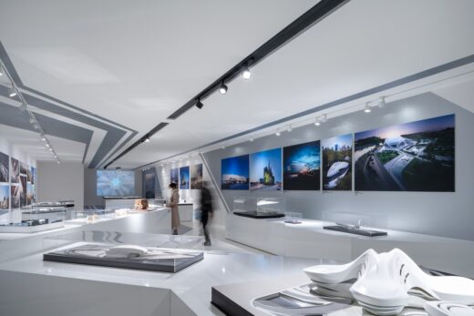
photo : Liang Xue
ZHA Future Cites exhibition Chengdu
Guangzhou Infinitus Plaza
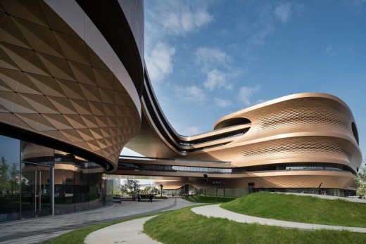
photo : Liang Xue
Guangzhou Infinitus Plaza Building
Architecture in China
Contemporary Architecture in China
China Architecture Designs – chronological list
Chinese Architect Studios – Design Office Listings on e-architect
Architecture: Farrells
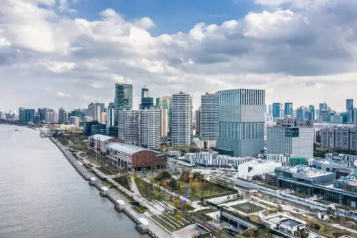
photo © Terrence Zhang and Farrells
Shanghai Shipyard Masterplan
Comments / photos for the Red Classic Chao Cuisine, Shenzhen, China designed by AD Architecture page welcome.

