PPG Flagship Store, Foshan Province Interior, Guangdong Commercial Project, Architecture Photos
PPG Flagship Store in Foshan
12 Jul 2021
Architects: Foshan Topway Design
Location: Foshan City, Guangdong Province, China
PPG Flagship Store
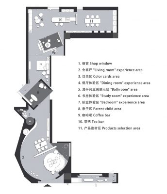
Located in Foshan, China, the project is a flagship store of PPG, an American coating brand. The original space was a long, skinny passage that was 3.3 meters in breadth and 26.6 meters in depth, and its left and right sides were confined by the neighboring spaces. It was a big challenge for the designers to conceive a flagship store in such an extremely narrow spatial environment.
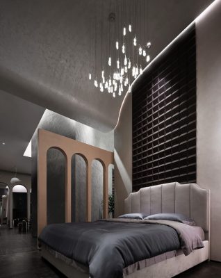
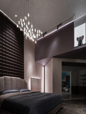
As a foreign coating brand, PPG’s target customers in China are upscale housing occupants. This flagship store needed to accommodate a series of home settings such as living room, dining room, bedroom, bathroom and study for customers to experience.
However, the existing spatial width was unable to satisfy the scale of normal household spaces. Therefore, the designers borrowed some next-door spare spaces, and then took advantage of the spatial height to stretch the structures up and down and weaken the spatial boundaries.
The two box-like volumes were appropriately rotated to further broaden the space, and the twists and turns formed different varying scenes as customers walking around. The design changed the narrowness of the original space through architectural languages, endowed the space with more fluidity and visual extension, and recreated the space’s physical property and aesthetics through curved surfaces and oblique lines.
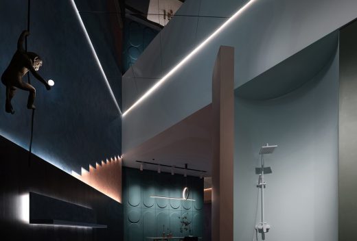
Meanwhile, the design team leveraged and highlighted the long yet narrow spatial scale, and let the structures grow upwards and overlap. In this way, the space seems to be growing in the crack, squeezing, revolving and mixing, and presenting a naturally growing state.
A poetic dream world
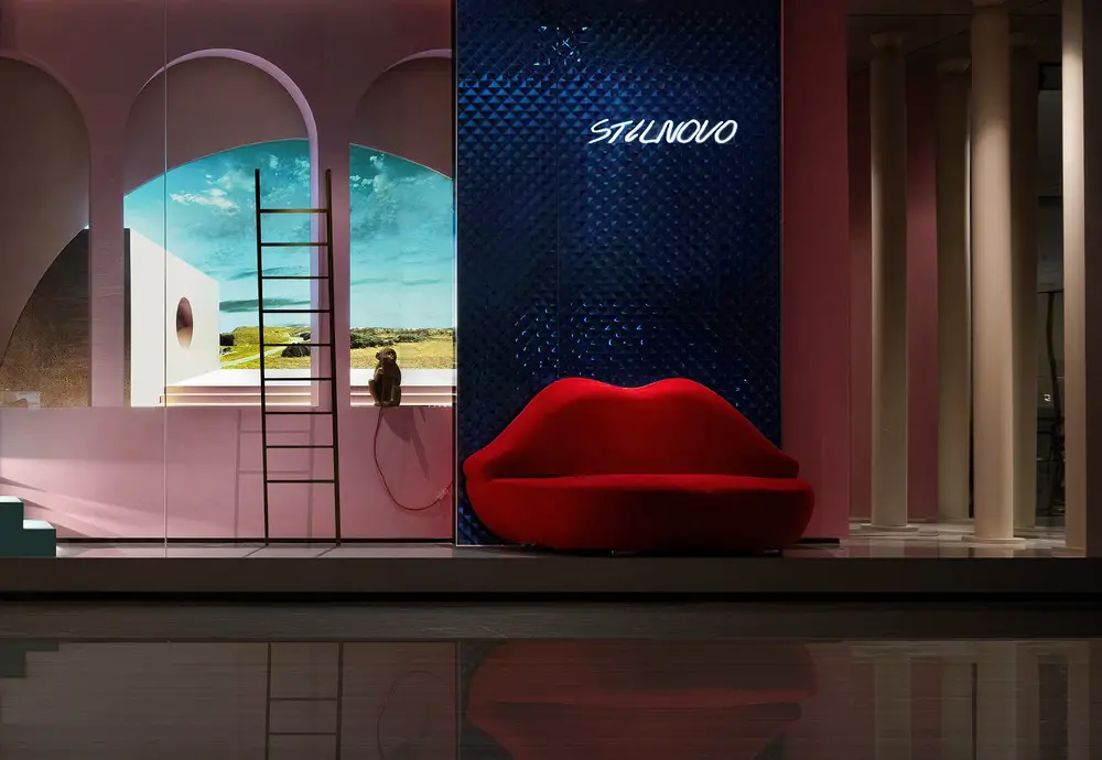
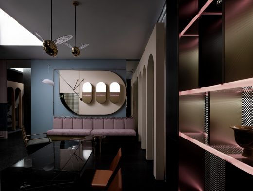
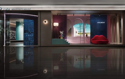
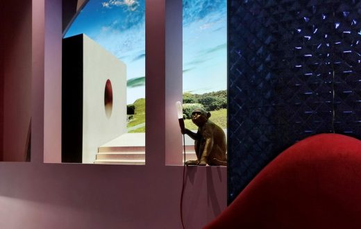
Everyone yearns for poetry and distance deep inside. The designers hoped to stimulate people’s expectation for the future through the romantic and fantastic showcase area. The arched “windows” are inset with a backdrop that depicts beautiful natural scenery, bringing people from the indoors to the open wild.
The coatings with dreamy colors go well with the romantic and fashionable red-lip-shaped sofa, seeming to take customers to a Paris street. Art installations including the little naughty monkey on the windowsill and the cute Gloomy Bear on the step create a fairy tale land. The design team conceived the space through a storytelling narrative, in order to evoke the people’s curiosity and draw them to walk in to explore the space.
Three-dimensional curved surfaces
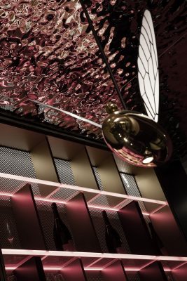
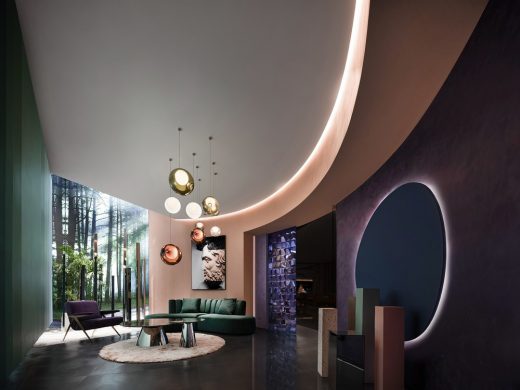
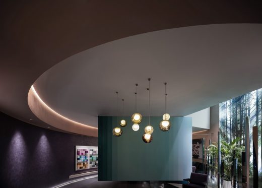
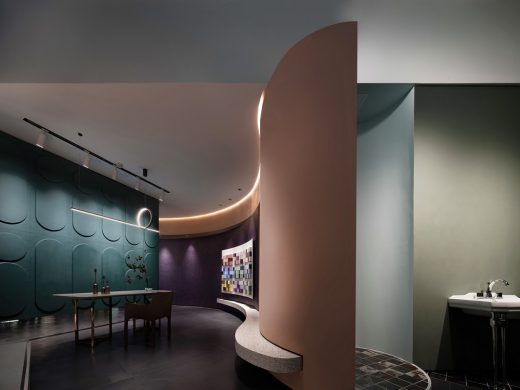
At the lobby, the suspended oblique wall separated the space into front and back “yards”, while the arced wall blends them together naturally. The bubble lights suspended from the ceiling and the gradient colors on the walls connect different functional areas and ensure the consistency of the spatial narrative. Various structures and equipment are hidden along the flowing circulation route, hence making the space more compatible and accessible. The pale pink hue of the textured paint ensures the space’s purity, and matches well with any other colors in the space.
The designers imagined the spatial form and experiences based on the concept of “interior architecture”, and broke the conventional balanced spatial layout by the winding and rolling curved surfaces. The curves with varied curvature link up different areas, and the extended visual effects add a sense of rhythm to spatial scenes.
The precisely controlled layout and scales lay a basic framework for the display and concealment of interior landscape. Contrasted with the multiple steady volumes, the two curved walls are the visual focus in the space. Erecting from the floor to the ceiling, the two distinctive walls appear elegant and flexible, creating fun illusion of the interior wall volumes.
The design abandoned the common approach that uses vertical and horizontal lines to cut and allot interior surfaces, but instead adopted gentle and flowing curves as the design thread, thereby creating an environment filled with rhythmic lines and free of sharp edges to bring people unique experiences. The architectural space with such property is like a giant sculpture that can be walked in. Its design not only emphasizes the relationship between the interior and outside, but also brings people a sense of time as they walk around.
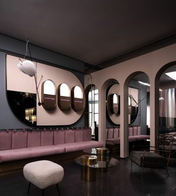
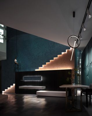
The designers hoped to create a combination of scenes defined by the pleasant colors and artistic textures of coatings and conceive an artistic spatial composition and a garden tour-like circulation route, so as to evoke curiosity, exploration, contemplation and surprising feelings. The long curved corridor and the contrasting colors produce an illusory spatial atmosphere, which brings people to a dreamland and opens up an art journey. In the “dining room” area, the slanting wall and the triangular structure of ceiling enables the space to fold up and extend visually. Besides, the geometric design of the staircase recalls an endless time tunnel. The spatial blocks were reconstructed, aiming to reorganize the spatial order via irregular arrangement.
Growth and dialogue within the crevice
The fluidity, openness and continuity of the architectural space can be seen from the color palette and the exteriors. Meanwhile, innovation is embodied in the creation of light atmosphere, as well as the unity of textures of both interiors and exteriors and the emotions evoked in the space. Window openings with appropriate scale were created in the interior design. Different from French windows which bring in natural light, the deliberately carved-out openings inside are more like viewing windows that reveal different scenes in a subtle and restraining manner. In this space imbued with fluidity, straight lines intertwine surprisingly well with gentle curves.
Geometric languages formed a flexible space, where people are the protagonist. The light pink color achieves a balance with purple, together creating a dialogue with emotions.
The lofty space extends upwards, which enriches its relationship with light and arouses people’s curiosity and desire for exploration. The expansive and bright environment along with the natural textures highlights the authenticity of the space.
Usually, proportions, forms, materials, lights and details are utilized to prop up a space. Yet this project is the opposite, as materials are supported by the space and are also the protagonist within the space. The space gives way to materials and people, offering opportunities for interaction. The cement-like coating with white and gray hues and the black wall featuring diamond-like patterns integrate organically in the space. The arches are the only partitions and are isolated from the ceiling. People can interact with the peaks of the arches as moving in the space, and the continuous arrangement of arches highlights the mystery and playfulness of the space.
Emotion-evoking spatial scenes
The designers purposely reduced the scale of the entrance at the turning corner to hint that customers are stepping into a world with different emotions and styles, in order to evoke their curiosity and imagination about what will happen next. Light is a crucial medium to express spatial emotion, and it is interdependent with shadows.
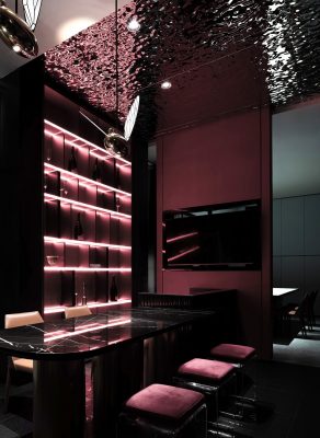
The large area of stretched membrane emphasizes the softness and balance of light, and better serves the illumination of products in the space. Emotionally, it weakens the effect of shadows and produces a dramatic silence. However, in some areas the light and shadows are strengthened, in order to let customers feel both the material textures and the vitality of the space. For this project, the designers approached the spatial design simply from an aesthetic perspective, for touching people’s heart.
In addition, the designers also attached great importance to the interaction between space and people. The team transformed the existing architectural space and its composition, which was conducive to reorganization of structures, materials and colors whilst also creating a new connection between the building and the venue. The design took light as a visible material and presented it as an observable object in the space, to enable it to express the spiritual world and evoke sentiments of mystery, silence and illusion.
PPG Flagship Store in Guangdong, China – Building Information
Project name: PPG Flagship Store
Location: Foshan, China
Client: Foshan YSH Brand Management Co., Ltd.
Design firm: FOSHAN TOPWAY DESIGN
Chief designers: Wang Zhike, Li Xiaoshui
Design team: Lu Zhongwen, Lan Jingwei, Huang Jianhe, etc.
Area: 120 square meters
Completion time: December 2020
Main materials: coating (PPG), tiles (Tonino Lamborghini), paint (TASSANI), stainless steel (Zhongchuang)
Photography: Ouyang Yun
Text: Lan Jingwei
PPG Flagship Store, Foshan Guangdong Province images / information received 120721
Location: Foshan City, Guangdong Province, China
China Architecture
– chronological list
Chinese Architect – Design Practice Listings
Architect: The Architectural Design & Research Institute Of ZheJiang University Co,Ltd
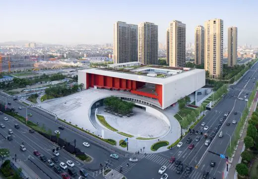
photograph : Qiang Zhao
Yiwu Cultural SquareBuilding
Design: The Architectural Design & Research Institute Of ZheJiang University Co,Ltd
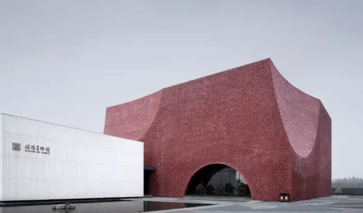
photograph : Qiang Zhao
Shuyang Art Gallery Building
Comments / photos for the PPG Flagship Store, Foshan page welcome

