I.T CERAMICHE HQ & Exhibition Hall, Foshan Interior, Chinese Exhibition Space, Architecture Photos
I.T CERAMICHE Headquarters & Exhibition Hall in Foshan
24 Mar 2020
I.T CERAMICHE HQ & Exhibition Halln
Design: Foshan Topway Design
Location: Huaxia Ceramics Exposition City, Foshan, China
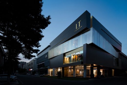
I.T CERAMICHE is an Italian ceramic tile brand that pursues freedom, individuality, fashion and novelty. The project is the headquarters & exhibition hall of the brand. The design intends to blend Italian living aesthetics that features natural comfortableness, artistic taste and affordable luxury into oriental context, to endow the brand with unique romantic and artistic charm. 1F and 2Ffunction as product display, reception and leisure spaces, while 3F and 4F are used for working and logistics purposes.
Freely rotating cube-shaped blocks
The building is a four-storey construction. The architectural appearance is inspired by the popular “Rubik’s Cube”. Each floor is a box, which interactively rotates, together creating a twisting form that shows contradictory yet interdependent visual effects and highlights the mechanical beauty of the building blocks. Plain, heavy and dark cement bricks offer a strong visual contrast to the light transparent glass box, making the building “boxes” appear suspended in the air. The contrast between black and white, lightness and heaviness, void and solidness, together with the free plane and facade design, contributes to producing changes to the architectural form. The harmonious combination of brass metal and dark gray terrazzo, colored acrylic glass and marbles, as well as artificial synthetic materials and traditional natural materials, perfectly demonstrates the brand’s sense of affordable luxury, ultimate craftsmanship and aesthetic concept.
A world under water
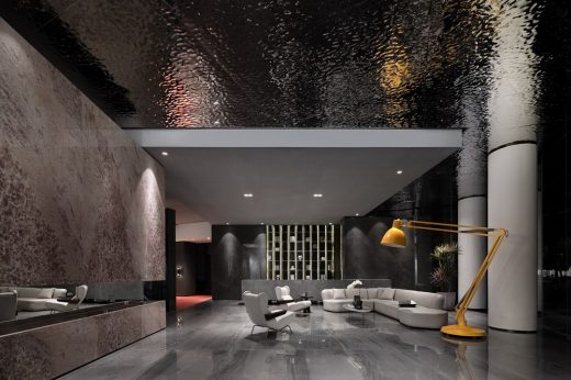
The concept of “Cube” is extended to the interior design, which creates free yet contrasting spatial forms. At the lobby, the ceiling is finished with a stainless steel panel featuring rippling patterns, which create a feeling of being underwater. The rotating wall and ceiling are connected and interpenetrated via blocks, giving the space a strong sense of architectural blocks.
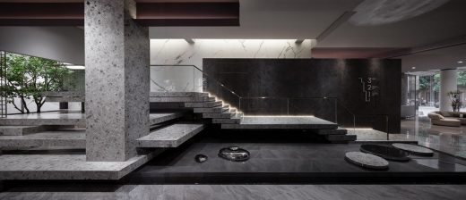
The luxurious pink stone and the cement-like flooring form a sharp contrast, while accentuating their own unique textures. Visitors can have varying visual experiences at each step along the circulation route. The core of this free space is that it never restricts people’s behaviors. Instead, it guides them to walk and explore under the “rippling water”. The poetic design language enables the architectural space to resonate with inner mind.
Floating stairs leading to future
The terrazzo staircase looks like floating above water through architectural approaches. Although the design seems to contrary to the laws of nature, it helps stimulate imagination. Visitors are guided by the stairs as if they are led to an unknown world. Separated blocks, gaps between blocks, and light belts inside the gaps, all make the originally heavy stairs appear more lightweight. The design team believes that each form or shape should be independent yet interrelated in the space.
Italian architect Carlo Scarpa put forward the architectural concept of “Separatism”, which undoubtedly has influenced the field of spatial design. At the end of the stairs, lively greenery guides the line of sight. Beside the staircase is an atrium, which links up the first and second floors and brings in natural light. In addition, the pool under the stairs reinforces the floating sense, while the water drop-shaped art installation made of stainless steel intensifies the theme.
Separation and reconstruction in multiple dimensions
Le Corbusier’s free facade theory advocates that building facade should get rid of the limitations of structural columns, and architectural structures should not be concealed because they own independent and unique charm. Therefore, the design team not only retained the original beauty of the structures, but also further strengthened it.
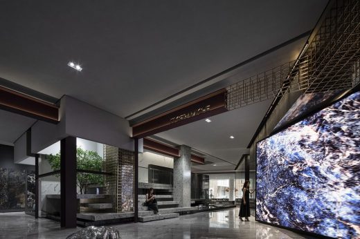
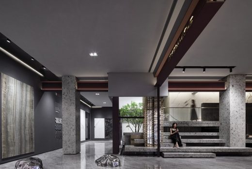
The exposed universal beam structure and the steel grid are naturally interpenetrated, which pays tribute to the architectural structure at industrial age. With a unique aesthetic, the exposed architectural structures become decorative elements in the space. The blocks and lines in multiple dimensions produce a sense of layering.
The 3 columns of different sizes in the space seem to gradually peel off the coverings of the building, creating strong visual effects and leading people into philosophical thinking: What is real perfection?The design emphasizes the collision among materials of different textures. Polished terrazzo, exquisite marbles and rusting universal beams, either smooth or rough, cool or warm, are applied to constructing the space by means of contrast, analogy, symbiosis, repetition and order, etc.
The column at the center is integrated with metal, aluminum and glass to form a new architectural and visual element. Such combination embodies an exploration of sustainable materials and an inheritance of modernism. Design is more than superficial decoration, but more importantly should explore and bring more possibilities of internal reconstruction.
Dialogues between oriental and western aesthetics, past and presentI.T CERAMICHE
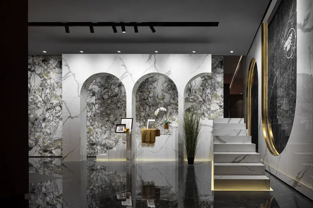
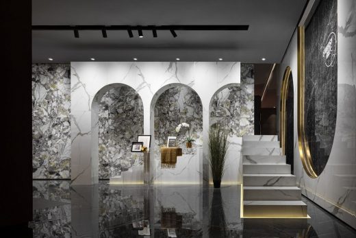
Arched doors embody both oriental and western architectural languages. The paralleled upward and downward arches in the space create resonance and collision of oriental and western aesthetics, and are endowed with product display function.
Gentle spiritual touch
As the extension of the building, the interior space is given essential spatial features by the void balcony and French glass windows. Raised balcony, garden-like study and tranquil bedroom create a private realm to enjoy nature and sunshine.
Prominent postmodernist Robert Venturi advocates using historical symbols to enliven architectural form. Such practice has enriched the aesthetics and entertainment of contemporary architecture.
The designers created such surprise at the corner purposely, with a view to reigniting the architectural concept of “seeing things as equal” that man and architecture are integrated into natural things.
I.T CERAMICHE HQ & Exhibition Hall, Foshan – Building Information
Project name: I.T CERAMICHE Headquarters & Exhibition Hall
Location: Huaxia Ceramics Exposition City, Foshan, China
Design Firm: FOSHAN TOPWAY DESIGN
Chief designers: Wang Zhike & Li Xiaoshui
Design team: Lu Zhongwen, Li Nianhua, Qiu Wenfeng, Lan Jingwei, Lv Jiechao, Xian Liuqing, Huang Jianhe, Lai Yuqin, etc.
Decoration design: Yang Shiwei
Area: 1,800 m2
Start time: October 2019
Completion time: May 2020
Client: Foshan Kai Ensi Ceramics Co., Ltd.
Text: Jiang Xiaoli
Photography: Ouyang Yun
I.T CERAMICHE Headquarters & Exhibition Hall, Foshan, China images / information received 121020
Location: Huaxia Ceramics Exposition City, Foshan, China
China Architecture
Contemporary Architecture in China
– chronological list
Chinese Architect – Design Practice Listings
Architect: The Architectural Design & Research Institute Of ZheJiang University Co,Ltd
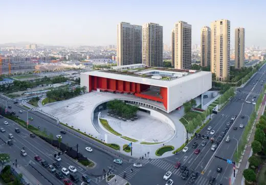
photograph : Qiang Zhao
Yiwu Cultural SquareBuilding
Architects: 10 DESIGN
image courtesy of architects office
Industrial Service Centre in Jinwan Aviation City
Comments / photos for the I.T CERAMICHE Headquarters & Exhibition Hall, Foshan page welcome

