HEYTEA LAB Harbor Store, Shenzhen Commercial Building Development, Chinese Architecture Photos
HEYTEA LAB Harbor Store in Shenzhen
31 Nov 2021
Architects: TOMO DESIGN
Location: Shenzhen, China
Shenzhen OCT Harbor Store
The improvement of consumption and the convenience of digitization have promoted the transformation and formation of new consumption patterns and consumer groups. China is accelerating its entry into a new era of consumption.
Today, in face of the new consumer groups and new consumerism, how can we help Heytea, a popular new tea brand, to convey its individuality and to demonstrate its business strategies in product innovation, experience innovation and business integration? Optimizing every possible consumption procedure and creating immersive and interactive consumer experience are the basic logic for TOMO DESIGN in the design of Shenzhen Heytea Lab.
Facing the complex background and business environment, the design is based on the insights of the consumption experiences that the brand will bring to the consumers. The design goes beyond the conventional reference system, deconstructs the consumers’ demands and feelings, and extends the potential value of Heytea in the background. Finally, by planning and operating, TOMO has successfully created the space value and new experiences with unique creativity.
Entrance Building
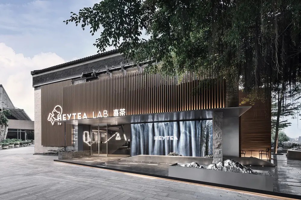
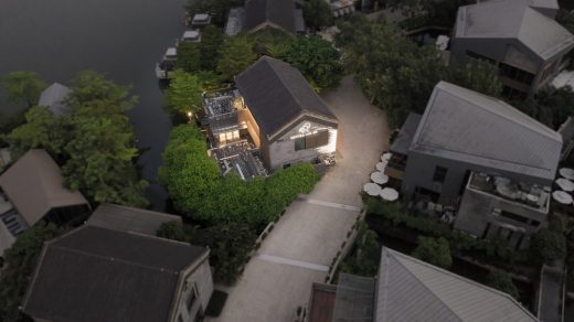
Tracing the origin of the project, the designer interprets the artistic context of the building with a sequence of landscape. The façade of the flagship store is designed by gray bricks, which is interspersed with metal bricks to show both traditional beauty and a youthful atmosphere.
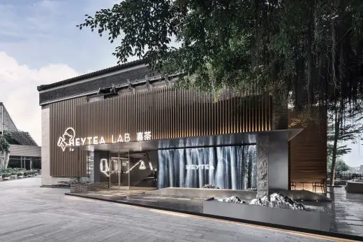
The large brand logos are placed on the metal grilles and the protruding eaves. The newly-built block is integrated with the existing columns. The stone benches and the metal hills are arranged flexibly for both landscaping and short break.
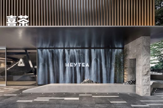
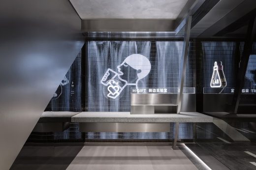
At the entrance, the metal grille façade replaces the solid wall, creating a relaxing atmosphere. And the screen behind it displays the beautiful landscape repeatedly. Here, the art of architecture, modern ink paintings, digital technology as well as the “rain curtain” dialogue with each other and show both the collision and combination between tradition and modernity.
Courtyard Landscape
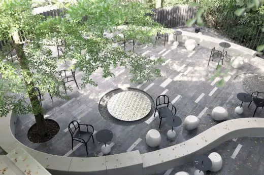
With a holistic perspective, the designer creates a courtyard landscape with minimalist skills, creating a clear and open pattern which encourages the interaction between landscape, objects and people. Whether it is a sheet-like grille at a 45-degree angle, or the well-arranged seats in the sunken area, or the pavilion designed with modern skills, or the smooth or rough liner benches, it shows multiple aesthetics and effectively activates the ornamental and practical functions of the courtyard.
The interior space is divided into five different laboratories: the peripheral lab, the ice-making lab, the dessert lab and the illustration lab on the first floor as well as the tea geek lab on the second floor.
Peripheral Lab
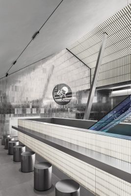
The peripheral lab is located at the entrance to continue the images on the LED facade and display a variety of peripheral products.
Staircase
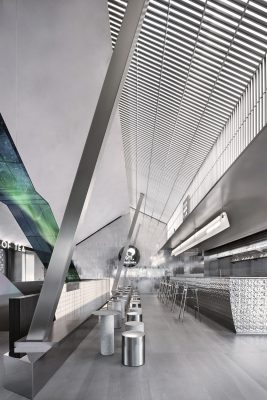
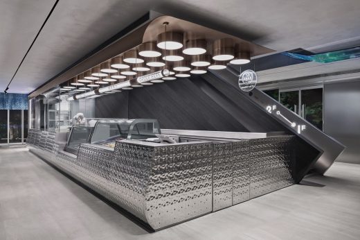
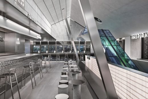
The geometric staircase leads customers to different labs on the first and second floors, and it is also the visual center of space.
Around the staircase, the metal electronic screens present beautiful scenes of four seasons, reminding people of the limitless vitality and creating an aesthetic connection between customers and the device. When they don’t display special effects, the LED screens also serve as art decorations in the space.
Ice-making Lab
Dessert Lab
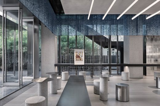
Silver metal bar counter, metal grille details, gray emery floor, and sequential bubble lights as well as the ice-making and dessert displays, connect a series of interesting spaces. At the same time, the floor-to-ceiling glass doors create an interactive visual experience between the interior and the outside landscape.
Illustration Lab
The illustration lab is open on three sides, enjoying an open and clear view. The designer cleverly emphasizes the brand culture with details and integrates illustration elements into the space. For example, it displays the brand logo on the ceiling lights. Different from conventional commercial design, the seats are arranged in the peripheral, while the center is relatively empty. This kind of arrangement caters to customers’ social demands and provides an immersive experience.
Tea Geek Lab
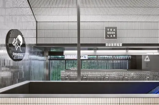
Stepping up the staircase with LED images changing alongside, you will finally reach the second floor. Here the ceiling is designed according to the pitched roof to form blocks of different textures, against which a moon-shaped art decoration was created. With the moon hanging against the “starry sky” on the LED screen, a beautiful picture is gradually unfolding before us.
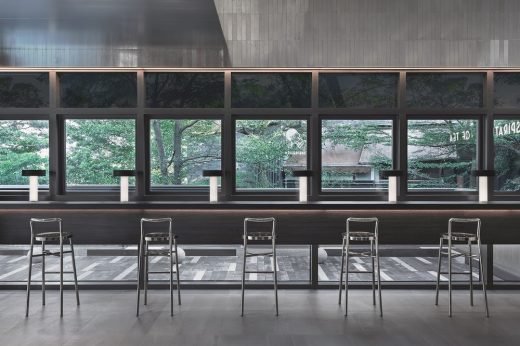
The strip lights and light films are inlaid in the ceiling and the metal grilles to highlight the simplicity and elegance of the space. And the aluminum foam sheet covering the side walls is in contrast with the delicate satin brushed metal. Sitting by the window, you can have a great view of the luxuriant green and feel relaxed and refreshed.
According to its market positioning and business strategies, Shenzhen Heytea Lab is designed as the first flagship store in the city. It is a successful practice based on the analysis of the current consumption habits and trends. By integrating commodity and experience with social function, Shenzhen Heytea Lab is devoted to providing brand new consumption experience.
HEYTEA LAB Harbor Store in Shenzhen, China – Building Information
Architects: TOMO DESIGN
Name:
Location: Shenzhen, China
Area: 1200 sqm
Client: HEYTEA
Date: Sep.2019
Interior Design: Uno Chan, Xiao Fei
Cooperative Design: Suri Liao, Joey He, Jason Luo, Yun Peng
Main Materials: Gray and white Granite, Metallic silver sand surface, Volcanic rock, Metal texture brick, Sintered Stone, LED transparent screen
Material brand: H Art Materials Shenzhen, TECHSIZE, Hall of Fame
Photographer: Sean
HEYTEA LAB Harbor Store, Shenzhen images / information received 311221
Location: Shenzhen, China
China Architecture
– chronological list
Chinese Architect – Design Practice Listings
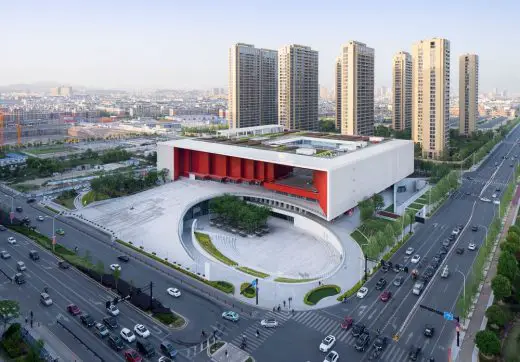
Architect: The Architectural Design & Research Institute Of ZheJiang University Co,Ltd
photograph : Qiang Zhao
Yiwu Cultural SquareBuilding
Design: The Architectural Design & Research Institute Of ZheJiang University Co,Ltd
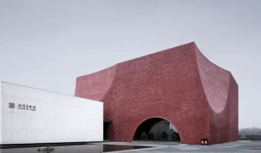
photograph : Qiang Zhao
Shuyang Art Gallery Building
Ways To Keep Your Office Building In Top Condition
Comments / photos for the HEYTEA LAB Harbor Store, Shenzhen page welcome

