Museum of the 20th Century Berlin Building, Kulturforum Design, German Architecture Images
Museum of the 20th Century Berlin by REX
New Berlin Architecture beside Neue Nationalgalerie, Germany design by REX architects
1 Nov + 31 Oct 2016
Museum of the 20th Century Berlin by REX architects
REX Unveils Competition Design for The Museum of the 20th Century
Design: REX, architects
Location: Kulturforum, Berlin, Germany
THE MUSEUM OF THE 20TH CENTURY Berlin, Germany
“I am thinking of a complex superstring museum with at least eleven dimensions: the classic ‘white cube’ with straight walls, as well as the black box for video art; chapels, dream departments, gardens, house museums, labs, media museums, mobile museums, contemporary museums, artists museums, and anti-museums.”—Hans-Ulrich Obrist, Artistic Director of the Serpentine Galleries in London (from The Museum of the 20th Century’s competition brief) Next to the world’s most exquisite frame for art—Mies van der Rohe’s Neue Nationalgalerie—we propose its counterpoint: a functional (not aesthetic) objet trouvé for the art of framing collections.
The Neue Nationalgalerie is a blank slate on which any exhibition format can be constructed. In practice, as artistic media grow more diverse and museums’ operational budgets become more limited, a blank slateis constrictive: the Staatliche Museen zu Berlin finds the climate, light, and universality of this iconic space challenging to stage exhibitions, and endlessly transforming this empty canvass is an expensive proposition.
The result is not freedom, but imprisonment within a glass box. By embracing a new definition of gallery flexibility, The Museum of the 20th Century (The Museum) avoids this trap. The Museum offers complete flexibility—without increasing operational costs—by providing built-in tools, not a tabula rasa. It is a foil with which or against which curators can operate.
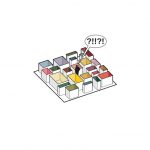
The competition brief for The Museum of the 20th Century required “a lively alternation of larger and smaller rooms […that are] clearly defined, fixed spatial volumes […] offering the greatest possible flexibility […]. There should be no explicit round tour. Rather, there should be many paths and single avenues through the exhibition spaces available for individual selection.” A random field of galleries—each endowed with distinct characters—provides individual choices of routes and modes of perception, but renders the overall collection and individual thematic complexes difficult to organize and illegible. Intuitive wayfinding is obfuscated, causing futile wanderings.
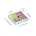
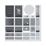
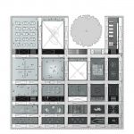
A gradational grid of galleries, however, offers curatorial clarity and facilitates self-navigation, while still offering diversity in room character, size, and proportion, as well as multiplicity of experience and individual choice of route. From anywhere on the floor, patrons can see the Neue Nationalgalerie, the Piazzetta, the Philharmonie, and the Staatsbibliothek down the hallways created by the matrix, further aiding orientation.
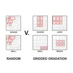
Unlike an arbitrary assemblage of rooms of various sizes which limits curatorial ‘play’ to a haphazard combination or a constellation of small rooms only (via divided larger galleries), the gridded gradation expands curatorial freedom as it provides flexible zones of potential collaborating galleries for any exhibition or theme desired: all large galleries, all small galleries, mixed gallery sizes (via division of some larger galleries), or even all medium sized galleries (by organizing a show in the center.)
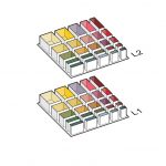
To fit The Museum’s program requirements within the delineated square, the floorplate is doubled. While both gallery floors follow the same gridded gradation, the characters of galleries are unique on each floor.
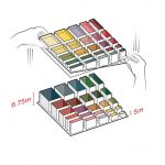
To increase diversity of the galleries and the multiplicity of experiences: i) the Level 2 floor slab is tilted—sloped from south to north—raising the galleries’ heights from 5 m at the southern end to 6.75 m at the northern end. Conversely, the galleries’ heights on Level 1 transition from 6.75 m at the southern end to 5 m at the northern end;…
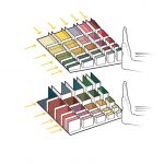
…ii) the gradation is pushed towards the southwest to offer optional side daylight to the galleries along the southern and western perimeters (similar to the basement galleries of the Neue Nationalgalerie, which reach west to the façade of its sculpture garden); and…
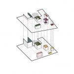
…iii) unique attributes are added to multiple galleries, such as ceiling and floor shapes, glass walls, skylights, and double-heights (accommodating the 9 m height of the Joseph Beuys Gallery and the large, column-free space dedicated to Neue Nationalgalerie’s installations.)
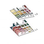
The result is a ‘Wunderkammer,’ an environment where the extreme individualization of each gallery’s interior contrasts with the more abstract and seeming sameness of their exteriors and The Museum’s hallways. This creates an unusual, intensively immersive experience. In this museum matrix, patrons encounter surprise and slight disorientation at once, yet can still find their place on the floors with the visual cues of the gradating galleries and the always visible façade and exterior views.
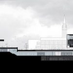
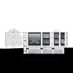
North-south section with connection to Neue Nationalgalerie
Competition Model, full site
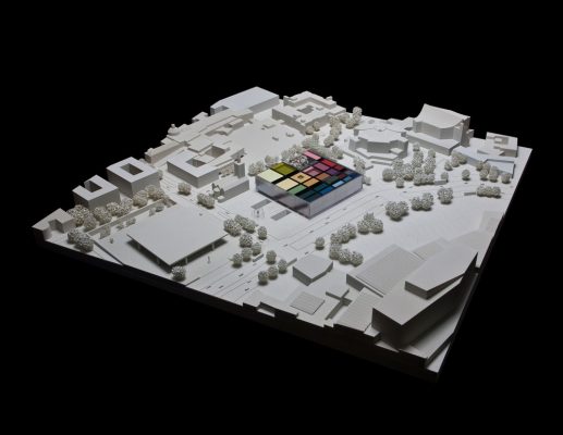
image : Radii
South elevation and east/west sections
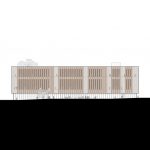
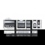
Competition model showing the Level 2 floor slab tilt
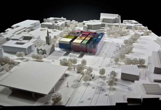
image : Radii
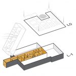
The gradational grid is projected from the gallery floors onto the ground plane of Level 0. Similarly, the Level -1 gallery that will house the Nationalgalerie’s art dating from before 1945 and early post-war, is a mirror plan of Mies’11 x 4 module layout in the adjacent Neue Nationalgalerie, and even includes views into its own sculpture gardens. This organization emphasizes the continuity of content and the desired round-tour experience between the collections of the Neue Nationalgalerie and The Museum.
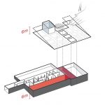
The site’s east-to-west slope is integrated within the building, enabling the 6 m heights necessary for the Media/Event Space on Level 0 and the Marx Collection on Level -1. By placing the Changing Exhibitions Gallery on Level -1—and cutting out the Level 0 floor slab above it—that gallery also achieves extra high ceilings, as well as sightlines from the public and education functions on the ground level (Foyer, Restaurant/Bar, Education/Art Appreciation, Shop, and entrance to the Media/Event Space).
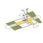
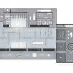
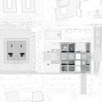
On Level 0, the grid of the projected gradation from the galleries above is selectively dissolved to reinforce one major and one minor urban axis, and lines of sight. These axes also define a grand space at ground level which can be used—in conjunction with the Changing Exhibitions Gallery and including the Restaurant/Bar—as a large, urban-sized event space. At the nexus of the two axes is The Museum’s vertical circulation: a grand stair and a glass elevator core, that both look into the lush courtyard of the Plane Tree.
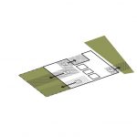
The ‘memory’ of the gradation also informs the ground level’s zoning, delineating distinct areas for those functions which need discrete access and must operate independently: Restaurant/Bar, Education/Art Appreciation, Museum Shop, and Media/Event Space. Each of these areas is directly adjacent to its own exterior public space.
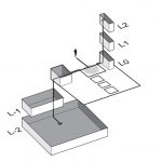
The building’s northwest ‘spur’—just north of the Plane Tree—and the southwest quadrant of Levels 0 and -1 are dedicated to staff uses, including Administration, Restoration Workshops (adjacent to their respective gallery spaces), and the freight elevator to the Depot (Art Storage). Museum staff has its own entrance within the plane tree’s courtyard, and all administrative functions are conveniently located adjacent to elevator cores and egress stairs to facilitate staff movement vertically.
Level 0 (Ground Level) floor plan
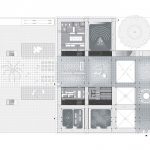
Level 0 with views into Level -1 galleries
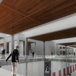
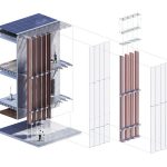
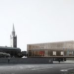
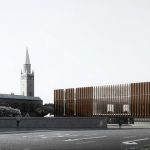
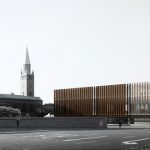
The Museum’s double-skinned window-wall is one of the building’s most notable sustainable features. Each facade’s two glazing layers, the naturally-ventilated cavity between them, and its enclosed, vertical, wooden sun/glare-control louvers, work in concert to significantly reduce The Museum’s mechanical and electrical loads. The double-skin/air cavity system is a highly insulated barrier that mitigates the fluctuations of external temperatures.
In addition, the air cavity creates a chimney stack effect which allows natural and mixed-mode ventilation, as well as heat recovery or discharge. The used, hot air is either purged to the exterior during summertime or its heat recovered during wintertime. The façade’s external glazing layer is comprised of heat-curved, laminated, clear low-iron glass panels that are pre-bonded to extruded aluminum glazing interlocking cassettes.
The internal glazing layer is composed of double-glazed, heat-curved, clear low-iron safety glass units with a triple-silver low-E coating on surface #3. The aggregate window-wall U-value is 0.70 W/m2K with a high SHGC of 0.20 for solar heat gains in winter.
The sun/glare-control louvers block sunlight and collect heat inside the double-skin/air cavity to also be rejected or recovered. When the sun/glare-control louvers are open, daylight reaches deep into the building, reducing electrical loads and warming up the structure’s concrete floors and walls for passive heating when desired. The louvers can also be rotated for complete blackout of the twelve galleries which directly abut the exterior wall.
The plan shape of the louvers is rounded, to play off the tube-like geometry of the double skin and provide appropriate access for cleaning and maintenance. The louvers are programmed to track the sun’s rotation. The dance of their synchronized or individualized rotation provokes visitor’s perception of The Museum’s interior pavilions, breaking up the building’s scale, giving it a more pedestrian friendly aggregation of smaller volumes.
Double-skinned window-wall and wooden sun/glare-control louvers in various positions:

image : Luxigon
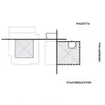
Taking a cue from Mies van der Rohe’s alignment of the western edge of the Neue Nationalgalerie with the eastern wall of St. Matthäus Kirche, the southern edge of The Museum aligns with St. Matthäus’ north wall, protecting the unobstructed view of the church from Potsdamer Strasse. The square form of The Museum fits ideally in the remainder of the site area.
The large, protected Plane Tree notches this pure plan. Additional alignments reinforce the two-museum campus concept. The clear height of The Museum’s Ground Level (Level 0) matches the height of the Neue Nationalgalerie’s plinth. The height of The Museum’s Level 2 at its southern edge aligns with the top of the Neue Nationalgalerie’s roof.
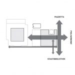
Two major axes transect and organize the site and The Museum’s connections to its neighbors. The north-south axis from the Philharmonie to the Neue Nationalgalerie traverses through The Museum. The east-west axis passes between The Museum and the Kammermusiksaal, from the Piazzetta to the Staatsbibliothek.
Two minor axes complete the site’s hierarchy: the first along Potsdamer Strasse connects The Museum and the Neue Nationalgalerie, and the second from the Plane Tree through The Museum, and across to the Staatsbibliothek, folds the latter more closely into the Kulturforum. These four axes organize a new primary pedestrian circulation for the Kulturforum, while offering significant public spaces.
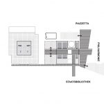
The urban landscape program of The Museum defines and creates a hierarchy amongst the existing and future open spaces. In continuity with the Neue Nationalgalerie’s plinth, granite paves the four axes that form the pedestrian public spaces. The renewed open spaces that are partially existing draw their inspiration from the naturalist landscapes of the Tiergarten with random tree bosques sculpting grass clearings.
In contrast, a gridded allée of trees on both side of Scharoun Platz frames the views from the Piazzetta to the Staatsbibliothek while allowing outdoor performances, artshows, and special events. Between The Museum and the Neue Nationalgalerie, two simple lawns frame the void to maintain the visual link between the two buildings.
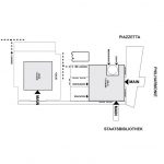
The two public entrances of The Museum take advantage of the site’s pedestrian circulation axes and maximize The Museum’s relationship to the Neue Nationalgalerie. The Museum’s entrance on Potsdamer Strasse connects—via the new, granite-paved pedestrian axes—with the Neue Nationalgalerie’s entrance as well as to the grounds of the Staatsbibliothek. Additional entrances are dedicated to certain functions that can remain open while The Museum is closed: Restaurant/Bar, Education/Art Appreciation, Museum Shop, and Media/Event Space. They face the building’s open spaces and the Plane Tree courtyard.
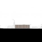
Neue Nationalgalerie, Museum of the 20th Century, Kammermusiksaal Elevation
Competition model
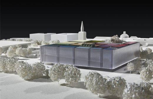
image : Radii
CLIENT: Stiftung Preußischer Kulturbesitz (Ministry for Culture and Media), Bundesrepublik Deutschland (Federal Republic of Germany)
PROGRAM: Museum—forming a curatorial unity with the Mies van der Rohe-designed Neue Nationalgalerie—consolidating the Nationalgalerie’ s holdings of 20th century art, the Marx, Pietzsch, and Marzona Collections, and works from the Museum of Prints & Drawings and the Art Library’s museum collections; and (A-Z) administration, art storage, café, education/art appreciation spaces, exhibition spaces, media/event space, restaurant, restoration areas, and shop
AREA: 29,500 m² (318,000 sf)
CONSTRUCTION COST: €110 million STATUS Limited international competition, 2016
DESIGN ARCHITECT: REX PERSONNEL Julie Bauer, Maur Dessauvage, Kelvin Ho, Isabelle Moutaud, Elizabeth Nichols, Kelsey Olafson, Joshua Prince-Ramus, Cristina Webb
EXECUTIVE ARCHITECT: rw+
CONSULTANTS: BuroHappold, Front, hhpberlin, Marti-Baron+Miething, Werner Sobek
Museum of the 20th Century Berlin by REX images / information from REX
Location: Kulturforum, Berlin, Germany
Berlin Buildings
Berlin Architecture Designs – chronological list
Berlin Architecture Walking Tours by e-architect
Potsdamerplatz Buildings
photo © Adrian Welch
Hotel nhow Berlin
photo : Roland Halbe
H10 Berlin Hotel
Design: Architect Jan Kleihues
Kreuzberg Tower in Berlin – a rare building by the late John Hejduk
Comments / photos for the Museum of the 20th Century Berlin by REX page welcome
Website: Berlin


