Zhen Fund Office, Beijing, Chinese Commercial Building Interior Design, New Architecture Photos
Zhen Fund Office Interior in Beijing
4 July 2022
Design: asap/ adam sokol architecture practice
Location: Beijing, Northern China
Photos by Jonathan Leijonhufvud
Zhen Fund Office Interior, China
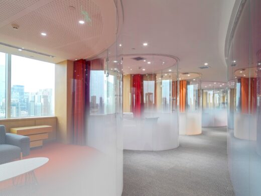
The Zhen Fund is a project that takes advantage of immersive urban views, while also conveying a sense of the significance and dynamism of the client’s work, and the tremendous joy and enthusiasm that is so characteristic of this company. asap was asked to create a fairly typical office fit-out for a prominent venture capital firm in Beijing.
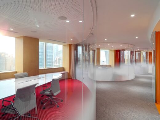
The very significant number of conference rooms requested, of all sizes, was slightly unusual, as well as the “XL” room with seating for up to 100. Given the U-shaped space, it was clear that the challenge would be to avoid interminable and dull corridors. Furthermore, the firm, Zhen Fund, is known for its investments in not only tech startups, but also in visionary new consumer products, thus the space needed to reflect a sense of optimism, ambition, and an embrace of the future. The program requested was also fairly tight, relative to the space available to work with, so very free-form designs were not an option.
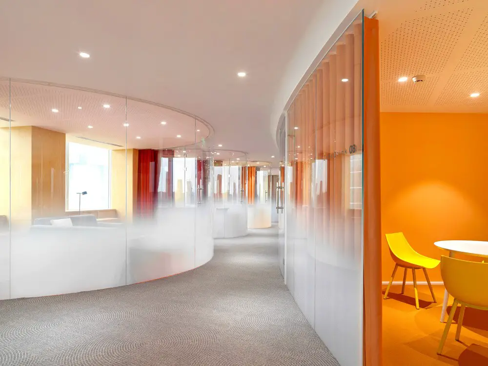
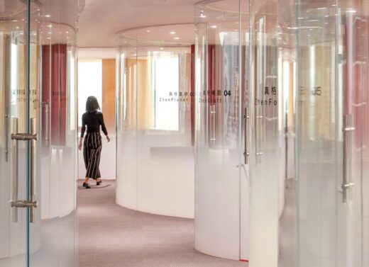
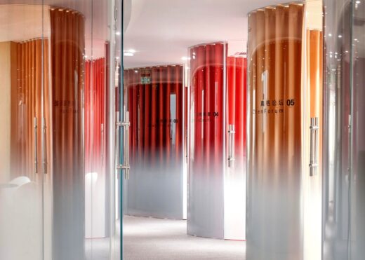
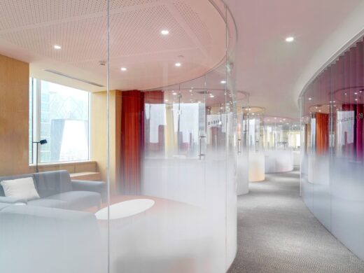
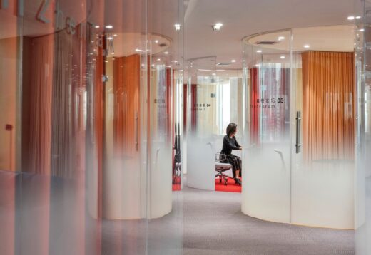
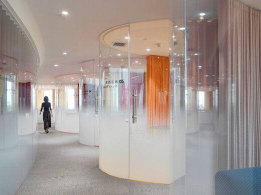
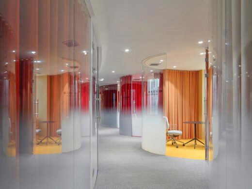
Much of asap’s work explores various types of curves, and so they began to explore how that might impact this design as a solution. While seemingly inefficient at first glance, the curving glass conference rooms that became the signature of this project actually accomplished several things: they avoided the monotony of dreaded long, double-loaded corridors; they immediately gave the design a bold and visionary quality, deriving as much from the forms as from the ever-changing reflections and refractions they created; lastly, there is a positive benefit achieved from the pockets of space created where the rooms meet, turning what could have been an awkward passing moment in a hallway into a gracious pocket of space that also lends itself to informal but private side conversations.
Relative to their competitors, who mostly have offices vaguely resembling coffee shops, Zhen Fund has become the talk of the town for its must-see space, where people come as much to see the offices as the company.
asap always seeks opportunities for geometric exploration in their work. Much of the work over the past decade has explored spheres, ellipses, ovals, arches of various kinds, and Bézier curves. In this project, they took the opportunity to study a new geometry: parabolas. They found that these not only worked well to accommodate the spatial requirements, but also to give the corridors the “bouncing tennis ball” quality that makes them so pleasurable. Contrasting this is a single giant circle which encapsulates the building’s core and serves as a unifying gesture that connects the disparate and distant elements of the program.
Zhen Fund Office Interior in Beijing, China – Building Information
Architect: asap/ adam sokol architecture practice – https://www.asap.pro/zhenfund
Adam Sokol, AIA, principal; Michael Wysochanski, project architect; Breanna Browning; Cisem Saglam;
Client: Zhen Fund
Site: The site is an interior of a high rise in Beijing’s China World Trade Center.
Size: 10,764 square feet / 1,000 sqm
Program: Commercial workspace with 16 conference rooms of varying sizes, individual spaces, common areas, and an “XL” room with seating up to 100
Project Manager: Li Ling, LMio
General Contractor: Indeco
About asap
asap is a collaborative design practice founded in 2011 and based in Los Angeles and New York.
The firm’s approach to design is rooted in the timeless fundamentals of architecture: space, materials, light. Eschewing the trends of the moment, the firm instead seeks to create work whose core ideas will endure.
asap embraces every project as an opportunity to chart a path toward the future, using the best resources of the present, and absorbing the wisdom of the broad past of human design.
Photography: Jonathan Leijonhufvud
Zhen Fund Office Interior, Beijing images / information received 040722 from v2com newswire
Location: Beijing, People’s Republic of China
Architecture in Beijing
Beijing Sub-Centre Library
Design: Snøhetta
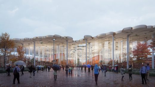
image : Plomp
Sub-Centre Library
Pop-up Shop of Zhima Health
Design: Wang Yong
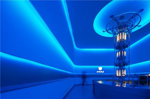
photo : Rock
Zhima Health pop-up shop at Zhengda Center
In S&N Resort, Xidamo Village, Qingshui Town, Mentougou District, Beijing
Design: Penda China
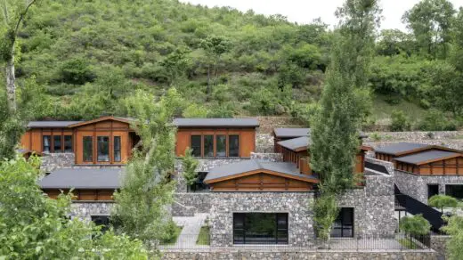
photo : Xia Zhi
In S&N Resort, Mentougou
Jetlag Books pop up shop
Design: WIT Design & Research
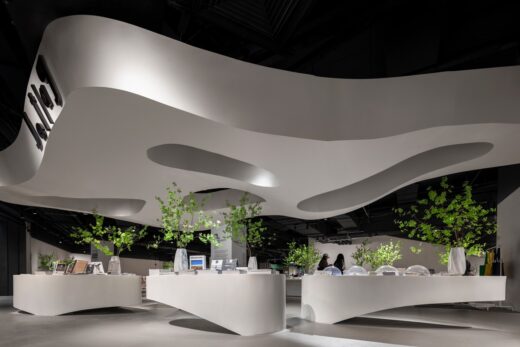
photo : One Thousand Degree Image
Jetlag Books pop up shop
Comments / photos for the Zhen Fund Office Interior, Beijing by asap/ adam sokol architecture practice, page welcome

