WILLchá Flagship Store Beijing, Chinese Building Interior Design, New Architecture Photos
WILLchá Flagship Store in Beijing
2 July 2022
Design: CUN DESIGN
Location: Beijing, Northern China
Photos by Jia Bin, Si You
WILLchá Flagship Store, Beijing, China
“ Will you have a cup of chá? ”
“ Yes, why not! ”
When you wake up every morning, will you choose to brew a cup of pour-over coffee, or go downstairs for a cup of Starbucks at the street corner? Currently, coffee and cola seem to have gradually become the mainstream of people’s consumption. Whenever we wander the streets and smell the pungent aroma of coffee beans, can we still remember the scent of tea that wafted on the land of China a long time ago?
Tea originated in the Shennong era in China, rose in the Tang Dynasty, prospered in the Song Dynasty, developed in the Ming and Qing Dynasties, and has a history of more than 5,000 years.
Today, the traditional form of tea has become far away from people’s lives. As Chinese, should we say goodbye to tea, or have a new understanding of it? This is a question that contemporary people, especially young people, should think about.
Meanwhile, we came across a project. At the end of 2021, the founding team of WILLchá found CUN, hoping to use design to complete a new upgrade for the brand. With this task, we conducted researches and analysis on their products and targeted customers, respectively.
The products of WILLchá are different from other milk teas on the market, and their raw materials are all derived from natural tea leaves. Their concept focuses on healthy tea drinking + scientific tea making. Interestingly, the leading customer group it faces is the post-90s and post-00s between 20 to 35 years old.
In fact, in recent years, more and more young people have begun to pay attention to their health and gradually join the army of healthy diets, which also makes new tea and light tea drinks gradually replace milk tea, and become the fashion darling of the”Generation Z” crowd. Therefore, CUN made a completely innovative attempt in the space based on retaining and promoting the brand charm of WILLchá, “leading the healthy lifestyle of contemporary young people.”
The Space
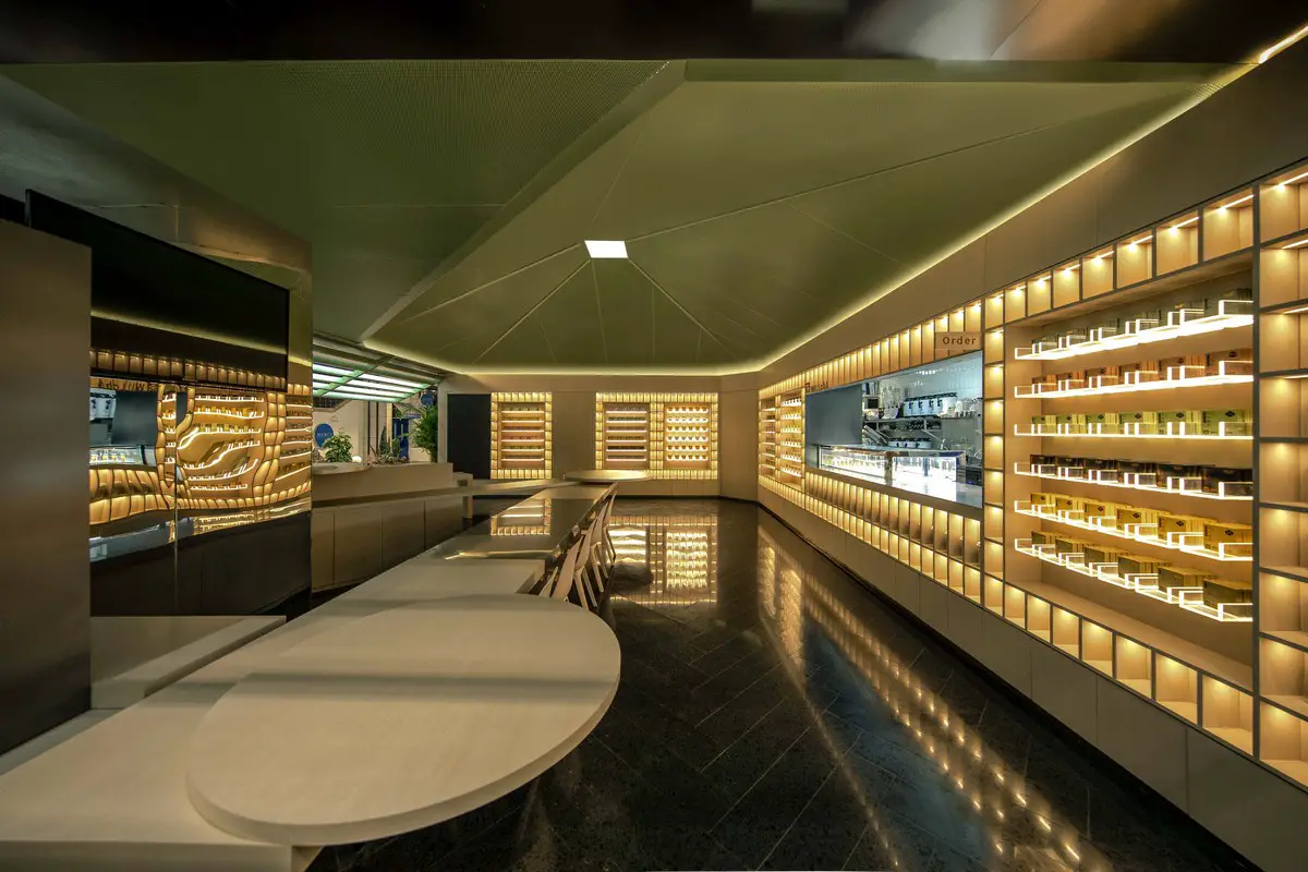
WILLchá flagship store does not occupy a large area, but such a small space is endowed with multi-level spatial expression.
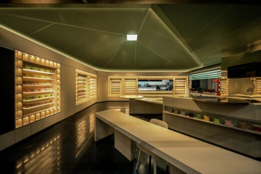
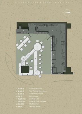
In the layout of the plan, we used the method of geometric composition to divide the area of 100 square meters into a composite commercial body with nine spatial functions. The space not only has sufficient kitchen space, storage room and lounge area for staffs, but also contains ordering area, dining area, DIY tea-making area, customer service bar, tea display and retail area. This truly demonstrates the position of Willchá as “new fashion space of tea experience”.
The feeling of attraction by these magical geometric forms in the space is very intensed. Your mind jumps out of the land and come to the immense universe. In front of you, there are vast rivers of stars.
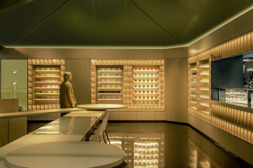
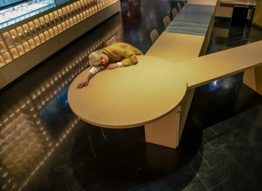
Looking back, you can see a picture like a movie scene: the girl like a visitor from the sky quietly sitting there, bathing in the slightly yellowish light, silently telling the story of the whole space.
The Nature
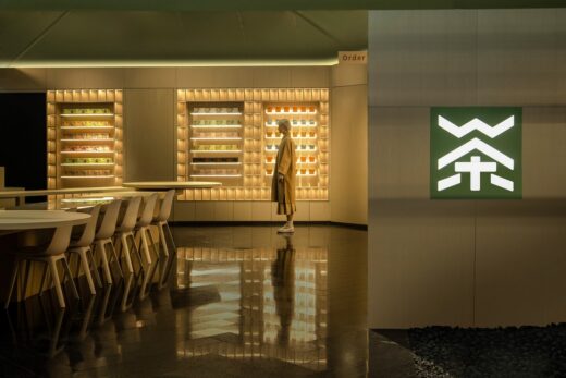
Standing on the central passage, you can see a touch of green in the distance.
This is the visual brand color of Willchá, we then used it as the theme color in the space, thus determining the first impression of Willchá: Natural and Pure.
Entering the store from the outside, you can strongly feel the contrast of the field brought by the change of space from the low-height green grid-like structures, transitioning to the interior with high roof.
The continuation of materials and colors ensures the coherence of spacial feeling, and the sudden change in heights brings infinite imaginations about the space, making people feel enlightened between the steps from the outside to the inside.
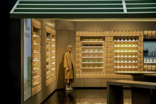
When you are inside, you can see a green profiled top surface, like a giant leaf, starting from the junction of the walls and the ceiling, extending from 2.8 to 5.5 meters above the ground and meeting the light source at the highest point perfectly. The cold light at the top, combined with the warm light emitted by the surrounding light strips, makes the whole space full of layers and three-dimensionality, like a scene in a fantasy.
The entire wall surfaces and furnitures are all made of light gray oak wood veneer, which looks very high-end and cozy under the reflection of warm indoor lighting.
The ground material is black terrazzo. This highly reflective material reflects the entire space. The texture of the array-like shelves on the wall is wiped away, leaving only the stars reproduced on the ground.
The top of the head is a leaf, the side of the body is wood, and the foot is a stone. The so-called “being among the grass and trees” – a small space, reflects the vast nature.
The East
Echoing the slogan of Willchá – “Oriental Light Tea”, we incorporated oriental elements into the space.
The facade of the entire space is like an architecture with oriental aesthetics, full of mystery and internationality.
The horizontal grille below the lightbox at head of the door entrance seems to come from the architectural element of “eaves,” but the turning and junctions are not connected. The disconnected shape adds a unique aesthetic to the design, thus establishing long-term visual appearance of the brand.
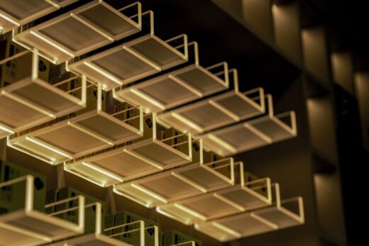
The ideas of pillar-holding window at the door and the folded interior surface of the wall display system are derived from the element of oriental “folding fan”. We use a coherent method to coordinate all displays on the wall, so that the same material and performing elements are used throughout, and unique designs such as “acrylic U-shaped frame” has been added to make the entire elevation not only united, stunning, and pure, but also different from others.
The innovative elevation system not only forms negative space, creates a three-dimensional sense of light and shadow as well as demonstrates material opacity, it also carries out cultural conception and dissemination.
“Will” means want and hope, and “WILLchá” is a warm brand. It wants to expound not only the concept of idealism of a leaf but also the persistence that gradually shines into reality in efforts.
CUN shares the same vision as WILLchá. We hope that through this project, design can be used to convey a new consumption and lifestyle to contemporary young groups, deepen the connection between “Generation Z” and “Tea,” and let more young people experience and taste the unique charm of oriental culture.
Emerson said, “Culture opens the perception of beauty.”
For Chinese people, both language and traditional arts are cultural genes in blood, forming common memories and national identity.
Strong tea will fade at some time, but its lingering fragrance will not sink in history, but will blend with the new era, brewing new cultural possibilities.
Use modernity to understand the tradition and express the future. This may be the local cultural attribute in the projects I have completed.
WILLchá Flagship Store Beijing, China – Building Information
Project Name: WILLchá Flagship Store
Area: 120㎡
Location: Beijing, China
Chief Designer: Fu Lin
Design Company: CUN DESIGN (www.cunchina.cn)
Participated Designers: MA Chuan, Zhang Jiajun, Hou Longyang
Main Materials: perforated aluminum plates, wood veneer, terrazzo
Design Time: 2021. 08
Completion Time: 2021. 11
Photographers: Jia Bin, Si You
WILLchá品牌旗舰店
项目名称:WILLchá品牌旗舰店
项目面积:120㎡
主设计师:付琳
设计公司:CUN寸DESIGN (www.cunchina.cn)
参与设计师:马川 张家俊 侯龙洋
主要材料:冲孔铝板,木饰面,水磨石
设计时间:2021.8月
完工时间:2021.11月
摄影师:贾宾 四又
每天清晨起床,你会选择冲上一杯手冲咖啡,还是会去楼下街角喝上一杯星巴克?在如今这个时代 ,咖啡和可乐似乎已经逐渐成为人们的消费主流。每当辗转在街头巷尾,闻着咖啡豆的浓香,我们是否还能记起早在许久以前,就飘荡在华夏土地上的那一抹茶香。
茶最早起源于中国神农时代,兴起于唐朝,繁盛于宋朝,发展于明清,距今已有五千多年的历史。
在今天,传统形式的茶已经离人们的生活越来越远,作为中国人,我们是要与茶说分手,还是要对其有全新的认识?我想,这是当代人们尤其是年轻群体所值得思考和探讨的一个问题。
与此同时,我们遇到了一个项目。2021年底,未来茶浪WILLchá的品牌创始团队找到CUN,希望用空间设计为品牌完成一次全新的升级和输出。带着这个任务,我们分别对商业的产品和目标客户进行了调研与分析。
WILLchá的产品不同于市面上的其它奶茶,它的原料全部来源于天然茶叶,理念主打健康茶饮+科学制茶。有意思的是,它所面对的主要客户群体却是20-35岁之间的90和00后们。
实际上近年来,越来越多的年轻人已经开始注重自身的身体健康,逐步加入健康饮食的大军,这也使新茶饮和轻茶饮渐渐地代替奶茶,成为“Z世代”人群的时尚宠儿。于是, CUN在保留和发扬WILLchá “引领当代年轻人健康生活方式”的品牌魅力基础上,在空间上进行了一次完全创新的尝试。
The Space·既是空间,也是宇宙
WILLchá品牌旗舰店占地面积并不大,但就是这么一个小小的空间,被赋予了多层次的空间表达。
在布置平面时,我们运用几何构成法,将仅有一百多平方米的面积切分成了涵盖九种空间功能的复合商业体。使其不仅具备充足的后厨空间、员工储物室和休息室,更是在满足了公区的主要功能比如点单区和堂食区外,还为其配备了茶饮DIY体验区、茶客服务区以及茶品展示和零售区,真正实现了WILLchá “新茶饮时尚体验空间”的定位。
置身于店内,仿佛被这些神奇的几何体块所牵引,思绪跳脱出了陆地,来到了广袤无垠的宇宙,眼前浮现的是浩瀚星河。
一回首,望见的又是另一幅电影场景般的画面:天外来客般的女孩静谧地坐在那儿,昂着头颅闭着眼,沐浴在微微泛黄的灯光下,缱绻诉说着整个空间的故事。
The Nature·身在草木间
站在主通道上,远远地便能望见一抹绿。
这是WILLchá的视觉品牌色,也因此被我们将其作为主题色运用到了空间当中,至此便塑造了WILLchá给人的第一印象:自然且纯粹。
从外部进入店内,能够强烈感受到从门头压低的绿色格栅,踱步转场到穹顶高耸的室内所带来的场域反差感。材质与颜色的延续塑造了空间的连贯性,而高度的骤变又带来了无限的空间遐想,让人在由外入内的一步之间有豁然开朗之感。
真正置身于内部时,一抬头映入眼的是绿色的异形顶面,仿若一片硕大的叶子,从四周顶立交接处开始由低到高一直延伸到距地面五米处的灭点,与顶部最高点的光源完美相接并融为一体。顶部的冷光,配着四周灯带所散发出的暖光,使整个空间层次感和立体感十足,如幻境中的场景一般。
整个立面和内部家具材质全部选用浅灰色的橡木纹木饰面,在室内暖色灯光的映照下,显得高级又不失温暖。
地面采用的是黑色水磨石,高反射的材质倒映着整个空间。将立面的阵列感架子抹去肌理,只留星光点点,在地面重现。
头顶是叶,身侧是木,脚下是石。所谓“身在草木间”,小小空间,映照辽阔自然。
The East·未来予东方
呼应着WILLchá品牌“东方轻茶饮”的slogan,我们当然也把东方元素融入到了此次空间设计当中。
整个店的外立面恰似一座极具东方美感的建筑,充满神秘感又十分国际范儿。
门头灯箱下方的横向格栅,看似来自于“屋檐”这一建筑元素,但实际上转折交接处并未相连,断开的造型不仅为设计增添了一份独特的美感,更是为品牌建立了长久的视觉架构。
门口的抱柱橱窗和室内墙面展示架内部的折面,均来源于东方的“折扇”这一元素。进入空间内部,映入眼帘的便是阵列感十足的茶品展陈架。我们用一种连贯的手法统筹所有立面,使同一材质和表现元素贯穿始终,其中更加入了“亚克力U形架”等独有设计,让整个空间立面在统一、震撼且纯粹的基础上,多了一份变化与不同。
对于立面结构的巧思,在形成负空间、塑造光影立体感和材质通透感的同时,也进行了东方文化的传播。
“Will”是想要与希望的意思,“WILLchá”是一个温情的品牌。它所想阐述的不仅仅是一片叶子的理想主义,更是在努力中一点点照进现实的那份坚持与执着。
CUN与WILLchá的愿景一样,希望能通过此项目,用设计传递给当代年轻群体一种新的消费和生活方式,加深“Z世代”与“茶”之间的关联,让更多年轻人体会与品味到东方文化的独特魅力。
爱默生说过:“文化开启了对美的感知。”
对于中国人,无论是语言文字,还是传统艺术,它们都是血脉中的文化基因,熔铸了共同的记忆,形成了民族身份。
浓郁的茶会有变淡的时候,但它的余香却不会沉淀在历史中,反而会与新时代交融,酝酿出新的文化可能性。
在传统中用现代性进行理解,并对未来表达。这一点可能是我所完成项目中的在地文化属性。
WILLchá Flagship Store Beijingimages / information received 010722
Location: Beijing, People’s Republic of China
Architecture in Beijing
Beijing Sub-Centre Library
Design: Snøhetta
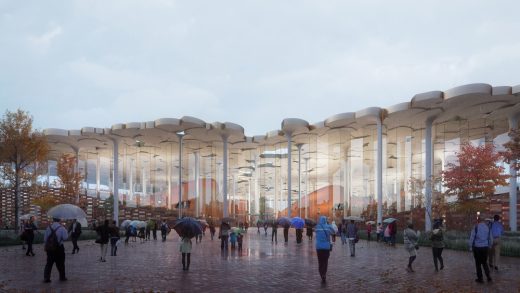
image : Plomp
Sub-Centre Library
Pop-up Shop of Zhima Health
Design: Wang Yong
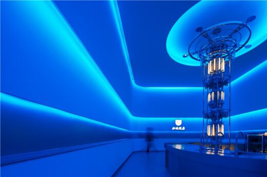
photo : Rock
Zhima Health pop-up shop at Zhengda Center
In S&N Resort, Xidamo Village, Qingshui Town, Mentougou District, Beijing
Design: Penda China
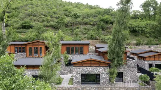
photo : Xia Zhi
In S&N Resort, Mentougou
Jetlag Books pop up shop
Design: WIT Design & Research
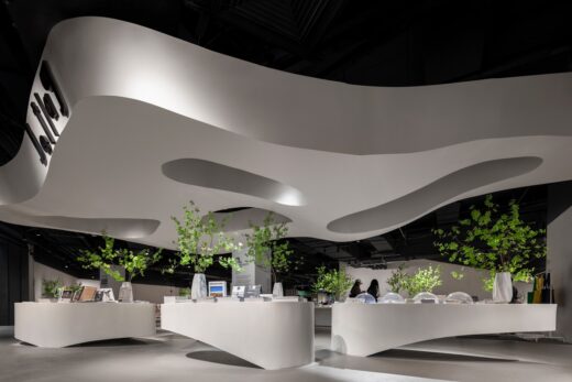
photo : One Thousand Degree Image
Jetlag Books pop up shop
Comments / photos for the WILLchá Flagship Store Beijing by CUN DESIGN led by Fu Lin, China, page welcome

