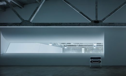
Utter Space Photography Studio, China, Beijing Art, Chinese Architecture Design
Utter Space Photography Studio in Beijing
1 Jun 2020
Utter Space Photography Studio
Architects: CUN DESIGN
Location: Beijing, China
Design is not just creation and decoration, but exploring and choosing by heart.
With the development of trend and fashion, the media has become more and more diversified in images. Under this background, more photographers of different styles have appeared.
Liu Zongyuan, a famous Chinese photographer, is one of them. In early 2019, he found CUN, hoping to design for his photography studio in an old building warehouse in Beijing. We talked for more than 3 hours in the evening, and we feel that, nowadays, everything that can bring people beauty, such as design, video, art, and even music, has become blurred and full of freshness.
We adjusted the nature of this space from purely serving the needs of photography, and adjusted it into a composite space that integrates work, art museums, and activities. This makes the space more thorough and pure on any road, and its name is Utter Space.
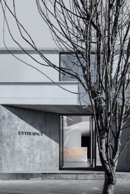
The space building is an old warehouse in the 1960s. When first arriving at the site, I saw that the entire space was partitioned and structured in a particularly chaotic manner. The interior wall of the building was decorated with panels and the top surface was completely blackened. But through the tacky decoration, I can still see the architectural body full of history hidden behind it.
So we started the first job, found it back–the discovery of beauty
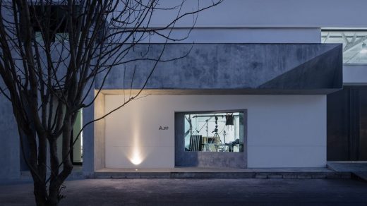
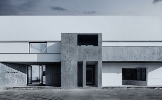
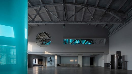
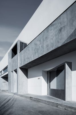
After half a month of demolition, the original appearance of the entire old building was restored. In the process, we found that the original cement wall has a unique history and traces of time and the beauty of it. On the west side, the exterior windows of the building were also demolished.
It turned out that a warm and beautiful golden sunset was projected into the room in the afternoon, transforming the temperament of the entire space. In addition, the structure of the suspended ceiling completely shows the prefabricated formwork of concrete under historical technical conditions.
Its structure is full of a sense of the times, and at the same time has an inexplicable future. So it took us a month to wash out the original cement texture of the entire top surface in the form of water washing. When the whole building was restored, it was already quietly there, following the change of light, it was aesthetically pleasing.
So, I guess, before transforming, designers should have the insight to respect the origin and find the beauty inside.
After the building was excavated, we entered the second stage of work-design and construction.
This time it was different, I couldn’t bear to deal with this already beautiful space. So, I spent two weeks thinking about how to get involved in design and construction.
There is a word in Chinese wisdom called “SHEDE”, which means that you can only get rid of some greed to get unexpected results. Changing to a western design language may be equivalent to “less is more”. Therefore, for the designer, how to control his own intervention and action choice becomes even more important!
We first set up an empty space with two moving lines according to the moving lines of reception, filming, backstage work, and exhibition, one of which belongs to the plane line and the other to the vertical line of elevation. First of all, these two moving lines are looped closed moving lines, and secondly they are linked without crossing.
Next, we allocated area and functional division around these two moving lines to make the whole result more rational. Therefore, whether it is the reception hall on the first floor, the large studio, the small studio and studio on the second floor, or the independent space on the third floor, it is step by step, very reasonable and rhythmic.
Using the existing structure of the space, we have processed the second and third floors progressively and retreat, respectively, so that the three spaces have a rich relationship.
After the structure, function, and spatial rhythm were arranged properly, we entered the work of decoration.
At this time I chose to exercise extreme restraint and let the most primitive architectural scales and material relationships be the performers.
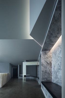
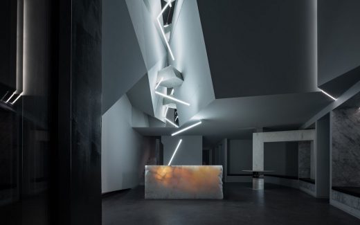
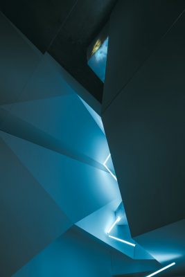
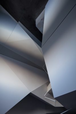
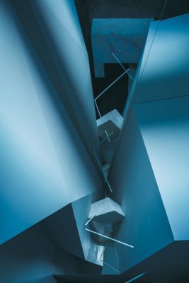
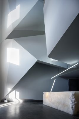
First of all, we arranged a canyon shape in the front lobby space, making this reception space full of fantasy and impact. It is worth mentioning that the beauty of the design is expressed by using the texture of the entire stone. The strength of the design comes from our choice of letting the light pass through the small stones on the ceiling, and reaching the stone front desk that directly penetrates the whole. This method is used to express the beauty of the light transmission of the stone and the beauty of its original weight.
At the big studio, the original charm and tension of the building conquered everything. We keep all the traces of the old building and time, let the east-west direction talk with the sunlight of the day, let the north-south direction add the texture language of the stone, and form the language with the geometric windows. In this way, you will feel simple and powerful, and you will appreciate the treatment we have added, so this part is the control of design strength.
Finally, to the second and third floors, we did a progressive process so that each floor can look into the hall. The second floor gives a more inclusive and connected feeling. You can say that it is a disappearing sense of existence, because its two main walls belong to the first floor space and the third floor space at the same time.
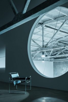
On the third floor, we made enhanced expressions. In a building with a sense of strength in the top beam space, we added two friends, stone and metal, to talk with this secret space through structure and material. You can understand it as a compromise, ascooperation interdependence or even as destroying confrontation and disharmony. So it’s full of power and there is no standard answer. Maybe that’s the charm of building it.
In the end, we didn’t make more shapes or materials in this design, but we just made excavations and choices in this encounter. However, all the work was very challenging and creative. So the day when UTTER SPACE is unveiled, I will still meet more aspects of it. Is it rustic, future, art, technology or dark metal? Perhaps it is its tolerance and possibility that struck me. Sometimes design succeeds in thinking instead of intervening!
Utter Space Photography Studio, China – Building Information
Design Firm: CUN DESIGN
Area: 1000 sqm
Chief designer: CUI Shu
Coordination designer: MA Chuan, ZHAO Yang, JIAO yunqi, WANG xu
Furniture art: Back to the 20th Century
Main material: Marble, latex paint, wood veneer, iron plate, self-leveling cement
Photography artwork: LIU Zongyuan
Space photography: WANG Ting
Utter Space Photography Studio in Beijing, China images / information received 010620
Location: Beijing, China
New Beijing Architecture
Design: Zaha Hadid Architects
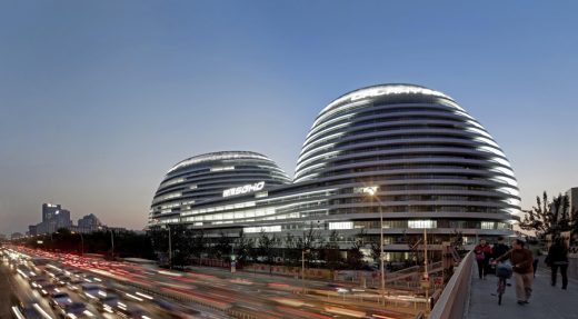
photograph : Hufton and Crow
Galaxy Soho in Beijing
Architect: People’s Architecture Office
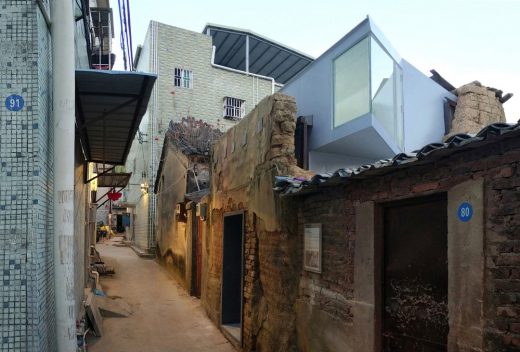
photo © People’s Architecture Office
Courtyard House Plugin
ASTUDIO Photography Studio, Art Valley, Chaoyang District
Design: United Units Architects
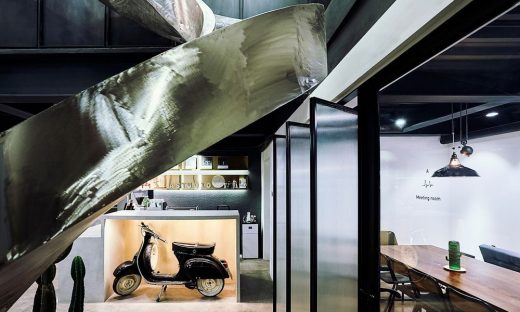
picture © ASTUDIO
Photography Studio in Chaoyang District
Design: Grant Associates
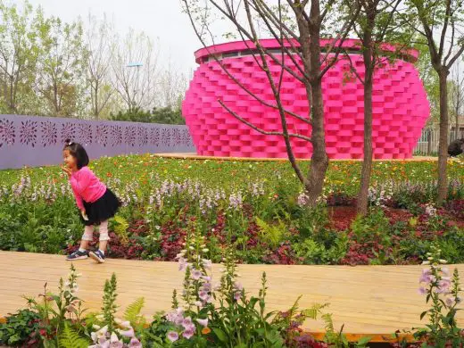
image courtesy of Grant Associates
Rewilding Garden Beijing
Wangjing Soho
Design: Zaha Hadid Architects
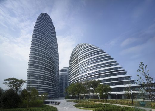
photo : Virgile Simon Bertrand
Wangjing SOHO in Beijing
Comments / photos for the Utter Space Photography Studio in Beijing, China page welcome


