InterContinental Sanlitun Beijing Building, Chinese Hotel Architecture, Architect, Images
InterContinental Sanlitun in Beijing
Hotel Interior Development in China – design by CCD/ Cheng Chung Design
27 Jan 2018
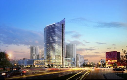
InterContinental Sanlitun
Architects: CCD/ Cheng Chung Design
Location: No. 1 Sanlitun, Beijing, China
New Yuppies – InterContinental Beijing Sanlitun
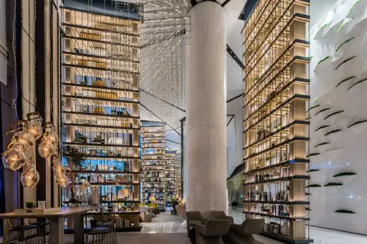
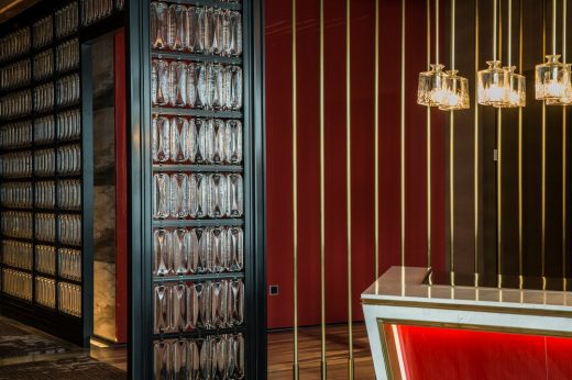
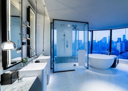
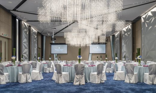
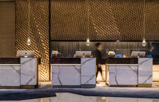
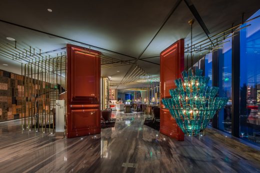
The design concept of the hotel was inspired by the hexagonal diamond element in the building facade. Through the analysis of the formation of diamond, which is made from constantly refining of rough stone; the design adopted the cutting and luster characteristics of diamond to shape the space. This concept is throughout the architectural plan layout and every elevation detail. Each detail is a story; a stylish and avant-garde space scene is created by the atmosphere of lighting, stylish furniture and exquisite artworks.
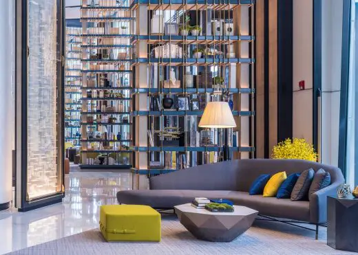
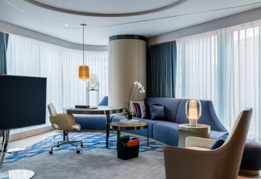
CCD intended to create a “New Yuppies” style hotel. It is “new” for that typical Yuppies symbolizes the pursuit for positive, confident, calm, gentle and fashionable life, with main colors of black, white and grey. CCD’s New Yuppies for InterContinental Beijing Sanlitun stuck to the pursuing of fashion trend, but the color is not only black, white and grey; gemstone blue is acting as the main color to create an avant-garde atmosphere of future and technology.
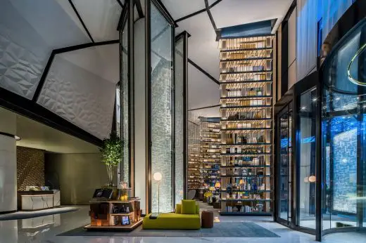
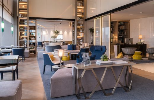
The interior design is in line with architectural design and makes full use of the spaces of the existing building, in order to create a convenient, elegant and comfortable interior space with reasonable layout, which is conducive to efficient business management and development. For example, by making full use of the advantages and disadvantages of the main structures, the structural column in the way is combined with custom-made arc sofa, forming virtual spaces together with the partition and sinking ceiling. In this way, different functional spaces are independent of each other, while maintaining a magnificent sense of the grand space circulation.
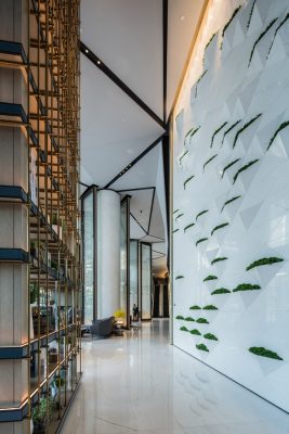
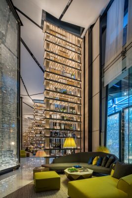
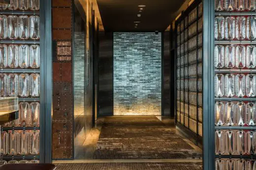
The interior design started from shaping space scene; it is not only about the surface decoration, but also dividing the spaces in an architectural way. Spaces are penetrated into each other, creating an visual experience of alternation of virtual and reality. For example, the architectural space of the lobby is long and narrow with short spatial depth, this existing condition inspired CCD on the spatial processing. CCD broke the traditional design techniques for a lobby, they adopted the way for a fashion boutique store to create the lobby into a stylish avant-garde space. CCD separated the spaces by using screen and shelves which are made of exquisite special glass and crystal, creating different space scenes in the long and narrow lobby area. Another eye-catching place in the lobby is the plant wall, designed by the same method of diamond cutting and patchwork, where green plants are scattered in a well-arranged way, giving the space vigor and vitality. The design of the lobby bar continued the treatment of diamond cutting, where luminous art installation is pouring down and make an impression to the guests.
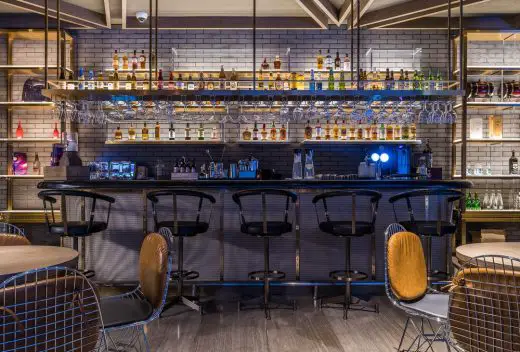
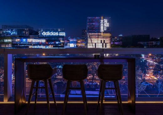
The third floor is for dining, where 5 restaurants are distributed, so that people can have choose from them according to their taste and mood. The Top Tapas Restaurant and Top Bar are the first two spaces coming into the public eye, decorated with red color and copper pipe partition to show the Spanish style properly; Ying Japanese Restaurant is surrounded by Ying Chinese Restaurant with “Hermes orange” as the main color; opposite to Ying Restaurant, the Char Dining Room (Steak House) & Lounge is in open industrial style. The Lounge faces Sanlitun Bar Street. Sitting in the lounge at night and facing Sanlitun neon flashing, it has an atmosphere of ardency without being disturbed.
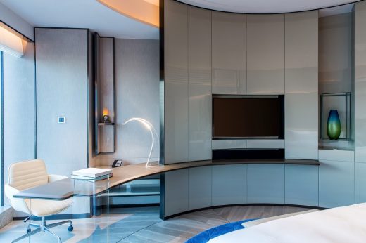
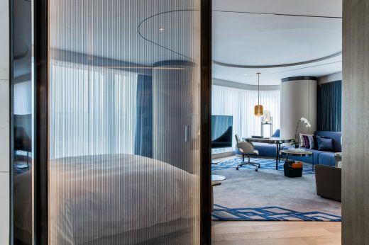
There are a lot of innovations in design, the most unique one is the circular layout of the room, which makes the original rigid 45 square meters guestroom artistic, avant-garde, more open and convenient.
The Executive Lounge on the 22nd floor is created into a modern space, where the bright and elegant color contrast can awaken the youth of Yuppies. This is certainly the best place for a private party.
The design of the presidential suite continued the concept of fashion boutique store, and has chosen the elements of the elegant DIOR brand. For example, DIOR’s representative gold and white are applied to the designs of wall, screen, lamp and so on.
There are some artworks which are exclusively customized for the hotel based on its artistic culture, with main materials as paper, steel and wood. Green plant is the DNA of the design, so that the space has more natural vitality.
InterContinental Beijing Sanlitun gives new vatality to the InterContinental Hotels & Resorts, which is dedicated to creating luxury hotel brands for 70 years. At the same time, it highlights the determination and achievement of InterContinental Hotels Group on the strategic deployment to develop landmark hotels in first-tier cities.
InterContinental Sanlitun – Building Information
Design company name: CCD/ Cheng Chung Design (HK)
Project name: InterContinental Beijing Sanlitun
Design time: May 2014 – February 2015
Completion time: August 2016
Project Location: No. 1 Sanlitun, Beijing
Project area: 30,000 square meters
Main materials: resin board, paint board, stone, bronze, leather, cloth
Construction company: SHENZHEN ASIANTIME INTERNATIONAL CONSTRUCTION CO., LTD
InterContinental Sanlitun in Beijing images / information received 270118
Location: Beijing, China
Beijing Architecture
Beijing CBD Eastern Expansion
Design: SOM, architects
Beijing CBD
Z15 Tower – tallest building in Beijing
TFP Farrells, BIAD, ARUP and MVA
Z15 Tower
Beijing Architecture – Major Designs
Central Chinese Television Tower
Rem Koolhaas Architect / OMA
CCTV Beijing
Capital Airport
Foster + Partners
Beijing Airport Building
Comments / photos for the InterContinental Sanlitun in Beijing page welcome


