Raiffeisen Finance Center, Eisenstadt Building, Architecture Austria, Images, Architects, Design
Raiffeisen Finance Center, Eisenstadt
RFC Building, Austria design by Pichler & Traupmann Architekten
16 Feb 2011
Design: Pichler & Traupmann Architekten
Images courtesy Pichler & Traupmann Architekten
RFC Eisenstadt
Raiffeisen Finance Center, Eisenstadt Building
DESIGN MOTIFS
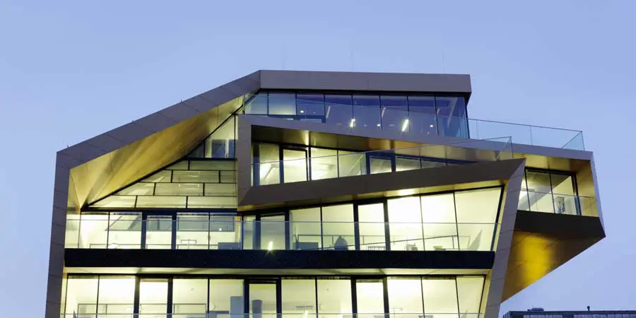
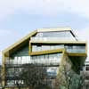
“The design of the building playfully responds to the restrictions imposed by the building regulations as well as to the schedule of accommodation for the different floors, and develops an encasing figure that encloses all the activities of the bank in a continuous form. The continuity of the building envelope conveys a sense of identity to both staff and customers, while the building’s volumetric shaping ensures it a striking role in the appearance of the town.
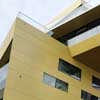
It is made of aluminium sandwich panels whose colouring might awaken associations with coins or the bank’s corporate identity. Narrow window openings at calculated positions in the façades respond to the need to screen people who work at computers from glare.”
UNUSUAL FAÇADE WITH A HIGH DEGREE OF FUNCTIONALITY
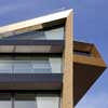
This basic idea – quoted from the explanatory report that accompanied from the competition entry – was deepened and developed further. To the east and the west the building is encased in a metallic façade made of Alucobond panels that is perforated by windows arranged in a specially developed layout. This layout allows unfamiliar views outside, but also offers the staff an almost intimate work atmosphere and provides protection against glare for those working at computers.
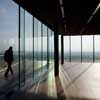
The amount of glazing is based on guidelines on lighting for work places. This allows a large area of solid wall which, thanks to its building physics qualities (good thermal insulation and good heat storage), contributes to optimising the building’s energy balance. The full-height glass façades to the south are a response to the marvellous views across the plain of the River Wulka and, thanks to regulatory elements (sun screen system), can allow energy (solar heat gain) to enter the building or can screen most of it.
VARIABLE INDOOR SPACE AS A REGULATED SYSTEM OF REFERENCE
The interior is formulated as a regulated system of reference on various levels of meaning:
Firstly, in terms of spaces and materials it forms a single entity with the building’s external form. The material used for the external shell provides the starting point for the concept of materials used in the interior. Like the façade, the window reveals and the fan coils are also clad with Alucobond.
The suspended ceilings in the formal areas on the upper floor are made of the metal in the same colour so that, in a sense, the building envelope is drawn into the interior. The exposed, unclad areas of ceiling and external wall are made of smooth exposed concrete.
Plasterboard painted light grey is used for the suspended ceilings above the corridor areas as well as for parts of the office partition walls, and together with flooring of sound absorbent rubber or carpet complements the canon of materials in softly graduated shades of grey. The elegant neutralizing background allows individual colour accents to be used in the work area to emphasise special areas, spheres, or significance.
Secondly, in directing the relationship between indoor and outdoor space.
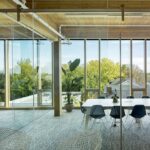
The office walls onto the corridor zones are, in principle, to be made as a system of glass partitions whose degree of transparency can be modified by the use of foils. This means that views inside, outside and through the building can be directed as required, transparency and spatial depth can be experienced, and indeed outdoor space and the landscape are brought into the innermost area of the building. The interior design is intended to allow spatial relationships, not to block them.
Thirdly, as a depiction of the company’s internal organisation The structural layout of the building and the articulation of the facade on a basic grid of 1.30 m allows the office partition walls to be positioned flexibly within the given grid system. This allows rooms of different sizes to be made that respond to various functions and needs and, where necessary, can be easily altered.
Open, semi-open or closed areas can be easily made in different formulations. The plans of the different floors illustrate this system’s high degree of flexibility. Monotony and repetition are avoided; different functions and levels of organization can be depicted.
Fourthly, as an articulated body of rules of communication The partitions between the individual offices are made of glass or have a high-level strip of glazing that varies in height. The different amounts of glazing articulate the different amount or degree of communication required.
THE FOYER AS PUBLIC SPACE
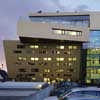
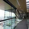
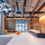
Particular attention is devoted to the design of the foyer and entrance hall. As a connecting element between the existing fabric and the new building this space is the building’s calling card, so to speak. Its quality is derived from its permeability, its height, the connecting bridges that traverse it, and from its glass façades that are several storeys high: the glass façade to the outside and the glass façade positioned in front of the restructured part of the existing fabric for which an artistically designed lighting concept is employed.
As this space is where the initial contacts with the bank are made, it is presented as a customer-friendly, open and yet representative financial institution. The space is crossed by both customers and bank employees, thus creating a feeling of belonging, strengthening the sense of identification with the Finance Center and the bond to a reliable, strong partner.
Raiffeisen Finance Center Eisenstadt images / information from Pichler & Traupmann Architekten
Location: Eisenstadt, Austria, central Europe
Austrian Building Designs
Austrian Architecture Designs – architectural selection below:
Vienna Architecture Walking Tours by e-architect
Austria Architect : Offices Listings
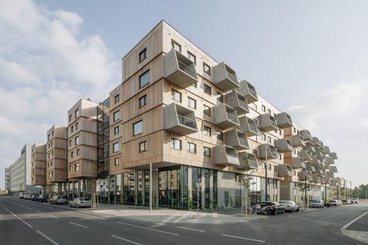
Holzwohnbau Seestadt Aspern Wien
Design: Berger+Parkkinen with querkraft architects
photograph © Herta Hurnaus
Holzwohnbau Seestadt Aspern Wien
KAP – The Kapellenhof Estate (1220 Vienna) – 450 Living Units, Kapellenweg
Architects: ARGE AllesWirdGut | feld72
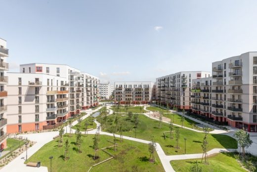
image courtesy of architects office
Kapellenhof Estate Vienna housing
Comments / photos for the Raiffeisen Finance Center Eisenstadt Building design by Pichler & Traupmann Architekten page welcome

