
Nail Color Harmony in Your Dining Room: Easy Ways to Mix Paint, Décor, and Dinnerware
13 October 2025
Today, let us turn our attention to the art of color harmony within the dining room. It’s a big deal if you’ve just moved into a new place and are figuring out your dining area, if you’re giving your old space a refresh, or even if you’re a designer tackling a trendy project right now.
Modern trends call for a smooth approach to incorporating and following the principles of color harmony: so it’s not just about the big pieces—you’ve got to think about the little décor touches and even the table setting, making sure everything ties back to the main idea.
The truth is, it’s super easy. As long as you keep to a few basic pointers, you’ll always get it right without stressing.
The Right Way to Make It Work
The starting point is always your style. Once you define it, the wall colors, home decor, and even the tableware for your dining area can be selected to perfectly support that vision. Honestly, there aren’t really any rules here. Right now it’s all about going with what feels right for you—so in décor you’ll spot everything from sleek modern pieces to something dramatic and old-school, like Baroque. But we’ll focus on the main trends of 2025 that are most popular in projects around the world: Japandi, Natural (Sustainable), Maximalism and Eclectic(Vintage & Retro).
Popular Interior Trends and Their Favorite Color Palettes
We present five of the most prominent interior styles of 2025, accompanied by carefully chosen color palettes, suitable for both decorative accents and elegant tableware. Each design trend sets the tone with a unique palette that reflects lifestyle and personality. To make it easy for you, we’ve paired practical tips with brands that perfectly complement every concept.
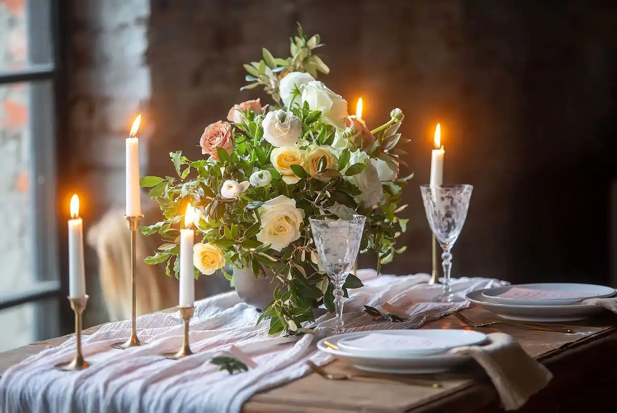
Japandi
It’s a kind of minimalism with warm tones. It’s defined by a mix of Scandinavian influences and a distinctly Japanese sense of restraint. In spaces like this, people usually go for natural stuff—light woods such as oak, ash, or bamboo, a few black or charcoal accents, and fabrics in sandy or creamy shades. It’s all kept simple, but still cozy and comfortable. That’s why the colors need to vibe with the whole setup.
Go for neutrals only—leave out anything too flashy or loud. Typical wall colors include soft whites, warm beige, light gray, and elegant ivory. To upgrade the look, designers sometimes add striking accents like deep graphite or natural green.
For Japandi, your table setting should flow with the vibe of the room—think simple pieces, natural touches, tactile details, and a soft, calming palette. Choose matte ceramics in tranquil hues—milk white, tender beige, warm gray, and sand. To add a touch of intrigue, consider smoky glass in refined gray or olive hues. Explore this selection to discover pieces that bring the look to life:
- Kinto (Japan)
- Hering Berlin (Germany)
- Hasami Porcelain (Japan)
- Serax (Belgium)
- Iittala (Finland)
- Fürstenberg (Germany)
- Jars Céramistes (France)
- Heath Ceramics (USA)
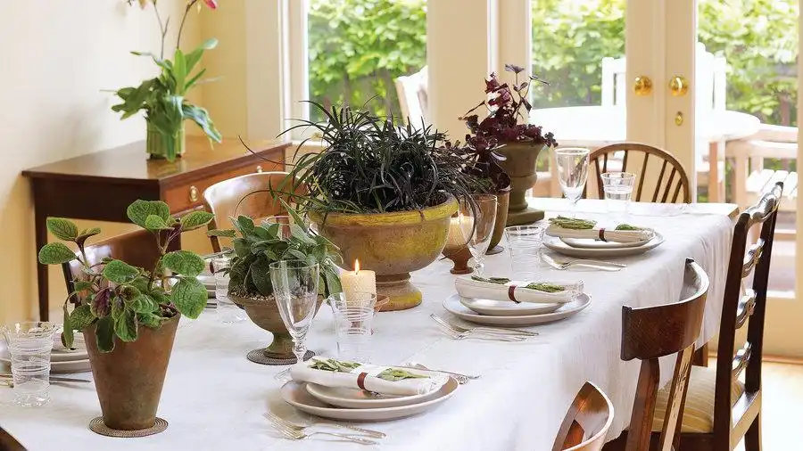
Natural, Sustainable Style
Sustainability isn’t exactly a new thing, but it’s definitely not losing any steam. Natural materials, artisanal details, and nature-inspired palettes—earthy shades, greens, and blues—make today’s interiors more desirable than ever. The vibe is all about natural wood, mossy greens, warm earthy browns, and laid-back fabrics like linen in gray and white.
To really bring out the vibe, people paint the walls in colors like terracotta, clay, warm beige, soft olive, or a toned-down sandy shade. In the Natural look, your tableware should feel natural—showing off eco vibes and simplicity. Skip the shiny, fancy stuff or loud, fake colors. Choose dinnerware in tones that complement your walls and décor, ideally with textured finishes rather than glossy ones. For glassware, opt for elegant recycled glass—either clear or softly tinted in green, amber, or smoky hues. Brands that fit this style:
- Broste Copenhagen (Denmark)
- Hasami Porcelain (Japan)
- La Soufflerie (France)
- Cutipol (Portugal)
- Ekobo (France)
- Mepra (Italy)
- Coralla Maiuri (Italy)
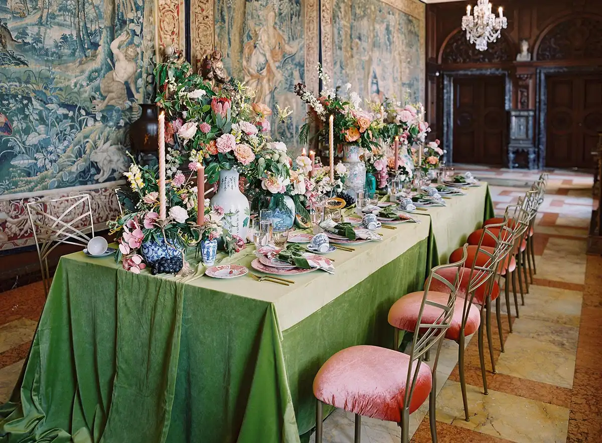
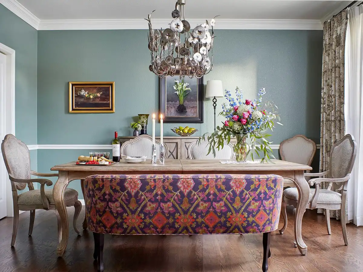
Maximalism
On the flip side of minimalism, maximalism is all about mixing it up—lots of colors, patterns, and textures, with plenty of richness to go around. This style isn’t about chaos—every color choice is thoughtful, impactful, and beautifully refined.
For this look, furniture and décor really need to pop—like bold velvet fabrics, rich patterns, hints of gold, glossy lacquered pieces, and lots of textures mixed together. The walls are best adorned in sumptuous tones: emerald, sapphire, burgundy, or midnight blue. At times, a daring contrast of yellow or fuchsia proves strikingly effective.
With Maximalism, the table is all about abundance. Go for plates that mix daring combos and colors like sapphire, emerald, burgundy, dark purple, bright ocher, or indigo. Feel free to mix contrasting colors in one setting. Maximalism celebrates the vibrant play of shades, textures, and daring, unexpected pairings. Complete the look with colored glassware—cobalt, ruby, amber, or emerald—enhanced with fine engraving or unique, eye-catching shapes.
For statement-making pieces, explore luxury brands including:
- Versace Home (Rosenthal, Germany)
- Ginori 1735 (Italy)
- Vista Alegre (Portugal)
- Baccarat (France)
- Lalique (France)
- Bernardaud (France)
- Robert Haviland & C. Parlon (France)
- Rosenthal (Germany)
Eclectic (with Vintage & Retro)
Eclectic is still one of the coolest looks out there. In 2025, it leans into mixing modern shapes with vintage finds—dark wood, brass touches, vintage greens, velvet blues, and lots of patterned fabrics. It’s about mixing everyday modern brands with high-end luxury names that carry history, rich colors, and their own vibe.
The base colors here are super calm—think creamy whites, soft grays, light blues, and sometimes a touch of pastels. When it comes to accents, think burgundy, mustard, turquoise, plus a splash of gold or platinum—matte or glossy, both look amazing. Tableware in this style plays with color—pastel bases mixed with burgundy, mustard, turquoise, or emerald accents. It feels expressive, a bit bohemian, even a touch chaotic, but always on purpose.
You might see floral or geometric patterns in a mid-century style, along with vintage colored glass—amber, mint green, pink, or blue—often with hand engraving. Brands that fit this style include:
- Anthropologie (USA)
- Seletti (Italy)
- Royal Copenhagen (Denmark)
- Maison Margaux (UK)
- La Rochère (France)
- Baccarat (France)
- Haviland (France)
- Depression Glass (USA)
- Christofle (France)
What Else to Mention
Creating your own exclusive interior project is both interesting and engaging. What really matters is balancing the colors and details so everything feels in sync. Even the simplest neutral background can feel fresh when you layer in accents with textiles, tableware, or furniture pieces. A harmonious palette has the power to quiet chaos, conceal minor flaws, and render the space whole.
Ready to experiment with bold colors and create a seamless look? The best part is, you can shop for many of these pieces directly from your smartphone or laptop. You can order paint, accessories, exclusive glass, and luxury tableware online, making it easy to create a unique design. You can also take advantage of cool design tech like AR to see how certain ideas and color options will actually look in your space before committing. With the right approach, you can turn your home into the perfect reflection of the atmosphere you’ve always wished for.
Comments on this guide to How to Nail Color Harmony in Your Dining Room: Easy Ways to Mix Paint, Décor, and Dinnerware article are welcome.
Restaurant Furniture – Interior Architecture Design
Restaurants Furniture Articles
How building design shapes restaurant furniture
Choosing the right restaurant furniture
Choose best restaurant furniture for more tourists
++
Building Articles
Residential Architecture
Comments / photos for the How to Nail Color Harmony in Your Dining Room: Easy Ways to Mix Paint, Décor, and Dinnerware page welcome.