Living Structure Comes From Patterns, Global Architecture Design, Buildings, Architect
Living Structure Comes From Patterns
Architectural Wonders article by Nikos A. Salingaros
21 Aug 2015
Living Structure Comes From Patterns, Part 1
By Nikos A. Salingaros
What is a living pattern?
Living Structure Comes From Patterns, Part 1
Patterns describe essential relationships among the elements of systems, and provide a unique and useful tool for handling and organizing complexity. This truth, embodied for centuries in the practice of creating human habitation, has in recent years been dissected and catalogued by science. Computer researchers have adopted the pattern method both to understand and to manipulate complexity. Advances in our knowledge of how patterns reflect the ordered complexity of nature has led to breakthroughs in computer technology that continue to fuel economic growth and development not just in industry but in every realm of our society (Leitner, 2015; Mehaffy & Salingaros, 2015).
Patterns of behavior, and of practice in any field of human endeavor, evolve over time with constant repetition, each repetition embedded in and learning from its predecessors. Any pattern arising from such evolutionary selection over generations is irreducible; that is, it cannot be understood in terms of simpler components. It is not a multiplication of a prior component but an accretion to its complexity. It grows ever more subtle, ever more useful, and comes closer and closer to reflecting how nature works: It is a living pattern. Such a pattern can be combined with others into a system that reflects an ever-higher level of useful relationships (Salingaros, 2005: Chapter 8).
We rely on techniques akin to genetic programming to discover evolved solutions as general methods for manipulating complexity without destroying its order. By examining an enormous number of possible small variations, a pattern is selected as the optimal configuration, the one that provides the most useful feedback. Direct simulated evolution is computationally very intensive, so the results, once obtained, are worth documenting in a pattern format.
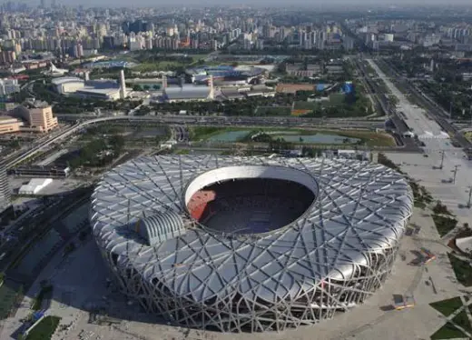
Beijing National Stadium, China:
Twelve living patterns help define human spaces
The key question in architecture is how to design a space that feels reassuring on at least an unconscious level. Incredibly, we have been producing hostile, anxiety-inducing spaces or dreary, depressing spaces for decades, at least as judged by their users. A dozen living patterns selected from Christopher Alexander’s A Pattern Language (Alexander et al., 1977) can help architects get beyond this deplorable practice. The following pattern summaries are my own, and they focus on spatial aspects. The reader is urged to consult the original, lengthier version of each numbered pattern, which includes research material giving detailed arguments and/or scientific validation for the patterns.
Pattern 61: Small Public Squares. Build public squares with a width of approximately 60 feet. Their length can vary. The walls enclosing the space, whether partially or wholly surrounding it, should make us feel as if we are in a large open public room.
Pattern 106: Positive Outdoor Space. The built structures partially surrounding an outdoor space, be it rectangular or circular, must define, in its wall elements, a concave perimeter boundary, making the space itself convex overall.
Pattern 115: Courtyards Which Live. The best courtyards have many entry points, a view to the streets beyond, and enclosing walls that are fenestrated, not blank. These are used most often.
Pattern 124: Activity Pockets. The success of urban space depends on what can occur along its boundaries. A space will be lively only if there are pockets of activity all around its inner edges.
Pattern 167: Six-Foot Balcony. The minimum depth of social space for a balcony is six feet, preferably with its space partly enclosed, either canopied, protected from nearby observers by side screens, or partly recessed into the facade. Recessed balconies provide an excellent sense of enclosure. But if balconies are narrower than six feet, are totally exposed or entirely cantilevered (sticking out), they are rarely used.
Pattern 179: Alcoves. To heighten the sense of intimacy indoors, build a useful smaller space within a larger space, partially enclosed with concave boundaries and a lower ceiling. Its width and depth could both be approximately six feet.
Pattern 180: Window Place. A concave boundary can incorporate windows. Examples range from (small) a window seat where the wall is deepened to create a space around the window, to (medium) a bay window where windows wrap around an extruded portion of the space, to (large) a glazed alcove where windows partially wrap around a room.
Pattern 183: Workspace Enclosure. The best place for working has no more than 50 to 75 percent of its perimeter enclosed by walls or windows. A workspace needs at least 60 square feet of floor area for each person.
Pattern 188: Bed Alcove. Give the bed its own partial enclosure. The space should feel comfortable, not too small, with a lower ceiling than the main part of the bedroom.
Pattern 190: Ceiling Height Variety. Give a building’s rooms different ceiling heights to enhance comfort at every scale of activity. High ceilings contribute to formality, low ceilings to informality, with the lowest height for the greater intimacy of alcoves.
Pattern 191: The Shape of Indoor Space. Indoor space should be roughly rectangular in plan with straight, vertical walls for practicality, but with concave wall portions where possible, and a roughly symmetrical vaulted ceiling. One-sided, sloped ceilings and sharp, slanted, or re-entrant angles in walls generate discomfort.
Pattern 203: Child Caves. Create small “cave-like” spaces in a house, or outside, for children to experience and play in.
Reading these living patterns should evoke a sense of human space that envelops and nourishes us; it goes far beyond strict mechanical utility. We need a new methodology for adaptive design, to re-awaken our lost spatial sensitivity and focus once again on creating “reassuring” spaces. These are vital for health and comfort in the built environment. If an architect expresses repulsion at the supposed “sentimentality” of these patterns, that is merely evidence of ideological conditioning to reject healing spaces.
Recurring themes run throughout the above spatial pattern summaries, such as partial enclosure balanced between too little and too much, and the need for concave boundaries to create convex space — Alexander called it “positive” space. Like biophilic design patterns, spatial design patterns enjoy scientific support. First, the inherited memory from our ancestral evolutionary environment certainly includes clearings, tree canopies, and caves as prototypes (Salingaros, 2015). Those settings provided a reassuring sense of enclosure at the right dimension. Second, neurological responses that were developed for our general survival long ago act now to interpret a space’s geometry as either friendly or hostile.
Experienced space and the principle of concavity
Spaces that embrace us gently are spaces we find inviting. Such spaces formed from concave boundaries embody the “principle of concavity”, which determines at all scales how we experience space. It tells us that we prefer surfaces that enclose us in a more or less organic manner. Urban space must be partly surrounded by an enveloping perimeter if it is to be used with pleasure and reassurance. It cannot just be leftover space between stand-alone “look-at-me” buildings. Humans tend to feel exposed and threatened in those leftover spaces because they are not defined coherently (Salingaros, 2005: Chapter 2). They fail to fit into the expectations formed by our instinctive judgment of space, which is built up over time — over generations — by our experience and that passed down to us by generations of users of the built environment. So people avoid fractured and incoherent open spaces in obedience to perfectly rational psychological imperatives.
Moreover, urban space is not two-dimensional. It is not enough to define it by means of a ground plan. Additional geometrical elements are needed to complete the sense of a three-dimensional enveloping boundary. Those work in the vertical dimension, and arise from the scales of architecture, not urbanism. Much depends on whether the details of the surrounding walls transmit either psychologically friendly or hostile messages to users of an open space. Mirrored or transparent curtain-wall façades diminish the visual sense of enclosure of a public space, making it less informative, less interesting, less friendly, less functional. Contrarily, solid façades showing organized complexity (as defined by their windows, doors, and other details) improve the functionality of an urban space.
Every useful, satisfying urban space reaches visual completion at a certain height off the ground, like framing a picture. For example, a roof cornice on facing buildings adds a horizontal lip to the built perimeter of urban space, creating a degree of concavity that enhances the feeling of enclosure (Salingaros, 2005: Chapter 2). Such framing edges are nowadays dismissed as inessential because their original function is not understood; yet they play a major supportive role in the definition of reassuring urban space.
In Volume 3 of The Nature of Order (Alexander, 2005) Alexander introduces the concept of “hulls” (as in the concave hull of a boat) in public space. This is again the idea of coherent public space that promotes the sensation of being in a giant outdoor room, a room without a ceiling. Alexander also describes the process of designing indoor rooms whose volume and boundaries offer the qualities necessary to induce comfort. Altogether, we have a set of new tools for creating coherent living space, interior or exterior, defined by the characteristics of its enveloping and sheltering boundary.
How do we create healing spaces?
An essential group of patterns describes the shape of the space we experience, the volume in which living actually occurs. A space or collection of spaces that is well designed offers psychological “reassurance” to its users (Salingaros, 2015). We find such healthy characteristics predominantly in traditional places. Of course, we could literally perform an action in any volume large enough to contain it. But a space should make us comfortable enough to enact our roles in life without feeling anxiety from aspects of the built environment’s geometry. Such a space is shaped so that it “reassures” our body and mind — not necessarily as an aesthetic response but as a medical/psychological response (Salingaros, 2015).
All of us have experienced the sense of emotional elation inside a truly great space. This has little to do with its size. And yet many architects seem strangely uninterested in the factors that are responsible for this effect. The rules for designing such spaces can be researched, and then documented as design patterns. Certain environments — usually of rather modest dimensions — invite us to work and linger in them, whereas other spaces of similar size somehow disturb us. Specific geometric components and features, which we might not notice until they are brought to our attention, make all the difference in the world to the adaptive quality of spaces that contain human activity.
Mental and emotional well-being is a function of adaptive architecture. Experiments in human psychology document that we have a built-in aversion to sharp objects in general, and in particular to those pointing at us. Most people prefer rounded moldings to sharp, angular moldings in window frames and sills. At the next architectural scale, walls that are not vertical and ceilings that are not horizontal, and re-entrant walls and ceilings bulging towards us instead of yielding outwards, cause alarm. Emotional discomfort can be triggered by design elements of a wall meant for purely aesthetic effect — rather than for real or apparent structural utility such as columns, pilasters, or beams.
All of this information can be documented as living patterns. Some of it already has, although much research remains to be done.
Architects trained in conventional methods tend to resist design solutions that employ living patterns. They don’t want to be told that their designs might displease or even hurt the users’ sensibilities. That would imply failure, so they ignore feedback and insist on judging design exclusively by abstract aesthetics. They value appearance above utility. For them, design patterns are anathema.
Living patterns enhance our lives and health
Patterns are an adaptive design tool for today — already available, developed previously by someone else. Its existence saves an enormous amount of work. We need not rethink everything to implement a new project. Yet the flexibility of living patterns means that what is re-used is only the most relevant structural relationship, conveyed as an evidence-based proposition. A living pattern does not merely copy an image from the past but implements the latest upgrade. In this sense, living patterns are tools of evolutionary, adaptive design (Leitner, 2015; Mehaffy & Salingaros, 2015: Chapter 18).
The relationships embodied in living patterns help create an environment with healing properties. Humans have used patterns for millennia. The backstory became evident with research on the concept of biophilia and evidence-based design that arose from it (Kellert et al., 2008; Mehaffy & Salingaros, 2015: Chapters 11 & 12; Salingaros, 2015). Faster patient healing after surgery depends on exposure to natural environments, and buildings that have the right mathematical qualities mimic this effect. Living patterns have immediate consequences for human health and life. They are not simply a matter of individual preference.
The pattern format expresses a design constraint, a relationship that expresses what a design element can accomplish — and cannot. It narrows down the specific purpose of any given design solution. This constraining specificity enables the transmission of such knowledge from one culture, historical time and place to another (Salingaros, 2005: Chapter 8). But living patterns as studied relationships among design elements may seem irrelevant when interpreted, as they often are, in the framework of a purely formal, sculptural architecture.
To read Alexander’s design framework of 253 socio-geometric patterns (Alexander et al., 1977), is to immediately feel the patterns, especially the biophilic ones, to be true in a visceral sense. Patterns not directly linked to biology may still be interactive or social in type, acting together on different scales in a way that mimics nature. Many non-architects in fact learn architecture from A Pattern Language, even practicing as amateur architects. Living patterns make design a more participatory, vernacular, even democratic process, working to push back against the myth of the “genius” (and often authoritarian) architect.
Some patterns rely on experiential psychology, driving humans to feel comfortable or uncomfortable in different types of setting. Others relate to human visual and spoken communication with passersby, whether sight lines, proximity, and other factors that promote or discourage interaction. Human contact is required for the well-being of adults, and especially, at either end of lifespan, for both the emotional formation of children and emotional health of the elderly. Meanwhile, the industrialized world continues to create formally striking places that skimp on human values. Whether cramped or so vast as to engulf human scale, they are ultimately useless. A proper intimacy of space, offering the psychological protection essential for inviting people to use it, is absent.
Planning regulations in recent decades have made it extremely difficult to implement living patterns. But as these outmoded codes are gradually reformed or discarded, living patterns are available to soften the rigidity of the 20th Century built environment. A more humane worldview can upend the paradigm that has guided the post-war development of cities and their surroundings.
The sterile city versus the verdant suburbs is an increasingly strained dichotomy of post-industrialized development. Research shows that the luxuriant suburban landscape already in retreat before decades of overdevelopment grows less and less trustworthy as compensation for the stress of traffic jams, social isolation, and visual clutter endemic to suburban sprawl. The house with its moat of green, repeated up and down a coagulated system of streets, has been a disappointing design solution. Because of its scarcity of living patterns, suburbia has violated its promise of a healing effect.
Information and communications technology patterns
Looking at the pattern phenomenon through the lens of computer science can help us to understand how design and building are related to the intrinsic structures of nature’s development.
Software is becoming more not less complex. Software patterns provide a very useful tool to organize the complexity of large programs. Interface patterns simplify the human use of complex programs. Social patterns, in turn, help us to organize and then carry out productive group interactions. Pattern applications in information and communications technology cover a large variety of purposes, including the following:
- Software patterns help us to organize the complexity of computer programs by identifying re-usable complex modules. Patterns can be shared and re-combined into new, more complex programs.
- Antipatterns are perceived solutions that seem workable because they are novel and have one or more appealing features. And yet they fail for reasons that are not obvious. They are useful to document to avoid re-inventing them and repeating the same mistake over and over.
- Real-time human interaction patterns are a resource for teams developing software. These organizational patterns help to manage and optimize group collaboration projects.
- Design patterns for human interaction with machines are crucial for hardware and software development. Pattern language that links us more intuitively to our computers and our program applications lies at the heart of the information revolution.
- Design patterns for human interaction with other humans in virtual space are crucial for developing social media platforms. These patterns are abstracted from and translated from documented interaction patterns in physical space.
The software community discovers valuable, re-usable solutions and codifies them in pattern format; this shared information saves much duplicate effort. The corollary is also true: cataloguing antipatterns that recur in software and yet do not work helps to avoid re-inventing the square wheel again and again. Beyond software itself, human interaction patterns organize development teams to work more effectively on large software projects. Patterns guarantee efficiency through specific types of relationships developed over time. This has proved superior to top-down, command-style management in many fields, including politics and industry, throughout history. Knowledge of the patterns of human interaction with other humans is necessary to develop platforms for social media. Finally, interface patterns document the best discoveries from years of work on human interaction with computers.
Patterns help us run modern society by organizing massive and continuous exchanges of information. None of these interaction patterns have any direct relation to biology. And yet the quality of a “healing environment” has its parallel in computer science. A piece of hardware or software can be judged as possessing desirable properties: usable, intuitive, friendly, natural, thoughtful, elegant, graceful, accommodating without imposing its own “attitude”, a tool that blends with the user’s subconscious, etc. These descriptors do not apply to how a computer looks but to how it works.
Readings:
Christopher Alexander (2001-2005) The Nature of Order, Books 1-4, Center for Environmental Structure, Berkeley, California. Book 1: The Phenomenon of Life, 2001; Book 2: The Process of Creating Life, 2002; Book 3: A Vision of a Living World, 2005; Book 4: The Luminous Ground, 2004.
Christopher Alexander, S. Ishikawa, M. Silverstein, M. Jacobson, I. Fiksdahl-King & S. Angel (1977) A Pattern Language, Oxford University Press, New York.
Stephen R. Kellert, Judith Heerwagen & Martin Mador, Editors (2008) Biophilic Design: The Theory, Science and Practice of Bringing Buildings to Life, John Wiley, New York.
Helmut Leitner (2015) Pattern Theory, CreateSpace, Amazon.
Michael W. Mehaffy & Nikos A. Salingaros (2015) Design for a Living Planet: Settlement, Science, and the Human Future, Sustasis Press, Portland, Oregon and Vajra Books, Kathmandu, Nepal.
Nikos A. Salingaros (2005) Principles of Urban Structure, Techne Press, Amsterdam, Holland; reprinted 2014, Sustasis Press, Portland, Oregon and Vajra Books, Kathmandu, Nepal.
Nikos A. Salingaros (2015) “Biophilia and Healing Environments”, ten-part series in Metropolis, available here.
Living Structure Comes From Patterns information from Nikos A. Salingaros
Living Structure Comes From Patterns, Part 2
Location: UK
Architecture Articles – Selection
Real Synthetic Architecture : article by Brian Carter
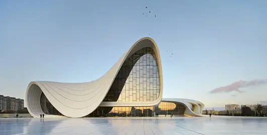
photograph : Hufton + Crow
Architectural Narrative : article by Trevor Tucker
Old World / New World Architecture : article by Brian Carter
Sustainable Architecture Design : article by Trevor Tucker
photograph courtesy of Toyo Ito & Associates
Comments / photos for the Living Structure Comes From Patterns, Part 1 Article page welcome

