Glasgow School of Art Holl Building, Disappearing Architecture, Architectural Comment, Architect, Image
Glasgow School of Art Holl Building
Contemporary Unobtrusive Building – article for e-architect by Joyce Hwang
22 October 2021
Mackintosh Building Options
Mackintosh Building, Glasgow School of Art
11 Jun 2013
GSA Phase 1 Building by Steven Holl
Article by Joyce Hwang
Joyce Hwang is an Assistant Professor in the Department of Architecture at University at Buffalo SUNY, NY, USA. She is also Founder of Ants of the Prairie.
Disappearing Act
Expectedly, controversy and debate surround the Glasgow School of Art Extension project, a new building sited across the street from Charles Rennie Mackintosh’s universally acclaimed masterwork. Although Steven Holl Architects and JM Architects were selected for the job through a highly publicized and elaborated competition process, their design has still been met with a barrage of criticism, perhaps most ardently from architectural historian William J.R. Curtis, who has stated that the proposal is “horrendously out of scale,” is “clumsy in form and proportion,” “lacks finesse in detail,” and “has no relationship to the human figure.”
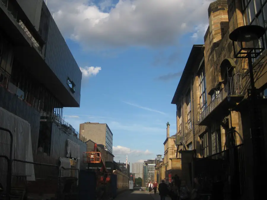
Glasgow School of Art Holl Building, Scotland – new photos online
Design: Steven Holl Architects with jm architects

photo © Adrian Welch
The new building is now under construction. Upon viewing it in its current state, one might initially agree that it lacks the detailing and compositional finessing that Curtis mentions. But Holl’s defense of the design, as published in Architectural Recordi, suggests that notions of detail and human-scaled proportioning systems are not the project’s goals. Rather, the designers have aimed to create a building that sits silently and unobtrusively, almost as if it were to blend into the background. As Holl states: “The concept of the new building, a ‘complementary contrast,’ is expressed in a silent matte façade which picks up the changing Glaswegian sky…”
The project’s renderings also reveal this intention; the building is always depicted in light, neutral, and almost immaterial ways, as if one could see the sky through the building itself. Even the interior renderings – from Holl’s initial watercolors to the digitally-generated images produced later in the process – suggest, too, that the new building’s interior spaces are shaped primarily through considerations of light – instead of matter – as a defining medium.
It was Holl’s intention to allow the original Mackintosh building to have a greater urban presence. In response to Curtis’ assessment that the new building will “dominate Mackintosh,” Holl counters, “The rich detail of the original will dominate the new urban space without interference from the silent contrast of the new neighbor.”
One could argue that the sentiments expressed by both Holl and Curtis – although conflicting in many regards – begin to point to the same questions. For instance, how does one create a significant building that also perceptually disappears? How might one design a bold structure that does not visually interrupt its surroundings?
These, of course, are not new predicaments. Recall, for example, the debacle surrounding the John Hancock Tower in Boston, designed by Henry Cobb of I.M. Pei & Partners, completed in 1976. In response to protests about the sheer scale and immensity of the tower, particularly due to its close adjacency to the beloved Trinity Church by H. H. Richardson, the project’s designers and supporters argued that the mirrored glass would reflect the sky, thereby inducing it to visually disappear from the composition of Copley Square.
Today, almost 40 years after the completion of the John Hancock Tower and its ultimately successful reception by the public, we are at a moment when strategies of visual disappearance (particularly through the use of reflective or matte glass) have become readily accepted as a means to introduce new structures into historically loaded contexts. One could argue that the notion of disappearance has even become a kind of default design strategy, ready for deployment in sensitive or difficult scenarios, ready to rationalize – or even neutralize – potential disagreements regarding questions of scale, material, form, composition, and aesthetic disposition.
The debates that have been raised during the process of developing the Glasgow School of Art Extension have revealed questions that can and should be reignited in our contemporary discourses. For instance: How might a new building instigate a more profound conversation with an existing neighbor? What are the critical differences between designing a project adjacent to a building of historical significance, as opposed to within a less ‘charged’ context?
Do strategies of ‘disappearance’ even perform as promised? As we well know, buildings will always be extremely ‘present’ in reality, regardless of how invisibly their materials are rendered. Certainly this is the case in Boston’s John Hancock Tower. A more recently completed skyscraper in Calgary, “The Bow,” designed by Foster and Partners with Zeidler Partnership, demonstrates how extremely dominant a glass building can be. Of course, the aim of this particular tower’s design was to stand out as an extremely visible landmark, but it is worth examining for the purposes of this discussion.
While the exterior of the building is comprised mostly of glass, reflecting the colors of the sky from certain angles, the building’s structural members are the elements that ultimately define its scale and presence, as perceived from both near and afar. The design of the building’s geometries is also critical to determining how it received by observers. Despite its glassiness and slenderly efficient structure, The Bow is still seen as a massive addition to the city skyline.
As journalist Jen Gerson observed in Canada’s National Post, “It should be noted that The Bow has the effect of making the Calgary skyline seem a tad unbalanced, particularly against the equally iconic Calgary Tower — a now completely sad-looking structure devoid of its only purpose, to be the tallest concrete pipe on the prairie.”ii In the case of the Hancock Tower, in contrast, the building’s geometries were precisely configured to create the illusion of slenderness, thereby diminishing the structure’s overall presence from the point of view of the pedestrian below.
Shaped like a parallelogram in plan, the tower’s wider elevation is angled away from the square. “In Copley Square, you would see only the narrow plane and an eight-story base – not the tower’s massive front,” said Cobb, in an article by Marc Myers in the Wall Street Journal iii.
Cycling back to the discussion of the Glasgow School of Art Extension building, the question in my mind, therefore, is not if the new building will stand as a silent partner to the original one. Rather, we might wonder if the relationships between its geometries, structure, and detailing will both contribute harmoniously to our experience of the original Mackintosh building, as well as put forward a unique and bold spatial experience in and of itself.
My hope is that the new building will not be silent, but will instead prove that it is not an egregious sin to deliver a courageous architectural statement adjacent to a building as legendary and treasured as the Glasgow School of Art. With that expectation, I eagerly look forward to the completion of the extension building to see how the conversation between Mackintosh and Holl will ensue.
i http://archrecord.construction.com/community/letters/steven_holl.asp
ii http://news.nationalpost.com/2013/06/04/a-really-really-big-building-calgary-heralds-opening-of-the-bow-tallest-tower-west-of-toronto/
iii http://online.wsj.com/article/SB10001424053111903366504576490561377486394l
Article by Joyce Hwang, NY, USA.
International Architectural Designs
Glasgow School of Art Extension Building
Comment received 12/06/2013:
Steven Holl is a good modernist architect, but this scheme simply shows how the modernist approach is totally unsuited in relevance to the existing building. Blocky, blocky, blocky. John Outram is the only worthwhile designer around, and I am sure that he would have proposed something far more suitable. I mean, he’s got and uses a set of french curves!
Author: Anthony Sully, Cambridgeshire, England, UK
Property Articles
Articles for e-architect by Joyce Hwang
Architectural Symbolism – 15 Jan 2013
Urban Porosities – 26 Jul 2011
Public Space – 12 Apr 2011
Resisting Boredom – 25 Jan 2011
Some thoughts on the 2010 Stirling Prize Winner – 5 Oct + 27 Jul 2010
The Shard photos
Design: Renzo Piano Building Workshop
Pritzker Prize architects – Architect Winners
Comments re Architecture Symbolism in an Age of Instability welcome

