Makeover Architecture, Building Add-ons, Extension Design Projects
Facelift Architecture
Article by Dimple Soni for e-architect
Makeovers and Extensions in Architecture
Article written by Dimple Soni:
18 Jun 2013
Face-lift and Add-ons
To sustain its relevance of function and form, buildings occasionally demand a makeover or an extension, the ramifications of which either augments or impairs the user experience. Transfiguration of spaces through partial changes in prevailing structure or by addition of an independent edifice to the existing setup loops the projects featured this week.
Gangnam Style – Chungha Building, Seoul, South Korea
Design: MVRDV

photo : ShinkyoungSub
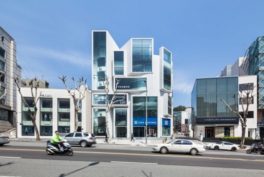
Situated on the groovy Apgujung Road of Gangnam, Seoul, the five storey Chunga building was once a corner-curved structure, composed of stereotype rhythm of beige horizontal bands and glass windows, housing multiple branded stores and offices, each combating for its sole and loud identity to display its dominance. Amidst its thriving neighborhood sprouting with à la mode flagship stores, the passé complex has been redefined by MVRDV, vivifying its stature.
The revamped wrapper of Chunga building is amply framed.
Rigid and monotonous parallel bands of earlier banal façade have been niftily replaced by collage of protruding rectangles of mixed magnitude, coherently bordered by white overlay of mosaic tiles. The trendy elevation of the Chunga building resembles a three-dimensional graphics page layout, incorporating box grids of distinct width and height, framing the glazed diaphanous windows that are aimed to serve as exclusive storefront – a canvas for individual owners to establish it’s sui generis brand identity. LED lights of different colors further illuminate its mien.
Abbotsford House Visitor Centre, Melrose, Scotland
Design: LDN Architects

photograph © Paul Zanre
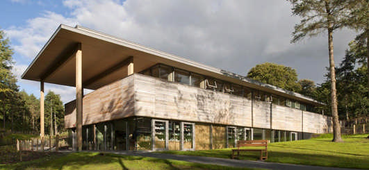
Abbotsford estate has a crisp visitor reception building in its premises that serves as a prelude to the intricate Scottish baronial house of Sir Walter Scott, in Melrose. The mute cultural pavilion, designed by LDN Architects, includes reception area, shop, café and exhibition space, and is intended to complement the topology of the site by gradually vanishing it into the surrounding hills.
A flat sedum roof hovers on the top and protrudes to form a high entrance canopy supported by timber portal frames, which repeats itself as a prime structural element. A conspicuous elevated wooden band clutches the entire rectangular mass into a unified entity. From distance, the building looks like triple layer of ice-crème crowned by a crispy slab of wafer.
Seamless ivory walls and ceiling with grey flooring and oak modules, fabricates the interior. Timber is extensively used within the structure – from identical wooden slats that stand still, generating vertical planes like the railing and counters, to the peaceful spread of ligneous planks, creating horizontal surfaces like the ceiling and floor, systematized by robust sections of sleek beams and columns.
Sorø Art Museum, Denmark
Design: Lundgaard & Tranberg Architects

photo : Jens Lindhe
The neoclassical building of Sorø Kunstmuseum, opened in 1943, has a vivid addition towards its rear end, tripling the original size to include au courant public amenities and exhibition spaces. Located in the historic brick town of Sorø, distinguished by its courtyard architecture, the scale, proportion and perpetual texture of new expansion, designed by Danish architects Lundgaard & Tranberg, complements the existing setup with a bold and solicitous contrast.
Encrusted with Petersen Kolumba handmade bricks – permeating the bucolic variation of hues and textures – the burnt sienna gabled construction, stands abutting the ancient masonry museum, soaked in yellow wash. The uniform texture of overlapping horizontal stripes on the roof and façade of the two-storey edifice, concocts a homogeneous exterior – enclosing and connecting the two spacious courtyards.
The annex appears to be diligently sculpted from a big chunk of handmade dark chocolate with horizontal grains.
Dimple Soni – regular Guest Editor at e-architect

image from Dimple Soni
Comments for the Facelift Architecture page welcome
Location: Ahmedabad, India
Property Articles
A recent article by Dimple Soni for e-architect, 8 Jan 2013:
Mute or Loud
Integration and Segregation in Architecture
A recent article by Dimple Soni for e-architect, 11 Sep 2012:
A run for runways
London Thames Estuary Airport
Another article by Dimple Soni for e-architect, 11 Sep 2012:
Stacked Tower
Al Hilal Bank Al Maryah Island
Comments / photos for the Facelift Architecture article page welcome

