
Designing a Shop Exterior That Works
12 January 2026
Designing the outside of your new shop is one of those things that sounds simple until you’re actually standing on the pavement staring at a blank frontage. Suddenly you’re thinking about colours, signs, lighting, windows, doors, plants… and wondering how any of it really matters. But it does. A lot, actually.
Your exterior is the first conversation you ever have with a customer. Before they know your prices, your vibe, or even what you sell, they’re judging the place from across the street. Fair or not, that’s how it goes. So let’s talk about how to design an exterior that feels inviting, makes sense for your brand, and actually pulls people inside.
Below is practical advice. Nothing fancy, no design-degree language. Just real stuff that works.
Start With Your Brand (Even If It’s Rough)
You don’t need a 40-page brand guide to design a good shop exterior. But you do need a clear idea of who you’re for.
Ask yourself a few basic questions:
- Who is my ideal customer?
- Is this shop meant to feel premium, playful, cosy, or practical?
- What emotion should someone feel when they see it?
A boutique skincare store probably shouldn’t look like a discount hardware outlet. And a no-frills repair shop doesn’t need gold lettering and marble tiles. Mismatch is one of the biggest mistakes people make.
Even if your brand is still evolving (and it probably is), pick a direction and commit. Consistency matters more than perfection.
Colours: Less Drama, More Clarity
Colour choice is where people tend to panic. Or overdo it.
A good rule: limit yourself to two main colours and maybe one accent. That’s it. Too many colours make a frontage look busy and confused, especially from a distance.
Think about:
- Visibility from across the street
- How the colour looks in different light (sun, shade, night)
- Whether it clashes with neighbouring shops
Neutral bases (white, charcoal, soft grey) with a bold accent often work well. But if bold is your thing, go bold properly. Half-committing just looks accidental.
And please, test samples on the actual building. Paint never looks the same on a screen.
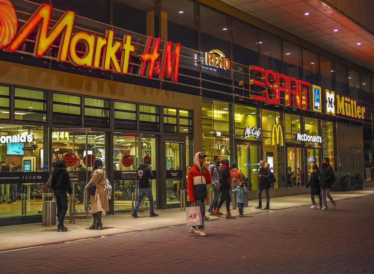
Signage That People Can Actually Read
Your sign has one main job: tell people who you are. Not impress designers. Not show off fonts you found online at 2am.
Keep these basics in mind:
- Legibility beats style
- High contrast between text and background
- Large enough to read while walking past
Fancy script fonts might look nice up close, but if no one can read them from five metres away, what’s the point?
Also, don’t overload the sign with information. Your business name is usually enough. You don’t need your slogan, phone number, website, and life story all crammed in there.

Windows Are Not Storage Units
If your shop has windows, treat them like gold. They’re free advertising space.
Some ideas that work:
- One or two strong focal displays instead of clutter
- Clear sightlines into the shop (people like seeing activity)
- Seasonal updates, even small ones
Avoid:
- Faded posters taped to the glass
- Random stock piled up “temporarily” (it never is)
- Blocking all light with vinyl or junk
Even minimal displays can work if they’re intentional. Empty but clean is better than full and messy.
Lighting: Not Just for Night-Time
Exterior lighting does more than help people see after dark. It sets mood and signals whether you’re open, active, and welcoming.
Consider:
- Soft lighting around the entrance
- Spotlights for signage
- Warm tones for cosy shops, cooler tones for modern ones
Bad lighting can make a shop look closed even when it’s not. And harsh lighting can make people feel rushed or uncomfortable. Balance matters.
The Entrance Experience
Your door is a psychological barrier. Make it easy to cross.
A few tips:
- Clear, visible entrance (no guessing where to go)
- Doors that are easy to open (sounds obvious, but still)
- Clean handles, frames, and thresholds
Little details matter here. A scuffed door or sticky handle sends the wrong message, even if the inside is lovely.
Attracting Foot Traffic Without Being Annoying
This is where smart exterior design really earns its keep.
Foot traffic isn’t just about location. It’s about giving people a reason to pause, look, and step closer. Most passers-by aren’t actively shopping. You’re interrupting their day, gently.
Ways to do that:
- Movement: flags, subtle animations on screens, even plants swaying
- Change: rotating window displays or signage
- Signals of life: lights on, music faintly audible, people inside
One often-overlooked detail is clear communication about whether you’re open. Sounds silly, but confusion kills impulse visits. A simple, visible shop open sign near eye level can make a big difference, especially for new customers who don’t know your hours yet.
You can also:
- Use A-frame signs with one clear message
- Highlight a single product or offer, not ten
- Keep entrances unobstructed (crowded doorways put people off)
And remember, subtle wins over shouty. People hate feeling sold to, but they love discovering things.
Materials Say More Than You Think
What your shop is made of communicates quality before anyone steps inside.
Wood feels warm and human. Metal feels modern or industrial. Glass feels open and honest. Cheap plastic… well, feels cheap.
You don’t need expensive materials everywhere. Just use the good stuff where hands and eyes go:
- Door handles
- Signage
- Window frames
- Counters visible from outside
Mixing textures can also help. A flat frontage with no depth often feels dull. Even small changes in material can add interest.
Think About Maintenance (Future You Will Thank You)
This part isn’t fun, but it matters.
Ask yourself:
- Will this paint show dirt quickly?
- Will this sign fade in the sun?
- How often will this need cleaning or repairs?
A design that looks amazing on opening day but tired six months later isn’t a win. Simple, durable choices usually age better. And yes, they’re often cheaper long-term too.
Blend In Enough, Stand Out Just Enough
You want to stand out, but not look like you landed from another planet.
Look at the surrounding shops:
- Height of signage
- Colour palettes
- General vibe of the street
You don’t need to match them, but you should respect the context. Sometimes the smartest move is a clean, confident look that contrasts quietly rather than screaming for attention.
Trust Real-World Feedback
Once your exterior is done, watch how people react. Literally.
Do they hesitate at the door?
Do they glance in and keep walking?
Do they stop and point things out?
Ask customers what made them come in. You’ll get honest answers, sometimes blunt ones. That’s good. Adjust where needed. Exterior design isn’t set in stone.
And yeah, you’ll probably notice small things you’d do differently next time. That’s normal. No shop exterior is ever truly “finished”.
Design it, live with it, tweak it. That’s the real process.
If you get the outside right, the inside has a fighting chance. And in retail, that first chance is everything.
Comments on this guide to Designing a shop exterior that works – retail building neon sign display article are welcome.
Buildings
Buildings Articles
Home renovation design principles
++
Store Design
Comments / photos for the Designing a shop exterior that works advice – retail neon sign display guide page welcome.