Architecture Context Article, World Building Projects, International Property Designs
Architectural Context – Global Building Design
International Architecture Discussion by Melissa Beasley Architcet, London, England, United Kingdom
15 Mar 2011
Architecture Context
This week’s guest editor Melissa Beasley is a registered architect working for studio octopi in Southwark, London. She studied at Newcastle and Bath Universities and has previously worked for Peregrine Bryant Architecture & Building Conservation and Russell Jones Ltd.
Of the following projects: one I have visited, one is complete but reviewed from photos and drawings, the last still in its design stages. The first is a building ‘of the moment’ stylised and reliant on technology. The second seeks to already be embedded in history. The third is determinedly single but governed by an old neighbour demanding a conversation between old and new.
W London, England, UK
Jestico + Whiles
picture from architects
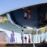
Although slightly nostalgic about the departure of the old Swiss Centre, I think this addition to the cinematic glitz of the west end is a good thing. Tourists are endlessly drawn to the famous bright lights of Leicester Square only to find it rather lacking in sparkle. Jason Bruges’ mesmerising inventions are always enjoyable and certainly a treat for the evening passers-by.
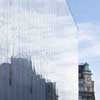
There is something relieving and fresh about this white building amongst the daily bustle of the West end. Perhaps a bit Germanic in complexion, the flatness of the facade with fritted glazing is a little one dimensional and does not allow for multiple readings from the various angles of approach. However, it is ‘cool’ and sleek as you would expect from an upmarket hotel, retreating by day and dressing up at night to suit the dual personality of the streetscape. I just hope the technology won’t age the building too quickly lest it becomes the next Sanyo relic.
City of Culture of Galicia, Spain
Eisenman Architects
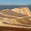
photo : Manuel Gonzalez Vicente
The contradictory nature of this scheme has challenged me, not aided by Eisenman’s explanation of the work,”Our project emerges as a curving surface that is neither figure nor ground but both a figured ground and a figured figure that supersede the figure-ground urbanism of the old city.”
From the outside there is an earthy quality to the palette of cladding. The solidity suggests the air of an ancient monument and the organic form, the flow of a nearby volcano? The push and pull of the public space around the various buildings hints that a journey within will expose a cavernous and flowing interior. Not so. A harlequin of languages is revealed fitting only to echo its intended cultural diversity. The blanched space is animated by a giant army of haphazardly marching columns alongside domestically scaled windows and doors. The muddy waves of the exterior abruptly turn inwards disjointing to form mall-like curtain walls and an angular faceted ceiling.
There is a disappointing difference between the concept drawings and models, which had looked dynamic and exciting, to the final built form. What the overlaying of various historical and geological maps with the Cartesian grid has brought to the project remains hidden. For me, there is rather too much going on.
Although only recently finished, the scheme already looks dated. The bipolar character has rendered the earth moving exterior somewhat flimsy, and the interior too fragmented. A little more ground hugging like Sanaa’s Rolex Learning Centre or Ando’s Chichu Art Museum would not have gone amiss. I suspect this is a building that cannot even begin to be understood from photos, but rather needs to be experienced in the flesh.
Glasgow School of Art Extension, Scotland
Design: Steven Holl Architects with jmarchitects
picture : Steven Holl Architects
I sincerely want to like Steven Holl’s ambitions for the Mackintosh School of Art extension having enjoyed his work for many years. However it is hard to feel much faith in a project with so much debate so close to home.
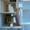
The imagery of the interiors is convincing, with memories of the Helsinki Museum of Contemporary Art to reinforce them. I have no doubt that the spaces will be dynamic and provocative; a muted palette of materials, with carefully sculpted lighting and beautiful craftsmanship to provide a pleasant environment for a school of art.
As with many of Steven Holl’s buildings, the exterior is strong. It is a standalone form that doesn’t really want to have a conversation with its neighbours. The use of a flush glass façade system to overcome its context seems too easy.
Jean Nouvel’s One New Change has played the same game with St Pauls, and although not unsuccessful, I don’t believe it will stand the test of time. Akin to the familiar glass bridge extension between old and new, this ‘reflect all’ trickery seems to be the latest unchallenging approach to overcome a testing relationship with a neighbour. Unfortunately alongside the meticulous crafting of the Mackintosh, the exterior of the scheme just doesn’t seem to work hard enough.
Glasgow School of Art Extension
Comments on this Architectural Context article by Melissa Beasley architect – Global Building Design – are welcome.
International Architectural Designs
Architecture Context : article by Trevor Tucker. Sep 2010
Resisting Boredom : article by Joyce Hwang. Jan 2011
Architecture Narrative : article by Trevor Tucker. Aug 2010
Design Narrative : article by Lee Miles – Sep 2010
Sustainable Buildings – Building Issues : article by Adrian Welch
Comments / photos for the Architectural Context Article by Melissa Beasley Architect London page welcome


