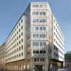
Verbund Headquarter Vienna, Austrian Office Building, Viennese Design
Verbund Headquarter, Austria : Vienna Office Building
Austrian Headquarters Building – design by SOLID architecture
11 Oct 2011
Verbund Headquarters Vienna
Design: SOLID architecture
Design for the facade of the Verbund Headquarter in the inner City of Vienna
Verbund HQ Vienna
1. Starting point and the task set
The headquarters of the Verbund AG is a block perimeter development built around a central courtyard in Vienna’s first district. It was erected between 1952 and 1954 to designs by Carl Appel and is bordered on three sides by public streets or squares. The street facade extends from the square known as Am Hof along Heidenschuss towards Freyung and into Tiefer Graben. The block perimeter development is made up of two volumes, one facing onto Am Hof and the other towards Freyung.
In formal terms the building refers back to the architecture of the interwar period. On the other hand the economical use of design and decorative elements, for example the window reveals of real stone, is characteristic of the post-war era.
In 1982 the plinth zone and the areas of facade that frame the large projecting bay elements on Heidenschuss and Tiefer Graben were remodelled to designs by architect Sepp Stein in the volume oriented towards Freyung. The storey-height glazing facing towards Freyung was replaced by horizontal ribbon windows with brown metal parapet claddings. This, however, weakened the building’s orientation towards Freyung.
As this facade design had reached the end of its useful life, an invited competition was set up for the redesign of these areas. This competition was won by SOLID architecture.
The objectives of the design
– The new design of the facade towards Freyung, one of the most prominent locations in Vienna, should represent the Verbund AG as a producer of electricity with the aid of hydraulic power.
– The facade should be integrated in its historic setting. The Verbund headquarters is the same height as the neighbouring buildings, but with its nine storeys has almost twice as many floor levels.
– The redesign of the facades should allow the different elements of Carl Appel’s Verbund building to be perceived as a coherent ensemble.
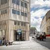
– The Verbund headquarters should be oriented more strongly towards Freyung in urban planning terms. In addition the shop entrance on the corner to Freyung, the sole area of the Verbund headquarters accessible to the general public, should be emphasized.
– In functional terms the new facades should use state-of-the-art technology.
2. Conceptual study of the theme “facade” on Freyung
The ensemble on Freyung is made up of buildings dating from various epochs which have been rebuilt and extended over the course of time. Overlaying a building with traces of different time layers is the conceptual starting point for the new design. It uses design principles from different eras of architectural history to integrate the volume of the building in the historic ensemble on Freyung.
Additional filters and levels of meaning were placed in front of the history and characteristics of the post-war building, overlaying the facade with a second layer that sits in front of it. By mounting this additional layer the new design, which initiates a dialogue between the existing Verbund building and the ensemble on Freyung, becomes clearly legible. An apparently ephemeral envelope or shell is created, which, depending on the weather conditions and the distance of the viewer to the building, allows different planes and aspects of the facade to emerge in the foreground.
3. A veil of silver waves – the technical implementation of the design concept
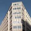
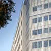
By separating the facade into two layers the inner layer could be upgraded simply and without the need for major interventions. A second layer is laid like a veil of silver waves in front of the original facade but at the same time allows a view of what lies behind it.
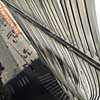
The entire veil of waves is designed with a single repeated facade element that is used at different scales. This element consists of stainless steel rectangular section tubes curved in a wave-like shape, arranged in an offset pattern and held in position by a frame.
In formal terms the wave-like form of the facade elements refers to the dynamics of water in motion. The wave symbolizes the Verbund and, in an abstract way, informs about the area in which the company operates. The gleaming silver veil of waves represents the Verbund towards the city. The ornament encases the building volume, which is detached from the internal layout of the building core, and lends it a symbolic content.
The arrangement of the facade elements makes reference to the historic neighbouring buildings, enabling the Verbund building to become part of the ensemble. The new facade elements are mounted in rows that follow the floor levels of the building. It is only on the facade facing towards Freyung that the new layer departs from the existing division into floor levels: here nine storeys of almost the same height are reduced to five by a design that extends across the floor levels. This move adapts the scale of the Verbund headquarters to that of the surrounding buildings.
The use of axes of symmetry – comparable with the secondary axes of symmetry in the surrounding historic buildings – additionally emphasizes the facade onto Freyung. Here the facade elements are not arranged additively but using mirror symmetry. This axial mirroring of the facade elements creates a new ornamental configuration that further emphasises this facade.
In the plinth zone the veil of waves delineates the load bearing structure of the facade in that the glazed areas are left free and the new facade elements are placed only in front of the structural piers. The facade elements facing onto the balconies above the large projecting bays can be opened. On the other floors two facade elements for each room behind are made as a rescue opening, comparable to a shutter.
4. The inner plane – the functional facade
The rear facade plane continues the design of the facade from Am Hof to Tiefer Graben. In the two-storey plinth zone the same natural stone cladding to the piers and the post and lintel facades with anodised aluminium cover pieces were used. The facades to the upper floors were insulated with mineral wool and rendered in the same colour as the facade onto Am Hof. Making the facades of the two building volumes more similar helps the Verbund headquarters to be read as a coherent ensemble.
The inner plane of the facade deals with all the technical aspects of the building envelope such as thermal and noise insulation, as well as protection from sun and glare. The old windows were replaced by combination windows (a modern form of the traditional Viennese double windows) of the same size. The solid parapets were left unaltered for structural reasons. For the offices where windows had to be replaced this meant short fitting times. Thus, the facade was refurbished without having to close down the building.
Verbund Headquarters Facade – Building Information
Project name: Facade VERBUND headquarters – a veil of silver waves
Name: VERBUND headquarters
Street: Am Hof 6a
Facade at the corner Heidenschuss / Tiefer Graben
Postal code: 1010
City: Vienna
Purpose: Redesign and thermal retrofit of the facade of the VERBUND headquarters
Planning data
Direct commission: No, first prize in an invited competition
Project status: Project completed
Competition: Mar / Apr 2008
Other participants: Architekt Heinz Neumann ZT GmbH
WERKSTATTWIEN + A2K
Knechtl Architekten
gerner°gerner plus architects
Start of planning: Sep 2009
Start of construction: Apr 2010
Completion: Oct 2010
Project Data
Facade area: 2,720m² thermal retrofit ; 1,320m² redesign of facade
Construction: Mineral wool rendered, stainless steel facade elements consisting of a total of 10,500 linear meters of stainless steel rectangular section tubes, 50x20x2mm
Spatial programme: Facade design
Exhibition: “Gebaut 2010“ at MA 19 (Vienna’s Municipal Department of Architecture and Urban Design): 21 outstanding projects completed in Vienna in 2010
Design Team
Architects: SOLID architecture ZT GmbH, Vienna
Project management: Arch. DI Christoph Hinterreitner
Assisted by: Arch DI Christine Horner, DI Daniel Glaser
Client: VERBUND AG Am Hof 6a 1010 Vienna Austria
Details of consultants
Structural engineering and technical consultancy: RWT PLUS ZT GmbH
Building physics: RWT PLUS ZT GmbH
Site supervision and health and safety management: Woschitz Engineering ZT GmbH
Construction firms
Building contractor: Dipl. Ing. Wilhelm Sedlak Gesellschaft m.b.H.
Aluminium facades: RIEGLER METALLBAU GmbH
Facade elements: RIEGLER METALLBAU GmbH
Stone mason: RADA NATURSTEIN GmbH
Project photographer : Günter Kresser ; Kurt Kuball
Copyright of photos held by SOLID architecture ZT GmbH
Verbund Headquarters Vienna images / information from SOLID architecture
Location: Verbund, Vienna, Austria
New Vienna Architecture
Contemporary Viennese Architecture
Vienna Architecture Design – chronological list
Vienna Architecture Tours by e-architect
Telegraf 7 Building, Lehargasse
Design: BEHF Architects
photograph : Hertha Hurnaus
Telegraf 7 Building in Vienna
Town Town Office Tower, Vienna, Austria
Coop Himmelb(l)au
Town Town Office Tower
DC Towers Buildings
Dominique Perrault with Hoffmann and Janz
DC Towers Vienna
Comments / photos for the Verbund Headquarters Vienna page welcome
Verbund Wien Headquarters – page
Website: www.solidarchitecture.at

