Alexandre Herchcovitch Japan, Shibuya-ku Shop, Tokyo Store, Photo, Design, Image
Alexandre Herchcovitch Tokyo : Shibuya-ku Store
New Retail Development in Tokyo, Japan – design by Studio Arthur Casas, Architects
31 Jul 2009
Alexandre Herchcovitch
Location: Shibuya-ku, Tokyo, Japan
Design: Studio Arthur Casas Architects
Photographs : Eusike Fukumochi
English text (scroll down for Portuguese):
The space it not only on the ground floor.
There is also the exhibitions floor and storage space at the mezzanine.
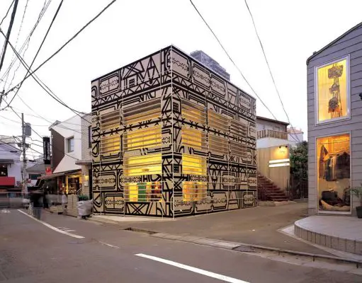
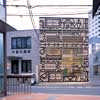
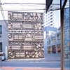
The perimeter of the façade is 18 linear meters and 6,5 meters high, wrapping the four sides of the building.
The construction work was finished in two months.
The store is a box that when it is closed, brings up curiosity. It doesn’t show completely its interior even when it is opened.
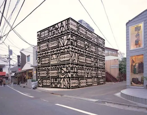
The façade is made of formica covered with prints that are updated every season following the graphics of the current collection.
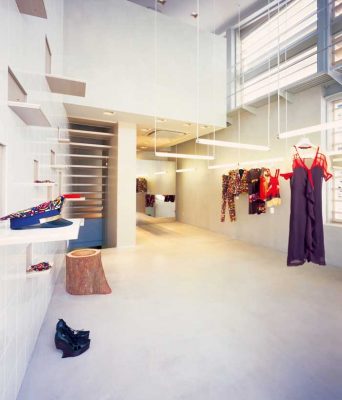
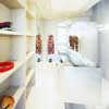
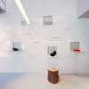
Inside, the strength is on the hanger installations, where acrylic finish fluorescent bulbs and tiles turn into products support.
I think that the Japanese are more curious and exclusivist than Americans and Brazilians. In Brazil the stores have to have a powerful front display window to show the merchandise, that is not important i Japan.
The store was built as per our first proposed layout. Alexandre just wanted to make sure that his store would have enough hangers and shelves to expose whatever he woud like.
Alexandre Herchcovitch Tokyo – Building Information
Basement Area: 315..93 sqft
1st Floor Area: 315..93 sqft
Mezzanine Area: 131.43 sqft
1. What was your inspiration/concept for the facade of the building?
Why does it look the way it does? Was this a ground-up project or did you just completely renovate the building?
There was a building not too old (around 20 years old) probably built to be a commercial space. As there was no charm on this building, I decided to “cover” it with a structure of formica, which works as a support to the stamps and this stamps supposed to be replaced every new collection.
2. How do the interiors relate to the facade, and vice-versa, or are they unrelated? If they’re unrelated, why?
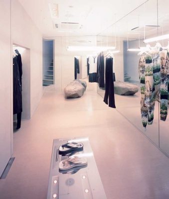
The space, especially on the american standards, it’s very small . Alexandre Herchcovitch’s clothes are very rich in details, and that’s where the attention should be focused, not on the architecture. I opted for neutral materials but with some humor such as the tiles, when it opens they work as a support for the accessories. The big stone underground, as it had been found during the excavation, and the clothes hangers made by fluorescent light covered with acrylic.
3. How does the architecture relate to the fashion design of Mr. Herchcovitch, if it does?
I think the answer above clarifies this question. The stickers of the facade per example, it’s designed by the stylist and it’s related with one of his collections.
4. Is there any feature of the interiors that is unusual (fitting rooms, display systems, cash counter, etc.)? How is it unusual, if so?
Does this affect the way customers will circulate through the space and/or how they will shop?
I think the answer of question 2 it’s good for this question. The cash counter, per example, it’s unified to the litting room and was esecuted in mirrored metal to “disappear” in the space.
Portuguese text:
Alexandre Herchcovitch, Tokyo, Japan
área subsolo; 29,35 m2
área térreo; 29,35 m2
mezanino; 12,21 m2
não é um ambiente térreo, tem dois andares de exposição e um mezanino de estoque
O tamanho da fachada, que muda de estampa a cada temporada, são os quatro lados da loja um perímetro de 18 metros lineares e uma altura de 6,50 m.
A obra demorou 2 meses para finalizar
A loja é uma caixa que quando fechada provoca curiosidade e mesmo aberta não se expõe completamente. Sua fachada de fórmica será periodicamente adesivada com estampas da nova coleção.
Internamente o ponto forte são as “araras” (suportes para roupas) feitas com lâmpadas fluorescentes revestidas de acrílico e os azulejos que se “abrem” e se tornam suportes para produtos.
Acho o japonês mais curioso e exclusivista que o americano ou o brasileiro.
Aqui as lojas têm que ter uma vitrine poderosa e super expor o produto, no Japão isso não é importante.
A loja foi religiosamente executada de acordo com a nossa proposta inicial.
A única coisa exigida pelo Alexandre foi que projetássemos a quantidade de suportes ou araras suficiente para o que ele desejava expor.
Data de inauguração (opening date): 22 de marco de 2007
Endereço (address): 25-8 sarugakusho, shibuya-ku, Tókio 150-0033 Japão
a estampa mudara a cada coleção, e foi criada por alexandre herchcovitch. (The stamp will change according to its season collection, it was created by Alexandre H.)
esta estampa faz parte da coleção de verão 2007. (the actual stamp it’s part of the summer season collection of 2007)
Alexandre Herchcovitch Tokyo images / information from Studio Arthur Casas, Architects
Studio Arthur Casas – Alexandre Herchcovitch Tokyo architect
Location: 25-8 sarugakusho, shibuya-ku, Tokyo, Japan
Tokyo Architecture
Tokyo Architecture Selection
Tokyo Architecture Designs – chronological list
Tokyo Stores – Selection
Armani/Ginza Tower
Doriana and Massimiliano Fuksas
Armani/Ginza Tower
Prada Store
Herzog and de Meuron
Prada Store Tokyo
Tokyo Building Designs – Selection
TBWAHakuhodo offices
Klein Dytham architecture
Tokyo offices
Japanese Architect Offices
Comments / photos for the Tokyo Alexandre Herchcovitch Architecture page welcome


