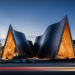
Centralplaza, Bangkok Retail, Thailand Shopping Centre, Building, Project, News, Design, Image
Centralplaza Bangkok : Chaengwattana Road Development
Thai Retail Development, Thailand, Asia, design by Manuelle Gautrand Architects
Centralplaza
Location: Bangkok, Thailand
Date built: 2009
Design: Manuelle Gautrand
Photographs: Philippe Ruault
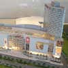
The CentralPlaza is the biggest shopping mall located on Chaengwattana road. The total area more than 300.000 sqm is dedicated to every brand name item from every corner of the world.
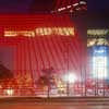
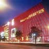
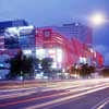
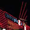
The Centralplaza Chaengwattana consists of the modern LED high-technology which is covering all facade of the project and computer controlling system is first used in Thailand as the newest technology.
This project is unusual: Manuelle Gautrand’s office took it over with studies already well advanced; the client was looking to improve the overall design outlined by another firm, which had folded.
Without calling into question the volume layout already in hand, the architects adopted a pragmatic approach that consisted in modifying contours and overhauling façades.
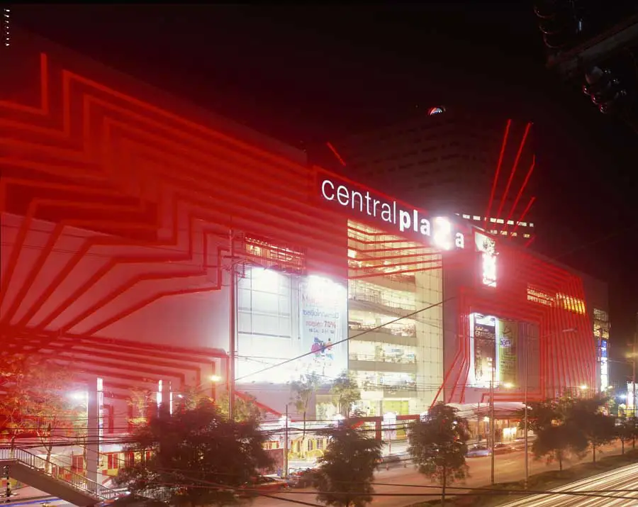
Since hyped up communication characterizes retail trading in the Far East, where advertising is never taboo, they concentrated on asserting a graphic presence strong enough to change the way volumes are perceived, innervating and expanding them to increase their legibility.
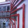
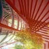
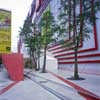
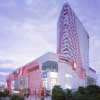
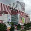
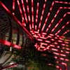
Dynamic red filaments (which are in fact tubes of light-emitting diodes) striate volumes, wrapping them in a continuous tracery that draws together all the functions and flows. Publicity signs occupy precise, predefined places in the arrangement, so as not to deflect the reading of façades. Starting from the approach plaza and footbridge, rhythm and graphics govern the entire project, tip-to-toe, end-to-end.
Red is giving the active and confident telling. If this colour is applied that means the confidence of product uses is needed.
LOCATION
The building is located in Bangkok, Thailand, on the side of 8-Lane Chaengwattana Road and near the express way entrance of Sriratch Express-Way only
1.4 kilometers and 2.4 kilometers distance from the Prachacheun road.
WE WERE INSPIRED BY…
The existing project was in an advanced stage, where the construction phase was just beginning at the moment:
Volumes correspond to the best efficiency for the functions, there are relatively simple with two spaces: The main volume for the retail and parking and another volume, connected to the first one, with office in a tower. Behind the shopping mall there is another connected volume for an independent parking.
In fact we didn’t wanted to generate important modifications, linked to this advanced stage, and also to this efficiency that we don’t want to lose or to diminish.
So we had the idea of adding something very strong and powerful, without modifying deeply the project. Orbit spoke about lines and movement in their own sources of inspirations: We liked this type of inspirations, in liaise with the flow of people in this place, and with the objective of accompany them with the most smooth and fluid shapes.
We would like to work with kinetic objectives, which can send messages of flow, movement and fluidity.
We would like to transmit a dynamic impression of the building, an existing impression…
So the first two ideas were:
To give a mina colour, an unique one, which can be bright and luminous, And to use this colour with a very graphic work, full of lines in movement.
THE EXISTING PROJECT
The first work was on the existing volume, trying to respect it without too strong modifications, but in the same time, trying to give it a more pure and simple
aspect.
We kept the proportions of glass and concrete, but we tried to simplify the grid on them, the connections and all the graphic details.
The goals would clearly be:
Find the most simple way to spread out opaque and transparent parts,
Find the most similar aspect between opaque and transparent parts, to give a clear unity to the hole volume. At the end, the volume must give the impression of a smooth and elegant volume in a sort of pearly white envelop.
ENVELOP THE PROJECT LIKE A BODY
After this first skin which has to be delicate and pure, the idea id to envelop this volume, like a body, with plenty of lines.
The proposed colour is red: for its brightness and its warm aspect.
And with this red, we encircle and wrap the building with lines, which are going up and down, describing a kinetic graphic.
The wish is quite to modify the perception of the outlines, to create movements which perturb the view and change with the different angles of vision.
On the main façade, the lines are more dense, and more you go further on the other façade, more the lines are less present: For example on the south, which is a secondary façade, the lines are quite rare.
They continue the same goal everywhere in the project, but with a progressive intensity, which corresponds to the importance of each façade.
The advertising are completely included in this concept: All the lines are continuous, and each line is going through the hole building, enveloping the facades and the tower. When a line find an advertising on its way, the line is just going around, describing a more existing design. The wish was to play with the advertising, and to emphasize it. Describing sharp or smooth turns around the advertisings, it’s a way to highlight them to give them a central position,
everywhere. In the same time it’s a way to prolong the red lines and never to forget them or to interrupt them.
MAIN FACADE (NORTH):
On this façade the lines are directly coming from the bridge, in a radiant movement: A part of the lines are going directly to the East façade, and the other envelop the entrance. The great glass wall from the main entrance inside the building is also highlighted: Two flows of lines are going around: one part on the top the other on the
base.
The central part of the glass wall is kept without lines to keep the transparency of the glass. But some lines, in going in front of the glass (on the top and base of the glass wall), are showing the beginning of the interior work. From the interior, people will have a look on this graphic work and will remember the red lines outside .One part of the flows of lines are continuing on the tower, including this high part of the building in the in the main façade.
THE FRONT APPROACH:
The front approach area has been entirely redesigned with the new concept.
The red lines as they touch the ground form the landscape. The front approach becomes a succession of slopes where the three entries are the higher level (1,20m) and the road the lowest (0,00m). The material used for the area will be concrete and the red lines will jus be painted with resin or “parking paint” on the ground.
The three main entries on the North façade are reinforced by a canopy which, as the regulation allows, go 50 cm beyond the façade limit, and 2m inside to form a shelter. Each entry is either the end of a red ine or the distortion of one.
SOUTH FACADE:
Lines are finishing they trip here, going down in the ground floor…
WEST FACADE:
The tower is completely included in the design of the lines: The unique and big flow envelops the tower first and the West faced after. At the end, on the west-south corner the lines slide down around the access ramp for the parking.
The idea would be to design the road and parking signs with the red lines…
Those could create all the partition and the numbers of the parking places.
EAST FACADE:
Lines are going down smoothly in a sort of fan-shaped form, with just some detours around the advertising and anchors.
TOWER:
The tower is wrapped like the façade, in the same movement, to elongate it: The proportion of the tower must absolutely be changed and refined because it is a little bit thick at the moment. So the idea was to prolong the line in a vertical direction, to give a right ascension.
Each line is going up and envelop the tower on its 4 façade in a continuity. They wind up and just pass in front of some windows, which can be an advantage for the offices: Lines can be like a decoration, putting some variety in the offices. Some of them will have this design behind the glass, which will not take any light, but give an unique spirit to each office which will have this opportunity.
THE BRIDGE:
The structure is composed of bended I shaped steel elements in a ring form. This structure is supported by the bridge concrete beam. The extension from the actual bridge towards the shopping centre at level 2 should be made exactly as the old bridge except one end becomes wider and ramps up two meters.
PLAY WITH kinetic views, diffracted light, movements-
The objective is to have a clear façade, and to have all those red lines in front of it. Each line is a rectangular tube, of 50×15 cm. The tube are structural one, because one of the 4 faces is a metallic structure, which is directly connected to the main façade just behind it.
The three other faces are covered with a transparent red Plexiglas which is made with one folded panel. Inside there is the light, proposed with leds. The three faces in transparent Plexiglas permits to the light to create a lot of pale red reflects on the
clear faced: The red will irradiate everywhere and will soften the lines. During the day, the red Plexiglas will be enough to irradiate itself, and during the night the effect will be reinforced by the light.
There could be a lot of ideas about the movement of the light: The red lines could be illuminated sequences by sequences: Some of them could be switched off sometimes, or the led could be illuminated progressively to create a huge movement.
We have made some animations about those ideas.
LED:
The system we recommend is a led (light emitting diode). It allows a bright lighting effect for few energy amount. It is the most efficient lighting performance.
The led exist in RGB colours, so tests should be realised in order to see if red led system combine with red opaque Plexiglas emits enough light, or if a white led system combine with red opaque Plexiglas emits the appropriate colour.
The images below show the led system we have found the most appropriate for this project.
The advantage of this product is to work on standard voltage electricity, and does not require any current transformer. This point is important for two reasons:
-considering the size of the project, the amount of current transformers would be gigantic. (and would also have a cost in case of breakdown the diagnosis is simplified; the technician does not have to verify between the current transformer and led system. So the maintenance is simplified with this solution. The led durability is approximately 50 000 hours. Our latest study show that the orientation of the LED horizontally (as shown on detail) permits to have a more diffuse lighting effect and reduces the visibility of the LED dots on the Plexiglas surface.
Prototypes
could be realised to verify this option.The line case is made of a folded aluminium sheet in U section, separated in two parts. The bottom part contains the cables and the upper part the LED system. They are separated by another aluminium folded sheet.
Centralplaza Bangkok – Building Information
Project Name: CENTRALPLAZA CHAENGWATTANA
Client: CENTRAL PATTANA PUBLIC COMPANY
Location: Chaengwattana Road, Bangkok, Thailand
Program: Façades Design for a shopping mall
Area : 290.000 sqm
Centralplaza Bangkok images / information from Manuelle Gautrand
Location: Chaengwattana Road, Bangkok, Thailand
Architecture in Thailand
Thai Architecture Designs – chronological list
Thailand Architecture – Selection
Sala Samui Chaweng Beach Resort, Koh Samui, Surat Thani
Architects: Onion
photo : Wworkspace
Sala Samui Chaweng Beach Resort
Central Embassy – retail and hotel complex
Amanda Levete Architects
Central Embassy Bangkok
PTTEP Headquarters Building, Bangkok
HASSELL
PTTEP Building Bangkok
Radisson Suites Bangkok Sukhumvit
HASSELL
Radisson Suites Bangkok
Central World Tower Hotel & Convention Center, Bangkok
BBG-BBGM withTandem Architects
Central World Hotel Bangkok
Comments / photos for the Centralplaza, Bangkok Thai Architecture page welcome

