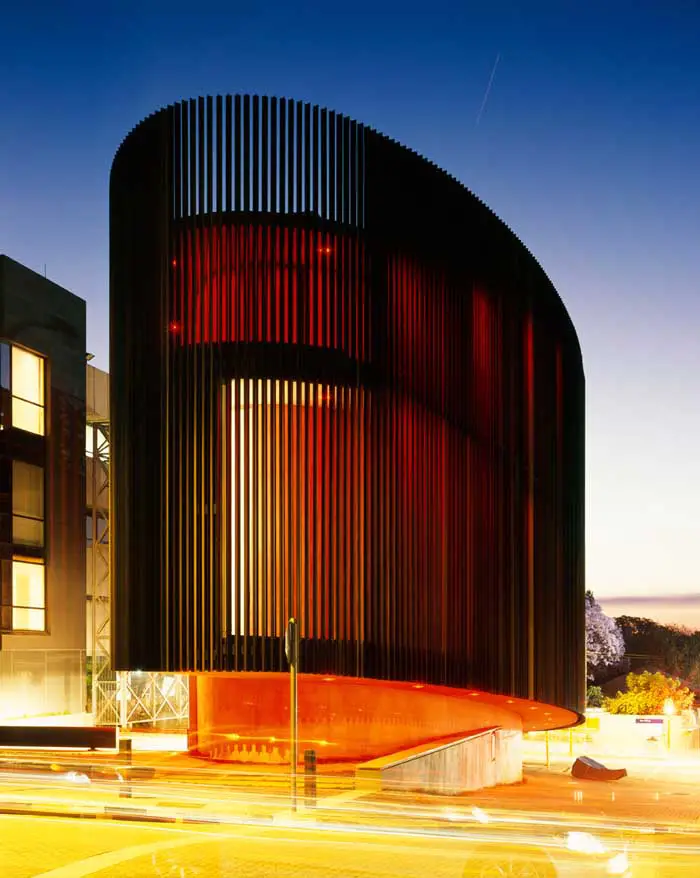
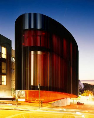
Circa Johannesburg, Everard Read Gallery South Africa Building, Mark Read Project Property Images
Arts Development in Johannesburg, South Africa
Art Gallery Building Extension: Circa on Jellicoe design by studioMAS Architects
Circa on Jellicoe Multi-media Art Gallery
Date built: 2009
Design: studioMAS architects + urban designers
A HISTORY OF CIRCA – ORIGINS AND CONCEPTS
9 Feb 2010
Circa on Jellicoe Johannesburg
The idea that was to evolve into the building named CIRCA originated in the late 1980’s. The Everard Read Gallery purchased from the Johannesburg City council a property adjoining the ERG at the corner of Jellicoe and Jan Smuts avenues. This is effectively the North west corner of one of SA’s largest retail precincts and a hugely visible property on a major artery carrying traffic to and from the Central Business District.
Over the course of the following 15 years, the property was utilized as an annex parking area for the gallery. During this time however, the idea began to grow in Mark Read that the gallery, already housed in a purpose-designed and much celebrated Post-Modern structure, could be extended into a new building developed on the corner site. As the nascent idea coalesced into the beginnings of a firm vision, Read set out to find the architect who could work on this project with him.
It was an exciting time as Rosebank was earmarked for extraordinary development in the future, due to the Gautrain and new hotels appearing in the vicinity. The gallery had had an extended period of successful business and Read began to have ambitions of creating an iconic structure that would be both visually beautiful, and a world class exhibition centre.
It didn’t take long before Read met an architect whose work he had much admired – Pierre Swanepoel of Studiomas Architects. Swanepoel, immediately grasped the concept and within a short period developed a model that when presented to Mark and Christine Read was accepted as being the embryo of a structure destined to take its place as perhaps South Africa’s most arresting contemporary building.
During the course of the following two years and encompassing countless meetings, the model was polished into a bespoke plan with no simple-to-build generic design features. Rather than the oval that it at first appears to be, the building is in fact a pure ellipse – this allows interior walls that are ‘flat’ enough for the hanging of artworks. Modular walls that slide between the ground and first floor exhibition rooms allow for innovative and optimal utilization of the space. The top floor has a large open deck that affords visitors a panoramic view of a forested Johannesburg. After a great deal of debate it was decided that the concrete exterior of the building would be sheathed with subtle colour-differentiated anodized aluminum fins. These are set a few centimetres apart from each other so that at night interior light can emerge giving the building an almost translucent quality.
As Reads’ ambition grew, so obviously did the budget for this increasingly complex building. The contractor was chosen – Murray & Dickson Construction – and given the challenge of constructing a building that was both technically complex and aesthetically pure – a building that will be analyzed by the most exacting minds in the future. It’s the forgone conclusion of all parties concerned that Murray & Dickson have more than ably succeeded in their brief.
Along the journey that the building took from conceptual model to finally standing on the corner of Jellicoe and Jan Smuts, it became obvious to Mark Read that this project had grown to be much more than an Everard Read Gallery extension. This architectural gift to Johannesburg, was in fact a space where he could do a great deal more than he could in Everard Read, which although being one of the world’s most spacious privately-owned galleries was nevertheless limited through its design to ‘domestic’ sized works of art. Everard Read is a world renowned gallery with a reputation of handling important figurative works. The new building presented a once in a lifetime opportunity to venture into new territory without damaging in any way the integrity of Everard Read. With the new space, top contemporary artists could show vast work in its cavernous interior. Sculptures can be hoisted into the main viewing space via sliding doors and a sophisticated gantry. An outside ‘piazza’ area with an attractive ‘patisserie’ will allow for even larger monolithic works of art.
The opportunity had arisen to create more than a new contemporary art space for Johannesburg. The city lies at the heart of one of the world’s most fascinating countries. Here was a place to show amazing fossils that have been discovered – some not yet seen outside of laboratories. South Africa’s biodiversity can be celebrated with a series of exhibitions and lectures (Mark Read is Chairman of WWF (SA)) and visitors can be treated to installations dedicated to the emergence of new green technologies. It is envisioned that in the future certain treasures from South Africa’s museums, such as a piece of the moon that came back with Apollo 16, and also the famous Coelecanth specimen will be on show for a while. Lectures on a variety of subjects, music, theatre and dance events will also take place.
The top floor will host private functions in the splendidly decorated ‘Darwin Room’. Visitors can descend from the ‘Darwin Room’ in the centre of an organic, green wall of hanging plants that was developed adjunct to the building.
On the ground floor though glass walls, visitors will be able to view extraordinary objects of cultural curiosity at SPEKE – a collaborative venture between the Reads, Mark Valentine of AMATULI fame and a young Englishman – James Green. Speke named after John Speke who sought the source of the Nile, will show disparate and often quirky cultural objects from throughout the world.
So this strange new building isn’t just an exciting new art gallery but will host a variety of fascinating events. One could say it’s neither here nor there, but rather free to travel in space and time, not hindered by any preconceived template. What better name for it than CIRCA.
Mark Read
CIRCA Opening Saturday 7 November 2009 with an exhibition by: Willem Boshoff & Karel Nel entitled: Penelope & the Cosmos. Architects: studioMAS Landscaping: Wesley de Wit Interior Design: Christine Read 2 Jellicoe Avenue I Rosebank I Tel: +27 11 788 4805 I christineread(at)mweb.co.za I wes(at)circaonjellicoe.co.za
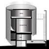
Section A-A ; Sections B-B and C-C
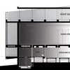
images : studioMAS
GREEN NARRATIVE – SOME UNDERLYING IDEAS
CONTEXT I PLACEMENT I LOCATION I FORM
The elliptical form of this building, responds directly to the narrow site on which it is located. Built on the corner of a busy intersection, it was evident that Circa would become an urban landmark, and that not only should it be striking, but also should expose to the Johannesburg public, a different type of architecture; one which is derived from certain “common logic” principles. A large number of these principles were based on our quest to bring in a greater appreciation for natural systems and to respond to the limits of the planet appropriately. More subtly, the ellipse is reminiscent of an organic form, not as structured as an oval, a lot more organic.
EFFICIENCY OF THE PLAN I ADAPTABILITY + CROSS PROGRAMMING I NO WASTED SPACE
Because of the limited size of the site, the plan has to be as efficient as possible so that there is no wasted space. The areas around the building are not fenced off, but rather integrate with the sidewalks, form a courtyard or maintain views through the site. As little space as possible is lost to circulation and services in the building; circulation occurs on the edge of the building, leaving the galleries unobstructed. This has also meant that heating and cooling of high occupancy spaces has been limited to net areas since our climate does not necessitate the heating and cooling of the entire building.
LONG-TERM EMBODIED ENERGY I PRIMARY MATERIALS
The structural concrete work in the building has been designed with the purpose that it should last for the next 200-300years. Because of Circa’s public nature, careful attention has been given to make the building as robust as possible, so that its embodied energy can be fully realised rather than be replaced every few years as consumerist culture often demands. The materials used also follow this philosophy of efficiency. Off-shutter concrete has been left as is, floors are untiled and minimal painting has been done. Anodised aluminium fins reflect their inherent qualities and materials are left to age with time.
INSPIRED BY NATURE I SCRIMS & CREEPERS
One of the prominent design features, of is that of scrims. While traditionally used in theatre to create the illusion of a solid wall or to suggest haziness through to the lighting, we have adapted this philosophy to design permeable building skins; skins that breathe and allow views through them. Circa consists of two scrims. The most obvious is the building facade, which consists of many-coloured anodised aluminium fins that are attached to the building structure. These fins create an in-between space wherein circulation occurs and their colour was drawn from elements in nature, particularly hues from tree bark. The second scrim is detached from the main building and contains the fire escape. This steel and wire mesh box has been planted by a variety of creepers that over time will grow to cover its edges completely. This paradox of implied order and chaos has been inspired by natural systems. Nature should overtake the architecture; in fact base walls have been planted with fine creepers so that the main structure will appear to hover above a green plinth.
PERMEABLE SURFACES
The prominence of Circa as a public place, has impacted on the design of the spaces around it. Simple landscaping around the building has resulted in the design of an urban square, with seating and distinctive pedestrian priority areas. During events, the community gathers in this space, informally appropriating their public realm. This space has been paved and planted in order to allow for some rainwater to permeate into the sub-soil. Rather than creating a storm water tank ion site, a man-made aquifer has been created to allow water to seep into the ground as it would naturally have done.
PASSIVE SYSTEMS I EVAPORATIVE COOLING I FILTRATION SYSTEM I NATURAL GAS
As far as possible, passive design strategies have been used to minimise dependency on mechanical systems. Only net areas are cooled by means of an evaporative cooler and heated by means of natural gas heat pumps. Circulation spaces are ventilated naturally. Natural gas is also used to heat up the water geyser, while all lighting consists of LED’s. The pond has been installed with a green water filtration system which depends largely on plants to generated adequate oxygen levels for filtration therein.
Circa on Jellicoe images / information from studioMAS architects + urban designers
Circa on Jellicoe Johannesburg : main page with images
Location: Cape Town, South Africa
Architecture in South Africa
South Africa Architecture Designs – chronological list
Architecture Walking Tours by e-architect
South African Interpretation Centre : WAF World Building of the Year
Soccer City Stadium South Africa
Comments / photos for the Circa on Jellicoe South African Architecture page welcome

