BABAMA Concept Store Shanghai, Huangpu District shop in China, Chinese retail property photos
BABAMA Concept Store in Shanghai
14 July 2023
Design: ATMOSPHERE Architects
Location: Huangpu District, Shanghai, China
Photos © Chuan He from Here Space
BABAMA Concept Store by ATMOSPHERE Architects
Close to two subway exits, the project stands out with abundant customer flow and advocates individuality and self-expression in the second phase of the Xintiandi fashion business district in Huangpu District, Shanghai. As the first BABAMA store, it has great significance to the brand. It is a congealment of the brand spirit and philosophy that BABAMA has accumulated since its establishment in 2011, as well as an in-depth dialogue about inheritance and fashion from the perspective of industrial aesthetics.
BABAMA, from the heart – Embark on a new adventure
1 Pumping Heart
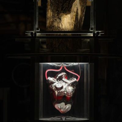
The heart, an important hub in the biological circulatory system, provides pressure for blood flow and pushes blood to run through the whole body. It offers sufficient blood flow to organs to provide oxygen and various nutrients so that cells can maintain metabolism and function and keep organisms operating and maintaining vitality
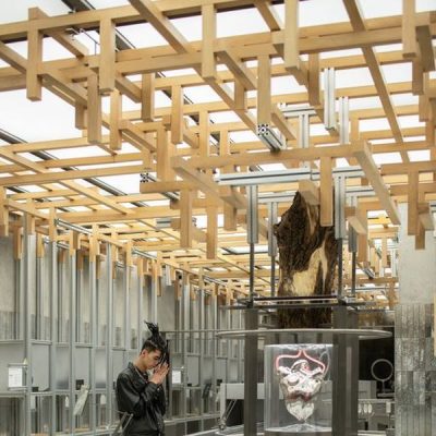
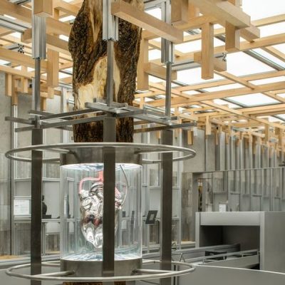
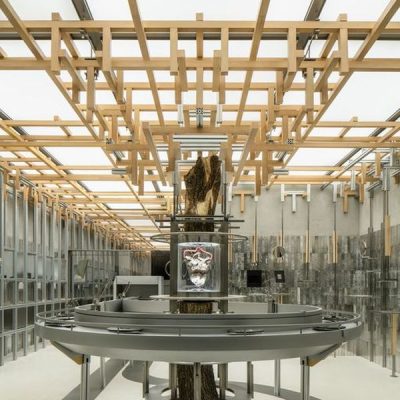
As one of the core elements of BABAMA, the pumping heart appears in the form of an art installation, which brings the original core of the brand spirit into the real space and forms a core visual focus that can be perceived.
The overall narrative logic of the space follows this design concept, which completed the secondary creation and transformation from the perspective of design by dismantling the biological circulatory system of arteries and the structure of material transportation in the body. The design follows the material transporting rule to arrange the space division, movement path design, and other creations. In this layout, the mechanical heart installation becomes the core of the space, continuously transporting energy for each area.
2 Circulatory System
Nature, machinery, and heart.
BABAMA builds its own circulatory system with these three core elements. Paying tribute to traditional industrial aesthetics, the design integrates natural elements and heart images to convey the core brand concept of pulsating life, which is an important basis for subsequent product design and space arrangement.
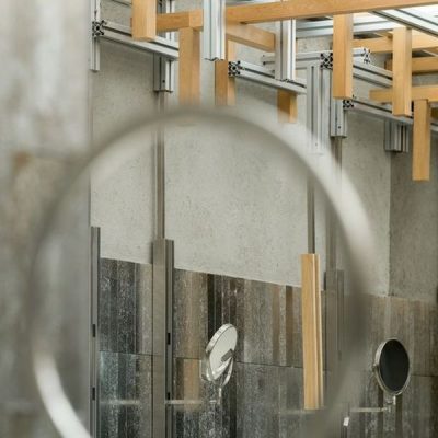
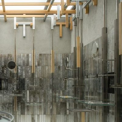
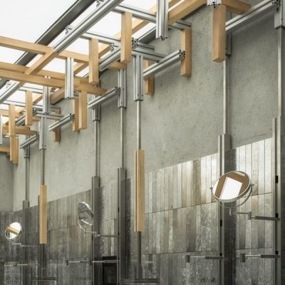
On the top of the core installation, a trunk combines with well-connected metals and wood to simulate a growing tree with branches reaching to the ceiling as if receiving the “energy” of the heart, and growing forever in the limited space.
The contrast of aluminum and wood extends the industrial style of the brand and neutralizes the strong mechanical sense of the space to a certain extent through natural materials, creating a harmonious coexistence.
3 Innovative Design
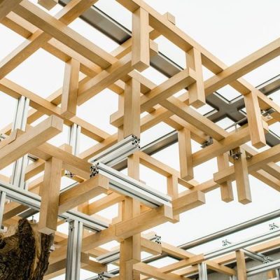
The bucket arch, also known as “Dougong”, is a unique component of Chinese architecture that features distinct style and characteristics in terms of aesthetics and structure. It is generally used between the columns and roofs of large buildings in ancient China as a transitional part. It is often found in monumental and important buildings.
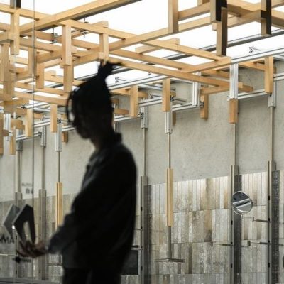
By extracting the cultural core of the bucket arch and adapting to the context, the space simplifies the original shapes and incorporates metal on wood to form the new structure.
The arrays on the ceiling make the space more recognizable, which connects the whole space and further expresses the design concept deeply.
4 Sustainability
Sustainability is one of the most important issues for humanity. Returning to design, we should make an attempt and effort to create a sustainable design system in the present when the resources are limited.
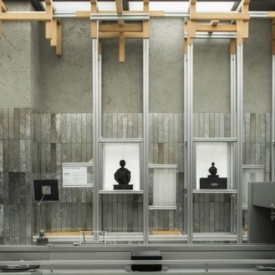
In line with the current trend of new retailing, the design of the showcase was completed with a modular concept at the beginning of the project, allowing the original fixed blocks to become detachable and flexible components for easy transportation and adaptation to other projects.
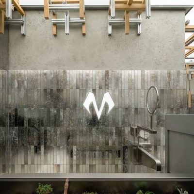
The interplay of metal, glass and other materials in line with the main body and the addition of circular mirrors also has been taken into account to meet the needs of visitors in fitting process, making it a natural experience for them to complete their shopping.
At the same time, on the premise of meeting the future long-term use of the space, each facade is combined with the existing product lines of the brand, through the combination of tray areas and cabinet areas, to meet the needs of different product display to the greatest extent.
Under this “wall system”, each tray, cabinet and even spotlight can be flexibly moved, combined and disassembled according to the actual product size, display needs and visual focus.
The combination of different modules satisfies various sales scenarios and locations in the future so that the overall display area is more flexible and creative in the form of modular, further expanding the space possibility.
5 Conveyor Belt
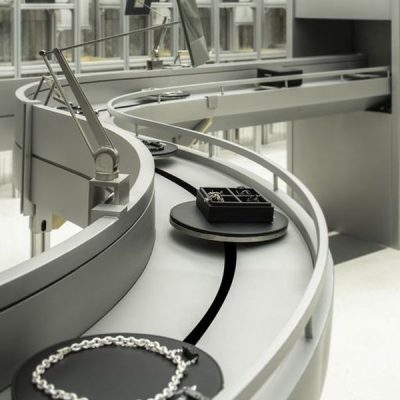
Taking the mechanical heart tree as the visual focus, the display area from the top to all around is a vertical space presentation. While in terms of the plane, the key point is the conveyor belt which serves for the actual sales as a closed-loop circulation around the behaviors of product display, try-on, selling, and packaging.
Adopting the conveyor belts commonly used in industry, it showcases the effect of “moving” through mechanical operation in visual performance and actual interaction, echoing the expression of the blood circulatory system related to the core concept of the mechanical heart.
The brand icon items are displayed on the circular tray of the conveyor belt. As they are placed one by one along the curved channel, the black leather tray highlights and restores the texture of metal and gemstone to the greatest extent, achieving an innovative viewing and interactive experience.
This kind of display mode can fit the brand’s multi-series product lines and future development trends. It also ensures that customers entering the shop are guided through the planning of the movement to maximize their experience from space and the reach of the products.
6 De-bordering
When the industrial transmission process returns to the actual consumption, the cashier area is the last step after packaging. In this way, the cashier function is embedded into the space.
It breaks the conventional large cashier area, weakens the construction mode, and eliminates the original boundary through a more flexible and lightweight partition. The project creates a channel that belongs to the external and internal connections of the space.
So that it can achieve mutual integration while maintaining independent functions, blur the existing boundaries, and realize the integrity and continuity of the overall space.
BABAMA, continuing the craftsmanship spirit of our fathers
Continuously growing, forever leaping
BABAMA Concept Store, Shanghai, China – Building Information
Project Name: BABAMA Concept Store
Location: Shanghai, China
Project Area: 108㎡
Completion Time: Mar 2023
Design Firm: ATMOSPHERE Architects
Chief Designer: Tommy Yu
Collaborative Design: Aubrey Liu.Valo Xiao.
Animation Design: ViVi Lee
Prop and Installation: ATMOSPHERE Architects
Lighting Solution: ArtLuci x Owen
General Contractor: Shanghai Yimuhe Construction Engineering Co., Ltd.
Photographer: Chuan He from Here Space
BABAMA Concept Store, Shanghai, China design images / information received 140723 from ATMOSPHERE Architects
Location: Shanghai, People’s Republic of China, eastern Asia
Shanghai Building Designs
Contemporary Shanghai Building Designs – recent architectural selection on e-architect below:
Design Team: MDO
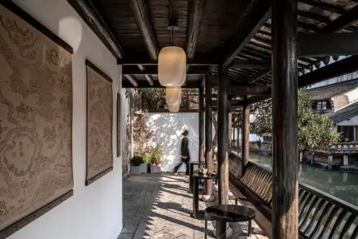
photo : Pianfang Studio
Qing Dynasty Post Office
Laizhou Bar, Fumin Road
Design Team: RooMoo Practice
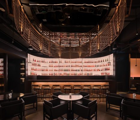
photo : Wen Studio
Laizhou Bar, Shanghai interior design
Scenery in Motion, Moyu Road, Jiading District
Design Team: Studio DOTCOF
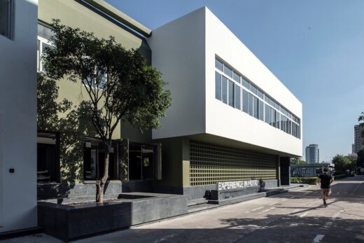
photo : LEIDU
Scenery in Motion
Design: Foster + Partners
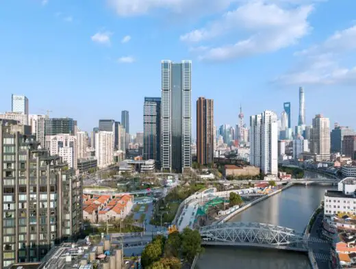
photos © Zhurunzi,
Suhe Centre for China Resources Land
Design: MVRDV, The Netherlands
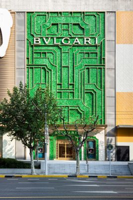
photograph © Bulgari
Bulgari Shanghai retail façade design by MVRDV
Design: AIM Architecture
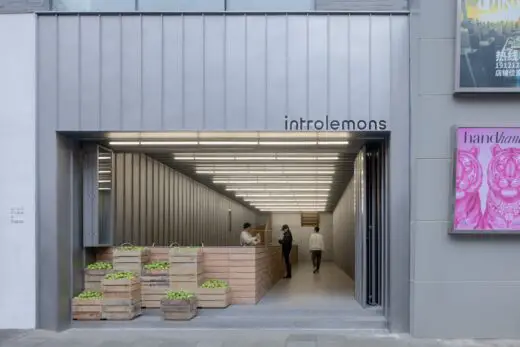
photo : Wen Studio
Introlemons Shanghai, Lemon Tea Store
Interior Design: Kokaistudios
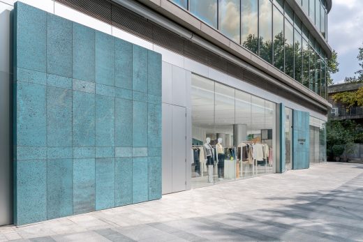
photo : Dirk Weiblen
ASSEMBLE by Réel
Design: TEAM_BLDG
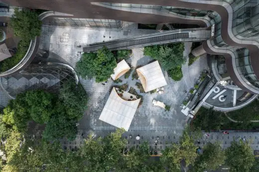
photo : Studio FF
PARKLIFE Spatial Installation Shanghai Downtown
Buildings in Shanghai
New Shanghai Architecture
Shanghai Architecture Designs – chronological list
by e-architect
Foster + Partners Architecture
Architects: AIM Architecture
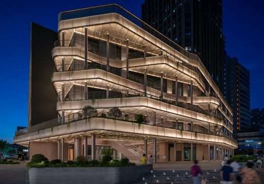
photo : Dirk Weiblen
Kailong Jiajie Plaza Transformation
Design: SPARK
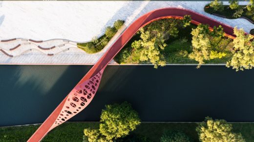
photo : Shine Lab
Minhang Riverfront Regeneration
Shanghai Architect – architectural firm listings on e-architect
Comments / photos for the BABAMA Concept Store, Shanghai, China design by ATMOSPHERE Architects in China, page welcome


