Novancia business school Paris, Architect, Building, Pictures, Design, Architecture
Novancia business school, Paris
16 June 2020
Novancia business school
Location: Armand Moisant street, Paris
Design: AS.Architecture-Studio
Photographs: Georges Fessy
Following a competition organised by the Paris Chamber of Commerce, the restructuring and extension of Novancia business school, located on Armand Moisant street in Paris, was entrusted to AS.Architecture-Studio. This higher education institution, specialising in entrepreneurship, should accommodate 1500 students in 2011. The building features a property complex including classrooms, offices, 3 amphitheatres, a 260-seat auditorium, a resource centre, a recording studio and food and beverage areas.
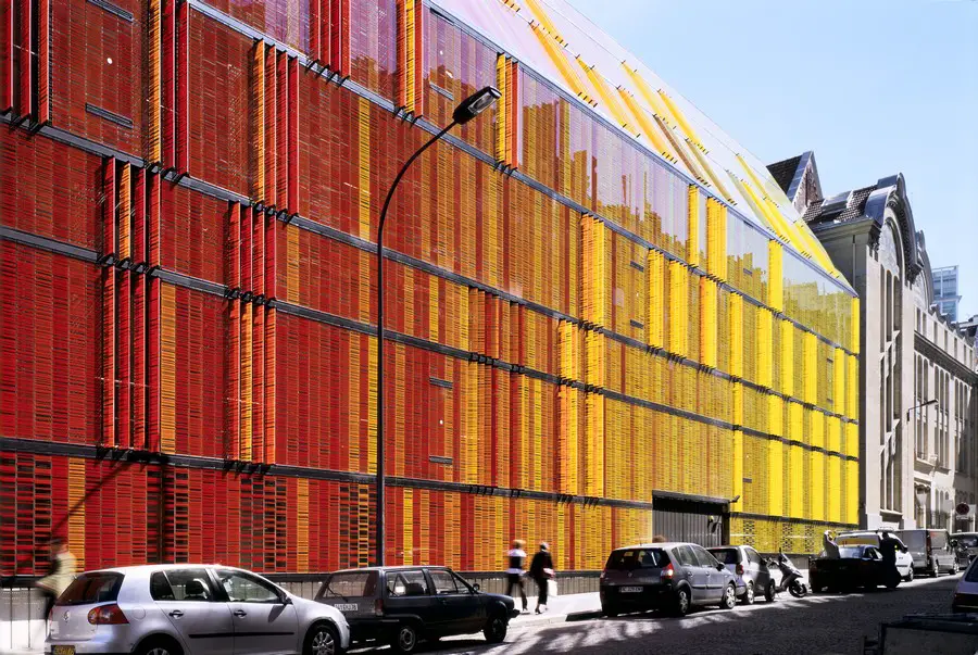
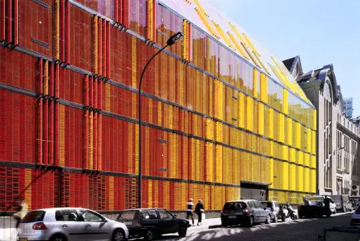
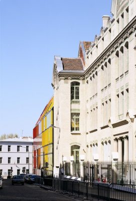
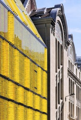
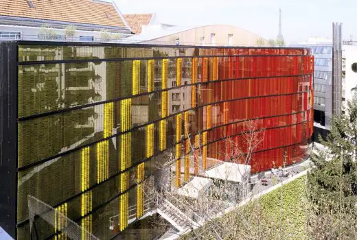
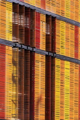
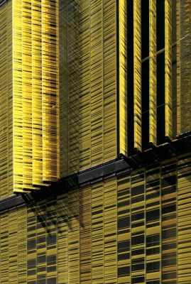
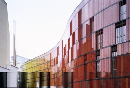
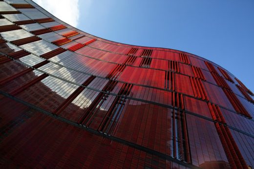
The building asserts its modern character, in line with its environment, and emphasizes the historical part built in 1908. In contrast with the latter ’s rough and static bricks, the extension is smooth, dynamic and kinetic. It is characterised by the refined design of glass facades composed of mobile ver tical shutters with couloured printed glass. These shutters act as a protection against sunrays or, on the contrary, let them in.
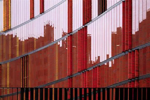
The facade colour range makes the building sensitive to its environment. I ts characteristics are constantly changing according to light inputs, angles and the positions of sun-breakers. Whereas colour gradation makes the building contextual, it becomes the «context» itself due to the reflection of surrounding elements onto the facade.
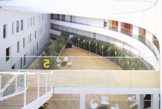
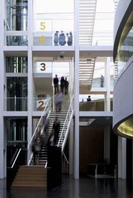
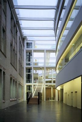
The main classrooms and offices are served by open walkways set around a large atrium. The atrium is the main foyer and an open, user-friendly area. I t is also a horizontal and ver tical transfer area connecting the old and the contemporary buildings. When bathed in light inside the atrium, one has the impression of being outside. When protected from bad weather, one really appreciates being indoors.
The business school is designed as a real forum dedicated to students, teachers and entrepreneurs. Permanent dialogue and common work between the client and the design team resulted in a project that fully complies with financial targets and established deadlines.
IN THE CITY
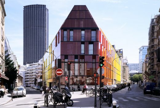
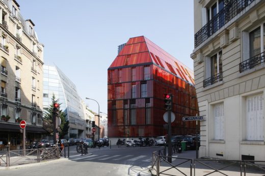
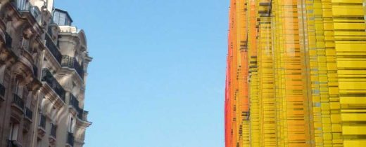
Several consultation meetings with residents took place during the study phases. The project has also gained the support of local politicians. We sought for chromatic harmony with nearby environment: yellow colour of the 1908 building and red colour of Bourdelle museum. The building plays and interacts with the brightness and colours of its surroundings.
The volume composition corresponds to Paris city planning regulations. The morphology of the plot includes twenty-three different sizes. In the prolongation of the 1908 building, the extension follows the Hausmanntype building line. In front of a ledge of the museum, where Bourdelle street narrows, the extension turns towards the core of the plot, generating a curve and a countercurve. The patio thus created expands urban space.
HERITAGE AND FUTURE
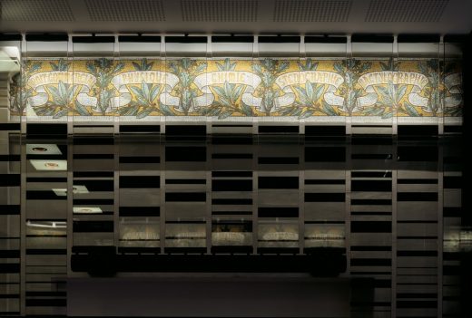
The project is both contemporary and historical – and these notions support each other. AS.Architecture-Studio renovated the initial building in a precise and refined manner. The school asserts its modern character while echoing and reinforcing the initial building. The use of hollow joints enables everybody to make a clear distinction between the initial and the new building; both thus become autonomous within this unitary project. The rear facade of the historical building reveals itself inside the atrium. The opposite facade asserts the aesthetics of the building: history and future – «together» and «simultaneously» – which is already a sign of contemporaneity.
THE OLD BUILDING
The old building was renovated according to its original treatment (bricks, stylized windows, cornices and mosaics). Original colours were resur faced and restored. We recovered room clearance by pulling out the 1954 extension. The old building was renovated in full compliance with its original design.
THE CONTEMPORARY BUILDING
A contemporary, precise, joyful and coloured building stands out of the street building alignment. I ts refined design makes it even more dynamic. As a contrast with the static and rough bricks of the historical building, the extension is smooth and kynetic.
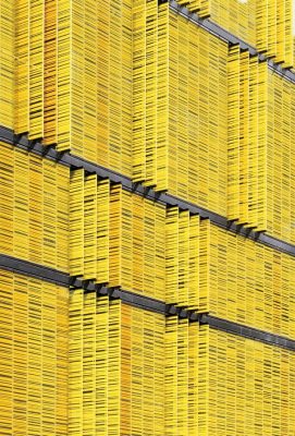
Facades gain rhythm thanks to mobile ver tical shutters made of coloured printed glass. They control light input (either protecting from sunlight or letting it in). These revolving shutters are grouped together and electrically-driven. The building thus comes alive, as shutters open, close and revolve. Shutters seem closed when seen from afar and transparent when seen from nearby. The colour range also changes, as it adapts to the brightness and position of the sun. According to sunray position throughout the year, the facade colours will vary from pastel to fluorescent. When people stroll nearby, the landscape reflected by the shutters vibrates and becomes pixelated.
According to a mathematical formula, colours vary within a gradation going from red to yellow and from yellow to red. Gradations accelerate and decelerate. Seven colours, three patterns, on both sides, and seven different heights result in eight hundred seventy-three references and four thousand one hundred and two implemented items. Shutters are the result of a long endeavour of graphic research, reinterpreting the sunbreaker theme.
This contemporary building, with a simple and unique design, turns in the schoolyard and wraps the historical building on the nor thern side. The opening onto Antoine Bourdelle street enables us to treate the rear facade as precisely as the front one. The integration work on the facade was achieved through constant collaboration with a national heritage architect.
The atrium represents the hear t of the building itself. Open walkways serve the main classrooms and offices, the auditorium, the amphitheatres and the cafeteria.
photograph : Architecture-Studio
The central foyer helps visitors find their way and makes the functioning of the building dynamic. It is a horizontal and ver tical transfer area for all:
– a horizontal area, at street level and through walkways located at various levels,
– a vertical area, through elevators and stairways that serve all the levels of both the old and new building. A monumental staircase generates a counterpoint in this longitudinal area.
Zenithal light changes the characteristics of this area throughout the day. Diurnal cycles animate social life and encounters.
When inside the atrium, one can easily imagine the geometry of the entire building. The curved lines in the patio differ from the front facade geometry. The auditorium is wrapped in a wooden shell and topped by a meeting platform, like a piazza. The facades of the 1908 building separate the atrium from classrooms and offices. They are a metaphor of the city inside the building. This majestic and welcoming atrium is planted with bamboos.
Dominated by the white colour, the atrium brings together the bricks of the old building, the colours of the glass facade, wood and vegetal textures, as well as the movements of people who meet inside the building.
The atrium establishes a physical and visual link with the ground floor and the planted patio, where the information directory and food and beverage areas are located.
Novancia Business School Paris – Building Information
Financing: Chamber of Commerce and Industry of Paris,
Ile-de-France Region
Client: Chamber of Commerce and Industry of Paris,
Real Estate Department
Architect: AS.Architecture-Studio
Engineering: Arcoba
Quantity Surveyor: Eco-Cités
Acoustics: AVA
Assignment: public contract + diagnosis + accessibility
Total area: 22,360 sqm (including car parks)
Budget: Euro 34 M before tax (market value)
Competition: 2006, winner
Studies: from 2006 onwards
Completion: 2011
Novancia Business School formerly titled Advancia Business School
Novancia Business School images / information from AS.Architecture-Studio
Novancia Business School design : AS.Architecture-Studio
Location: Armand Moisant street, Paris, France
Architecture in Paris
Contemporary Architecture in Paris
Parisian Architecture Designs – chronological list
Architecture Tours in Paris for groups, by e-architect
Another Parisian building design by AS.Architecture-Studio:
Maison de Radio France
Maison de Radio France
Paris Architecture – Selection
The Phare
Morphosis, Architects
The Phare Paris
Atelier Christian de Portzamparc
Société Générale tower
Comments / photos for the Novancia Business School Paris page welcome

