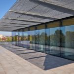
University Luigi Bocconi Milan, Architecture, Image, Architect, Design, Project
University Luigi Bocconi, Milan
Contemporary Milanese Building, Northern Italy design by Grafton Architects, Ireland
21 Feb 2009
University Luigi Bocconi Milan
Architecture Competition Report:
UNIVERISTA’ LUIGI BOCCONI
A Piece of City
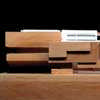
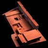
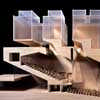
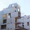
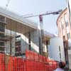
Grafton Architects saw this brief as an opportunity for the Luigi Bocconi University to make a space at the scale of the city. To this end they have built at the scale of the site, 50m x 150m.
Inside, the building is thought of as a large market hall, directly influenced by Il Broletto. As with Il Broletto, this hall acts as a filter between the city and the university.
A Window to Milan
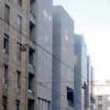
The northern edge of the site fronts onto the artery of Viale Bligny, with the clatter of trams, the rush of busses, general traffic, people passing.
It addresses the throbbing urban life of Milan, weaves into the mesh of the city.
This frontage becomes the architectural opportunity to have a ‘window’ to Milan, a memorable image to confirm the important cultural contribution that the Bocconi University plays in the life of this city.
For this reason, the public space of the aula magna occupies this frontage, asserting a symbolic presence and a register of the prestigious status of the University.
Social Lebensraum
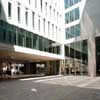
This building is set back from the Viale Bligny & Via Rontgen edges to make a public space 18m x 90m inspired by the space forward of Hospital Maggiore.
It’s much larger frontage, of approximately 200m , creates a vibrant socially active edge to a building which inside is a maze of secret cloistered courtyards and walkways.
The widened pavement and new urban space acts as bridge, the ‘Social Lebensraum’ and keeps the city at a respectful distance.
This new deep ‘finger’ of space reaches out to the city and beckons. the visitor into the heart of the interior.
This public space continues into the building, bringing with it it’s stone surface, the floor of the city.
A Place of Exchange.
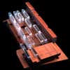
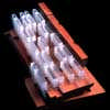
The world of the offices / and research is suspended between the ground and sky – a low- rise labyrinth with an interactive weave of courts, bridges terraces, corridors, all of which encourage overlap, expansion, contraction, new mixes, chance discussions, vertical and horizontal possibilities.
Moving Skyward:
In order to make this grand place of exchange we thought about the research offices as beams of space, suspended to form a grand canopy which filters light to all levels.
The offices form an inhabited roofscape which is generally 3 /4 floors deep.
This floating canopy allows the space of the city to overlap with the life of the university. Allows internal and external public spaces to merge.
Undercroft:
The undercroft is cool and shady in the summer, with reflected light and warmth in the winter.
The underground accommodation is treated as an erupting landscape which offers support to the inhabited light filters above.
The point of energy is where the sky world meets the underground world.
Spatially this underground world is solid, dense and carved.
By contrast the large spans allow the offices above to float like bridges slung in space.
We tried to establish a continuity between the ‘landscape’ of the city and the ‘made landscape’ of this undercroft.
Inside Out:
Because we have blurred the division between indoor and outdoor spaces, and because the scheme is a weave of courts, gardens and ‘halls’, this allows the building to expand and contract be it on a seasonal basis.
The external public spaces are microclimates protected from extremes of heat, cold and rain.
The internal public spaces are capable of being opened up to merge with the protected external spaces.
There is the potential for a surreal interchange to occur between inside and outside, between informal semi -internal landscapes and formal semi-external halls.
Inhabited Roof:
The beehive world of the research offices hovers over the city below, over the public spaces below, over the campus below.
It is physically separate but always visually connected to the life of the lower levels.
It is an adaptable and interactive labyrinth.
In search of gravity:
With regard to the structure and the assembly of this interactive labyrinth we thought we could perhaps establish a real sense of gravity or defiance of gravity. Our concrete piers are anchored in the ground and reach up to support the heavy roof from which the office levels are hung.
By banishing to roof level, this point of transfer from one scale of structure to another, we perform a number of tasks;
the boundaries between lower and upper levels are blurred;
the thinness of the division between lower and upper levels adds a sense of weightlessness to the suspended offices;
thermal mass is located where it is needed….at roof level
And what will this ‘construct’ look like?
The two components of the brief which are given expression on the street edge are the Aula Magna and the Library. For both architectural and environmental reasons these volumes are expressed as solids, either embedded and rising out of the ground as is the case with the Aula, or cantilevered and floating over the street as is the case with the Library.
Responding to the character of Milan as described by our Milanese colleagues…”hard on the outside, friendly on the inside” ,we have made an edge which is like a crusty ‘shield’, constructed in a robust material i.e., stone,render or concrete.
We have worked this material in order to give a sense of depth, density and mass as is the quality of so many buildings in Milan.
Our quest is to make something resolutely robust but beautifully bold.
Aula
The external wall to the sunken Aula Magna reaches the full height of the building with the upper level offices inhabiting it’s roofscape /attic.
The volume of the aula invades this roofscape for air and light and this ‘invasion’
which happens in the section becomes evident on the external wall.
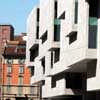
The wall is deformed and fractured in order to provide a more generous pavement and to turn the corner.
Our priority was that the presence of this space be given expression on the street.
The full bulk and scale of this great room ‘the embedded boulder’ sits directly on the street edge and is the anchor for the totality of the building.
The acoustic intimacy of the Aula Magna and the conference rooms is achieved by lining and folding the inner walls and ceilings.
The acoustic intimacy of the Aula Magna and the conference rooms is achieved by lining and folding the inner walls and ceilings.
The two interlocking volumes of this space are designed to accommodate 600 people at the lower level and 400 at the upper level.
The volume of the light scoops act as mini fly towers.
The 400 person space is separated from the larger volume by means of a twin walled acoustic screen which is lowered from this roof recess above.
A podium for the speaker in this smaller space, slides out from under the lower seating rows.
A backstage area is provided behind the main aula with a larger roof recess to accommodate backdrops etc.
This is the most dramatic light shaft in the space.
Blackout is via automatic blinds.
Progetto UNIVERSITA’ BOCCONI
University Luigi Bocconi Milan – Credits:
Competition phase:
Grafton Architects Architects
Tim Gatehouse Associates Quantity Surveyors
BDSP Partnership Consulting Engineers
RFR Structural Engineers
Planning Stage:
Grafton Architects Architects
Studio Ingegneria E.Pereira Structural Engineers
Amman Progetti Services Engineers
BDSP Partnership Environmental Engineers
Studio Rabuffetti Building Regulation Coordinator
Arpservice P. Molina Acoustic Engineer
Ing.Silvestre Mistretta Fire Cert. Consultant
BDA Ltd Facade design consultant
Tender and Construction Stages:
Grafton Architects Architects
Studio Ingegneria E.Pereira Structural Engineers
Amman Progetti Services Engineers
Progetto Pcmr Project Managers
Studio Rabuffetti Building Regulation Coordinator
Arpservice P. Molina Acoustic Engineer
Ing.Silvestre Mistretta Fire Cert. Consultant
Avenue Architects Interior architects
Competition: 2002
Site Construction: 2004-08
Client: Universita’ Luigi Bocconi
Representative for the Client: Mr Nicolo’ Di Blasi
Main Contractor: G.D.M. Costruzioni S.p.a.
Facade System : Permasteelisa Group
Stone Cladding: Marini Marmi s.r.l.
Progetto UNIVERSITA’ BOCCONI
GRAFTON ARCHITECTS
Directors; Yvonne Farrell, Shelley McNamara
Gerard Carty, Philippe O’Sullivan
Project Architect: Simona Castelli
Collaborators; Abi Hudson, Matt McCullagh, Kieran O’Brien, Paul O’Brien, Kate O’Daly, Ciara Reddy, Jasper Reynolds.
Past Collaborators; Lennart Breternitz, Matthew Beattie, Philip Comerford, Miriam Dunn, Andreas Degn, Ann Henry, David Leech, John Barry Lowe, Eavan Meagher, Orla Murphy, Aoibheann Ni Mhearainn, Sterrin O’Shea, Eoghan O’Shea, Michael Pike, Anna Ryan, Maurizio Scalera, Emmett Scanlon, Ansgar Staudt, Gavin Wheatley.
University Luigi Bocconi Milan Information from Grafton Architects
University Luigi Bocconi : main page with images
Location: Via Roberto Sarfatti, 25, Milan, Lombardy, northern Italy
Milan Architecture
Contemporary Milanese Architecture
Milan Architecture Designs – chronological list
Milan Architecture – Selection
Milanofiori North – Business Park & Leisure Centre
Design: Erick van Egeraat
Milan buildings
Via Tiziano 32
Design: Park Associati – Zucchi & Partners
Tiziano 32 Milan
Design: Stanton Williams
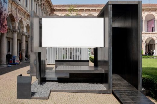
Baldacchino by Stanton Williams © Saverio Lombardi Vallauri
House in Motion for Milan Design Week 2018
, courtyard of Università degli Studi di Milano
Design: Peter Pichler Architecture
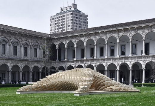
photograph : Oskar Dariz
Pavilion, Università degli Studi di Milano
Salone di Mobile Milan by Mecanoo architecten
Comments / photos for the University Luigi Bocconi Milan page welcome

