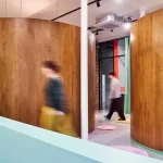
Designed to Refill Shop in Uccle, Bruxelles
9 September 2026
Design: Studio Kimchi
Location: Uccle, Bruxelles, Belgium

Photos: Klaas De Buysser
Designed to Refill is the renovation of Bio Vrac in Uccle, Brussels: a zero-waste organic bulk store conceived as a seamless, refill-first retail experience. The project began with a simple ambition—make sustainable shopping feel as intuitive as conventional shopping—then translated it into a clear spatial sequence: arrive, understand, choose, refill, weigh, pay.

The layout is organised as a legible system, with strong sightlines, logical zoning, and circulation designed to reduce friction and prevent bottlenecks, even at peak moments.

Studio Kimchi’s design approach balances editorial calm with operational precision. Refill stations are treated as the core destination, supported by ergonomic heights, generous working surfaces, and a consistent “system language” that teaches customers the process without excessive signage. Material choices prioritise durability, cleanability, and long-life performance—supporting hygiene, trust, and a low-waste mindset beyond the products themselves.
A rare focus for retail projects was the acoustic comfort of the space. By intentionally reducing noise and reverberation, the store supports a slower, more relaxed shopping rhythm—lowering cognitive load and making refill feel effortless and repeatable. *Designed to Refill* demonstrates how architecture can quietly guide behaviour, turning sustainable consumption into an everyday habit.

What was the core inspiration behind creating a zero-waste organic bulk store with a focus on a seamless refill experience? How does the store’s design directly support its mission to promote sustainable consumption?
The core inspiration was to make sustainable shopping feel effortless and desirable, not like a personal “project.” A zero-waste bulk store only works long-term when the refill routine is intuitive, calm, and repeatable—so the experience had to be designed around removing friction while keeping quality and trust front and center.


The store’s design supports its mission in very direct, practical ways:
Intuitive customer flow: the layout makes it immediately clear where to start, refill, weigh, and finish—reducing decision fatigue and making refill a habit.
Logical zoning: product categories are organized around real shopping behavior (browse → choose → refill → weigh → pay), so the process “makes sense” without instructions.
Ergonomics and comfort: correct heights, sufficient counter space, and easy-to-use refill points make the action of refilling simple and accessible.
Hygiene and trust cues: a clean, well-ordered environment communicates care and safety—essential for bulk to feel premium and reliable.
Clear, calm information: origin/allergen/product info is readable and helpful without visual noise, enabling conscious choices without overwhelm.
In short: the space is designed as a system that quietly guides behavior—so “less packaging” becomes the natural outcome of a better shopping experience.


As the interior architect, what specific design principles and material choices did Studio Kimchi implement to achieve both aesthetic appeal and the store’s zero-waste objectives? How does the architecture itself guide customers towards a refill-centric shopping experience?
Studio Kimchi approached Bio Vrac with one guiding principle: design the behavior, not just the look. The goal was to create a space that feels editorial, while making refill the most intuitive way to shop—so the architecture itself becomes a silent guide.
Design principles (specific + refill-led) – Behavior-first flow: the plan is organized around a clear sequence—arrive → understand → choose → refill → weigh → pay*—to reduce hesitation and make the routine repeatable. – Zoning with hierarchy: everyday staples are placed where customers naturally move first; discovery categories are positioned to invite exploration without disrupting the refill rhythm. – Low-friction navigation: sightlines and layout clarity minimize “Where do I go?” moments, lowering cognitive load and keeping the experience calm. – Ergonomics as design: refill stations are designed around comfortable reach, stable surfaces, and enough working space—so refilling feels easy, not fiddly. – Trust through order: visual discipline (alignment, repetition, consistent labeling logic) signals hygiene and reliability—crucial for bulk retail.
Material choices (aesthetic + zero-waste aligned) Materiality was selected to communicate natural quality and durability, while supporting a low-waste operation: – Durable, repairable finishes that age well (patina-friendly rather than disposable), extending the interior’s lifecycle. – Natural, tactile surfaces to create warmth and sensory calm—allowing products to be the “color” and avoiding visual over-stimulation. – Modular / adaptable elements (especially in display and refill infrastructure) so the store can evolve without demolition waste. – Low-maintenance, cleanable materials in high-touch refill zones to reinforce hygiene and make daily operations efficient.
How the architecture guides refill-centric shopping – Refill points are treated as the “main stage,” not an add-on—positioned and scaled to be the obvious center of action. – Clear spatial cues (rhythm, repetition, and consistent station design) teach the process without signage overload. – Dedicated moments for slowing down vs. speeding up: areas for choosing and reading are calmer; areas for weighing and checkout are streamlined—supporting a smooth tempo. – A coherent system language: once a customer understands one refill station, they understand the whole store—making return visits faster and more confident.


Could you walk us through how the seamless refill experience was conceptualized and translated into the physical layout and operational flow of the store? What design elements were crucial in making this experience intuitive and user-friendly for customers?
The “seamless refill experience” started as a simple design brief: make refill feel as natural as grabbing a product off a shelf. That meant designing the store around a clear, repeatable sequence—arrive → understand → choose → refill → weigh → pay—and removing every point of friction that typically makes bulk shopping feel complicated.
We translated that into a layout that works like a system. Customers can read the space in seconds: refill zones are positioned as the main destination, categories are grouped in a logical order, and circulation avoids bottlenecks so the process stays calm even when it’s busy. Operationally, the flow supports both the shopper and the team—refill, weighing, and checkout are aligned to keep the rhythm smooth and efficient.
Crucial design elements were clarity, ergonomics, and trust cues: strong sightlines, consistent station design, comfortable working heights, generous counter space, and a clean, ordered material language that signals hygiene and quality. The result is a store where the architecture quietly “teaches” the behavior—so refill becomes intuitive, fast, and easy to repeat.


Given that Designed to Refill was a renovation project, what unique challenges did you encounter in transforming the space into a modern zero-waste store? What innovative or sustainable solutions were employed during the renovation process?
Because Designed to Refill was a renovation, the biggest challenge was building a highly structured refill system inside an existing shell—with fixed constraints, legacy circulation, and technical realities that don’t always match the ideal retail flow. Bulk retail is unforgiving: if sightlines, spacing, or ergonomics are off, the experience instantly feels confusing or messy. So the design work was about bringing clarity and calm into a space that wasn’t originally planned for refill-first shopping.
We approached the renovation with solutions that were both operational and sustainable. The store was reorganised into clear zones and a frictionless sequence (choose → refill → weigh → pay), while keeping circulation efficient for staff and customers. We prioritised durable, repairable finishes and modular elements—especially in refill infrastructure and displays—so the store can evolve without constant demolition or waste. Material choices focused on long-life performance and easy maintenance in high-touch refill areas, reinforcing hygiene and trust while reducing the need for frequent replacement.
In short, the renovation wasn’t just an aesthetic upgrade—it was a functional transformation: turning an existing space into a modern, refill-centric system designed to make sustainable consumption feel effortless.


What impact do you hope Designed to Refill will have on the local community and the broader sustainable retail landscape? What future trends do you foresee in zero-waste retail, and how might this project influence them?
We hope Designed to Refill becomes a local reference point in Uccle—proof that sustainable shopping can be easy, calm, and genuinely enjoyable. At community level, the impact we’re aiming for is behavioral: helping people reduce packaging waste through a refill routine that fits real life, not just ideals. It’s also about trust—showing that bulk can feel accessible, hygienic, and well-designed, which makes more people willing to adopt it and recommend it.
On a broader level, we want the project to contribute to a shift in sustainable retail: from “eco messaging” to experience design. If the space is intuitive, the mission scales—because customers don’t need to be educated every time; the architecture guides them.
Looking ahead, we see a few clear trends in zero-waste retail: – Refill as mainstream convenience: faster, clearer systems that work for everyday shoppers, not only early adopters.
– Design-led trust and hygiene cues: bulk environments that feel as reliable as conventional retail.
– Modular, adaptable store systems: retail interiors built to evolve with categories, regulations, and customer habits—without creating renovation waste.
– More integration of brand + wellbeing: calmer, less visually noisy spaces that reduce decision fatigue and make shopping feel better.
Designed to Refill aims to influence that direction by demonstrating a simple idea: when refill is designed as a seamless, premium experience—rather than a compromise—sustainable consumption becomes the default, not the exception.

Designed to Refill Shop in Uccle, Bruxelles – Building Information
- Interior Architecture: Studio Kimchi – https://studiokimchi.be/
- Project size: 415 sqm
- Completion date: 2026
- Photography: Klaas De Buysser
Designed to Refill Shop, Uccle, Bruxelles images / information from Studio Kimchi achitect studio
Location: Uccle, Brussels, Belgium, northern Europe
Brussels Building Designs
Architecture in the Belgian Capital – recent selection from e-achitect:
Tour & Taxis Towers, Lake Side masterplan
Design: MVRDV, architects

image © Reverso Studio
Kanal Museum in Brussels
Design: EM2N, noAarchitecten and Sergison Bates architects
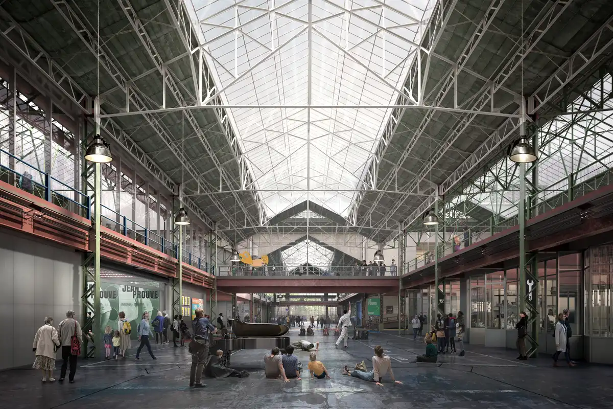
render © Secchi Smith
+++
Architecture in Belgium
Contemporary Architecture in Belgium – architectural selection below:
Tondo Bridge Brussels
Design: OFFICE Kersten Geers David Van Severen
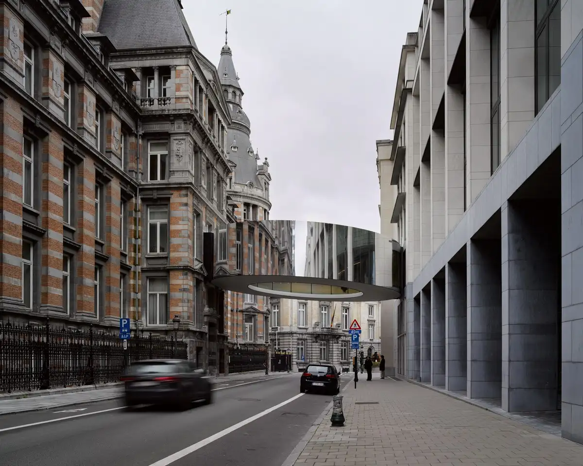
photo : Bas Princen
Comments / photos for the Designed to Refill Shop in Uccle, Bruxelles building design by Studio Kimchi page welcome