Subterranean Buildings, Underground Architecture, Earth Design
Subterranean Architecture : Underground Buildings
Subterranean Aesthetic – article for e-architect by Craig Barkla
1 May 2012
Subterranean Architecture
A Subterranean Aesthetic
`A SUBTERRANEAN AESTHETIC’
The recently completed Easter Sculpture Museum by Exit Architects and the Museum of Art & Archaeology of the Coa Valley (MAACV) by Camilo Rebelo + Tiago Pimentel, located in Spain and Portugal respectively, share a quality that one might describe as `a subterranean aesthetic’. Neither of these buildings could be precisely classified as underground buildings, yet when I saw them both published, I was struck by an apparent similarity that I contend is of a subterranean character.
This may be stating the obvious for Rebelo and Pimentel’s MAACV; which is situated on top of a mountain and invites its visitors to descend a long and winding pathway into its internal spaces. The Easter Sculpture Museum, however, is a building that occupies a dense urban site and, although it is hemmed in on most sides, the only areas that are actually below street level are ancillary to the exhibition spaces. So why is it that a building that is embedded into the top of a remote mountain in Portugal appears to have the same spatial qualities as a building built alongside a church in the centre of a Spanish town?
MAAVC, Portugal
Camilo Rebelo and Tiago Pimentel

photo © Cláudio Reis
Let us first consider the seemingly more subterranean of this pair; Rebelo and Pimentel’s MAACV. The building occupies a truly magisterial position on the crest of a mountain, enjoying panoramic views across a wide valley to mountains beyond. Whilst such a site is an enviable opportunity for an architect; it also presents a concomitant risk of blemishing this serene location with an inappropriate design. Rebelo and Pimentel’s response is ingenious. They have designed the form of this building so that its roof continues the profile of the mountain.
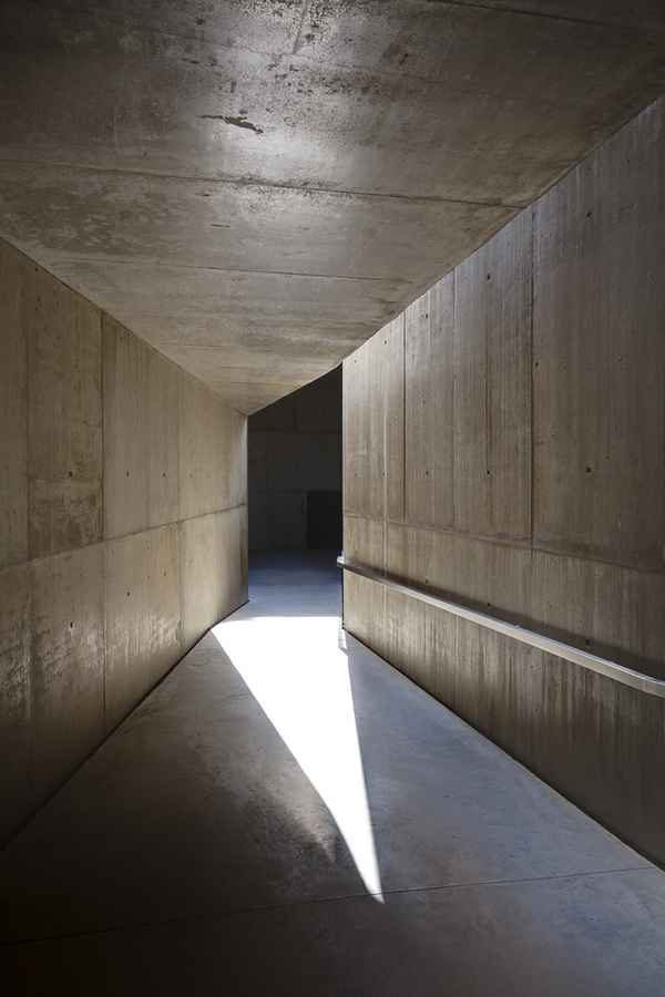
By approaching from above, visitors will park their car and descend the entry ramp probably unaware that they are already on top of the building. Not only does the roof provide a landscape that is completely harmonious with the local topography, but it also conceals the parked cars in elevation. Visitors who wish to enjoy the incredible views before entering the building simply cross the roof terrain and proceed up an inclined surface to an elevated lookout area. To enter the building you descend a long, gently sloping entry ramp. This ramp narrows as it descends – conveying a sense that the mass on either side is gaining density.
This effect, coupled with a slight crank in plan, precludes any clear understanding of destination. Like the approach to The Treasury (Al Khazneh) at Petra, this slow and sinuous descent heightens a sense of apprehension. The angled wall surfaces that provide only partial views of adjacent spaces, the rock-like in-situ concrete and the fact that the predominant lighting comes from the gradually diminishing sky above have a collective spatial quality that is not unlike a crevasse.
The depth of this descent is exaggerated by the roofline above and eventually this winding entry path becomes completely internal – as if one has descended into the mountain itself. The exhibition spaces typically only utilise thin vertical strip windows that are reminiscent of rock fissures. The restaurant space is situated at the south-east corner of the building at the actual ground level. The glazed walls of this space open the interior out to the views beyond but the sense is still akin to being in a cave by virtue of the squat spatial proportions and the massive overhang of the monolithic form above.
Rebelo and Pimentel’s masterly design seems to effectively insert the programme of the museum into the mountain itself. This building is an understated and harmonious addition to the landscape yet it provides a rich, sensory spatial experience.
Easter Sculpture Museum, Albacete, Spain
Exit Architects

photograph : Fernando Guerra
The Easter Sculpture Museum by Exit Architects is in many respects quite a different building to the MAACV. This building evolved over nine years from a scheme that won an ideas competition for the restoration and renovation of the historic Casa del Conde adjacent to the Church of the Asuncion, into what can be seen today. In summary, the architects have restored the precious details of the house facades and behind these they have recreated the original scale of the house with new glazed walls and roof. This singular volume is the largest of the exhibition spaces that make up the new museum.
Externally the building has an ashlar cladding of the same stone as the adjacent church. In some areas the stone has a split face, or perhaps hammer-drilled texture, to express a rustic plinth that is in keeping with many of the neighbouring buildings. The expressed objective of this external treatment is to tie the building into its local context. Likewise, the manipulation of the concrete finish to the external walls of the MAACV so that it resembles the natural stone of the mountain, would suggest that Rebelo and Pimentel share the same ambition of assimilating with the local context.
Like MAACV, this building also responds admirably to its site. The main entry is set back to provide a small entry forecourt and, at the rear, the building elegantly addresses the street corner. The architects have ensured that the height of the building steps down the hill to maintain a consistency of height with its neighbours. This stepping is also employed internally to achieve a cluster of terraced exhibition spaces. These spaces are perhaps the key to the subterranean quality that seems evident in this building. Again, like MAACV, the experience of the building is primarily an internal one.
The building is so tightly inserted into its urban context that the public spaces around it seem almost carved out in the same manner as the ancient Coptic churches at Lalibela. Visitors are invited to enter the building via a low horizontal glazed band at the base of a looming stone precipice. The base of this stone continues internally as a concrete ceiling. The relatively low height of this ceiling provides a sense of `spatial compression’ within the foyer space that is soon relieved by the cavernous interior volume of the former Casa del Conde. This stunning double height space is lined in structural glass planks that offer a soft translucency and an ethereal quality to the lighting. Clearly the light sources are external but this is very much an interior experience.
As visitors venture further into the building they depart the lightness of the main exhibition space and descend via gentle ramps into spaces where both the walls and ceilings are formed of white concrete with an expressed rough-sawn timber formwork. These surfaces, in combination with a similarly coloured polished concrete floor communicate a monolithic quality.
In these areas the natural light is provided by occasional openings in the concrete overhead that strengthen the subterranean sensation. The proportions of the concrete elements are quite massive – suggesting that we are in an environment where solid predominates over void. The terraced exhibition floor and ceiling levels also suggest that spaces have been carved rather than the structure cast. One must also acknowledge the elements that belie this subterranean aesthetic; the steel cladding and the occasional window with views to the outside certainly fall into this category. On the whole I cannot help but feel that this building exudes an enchanting subterranean spatial experience. It intrigues me that this quality has been sought in the designs for both a building in the centre of a town and also a building on the crest of a mountain.
Menis Arquitectos – The Sacred Museum & Plaza of Spain in Adeje

photo ® Simona Rota
Perhaps a subterranean spatial condition has an affinity with the museum programme, or perhaps these buildings have been inspired by the Spanish master of the subterranean; Fernando Menis? Regardless of the explanation, I feel that the subterranean aesthetic has a spatial potency that has much to offer and I hope to see more buildings that match the exceptional calibre and poetry of these two examples.
ABOUT THE AUTHOR
Craig Barkla:

photo from architect
Craig Barkla
Craig Barkla is currently completing a PhD in Architectural History at RMIT University in Melbourne, Australia. His research project is an investigation of the spatial planning employed within select buildings in Britain from the Regency Period.
Craig is also a practising architect with the Australian firm, Demaine Partnership and a project that he designed was published recently by e-architect:
Beaumaris Dental, Victoria, Australia
Demaine Partnership

image : Peter Clarke Photography
Comments on this Subterranean Architecture article are welcome.
Location: RMIT University, Melbourne, Victoria, Australia
Architecture Articles – Selection
Comments / photos for the Subterranean Architecture article page welcome

